Dans cet article, vous apprendrez comment créer facilement un histogramme ggplot avec une courbe de densité dans R en utilisant un axe y secondaire. Nous utiliserons le package gpubr pour créer les graphiques et le package cowplot pour les aligner.
Sommaire:
Prérequis
Chargez les packages R requis:
library(ggpubr)
library(cowplot)
Préparation des données
set.seed(1234)
wdata = data.frame(
  sex = factor(rep(c("F", "M"), each=200)),
  weight = c(rnorm(200, 55), rnorm(200, 58)))
head(wdata)
## sex weight
## 1 F 53.8
## 2 F 55.3
## 3 F 56.1
## 4 F 52.7
## 5 F 55.4
## 6 F 55.5Créer un histogramme avec une distribution de densité sur le même axe y
# Histogramme de base sans la courbe de densité
gghistogram(
  wdata, x = "weight",
  add = "mean", rug = TRUE,
  fill = "sex", palette = c("#00AFBB", "#E7B800")
  )
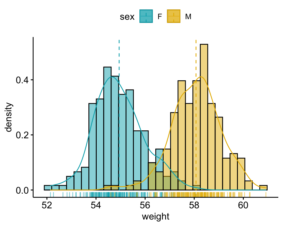
# Ajouter la courbe de densité sur le même axe
gghistogram(
  wdata, x = "weight", y = "..density..",
  add = "mean", rug = TRUE,
  fill = "sex", palette = c("#00AFBB", "#E7B800"),
  add_density = TRUE
  )
Utilisation d’un axe y secondaire pour la distribution de la densité
# 1. Créer le graphique de l'histogramme
phist <- gghistogram(
  wdata, x = "weight",
  add = "mean", rug = TRUE,
  fill = "sex", palette = c("#00AFBB", "#E7B800")
)

# 2. Créer le graphique de densité avec l'axe des y à droite
# Supprimer les éléments de l'axe des x
pdensity <- ggdensity(
  wdata, x = "weight",
  color= "sex", palette = c("#00AFBB", "#E7B800"),
  alpha = 0
) +
  scale_y_continuous(expand = expansion(mult = c(0, 0.05)), position = "right")  +
  theme_half_open(11, rel_small = 1) +
  rremove("x.axis")+
  rremove("xlab") +
  rremove("x.text") +
  rremove("x.ticks") +
  rremove("legend")

# 3. Aligner les deux graphiques et les superposer.
aligned_plots <- align_plots(phist, pdensity, align="hv", axis="tblr")
ggdraw(aligned_plots[[1]]) + draw_plot(aligned_plots[[2]])
Conclusion
Cet article décrit comment créer un histogramme ggplot avec une courbe de densité dans R en utilisant un axe y secondaire
Version:
 English


No Comments