# One-time install: the animation layers + a fast GIF renderer
install.packages(c("gganimate", "gifski"))Animated Plots in R with gganimate
Turn a ggplot2 chart into a smooth animation with a few extra layers
Data Visualization
Learn to create animated plots in R with gganimate — extend a ggplot2 chart with transition and easing layers to animate over time or groups, then render it to a GIF. Great for showing change over time and telling a data story your audience actually watches.
TipWhat you’ll learn
- The one-layer idea behind gganimate: keep your ggplot exactly as-is, then add a
transition_*()layer to make it move. transition_reveal()to draw a line as time passes,transition_time()to move points through a real date, andtransition_states()to morph between groups.- How to smooth the motion with
ease_aes()and add a live title that shows the current frame. - How to render to a GIF with
gifskiand save it withanim_save()— every plot below is real, copy-paste R.
A static chart shows the final state; an animation shows the change. When your story is “watch this evolve over time” — a growing trend, a shifting distribution, a race between groups — a short looping GIF holds attention far better than a wall of small multiples. The gganimate package makes this almost free: you build an ordinary ggplot2 chart, add one transition layer, and gganimate tweens the frames for you.
This post uses the built-in airquality dataset (daily air-quality readings in New York, May–September 1973) so everything runs with no data download. You only need two packages: gganimate (the animation layers) and gifski (the GIF renderer).
The recipe: a ggplot, plus one transition layer
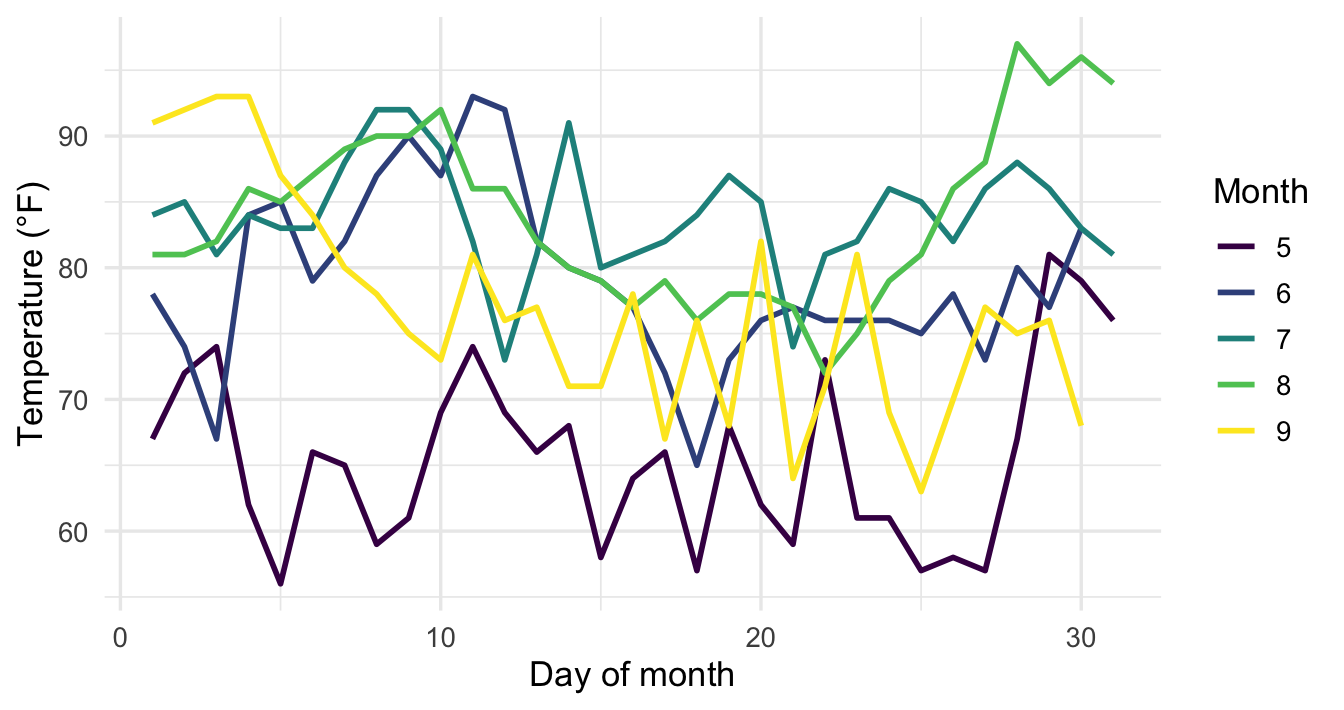
The whole idea in one sentence: make a normal ggplot, then add a transition_*() layer. Here is an ordinary line chart of daily temperature, one line per month, colored with the colorblind-safe viridis palette. Nothing about it is animation-specific yet:
library(ggplot2)

p <- ggplot(
  airquality,
  aes(x = Day, y = Temp, group = Month, color = factor(Month))
) +
  geom_line(linewidth = 0.9) +
  scale_color_viridis_d(name = "Month") +
  labs(x = "Day of month", y = "Temperature (°F)") +
  theme_minimal(base_size = 13)

p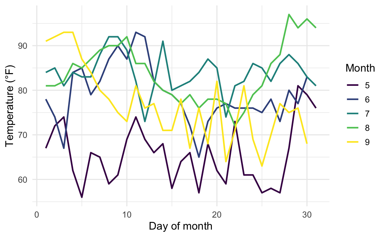
To animate it, add transition_reveal(Day). That tells gganimate to draw the lines progressively along the Day axis, so each frame reveals a little more of every month. Assign the result and render it with animate(), choosing the gifski_renderer() and a modest number of frames so the GIF stays light:
library(gganimate)

anim <- p + transition_reveal(Day)

animate(anim, renderer = gifski_renderer(), device = "ragg_png",
        width = 440, height = 320, units = "px", res = 100, nframes = 24, fps = 8)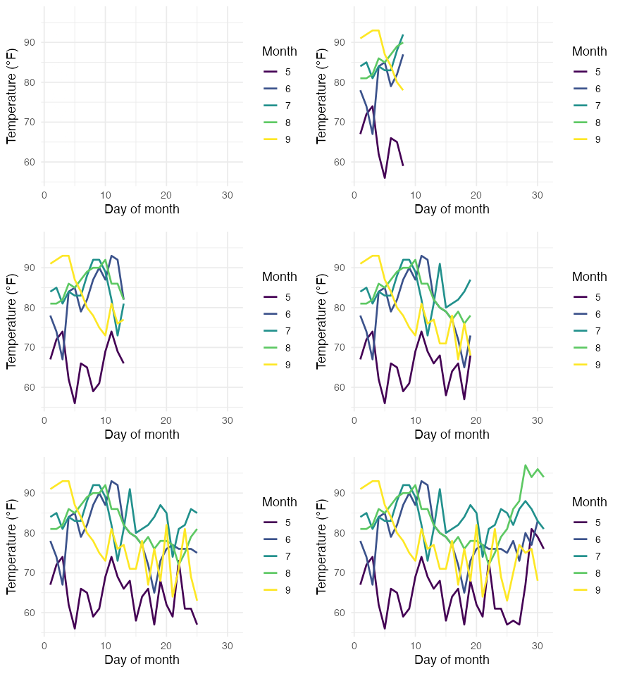
That’s the entire pattern. The lines you already had now grow from left to right, one day at a time, and all five months advance together. You changed one thing: you added a transition layer. Everything else — the aesthetics, the palette, the theme — carried over untouched.
transition_time(): move through real time
transition_reveal() keeps history on screen (the line stays drawn). Often you want the opposite: a single marker that moves through time, showing only the current moment. That is transition_time(), and it shines for a moving bubble.
Below, each row of airquality becomes one day’s reading — ozone against temperature, with the point sized by wind. We build a proper Date column from the month and day (base R, no extra packages), drop the days with missing ozone, and animate over that date. Two touches make it read well: a live title that prints the current date with the {frame_time} label variable, and shadow_wake() to leave a short fading trail behind the bubble:
library(ggplot2)
library(gganimate)

# Self-contained: build a date and keep days with a measured ozone value
aq <- airquality[!is.na(airquality$Ozone), ]
aq$date <- as.Date(paste(1973, aq$Month, aq$Day, sep = "-"))

b <- ggplot(aq, aes(x = Temp, y = Ozone, size = Wind)) +
  geom_point(color = "#3a86d4", alpha = 0.8) +
  scale_size(range = c(2, 10), name = "Wind (mph)") +
  labs(title = "Date: {frame_time}",
       x = "Temperature (°F)", y = "Ozone (ppb)") +
  theme_minimal(base_size = 13)

anim <- b +
  transition_time(date) +
  shadow_wake(wake_length = 0.1, alpha = FALSE)

animate(anim, renderer = gifski_renderer(), device = "ragg_png",
        width = 440, height = 320, units = "px", res = 100, nframes = 24, fps = 8)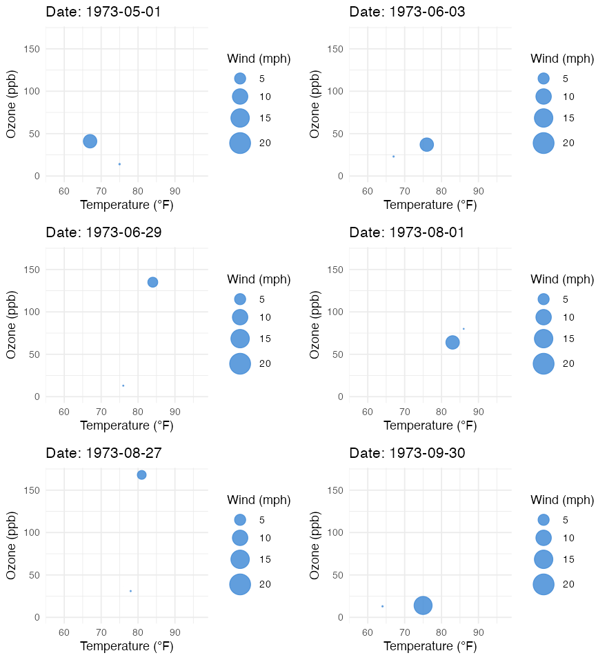
The bubble jumps around the temperature–ozone plane day by day, and the trail makes the path readable. The title updates automatically because gganimate exposes frame variables inside { }: transition_time() gives you frame_time (the current time value). If you prefer to keep the raw points visible in the background instead of a wake, swap shadow_wake() for shadow_mark().
transition_states(): morph between groups
The third common case has no time axis at all — you want to cycle through categories, morphing smoothly from one to the next. That is transition_states(). Here we first summarize mean temperature per month with base R’s aggregate(), then animate a bar chart that grows and fades between months.
mean_temp <- aggregate(Temp ~ Month, data = airquality, FUN = mean)
mean_temp$month <- factor(month.name[mean_temp$Month], levels = month.name)
mean_temp
Month Temp month
1 5 65.54839 May
2 6 79.10000 June
3 7 83.90323 July
4 8 83.96774 August
5 9 76.90000 SeptemberThe printed table shows temperature climbing to a mid-summer peak and easing off again by September. Now animate it. We add enter_grow() + enter_fade() so each bar grows in, ease_aes("cubic-in-out") to make the motion accelerate and settle instead of moving at a constant rate, and the {closest_state} label variable to show which month is on screen:
library(ggplot2)
library(gganimate)

mean_temp <- aggregate(Temp ~ Month, data = airquality, FUN = mean)
mean_temp$month <- factor(month.name[mean_temp$Month], levels = month.name)

s <- ggplot(mean_temp, aes(x = month, y = Temp, fill = Temp)) +
  geom_col(show.legend = FALSE) +
  scale_fill_viridis_c() +
  labs(title = "Month: {closest_state}",
       x = NULL, y = "Mean temperature (°F)") +
  theme_minimal(base_size = 13)

anim <- s +
  transition_states(month, wrap = FALSE) +
  enter_grow() +
  enter_fade() +
  ease_aes("cubic-in-out")

animate(anim, renderer = gifski_renderer(), device = "ragg_png",
        width = 440, height = 320, units = "px", res = 100, nframes = 24, fps = 8)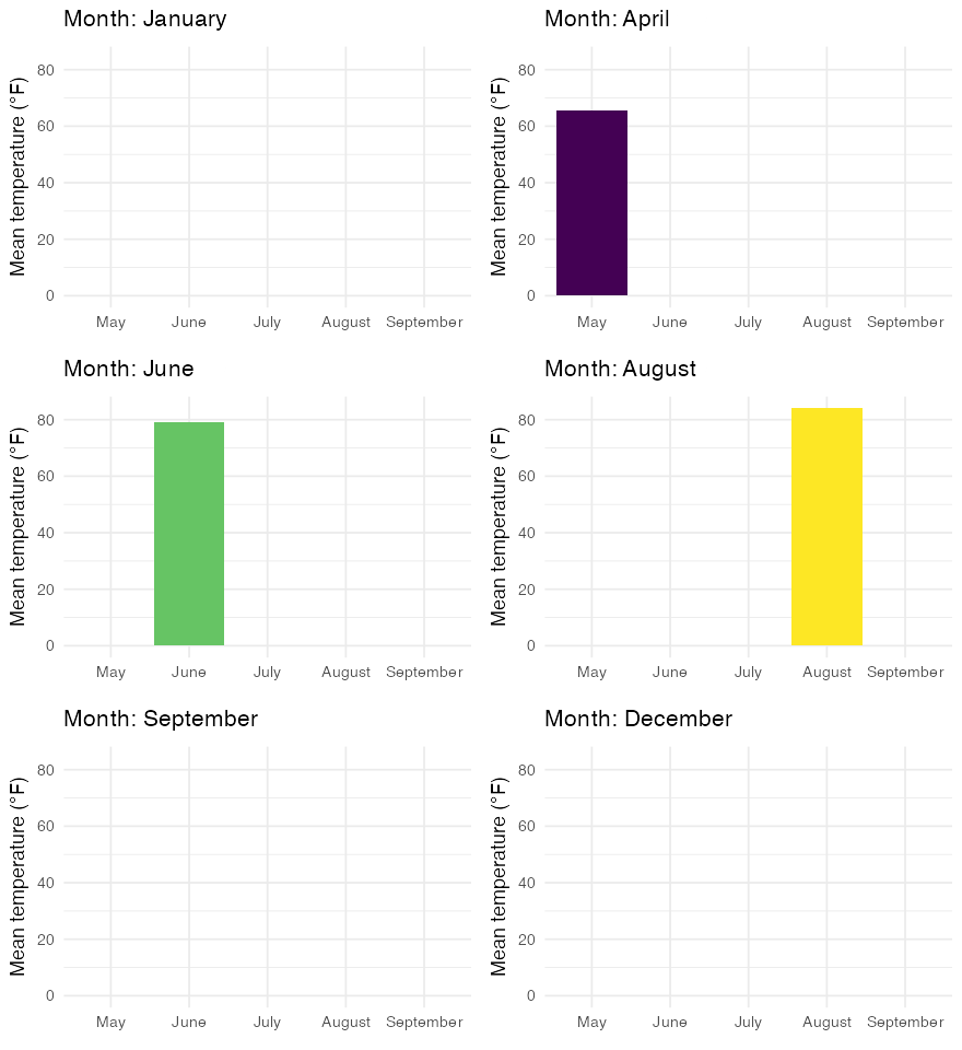
Each bar grows in as its month becomes the active state, and ease_aes() gives the growth a natural feel. transition_states() also works with facets — add facet_wrap() to your base plot exactly as you normally would, and every panel animates in step.
Saving your animation
animate() returns the animation, and anim_save() writes it to disk. Like ggsave(), it grabs the last rendered animation if you don’t hand it one explicitly:
anim <- s + transition_states(month, wrap = FALSE) + ease_aes("cubic-in-out")

# Render, then save the last animation as a GIF
animate(anim, renderer = gifski_renderer(), nframes = 50, fps = 10)
anim_save("temperature-by-month.gif")
Two knobs control length and smoothness: nframes (more frames = smoother and larger) and fps (frames per second = playback speed); together they set the duration (nframes / fps seconds). Keep both modest for a lightweight GIF. For an MP4 instead of a GIF, install the av package and pass renderer = av_renderer("out.mp4").
Frequently asked questions
NoteHow do I save a gganimate animation as a GIF or MP4?
Render with animate(), then call anim_save("file.gif") — it saves the last rendered animation by default, or pass one explicitly with anim_save("file.gif", animation = my_anim). For a GIF use renderer = gifski_renderer(); for an MP4 install the av package and use renderer = av_renderer("file.mp4").
NoteWhy is my animation showing as a static plot?
A gganimate object only becomes an animation once a transition_*() layer is added and the object is rendered. Make sure you added a transition (for example + transition_time(date)), that you print or animate() the object, and that a renderer such as gifski is installed. Inside a Quarto or R Markdown chunk, assigning the object and letting it print (or calling animate()) produces the GIF.
NoteWhat’s the difference between transition_time, transition_reveal, and transition_states?
transition_time() moves through a continuous variable (a date or number) and shows only the current moment — ideal for a moving bubble. transition_reveal() also follows a continuous dimension but keeps what’s already been drawn, so it reveals a line progressively. transition_states() steps through a categorical variable, morphing between discrete groups.
NoteHow do I control the speed and number of frames?
Pass nframes (total frames — more is smoother but larger) and fps (frames per second — higher is faster) to animate(). The playback duration is nframes / fps seconds. For a compact web GIF, values like nframes = 50 and fps = 10 are a good starting point.
NoteHow do I show the current time or group in the title?
gganimate exposes frame variables you can reference inside { } in any label. transition_time() gives {frame_time}, transition_states() gives {closest_state}, and transition_reveal() gives {frame_along} — for example labs(title = "Date: {frame_time}") updates the title on every frame.
Going deeper in /learn
This post is the focused recipe. gganimate is an extension layer on top of ggplot2, so the stronger your base chart, the better your animation. For the step-by-step, reproducibility-gated lessons on the charts you’ll animate, see:
- ggplot2 Scatter Plot in R — the bubble chart that
transition_time()brings to life. - ggplot2 Line Plot in R — the line chart that
transition_reveal()draws over time.
Citation
BibTeX citation:
@online{kassambara2026,
  author = {Kassambara, Alboukadel},
  title = {Animated {Plots} in {R} with Gganimate},
  date = {2026-07-08},
  url = {https://www.datanovia.com/blog/animated-plots-in-r-gganimate},
  langid = {en}
}
For attribution, please cite this work as:
Kassambara, Alboukadel. 2026. “Animated Plots in R with
Gganimate.” July 8. https://www.datanovia.com/blog/animated-plots-in-r-gganimate.