library(lattice)Lattice Graphs in R: The Panel & Conditioning Graphics System
A concise survey of lattice (Trellis) — the formula interface, the core plot types, and multi-panel conditioning with y ~ x | group
Data Visualization
A practical survey of the lattice package in R — the Trellis graphics system built on a formula interface. Covers the core high-level functions (xyplot, bwplot, histogram, densityplot, cloud), grouping with groups=, and lattice’s signature feature: compact multi-panel conditioning with the y ~ x | g formula. Every plot is rendered from real, copy-paste R using built-in data.
TipWhat you’ll find here
- What lattice (the Trellis graphics system) is, and its formula interface — the thing that sets it apart.
- The core high-level functions —
xyplot(),bwplot(),dotplot(),stripplot(),histogram(),densityplot(),cloud()— each with a runnable example. - Lattice’s signature move: multi-panel conditioning with
y ~ x | group— one small plot per subgroup, on shared scales, in a single call. - When to reach for lattice vs. base graphics or ggplot2 — and where to go next.
- Every plot is rendered from real, copy-paste R using built-in data; you only need
lattice, which ships with R.
Lattice is R’s implementation of Trellis graphics — a data-visualization system whose whole design centres on one idea: split your data into subgroups and draw the same plot for each, on shared scales, so the panels are directly comparable. It’s a base-R recommended package (it ships with every R install, no separate download), written by Deepayan Sarkar, and it predates ggplot2 as the go-to system for multi-panel “small multiples”.
You still meet lattice in the wild — older tutorials, the mixed-models world (lme4’s diagnostic plots are lattice), and Sarkar’s Lattice: Multivariate Data Visualization with R. This post is a fast orientation: what lattice is, its main plot types, and the conditioning feature that is still genuinely elegant. For new work the modern defaults are ggplot2 and base graphics — we cross-link both at the end.
The formula interface
Every lattice function takes a formula and a data frame, not raw vectors. That formula is the whole language:
y ~ x— plotyagainstx(a scatter, a box plot, …).~ x— a single variable (a histogram or density).z ~ x * y— a surface or 3D cloud.y ~ x | g— the signature move: drawy ~ xonce per level ofg, each in its own panel, on shared axes. The|reads as “conditioned on”.
Two arguments recur across every function:
groups =— overlay subgroups in the same panel (colour by group).auto.key = TRUE— draw a legend (lattice calls it a key) automatically fromgroups.
Load the package — no install.packages() needed, it’s already there:
The main high-level functions
Each function name says what it draws. This is the reference map:
| Function | Plot |
|---|---|
xyplot() |
Scatter plot / time series |
splom() |
Scatter-plot matrix |
bwplot() |
Box-and-whisker plot |
dotplot() |
Dot plot (Cleveland) |
stripplot() |
Strip plot (1-D scatter) |
barchart() |
Bar chart |
histogram() |
Histogram |
densityplot() |
Kernel density plot |
qqmath() |
Theoretical quantile (Q-Q) plot |
qq() |
Two-sample quantile plot |
cloud() |
3D scatter plot |
wireframe() |
3D surface |
levelplot() |
False-colour level plot of a surface |
contourplot() |
Contour plot of a surface |
parallel() |
Parallel-coordinates plot |
They all share the same grammar (formula + data + groups + conditioning), so once you know xyplot() you can read the rest. A few extras (ecdfplot(), mapplot()) live in the companion latticeExtra package.
xyplot(): scatter plots
xyplot(y ~ x, data) is the workhorse. Here it is on the built-in iris data (150 flowers, three species). We set point colour to the brand azure and a solid symbol with par.settings = simpleTheme(...), lattice’s shortcut for styling symbols and lines:
library(lattice)

xyplot(Sepal.Length ~ Petal.Length, data = iris,
       par.settings = simpleTheme(col = "#3a86d4", pch = 19),
       xlab = "Petal length (cm)", ylab = "Sepal length (cm)")
To colour points by group in the same panel, add groups = Species and auto.key = TRUE for the legend. A colourblind-safe three-colour palette (brand azure + two Okabe–Ito colours) goes through simpleTheme():
library(lattice)

pal <- c("#3a86d4", "#E69F00", "#009E73")

xyplot(Sepal.Length ~ Petal.Length, groups = Species, data = iris,
       par.settings = simpleTheme(col = pal, pch = 19),
       auto.key = list(columns = 3),
       xlab = "Petal length (cm)", ylab = "Sepal length (cm)")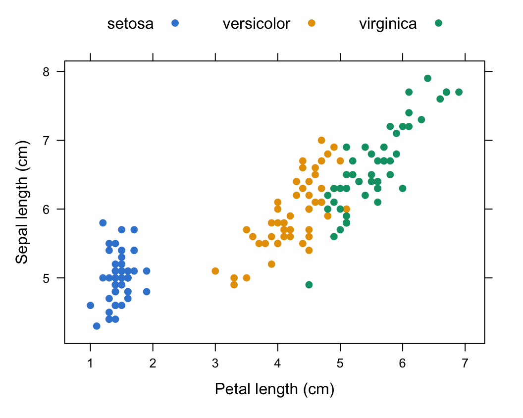
The type = argument controls what gets drawn — and you can combine several. type = c("p", "g", "smooth") overlays points, a reference grid, and a LOESS smoothing line in one call:
library(lattice)

xyplot(Sepal.Length ~ Petal.Length, data = iris,
       type = c("p", "g", "smooth"),
       par.settings = simpleTheme(col = "#3a86d4", pch = 19),
       xlab = "Petal length (cm)", ylab = "Sepal length (cm)")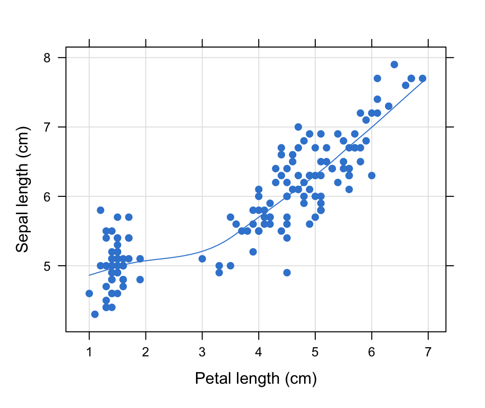
Conditioning: one panel per subgroup
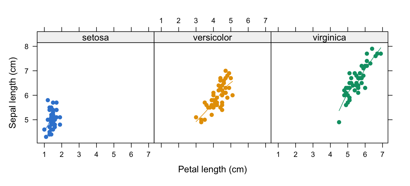
This is lattice’s defining feature. Add | Species to the formula and lattice draws the scatter once per species, each in its own panel, on shared scales — the “small multiples” idea, in a single call and with no manual layout:
library(lattice)

pal <- c("#3a86d4", "#E69F00", "#009E73")

xyplot(Sepal.Length ~ Petal.Length | Species, groups = Species, data = iris,
       type = c("p", "smooth"),
       par.settings = simpleTheme(col = pal, pch = 19),
       xlab = "Petal length (cm)", ylab = "Sepal length (cm)")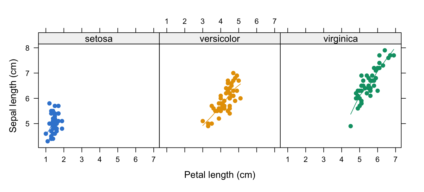
Each panel is directly comparable because the axes are shared. This same | g syntax works on every lattice function — a box plot per group, a histogram per group, and so on. It is the reason lattice still earns its place: compact, comparable multi-panel figures with almost no code.
bwplot(), dotplot(), stripplot(): distributions by category
For a categorical predictor, bwplot() draws box-and-whisker plots, dotplot() Cleveland dot plots, and stripplot() a 1-D jittered scatter. We use ToothGrowth (tooth length by vitamin-C dose), turning dose into a factor first:
library(lattice)
ToothGrowth$dose <- as.factor(ToothGrowth$dose)

bwplot(len ~ dose, data = ToothGrowth,
       par.settings = simpleTheme(col = "#3a86d4"),
       xlab = "Dose (mg/day)", ylab = "Tooth length")
Swap the function to change the display — same formula, same data. A strip plot shows every raw observation (use jitter.data = TRUE so points don’t overlap):
library(lattice)
ToothGrowth$dose <- as.factor(ToothGrowth$dose)

stripplot(len ~ dose, data = ToothGrowth,
          jitter.data = TRUE, pch = 19,
          par.settings = simpleTheme(col = "#3a86d4"),
          xlab = "Dose (mg/day)", ylab = "Tooth length")
Now the payoff of conditioning on real data. len ~ supp | dose draws a box plot of length by supplement type (OJ vs VC), in one panel per dose — layout = c(3, 1) arranges the three panels in a row:
library(lattice)
ToothGrowth$dose <- as.factor(ToothGrowth$dose)

bwplot(len ~ supp | dose, data = ToothGrowth,
       layout = c(3, 1),
       par.settings = simpleTheme(col = "#3a86d4"),
       xlab = "Supplement", ylab = "Tooth length")
At a glance you can compare OJ vs VC within each dose and across doses — three panels, one formula.
histogram() and densityplot(): single distributions
For one variable, drop the left side of the formula: ~ x. histogram() bins the values (showing the percentage of the total by default); densityplot() shows a smooth kernel estimate. Start with the histogram — nint sets the number of bins:
library(lattice)

histogram(~ len, data = ToothGrowth, nint = 12,
          par.settings = simpleTheme(col = "#3a86d4"),
          xlab = "Tooth length", ylab = "Percent of total")
For the smooth shape, densityplot(); plot.points = FALSE hides the rug of raw points under the curve:
library(lattice)

densityplot(~ len, data = ToothGrowth, plot.points = FALSE,
            par.settings = simpleTheme(col = "#3a86d4", lwd = 2),
            xlab = "Tooth length", ylab = "Density")
Add groups = to overlay one density per subgroup in the same panel — here one curve per dose:
library(lattice)
ToothGrowth$dose <- as.factor(ToothGrowth$dose)
pal <- c("#3a86d4", "#E69F00", "#009E73")

densityplot(~ len, groups = dose, data = ToothGrowth, plot.points = FALSE,
            par.settings = simpleTheme(col = pal, lwd = 2),
            auto.key = list(columns = 3, title = "Dose"),
            xlab = "Tooth length", ylab = "Density")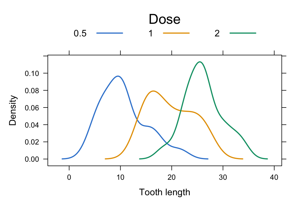
cloud(): 3D scatter plots
cloud(z ~ x * y, data) draws a 3D point cloud. The * in the formula pairs the two horizontal axes; z is the height. Here petal length as a function of the two sepal measurements, coloured by species:
library(lattice)
pal <- c("#3a86d4", "#E69F00", "#009E73")

cloud(Petal.Length ~ Sepal.Length * Sepal.Width, groups = Species, data = iris,
      par.settings = simpleTheme(col = pal, pch = 19),
      auto.key = list(columns = 3),
      screen = list(z = 30, x = -60))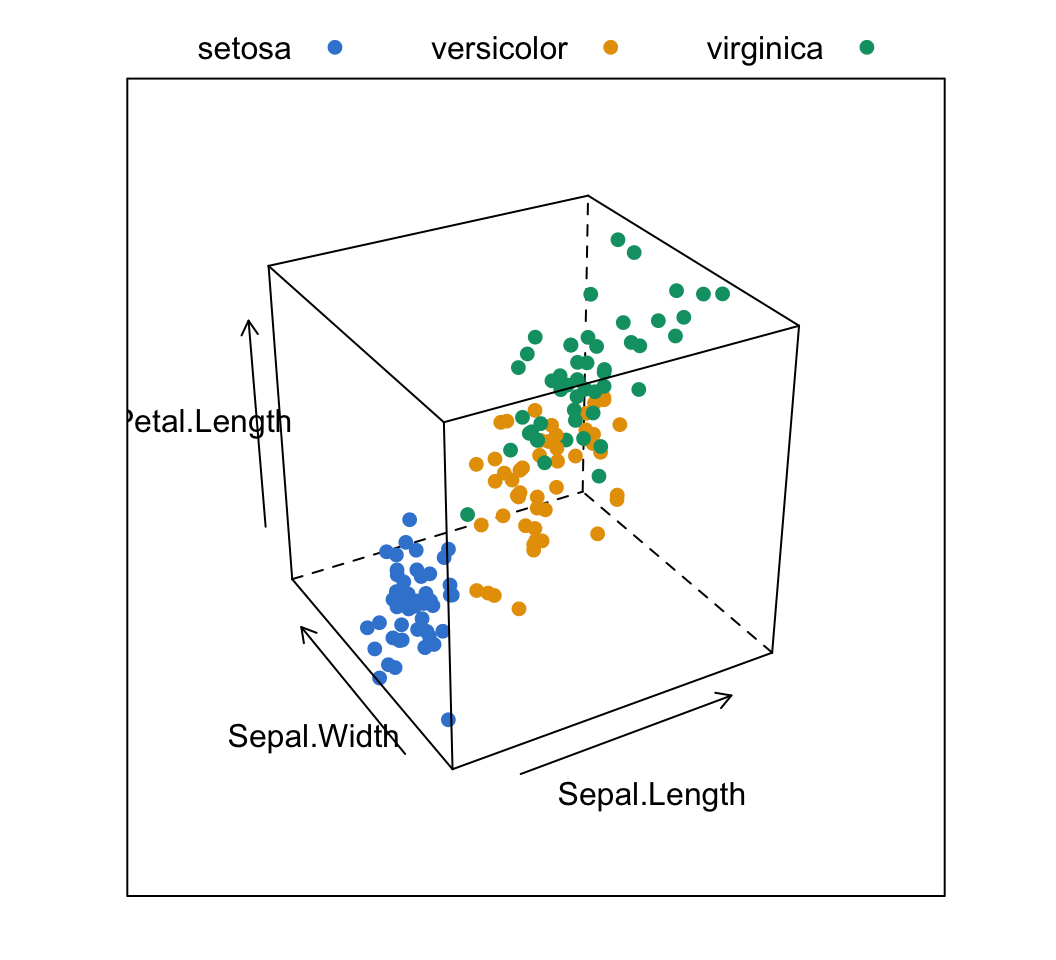
cloud() is a static projection — you set the viewing angle with screen. For a rotatable 3D scatter you spin with the mouse, use plotly instead (see our 3D scatter plots in R post).
When should you use lattice?
- Reach for lattice when you want compact multi-panel conditioning (
y ~ x | g) with almost no code, or you’re already in an ecosystem that speaks lattice —lme4mixed-model diagnostics, older analysis pipelines, or reproducing a figure from Sarkar’s book. Its shared-scale small multiples are genuinely elegant. - Reach for ggplot2 for essentially all new work.
facet_wrap()/facet_grid()give you the same conditioning idea, but the layered grammar, the richer theming, and the vastly larger extension ecosystem make it the modern default — and it’s what the rest of Datanovia teaches. - Reach for base graphics for quick, throwaway exploratory plots and total low-level control of a single panel.
lattice sits between the two: higher-level than base, but a different (and now less common) mental model than ggplot2’s grammar of graphics. Knowing it means you can read and maintain the lattice plots you’ll inevitably run into — and occasionally reach for its conditioning when it’s the fastest path.
Frequently asked questions
NoteWhat is the lattice package in R?
lattice is R’s implementation of Trellis graphics — a high-level data-visualization system built on a formula interface (y ~ x, ~ x, y ~ x | g). It ships with R (a recommended package, no install needed) and is designed around multi-panel conditioning: drawing the same plot once per subgroup, on shared scales, for direct comparison. Its main functions include xyplot(), bwplot(), histogram(), densityplot(), and cloud().
NoteWhat is the difference between lattice and ggplot2?
Both make multi-panel “small multiples”, but through different models. lattice uses a formula interface (y ~ x | g) and a fixed set of high-level plot functions; ggplot2 uses a layered grammar of graphics (ggplot() + geom_*() + facet_wrap()) that you compose piece by piece. ggplot2 has a larger extension ecosystem and is the modern default for new work; lattice is often faster to type for a quick conditioned figure and is still common in mixed-model diagnostics.
NoteHow do I make multiple panels (facets) in lattice?
Use conditioning — add | g to the formula, where g is a factor. For example xyplot(y ~ x | group, data = d) draws one scatter panel per level of group, on shared axes. Control the panel arrangement with layout = c(ncol, nrow). This | g syntax works on every lattice function (bwplot, histogram, densityplot, …).
NoteHow do I colour lattice plots by group?
Add the groups = argument to overlay subgroups in the same panel, and auto.key = TRUE (or auto.key = list(columns = n)) to draw the legend automatically. Set the actual colours with par.settings = simpleTheme(col = my_palette, pch = 19). Use groups = to overlay in one panel and | g conditioning to split into separate panels — they combine.
NoteDo I need to install lattice?
No — lattice is a recommended package that ships with every R installation, so library(lattice) works out of the box. (Its companion, latticeExtra, which adds ecdfplot(), mapplot() and more, is a separate CRAN install.)
Citation
BibTeX citation:
@online{kassambara2026,
  author = {Kassambara, Alboukadel},
  title = {Lattice {Graphs} in {R:} {The} {Panel} \& {Conditioning}
    {Graphics} {System}},
  date = {2026-07-12},
  url = {https://www.datanovia.com/blog/lattice-graphs-in-r},
  langid = {en}
}
For attribution, please cite this work as:
Kassambara, Alboukadel. 2026. “Lattice Graphs in R: The Panel
& Conditioning Graphics System.” July 12. https://www.datanovia.com/blog/lattice-graphs-in-r.