Draw choropleth and point maps with geom_sf() — the modern spatial workflow
Data Visualization
Learn to make maps in R with ggplot2 and the sf package — read spatial data, draw region polygons with geom_sf(), fill a choropleth by a variable, add points, and set a map projection. The modern replacement for the old maps/ggmap approach — every map is rendered from real, copy-paste R.
How to read spatial data into R with sf::st_read() — no shapefile wrangling, just one function.
Draw region polygons with geom_sf() — ggplot2 reads the geometry column automatically.
Turn a plain map into a choropleth by mapping a variable to aes(fill = ...).
Add points (cities, sites, county centres) on top of the polygons.
Reproject on the fly with coord_sf(crs = ...) — pick a projection that fits your region.
Every map is rendered from real R you can copy and run — you only need sf and ggplot2, and the data ships with sf (no download).
Making a map in R used to mean juggling maps, fortify(), and a Google-tiles package like ggmap for a raster backdrop. That workflow is now obsolete. The modern way is a single, coherent stack: the sf package holds your geography as an ordinary data frame with a geometry column, and ggplot2 draws it with one geom — geom_sf(). Read, fill, layer, project — all in the grammar of graphics you already know.
To keep this post self-contained, we use the North Carolina counties shapefile that ships inside the sf package, so nothing has to be downloaded. It has 100 counties and, for each, the number of births and SIDS (sudden infant death) cases recorded in 1974 and 1979 — perfect for a choropleth.
Read spatial data with sf
Point st_read() at a shapefile and you get back an sf object: a normal data frame where each row is one feature (here, one county) and the last column, geometry, holds that feature’s polygon. system.file() resolves the path to the copy bundled with the sf package, so this runs on any machine:
Read that output like any data frame — but notice the header above the table: it reports the geometry type (MULTIPOLYGON), the bounding box, and the CRS (coordinate reference system), NAD27 — geographic longitude/latitude. The geometry column travels with the attributes through every sf operation, so you never manage coordinates by hand. The columns we care about are NAME (county), BIR74 (live births, 1974) and SID74 (SIDS cases, 1974).
Draw region polygons with geom_sf()
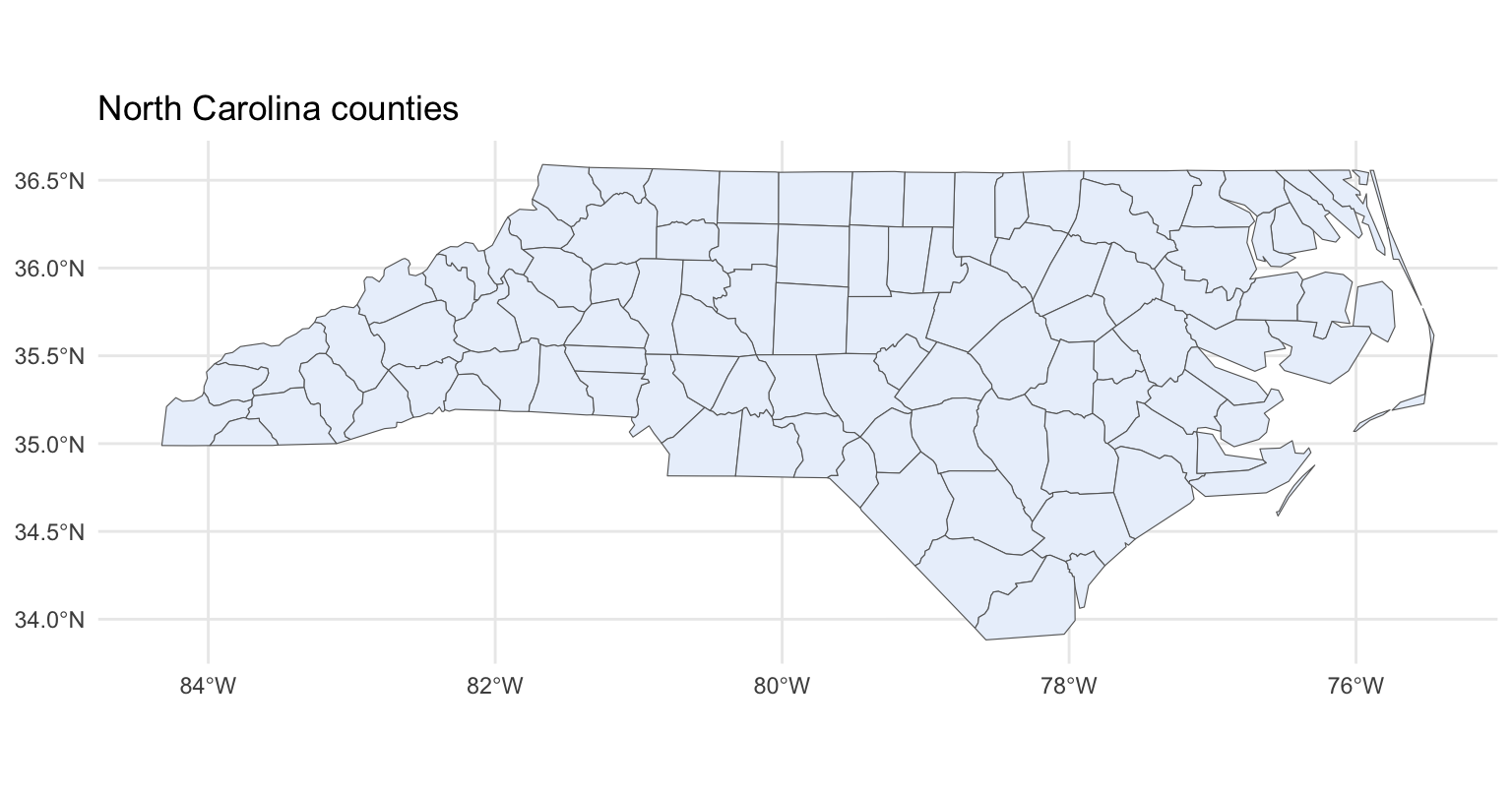
geom_sf() is the whole trick. Hand it an sf object and it finds the geometry column, picks the right drawing (polygons here) and sets an equal-scale coordinate system for you — no coord_fixed(), no aspect-ratio math. Here is the bare outline of all 100 counties:
That is a complete, correctly-proportioned map from three lines of plotting code. fill sets the polygon colour, color the borders, and theme_minimal() keeps it clean. To drop the graticule (the lon/lat grid lines) for a flatter look, swap in theme_void().
Make a choropleth: fill by a variable
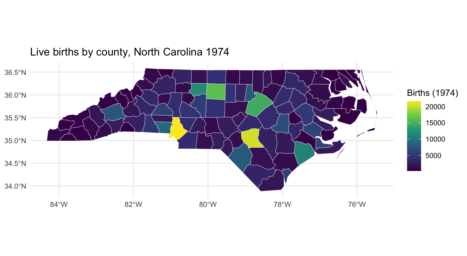
A choropleth shades each region by a value. Because an sf object is just a data frame, you map a column to fill exactly as you would for a bar chart — aes(fill = BIR74) — and geom_sf() colours each county’s polygon by its 1974 birth count. Use a sequential viridis scale (scale_fill_viridis_c()): it is perceptually uniform and colour-blind-safe, the right default for a continuous quantity.
library(sf)library(ggplot2)nc <-st_read(system.file("shape/nc.shp", package ="sf"), quiet =TRUE)ggplot(nc) +geom_sf(aes(fill = BIR74), color ="white", linewidth =0.15) +scale_fill_viridis_c(option ="viridis", name ="Births (1974)") +labs(title ="Live births by county, North Carolina 1974") +theme_minimal()
The map now tells a story: most counties render dark purple (a few hundred to a few thousand births), and a handful glow bright yellow — the state’s population centres. The single brightest county is Mecklenburg (Charlotte), with far more births than any rural county. That is the choropleth doing its job: it turns a column of numbers into geography at a glance. For a rate rather than a raw count you would compute SID74 / BIR74 first and fill by that — always prefer a rate when regions differ in population.
Add points to your map
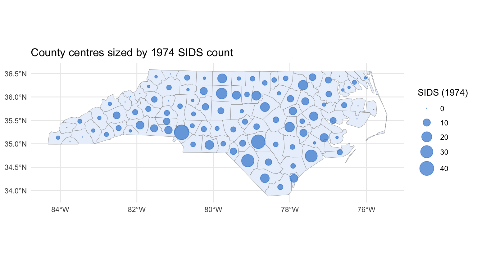
Real maps layer marks on top of the base geography — cities, sampling sites, capitals. In sf a set of points is just another sf object, and you add it with a second geom_sf(). To demonstrate without any extra data, we compute each county’s centroid with st_centroid() and size the point by its SIDS count. Because both layers carry a CRS, ggplot2 lines them up automatically:
library(sf)library(ggplot2)nc <-st_read(system.file("shape/nc.shp", package ="sf"), quiet =TRUE)centres <-st_centroid(nc)ggplot() +geom_sf(data = nc, fill ="#eaf1fb", color ="grey60", linewidth =0.15) +geom_sf(data = centres, aes(size = SID74), color ="#3a86d4", alpha =0.7) +scale_size_area(max_size =8, name ="SIDS (1974)") +labs(title ="County centres sized by 1974 SIDS count") +theme_minimal()
Each dot sits at a county’s geometric centre, and its area encodes the SIDS count — scale_size_area() maps the value to area (not radius), which is the honest choice for sized points. The data = argument on each geom_sf() lets the base polygons and the points come from different objects, the standard way to build a layered map. Swap centres for your own points — read them with st_as_sf(df, coords = c("lon", "lat"), crs = 4326) and the same call draws them.
Set a map projection
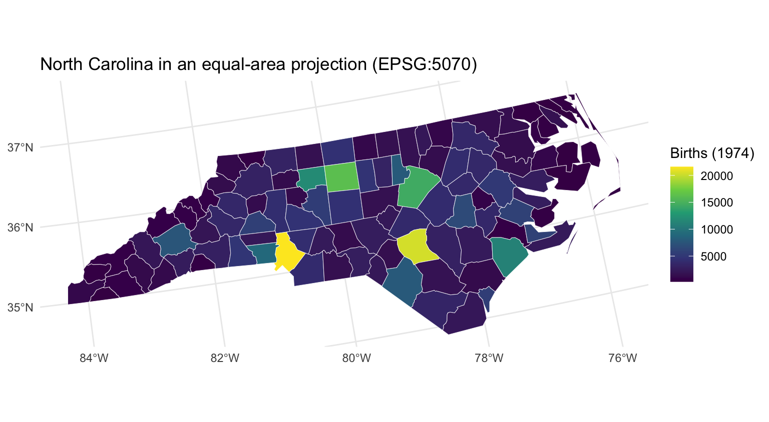
Every map flattens a curved Earth, and how it flattens is the projection. The NC data arrives in geographic coordinates (longitude/latitude, NAD27) — fine for a quick look, but longitude degrees shrink as you move away from the equator, so shapes and areas are subtly distorted. Reproject on the fly with coord_sf(crs = ...): it transforms the display without touching your data. Here we switch to US Albers Equal-Area (EPSG 5070), a projection built to preserve area — the right choice when you compare region sizes:
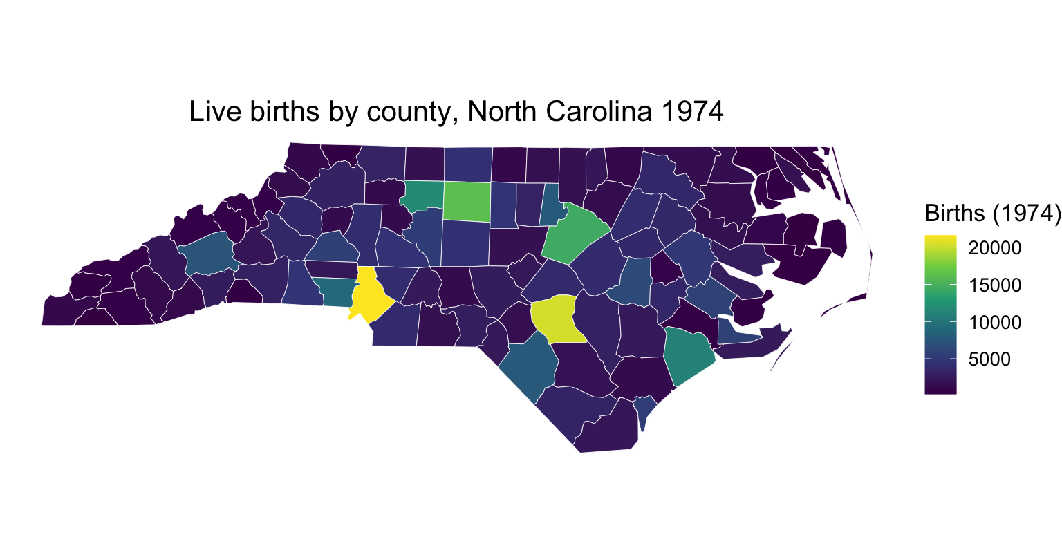
library(sf)library(ggplot2)nc <-st_read(system.file("shape/nc.shp", package ="sf"), quiet =TRUE)ggplot(nc) +geom_sf(aes(fill = BIR74), color ="white", linewidth =0.15) +scale_fill_viridis_c(name ="Births (1974)") +coord_sf(crs =5070) +labs(title ="North Carolina in an equal-area projection (EPSG:5070)") +theme_minimal()
Compare this with the earlier choropleth: the state now curves slightly, reflecting a projected, area-true view rather than a flat lon/lat grid. coord_sf() is the display-only route — it reprojects just for the plot. To reproject the data itself (for example before a spatial join), use st_transform(nc, 5070) instead. Either way you need an EPSG code; sf::st_crs(3857) (web Mercator) and 5070 (US Albers) cover most needs, and a regional State Plane code is sharpest for a single state.
Frequently asked questions
NoteDo I still need ggmap, maps, or fortify() for maps in R?
No. The old workflow — maps or a downloaded shapefile, fortify() to a data frame, and ggmap for a raster backdrop — is superseded. Store geography as an sf object and draw it with geom_sf(). You only reach for a tile package when you specifically want a photographic satellite/street backdrop; for polygons, points, and choropleths, sf + ggplot2 is the modern standard.
NoteHow do I plot my own longitude/latitude points on a map?
Turn your data frame into an sf object with st_as_sf(df, coords = c("lon", "lat"), crs = 4326) — crs = 4326 says the coordinates are WGS84 lon/lat (what GPS and most APIs give you). Then add it as a second layer: geom_sf(data = my_points). ggplot2 aligns it with your base polygons automatically as long as both carry a CRS.
NoteHow do I make a choropleth (fill regions by a value)?
Map a column to fill inside geom_sf(): geom_sf(aes(fill = my_variable)), then add a continuous scale such as scale_fill_viridis_c(). Because an sf object is a data frame, this is identical to filling bars in a bar chart. For fair comparison across regions of different population, fill by a rate (e.g. deaths / population) rather than a raw count.
NoteWhat projection should I use, and how do I set it?
Use coord_sf(crs = <EPSG code>) to reproject the display without altering your data. For area comparisons pick an equal-area projection (US Albers is EPSG 5070); web Mercator is 3857; a regional State Plane code is best for a single state or city. To transform the underlying geometry (before a spatial operation) use st_transform(data, <EPSG>) instead.
NoteWhy does geom_sf() know how to draw my data without x and y aesthetics?
geom_sf() reads the geometry column of an sf object directly — it discovers whether each feature is a point, line, or polygon and draws it accordingly, and it sets an equal-scale coordinate system so the map is not stretched. That is why you never pass aes(x = , y = ) for the geometry; you only map extra aesthetics like fill, color, or size to attribute columns.
Going deeper in /learn
This post is the focused map recipe. For the full grammar-of-graphics foundation behind geom_sf() — scales, themes, legends, and layering — see the step-by-step, reproducibility-gated lessons:
ggplot2 in R — the complete series: aesthetics, geoms, scales, and themes.
Data Visualization — the whole pillar, from first plot to publication-grade figures.
Ask Prova“draw a choropleth of my region shapefile with sf and geom_sf, filled by a rate” — it answers with code you can run on your own spatial data. The runtime is the judge.Ask Prova →
Was this page helpful?
Thanks for the feedback!
Get new R & Python lessons by email
Practical, reproducible, no spam. Unsubscribe anytime.
@online{kassambara2026,
  author = {Kassambara, Alboukadel},
  title = {Make {Maps} in {R} with Ggplot2 and Sf},
  date = {2026-07-08},
  url = {https://www.datanovia.com/blog/maps-in-r-with-ggplot2-sf},
  langid = {en}
}