
R Color Palettes: The Complete Reference
Every palette worth knowing — viridis, ColorBrewer, ggsci, Wes Anderson, base R — with runnable swatches
Data Visualization
The complete reference to R color palettes: viridis, RColorBrewer, grey, scientific-journal (ggsci) and Wes Anderson palettes, the 657 built-in color names, hex codes, how to expand a palette with colorRampPalette(), and colorblind-safe choices — every swatch rendered from real R.
TipWhat you’ll find here
- The palette families worth knowing in R — and when to reach for each.
- viridis (the safe default), RColorBrewer (sequential / diverging / qualitative), grey, scientific-journal (
ggsci), Wes Anderson, and base-R palettes (rainbow,heat.colors…). - The 657 built-in color names, hex codes, and how to expand any palette to more colors.
- Colorblind-safe choices — the ones that survive deuteranopia.
- Every swatch below is rendered from real R code you can copy and run.
Which palette should you use?
A good color palette is perceptually uniform (equal steps in data look like equal steps in color), colorblind-safe, and prints in greyscale. Two libraries cover almost every need:
- viridis — the default you can’t go wrong with: uniform, colorblind-safe, greyscale-safe.
- RColorBrewer — curated sequential, diverging, and qualitative sets for thematic maps and groups.
Reach past those only for a specific look — scientific journals (ggsci), Wes Anderson films, or the base-R classics. Avoid plain rainbow() for data: it is not perceptually uniform and fails in colorblindness. New to why these rules hold? Start with the colour theory basics below — palette types, colour models, and the colour wheel.
Colour theory basics
Before the catalog, the why — three quick ideas make almost every choice on this page obvious. Pick a palette by answering three questions: what kind of data (which fixes the palette type), which colour model you reason in, and how the hues relate on the colour wheel.
Match the palette TYPE to your data
This is the choice that matters most. There are three types, and each fits exactly one kind of data:
- Sequential — for ordered data that runs low → high (counts, income, temperature). One hue ramping light → dark, so darker = more. → viridis, Brewer
Blues/YlOrRd. - Diverging — for ordered data with a meaningful midpoint (correlations around 0, change versus a baseline, z-scores). Two sequential ramps meeting at a neutral centre, so the middle reads as “no difference”. → Brewer
RdBu/Spectral. - Qualitative — for unordered categories (species, treatment groups, countries). Distinct hues at similar lightness, so no group looks “bigger” than another. → Brewer
Set2/Dark2,ggsci, Okabe–Ito.

Get this right and the rest is polish; get it wrong — a rainbow on ordered data, a sequential ramp on categories — and the figure misleads before anyone reads a number.
Colour models: why viridis beats a rainbow
A colour can be described three ways, and the model you pick matters for data:
- RGB / hex (
"#3a86d4") — how a screen mixes red, green and blue light. Perfect for specifying a colour, poor for reasoning about one: equal steps in RGB are not equal steps to the eye. - HSV — hue, saturation, value; the intuitive “colour-picker” dial. Easier to tweak, but still not perceptually even — a fully saturated yellow reads far lighter than a blue at the same “value”.
- HCL (perceptual) — hue, chroma, luminance, built on how human vision actually works. Equal steps look equal, so magnitude maps honestly. This is exactly why viridis is perceptually uniform and a naive
rainbow()misleads: the rainbow crams detail into some ranges and invents bright bands the data never had.
Base R exposes the perceptual model through hcl(). Rotate the hue at a fixed chroma and luminance and you get an even, balanced qualitative set — no colour shouting louder than the rest:
# Five evenly-spaced hues at constant chroma + luminance (perceptually balanced)
qual <- hcl(h = seq(15, 315, length.out = 5), c = 60, l = 65)
qual
[1] "#DB8782" "#9DA43F" "#00B492" "#5FA4D9" "#D482C8"
The colour wheel: warm, cool, and how hues relate
hcl()’s hue is an angle on the colour wheel — and a few relationships are worth knowing when you build your own set:
- Warm vs cool — reds/oranges/yellows feel warm and advance; blues/greens feel cool and recede. A warm–cool pair is a natural way to contrast two groups.
- Analogous — neighbours on the wheel (hues ~30° apart): harmonious and low-contrast, a calm coherent palette — the intuition behind a sequential ramp.
- Complementary — opposite on the wheel (~180° apart): maximum contrast — good for a two-group highlight, and the intuition behind the two ends of a diverging palette.
Because the hue is just an angle, these are one arithmetic step apart — analogous hues sit close together, complementary hues are 180° away:
base <- 255                                        # a blue starting hue
analogous     <- hcl(c(base - 30, base, base + 30), c = 60, l = 65)
complementary <- hcl(c(base, (base + 180) %% 360),  c = 60, l = 65)
Tie it back to the catalog: viridis is a sequential, perceptually-uniform ramp; RColorBrewer ships all three types (and flags the colourblind-safe ones); the scientific-journal and Okabe–Ito sets are qualitative; and a diverging set like RdBu is the right call whenever your data have a meaningful middle. When none of the ready-made sets fit, design your own with these same three ideas.
viridis — the safe default
The viridis scales are perceptually uniform, colorblind-safe, and greyscale-safe. ggplot2 ships them built in (no extra package needed for the scales), and viridisLite gives you the raw colors for base R. There are several options: viridis, magma, plasma, inferno, cividis, mako, rocket, turbo.

In ggplot2, use the built-in scales — scale_color_viridis_d() for discrete groups, scale_color_viridis_c() for a continuous variable (swap color → fill for areas):
library(ggplot2)
ggplot(iris, aes(Sepal.Length, Sepal.Width, color = Species)) +
  geom_point(size = 2) +
  scale_color_viridis_d() +
  theme_minimal()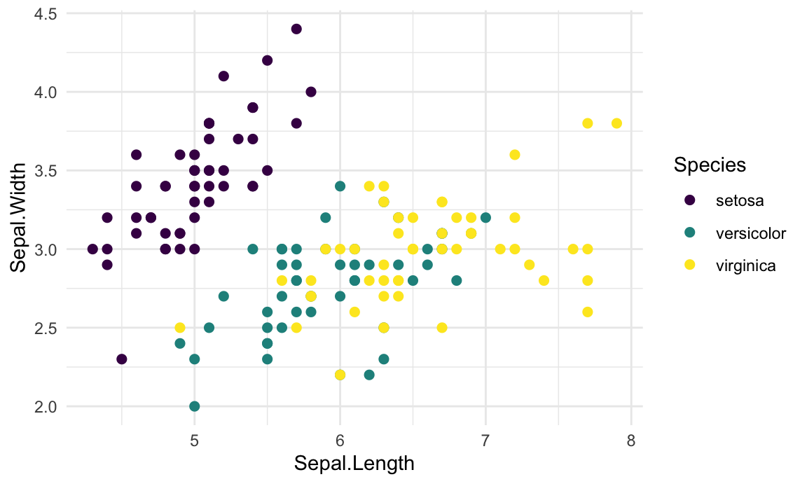
For base R, viridisLite::viridis(n) returns n colors: barplot(1:10, col = viridis(10)).
RColorBrewer — curated sequential, diverging & qualitative
RColorBrewer provides three families: sequential (low→high), qualitative (unordered groups), and diverging (a meaningful midpoint). Display them all:
library(RColorBrewer)
par(mar = c(0, 3, 0, 0))
display.brewer.all()
- Sequential —
Blues BuGn BuPu GnBu Greens Greys Oranges OrRd PuBu PuBuGn PuRd Purples RdPu Reds YlGn YlGnBu YlOrBr YlOrRd - Qualitative —
Accent Dark2 Paired Pastel1 Pastel2 Set1 Set2 Set3 - Diverging —
BrBG PiYG PRGn PuOr RdBu RdGy RdYlBu RdYlGn Spectral
Get the hex codes for a palette with brewer.pal(), or view one on its own:
library(RColorBrewer)
brewer.pal(n = 8, name = "Dark2")
[1] "#1B9E77" "#D95F02" "#7570B3" "#E7298A" "#66A61E" "#E6AB02" "#A6761D"
[8] "#666666"par(mar = c(0.5, 0.5, 0.5, 0.5)); display.brewer.pal(n = 8, name = "Dark2")
In ggplot2: scale_fill_brewer(palette = "Dark2") for areas, scale_color_brewer() for points/lines. In base R: barplot(c(2, 5, 7), col = brewer.pal(3, "RdBu")).
Grey scales
For print-only or minimalist figures, ggplot2’s scale_fill_grey() / scale_color_grey() map groups to shades of grey (start/end set the lightest/darkest):
library(ggplot2)
ggplot(iris, aes(Species, Sepal.Length, fill = Species)) +
  geom_boxplot() +
  scale_fill_grey(start = 0.8, end = 0.2) +
  theme_minimal()
Scientific-journal palettes (ggsci)
The ggsci package (install.packages("ggsci")) collects palettes used by scientific journals — Nature (npg), Science (aaas), Lancet (lancet), Journal of Clinical Oncology (jco), NEJM (nejm), and more — provided as ggplot2 scale functions. Great for publication figures:
library(ggplot2)
library(ggsci)
ggplot(iris, aes(Species, Sepal.Length, fill = Species)) +
  geom_boxplot() +
  scale_fill_jco() +          # try scale_fill_npg(), scale_fill_lancet(), scale_fill_aaas()
  theme_classic()
Pair scale: scale_color_npg() / scale_color_jco() for points and lines; for base R, the palette generators give a color vector — e.g. barplot(1:10, col = pal_jco()(10)). Other scales include scale_*_aaas(), scale_*_lancet(), scale_*_nejm(), and scale_*_tron() (built for dark themes).
Wes Anderson palettes
The wesanderson package has 16 palettes drawn from Wes Anderson films — small, characterful sets for categorical data (interpolate with type = "continuous" when you need more colors):
install.packages("wesanderson")
library(wesanderson)

names(wes_palettes)               # the 16 palettes
wes_palette("GrandBudapest1")     # a vector of colors

# Discrete fill in ggplot2
ggplot(iris, aes(Species, Sepal.Length, fill = Species)) +
  geom_boxplot() +
  scale_fill_manual(values = wes_palette("GrandBudapest1", 3))

# Interpolate to 100 colors for a gradient
pal <- wes_palette("Zissou1", 100, type = "continuous")
Base-R palettes
Base R ships five palette generators — rainbow(n), heat.colors(n), terrain.colors(n), topo.colors(n), and cm.colors(n):

Use them directly: barplot(1:5, col = rainbow(5)). Prefer viridis over rainbow for real data — rainbow is not perceptually uniform and is hard to read in colorblindness.
The 657 built-in color names
R knows 657 named colors — colors() returns them all, and any name works anywhere a color is expected (col = "steelblue"). Here are the first 96:
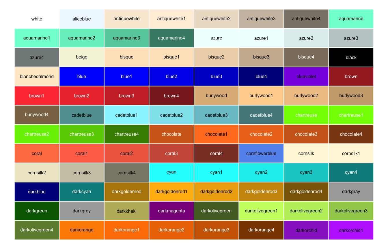
There are 657 in total (length(colors())); browse them all with colors().
Hex color codes
Any color can be given as a hex code "#RRGGBB" — each pair of digits sets the level of red, green, and blue from 00 to FF; add two more for alpha/transparency ("#RRGGBBAA"). Use one anywhere a color is expected: col = "#3a86d4". A clean, reusable set to copy from:
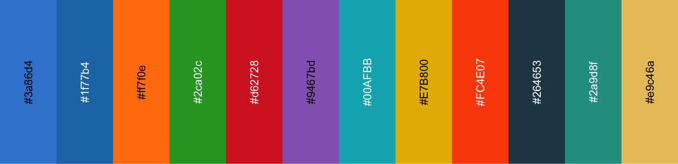
Convert any color name to its hex code with col2rgb() + rgb():
rgb(t(col2rgb("steelblue")), maxColorValue = 255) # "steelblue" -> "#4682B4"[1] "#4682B4"Expand a palette to more colors
Need more colors than a palette provides? colorRampPalette() interpolates any set of colors into a smooth ramp of n:
library(RColorBrewer)
more <- colorRampPalette(brewer.pal(9, "Blues"))(18)   # stretch 9 Blues -> 18 colors
Use the result anywhere: scale_fill_manual(values = more) in ggplot2, or col = more in base R.
Colorblind-safe palettes
Roughly 1 in 12 men has a color-vision deficiency — pick palettes that survive it:
- viridis — uniform and robust across all common deficiencies (the safest default).
- ColorBrewer —
display.brewer.all(colorblindFriendly = TRUE)shows only the safe sets. - Okabe–Ito — an 8-color qualitative palette designed for colorblindness:
okabe_ito <- c("#999999", "#E69F00", "#56B4E9", "#009E73",
               "#F0E442", "#0072B2", "#D55E00", "#CC79A7")
Apply it with scale_color_manual(values = okabe_ito) in ggplot2.
Designing your own palette
When no off-the-shelf set fits, build one with the colour theory basics above: decide the palette type first (sequential for ordered data, diverging around a meaningful midpoint, qualitative for categories), then pick hues on the wheel — analogous (neighbours) for a calm, coherent look or complementary (opposite) for maximum contrast — and reason in a perceptual model (hcl()) so the steps look as even as they measure. Handy online tools: coolors.co, ColorBrewer, and Adobe Color. Then bring the hex codes into R with colorRampPalette().
Using palettes in ggplot2
This page is the catalog. For the full how-to on applying color in ggplot2 — color vs fill, scale_*_manual(), coloring by group, and continuous gradients — see the dedicated lesson: ggplot2 Colors in R.
Frequently asked questions
NoteWhat is the best color palette to use in R?
For almost any chart, reach for viridis — it is perceptually uniform, colorblind-safe, and still readable in greyscale, so you rarely go wrong with it. When you need curated sequential, diverging, or qualitative sets (thematic maps, grouped bars), use RColorBrewer. Go beyond those two only for a specific look — scientific-journal (ggsci), Wes Anderson, or the base-R classics. Avoid plain rainbow() for data: it is not perceptually uniform and breaks under colorblindness.
NoteHow do I find a color by name or hex code in R?
R ships 657 built-in color names — run colors() to list them all (see the full catalog), and pass any of them straight to a plot, e.g. plot(1:10, col = "steelblue"). You can also specify a color as a hex code in the form "#RRGGBB" (for example "#3A86D4"); add two more digits — "#RRGGBBAA" — for transparency. See the hex codes section to build and preview them.
NoteWhich R color palettes are colorblind-safe?
viridis and its variants (magma, plasma, inferno, cividis) are colorblind-safe by design. In RColorBrewer, restrict yourself to the palettes flagged safe by display.brewer.all(colorblindFriendly = TRUE). Whatever you pick, sanity-check it the way the colorblind-safe section shows — simulate deuteranopia and view the plot in greyscale — and never rely on color as the only signal.
NoteHow do I get more colors than a palette provides?
Built-in palettes have a fixed number of colors (RColorBrewer sets top out at 8–12). To stretch any palette to as many colors as you need, interpolate with colorRampPalette(): colorRampPalette(brewer.pal(9, "Blues"))(50) returns 50 shades. The expand-a-palette section walks through it — the right tool when a discrete scale runs out of colors for your groups.
NoteHow do I apply one of these palettes to a ggplot2 chart?
Map the palette to the relevant scale. For a discrete grouping use scale_color_viridis_d() / scale_fill_viridis_d(), scale_color_brewer(palette = "Set2"), or a manual vector with scale_color_manual(values = my_colors); for a numeric variable use the _c twins (scale_fill_viridis_c()). The dedicated ggplot2 Colors lesson covers color vs fill, coloring by group, and continuous gradients in full.
NoteWhat is the difference between sequential, diverging, and qualitative palettes?
They match three kinds of data. A sequential palette is one hue running light → dark, for ordered data with no natural centre (counts, income) — darker means more. A diverging palette is two sequential ramps meeting at a neutral midpoint, for ordered data with a meaningful middle (correlations around 0, change versus a baseline) — the centre reads as “no difference”. A qualitative palette is a set of distinct hues at similar lightness, for unordered categories (species, groups) — so no group looks larger than another. The colour theory basics section shows all three as swatches; RColorBrewer ships every type.
NoteWhat is a perceptually uniform color palette (and why does it matter)?
“Perceptually uniform” means equal steps in the data look like equal steps in color to the human eye — so the color faithfully represents magnitude instead of exaggerating some ranges and flattening others. It comes from choosing colors in a perceptual model like HCL (hue, chroma, luminance) rather than raw RGB. viridis is the go-to uniform palette; a naive rainbow() is not uniform — it invents bright bands and hides detail, which is why it misleads on real data. See colour models for the intuition.
Conclusion
When in doubt, use viridis (uniform + colorblind-safe) or an RColorBrewer set chosen for your data type. Reach for ggsci or Wes Anderson for a specific look, colors() and hex codes for one-off colors, and colorRampPalette() to stretch any palette to the number of colors you need — and always sanity-check in greyscale and for colorblindness.
Citation
BibTeX citation:
@online{kassambara2026,
  author = {Kassambara, Alboukadel},
  title = {R {Color} {Palettes:} {The} {Complete} {Reference}},
  date = {2026-06-21},
  url = {https://www.datanovia.com/blog/r-color-palettes},
  langid = {en}
}
For attribution, please cite this work as:
Kassambara, Alboukadel. 2026. “R Color Palettes: The Complete
Reference.” June 21. https://www.datanovia.com/blog/r-color-palettes.