library(ggfortify)

model <- lm(Petal.Width ~ Petal.Length, data = iris)

autoplot(model, colour = "#3a86d4", smooth.colour = "#fb5607") +
  theme_minimal()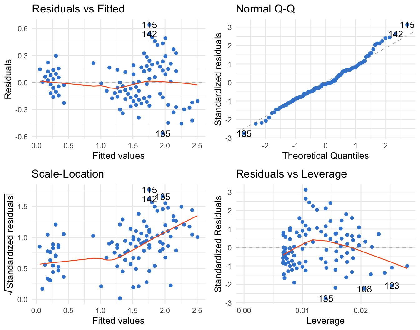
autoplot() turns lm, PCA, clustering, and time-series objects into ggplot2 figures
Learn to use ggfortify in R — the autoplot() generic that draws ggplot2 figures for common objects: linear-model diagnostics, PCA (prcomp), k-means clustering, and time series. One function, publication-ready plots, and every figure is rendered from real, copy-paste R.
autoplot() is — one generic that recognises the class of your object and draws the right ggplot2 figure for it.prcomp), k-means clustering, and time series — each in a single line.+ theme_minimal(), brand colours, viridis) because autoplot() returns a normal ggplot object.You have a fitted lm, a prcomp result, a kmeans object, or a ts — and you want a quick, good-looking plot without writing a ggplot() call from scratch. That’s exactly what ggfortify is for. It extends ggplot2 with a single generic, autoplot(), that inspects the class of whatever you hand it and draws a sensible ggplot2 figure. Because the return value is an ordinary ggplot, you can keep adding layers, themes, and scales on top.
Everything below is rendered from real R. You only need ggfortify (which loads ggplot2 for you).
The classic use case: you fit a model and want the four standard regression diagnostics — residuals vs fitted, a normal Q-Q plot, scale-location, and residuals vs leverage. Base R gives you those with plot(model), but as four separate base-graphics panels. autoplot() returns them as one ggplot2 figure you can theme.
We fit a simple model on the built-in iris data, then let autoplot() do the rest. Passing colour and smooth.colour recolours the points and the loess helper lines:
library(ggfortify)
model <- lm(Petal.Width ~ Petal.Length, data = iris)
autoplot(model, colour = "#3a86d4", smooth.colour = "#fb5607") +
theme_minimal()
Read them the usual way: a flat red smoother on residuals vs fitted means no obvious non-linearity, points hugging the diagonal on the Q-Q plot means roughly normal residuals, and no point stranded at high leverage on the last panel means no single observation is dominating the fit. The point is not the interpretation here — it’s that you got the whole diagnostic panel, ggplot2-styled, in one call. Want a subset? autoplot(model, which = 1:3, ncol = 3) selects and arranges specific panels.
autoplot() handles glm objects the same way — swap lm() for glm() and you get the same diagnostic grid.
Principal Component Analysis is the case ggfortify makes genuinely pleasant. Run prcomp(), hand the result to autoplot(), and pass the original data frame plus the grouping column so points can be coloured — then add loadings = TRUE to overlay the variable arrows (a biplot).
library(ggfortify)

pca <- prcomp(iris[, -5], scale. = TRUE)

autoplot(
  pca, data = iris, colour = "Species",
  loadings = TRUE, loadings.label = TRUE,
  loadings.colour = "grey40", loadings.label.colour = "grey30"
) +
  scale_color_viridis_d() +
  theme_minimal()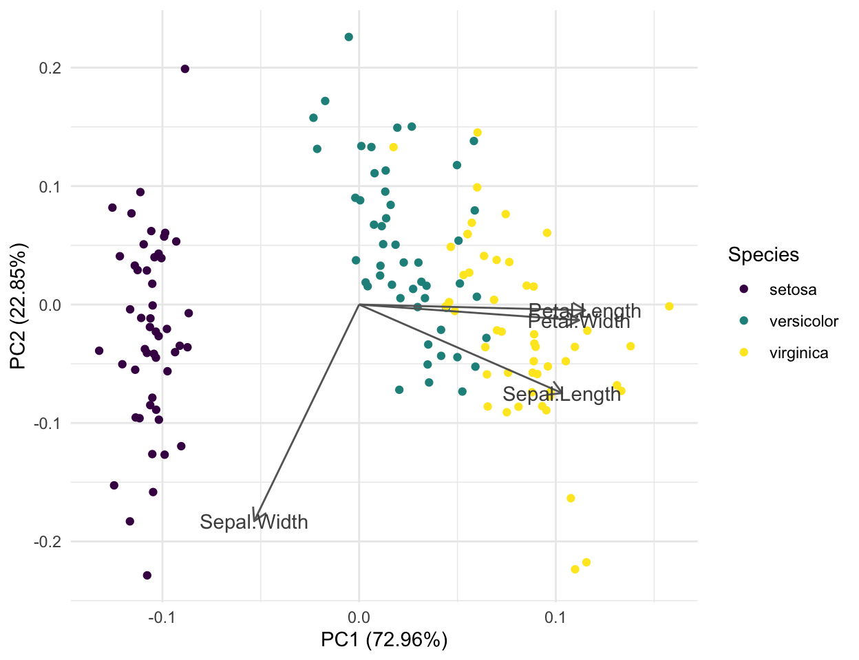
The axis labels tell you the payoff of the projection: PC1 captures about 73% of the variance and PC2 about 23%, so this flat 2-D picture preserves roughly 96% of the information in the four original measurements. Setosa (one corner) separates cleanly, while versicolor and virginica sit closer together and partly overlap. The loading arrows show why: petal length and petal width point almost the same direction along PC1, so they carry most of the spread that pulls the species apart.
Founder’s tip — for a publication-grade PCA figure, use factoextra. autoplot() is the fast look. When you want the finished figure — a scree plot, a labelled variable-correlation circle, confidence ellipses per group, and quality/contribution colouring — reach for factoextra’s fviz_pca_ind() / fviz_pca_biplot(), built for exactly this. See the Principal Component Analysis lesson.
kmeans() returns cluster assignments but throws away the data, so autoplot() needs you to pass data = back in. It projects onto the first two principal components, colours points by cluster, and — with frame = TRUE — draws a hull around each group.
We set a seed so the clustering is reproducible, then cluster the 50 US states in USArrests into three groups:
library(ggfortify)

set.seed(123)
km <- kmeans(USArrests, centers = 3)

autoplot(km, data = USArrests, frame = TRUE) +
  scale_color_viridis_d() +
  scale_fill_viridis_d() +
  theme_minimal()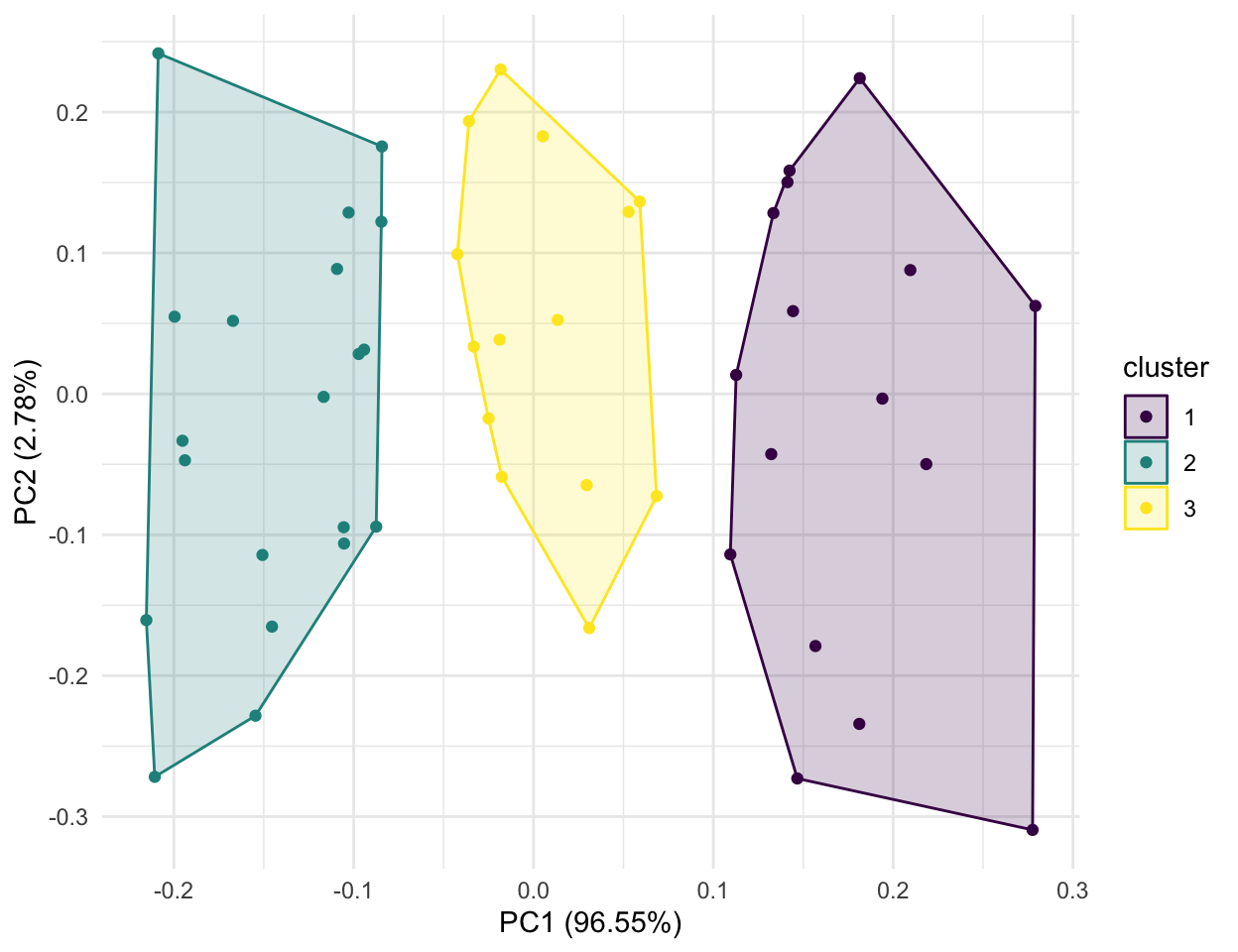
Each colour is one cluster and each shaded hull is its frame; the states spread along PC1, which for the un-scaled USArrests is dominated by the Assault rate, so the clusters roughly track low-, mid-, and high-crime states. ggfortify also speaks the cluster package — autoplot() accepts pam(), clara(), and fanny() objects directly, and because those store the original data you don’t even need to pass data =.
Founder’s tip — for cluster figures you’ll ship, use factoextra. fviz_cluster() gives you the same idea with labelled points, per-cluster ellipses, and full theming control, and fviz_nbclust() helps you choose the number of clusters in the first place. See the k-means clustering lesson.
Hand autoplot() a ts object and it draws a proper time-indexed line chart — no need to convert to a data frame first. The ts.colour argument recolours the line:
library(ggfortify)

autoplot(AirPassengers, ts.colour = "#3a86d4") +
  labs(x = "Year", y = "Monthly air passengers (thousands)") +
  theme_minimal()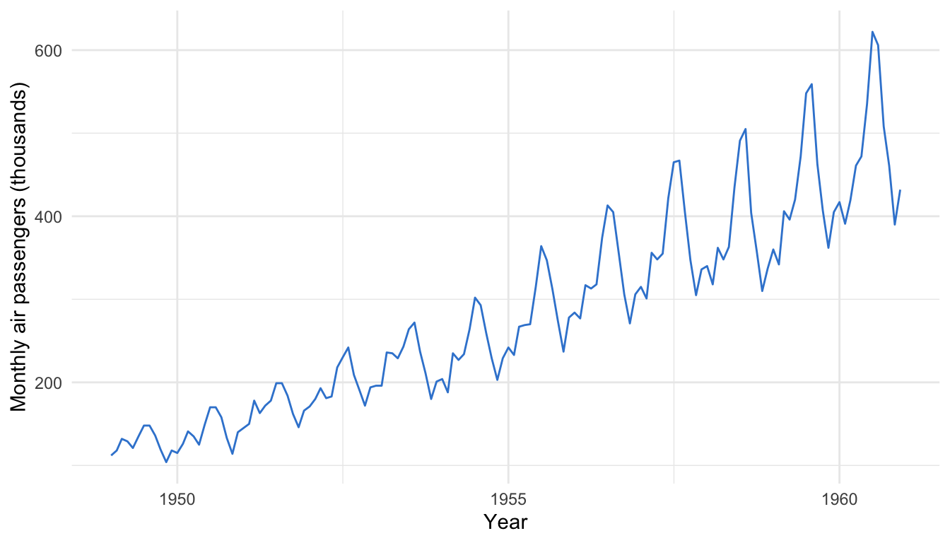
The built-in AirPassengers series (monthly airline totals, 1949–1960) shows both a clear upward trend and a repeating yearly seasonal wave whose amplitude grows over time — the textbook shape for a decomposition example. The same autoplot() generic also renders many neighbouring time-series classes, including forecast::forecast() output, zoo/xts series, stl() decompositions, and changepoint/strucchange break detections — one function, the whole ecosystem.
ggfortify recognises survival::survfit() objects too, so a Kaplan-Meier curve is one line:
library(ggfortify)
library(survival)

fit <- survfit(Surv(time, status) ~ sex, data = lung)

autoplot(fit) +
  scale_color_viridis_d() +
  scale_fill_viridis_d() +
  labs(x = "Time (days)", y = "Survival probability") +
  theme_minimal()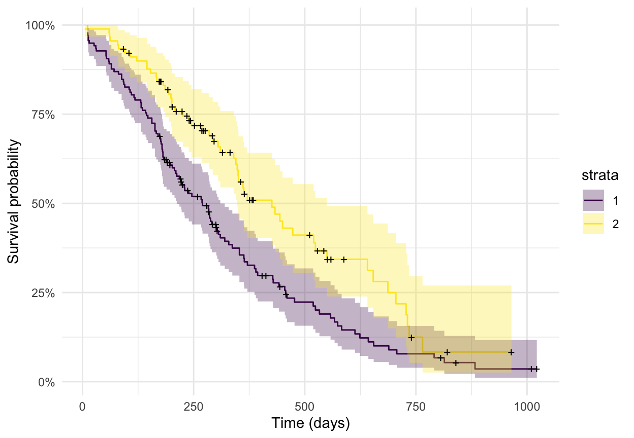
You get two stepped survival curves with confidence bands — perfectly fine for a quick look.
Founder’s tip — for a clinical survival figure, use survminer. A publication or regulatory Kaplan-Meier plot needs a number-at-risk table, the log-rank p-value on the plot, censoring ticks, and median lines — survminer::ggsurvplot() produces all of that from the same survfit object in one call. Use autoplot() for the quick check; use ggsurvplot() for the figure that goes in the paper. See Publication-Ready Survival Curves.
autoplot() is a generic — its power is the breadth of classes it recognises. Beyond the cases above, ggfortify dispatches on many more objects; you rarely have to remember a package-specific plotting function:
| Domain | Classes autoplot() recognises |
|---|---|
| Models | lm, glm (diagnostics) |
| Multivariate | prcomp, princomp (PCA), stats::factanal, MASS::isoMDS/sammon (MDS) |
| Clustering | stats::kmeans, cluster::pam/clara/fanny |
| Time series | ts, stats::stl/decomposed.ts, stats::acf, forecast::forecast, zoo::zooreg, xts::xts |
| Change detection | changepoint::cpt, strucchange::breakpoints |
| Survival | survival::survfit, survfit.cox |
| Matrices | matrix, table (heatmap or scatter via geom =) |
Because every one of these returns a ggplot object, the same follow-up works everywhere: add + theme_minimal(), a viridis or journal palette, titles, and facets exactly as you would on a hand-built plot.
autoplot() is a generic function from the ggfortify package. You hand it a fitted or computed object — an lm, a prcomp, a kmeans, a ts, a survfit — and it inspects the object’s class and draws the appropriate ggplot2 figure automatically. It saves you from writing a bespoke ggplot() call for each object type, and because the result is a normal ggplot you can keep styling it with +.
Yes. autoplot() is a live, maintained generic and works with current ggplot2 — install it from CRAN with install.packages("ggfortify"). Loading it with library(ggfortify) attaches ggplot2 for you, so + theme_minimal(), scale_color_viridis_d(), and any other ggplot2 layer compose on top of an autoplot() result as usual.
Use ggfortify’s autoplot() for the fast look: one line turns a prcomp result into a coloured score plot with loading arrows. Use factoextra (fviz_pca_ind(), fviz_pca_biplot(), fviz_eig()) when you want the finished, publication-grade figure — scree plots, a variable-correlation circle, per-group confidence ellipses, and contribution/quality colouring. They complement each other: quick exploration with ggfortify, polished output with factoextra.
Yes — that’s the main advantage over base plot(). autoplot() returns an ordinary ggplot object, so you add themes (+ theme_minimal()), colour scales (+ scale_color_viridis_d()), titles (+ labs(...)), and even facets exactly as you would on any plot you built by hand. Many object-specific arguments (like colour, loadings, frame, ts.colour) also let you tweak the figure inside the autoplot() call itself.
Fit the model with survival::survfit(), then call autoplot() on the result: autoplot(survfit(Surv(time, status) ~ sex, data = lung)). You get stepped Kaplan-Meier curves with confidence bands. For a clinical or publication figure — with a number-at-risk table, the log-rank p-value, and censoring marks — use survminer::ggsurvplot() on the same survfit object instead.
/learnThis post is the focused recipe. For the full, reproducibility-gated walkthroughs — building the underlying models and the publication-grade figures step by step — see:
autoplot() builds on, from scratch.prcomp, factoextra figures, and interpreting PCs.@online{kassambara2026,
author = {Kassambara, Alboukadel},
title = {Ggfortify: {One-Line} Ggplot2 {Plots} for {Models} and {Time}
{Series} in {R}},
date = {2026-07-08},
url = {https://www.datanovia.com/blog/ggfortify-autoplot-in-r},
langid = {en}
}