ggsurvplot in R: Publication-Ready Survival Curves with survminer
Build a journal-ready Kaplan-Meier figure step by step — risk table, confidence bands, p-value on the plot, median lines, custom colors and legend, faceting, combining curves, and exporting
Biostatistics
A practical survminer reference for ggsurvplot(): start from a basic survival curve and add, one element at a time, the number-at-risk table, 95% confidence bands, the log-rank p-value on the plot, median-survival lines, censoring marks, a colourblind-safe journal palette, custom legend, axis and title, faceting by a covariate, combining multiple curves, and exporting the figure at the right size — on the NCCTG lung-cancer data.
Published
June 25, 2026
Modified
July 7, 2026
TipKey takeaways
ggsurvplot() (from survminer, the package built for this) turns a survfit object into a publication-ready Kaplan-Meier figure — never settle for a bare plot().
Build the figure one element at a time: risk.table = TRUE (number at risk), conf.int = TRUE (confidence bands), pval = TRUE (log-rank p-value on the plot), surv.median.line = "hv" (median lines).
Make it journal-ready: palette = "jco"/"npg" (colourblind-safe), legend.labs/legend.title, xlab/ylab/title, break.time.by, and ggtheme = theme_minimal().
Compare across subsets with ggsurvplot_facet() (one panel per covariate) and overlay endpoints (e.g. OS vs PFS) with ggsurvplot_combine().
Export at the right size with ggsave() — a ggsurvplot is a list, so save print(p) (or arrange_ggsurvplots() for several panels) at 300 dpi for print.
Introduction
You have a Kaplan-Meier curve and need it to look like the figures in The Lancet or JCO — survival steps, a 95% confidence band, the number at risk under the plot, the log-rank p-value where a reviewer expects it, and colours that survive a grayscale printer. Base R’s plot(survfit(...)) gives you none of that without a fight.
survminer’s ggsurvplot() was written for exactly this job (it’s the package the field uses, and the one we maintain). This is a recipe reference: start from the plainest survival curve and add each publication element in turn — risk table, confidence intervals, p-value, median lines, censoring marks, palette, legend, axes, faceting, combining curves, and exporting. Each section is one paragraph, the code, and the figure it produces. Copy what you need.
If you are estimating curves for the first time, read Kaplan-Meier estimation first; this lesson assumes you already have a survfit object and focuses entirely on the plot.
The data and the fit
Every recipe below plots the same survfit object, so build it once. We use lung (NCCTG, ships with the survival package) — survival by sex in 228 advanced lung-cancer patients. The dataset auto-attaches with survival, so reference lung directly (no data() call):
library(survival)fit <-survfit(Surv(time, status) ~ sex, data = lung)fit
Call: survfit(formula = Surv(time, status) ~ sex, data = lung)

        n events median 0.95LCL 0.95UCL
sex=1 138    112    270     212     310
sex=2  90     53    426     348     550
Two strata (sex=1 male, sex=2 female), with their median survival and 95% CIs. Each {r} block below re-creates fit so you can copy any one of them and run it on its own.
Step 1 — a basic survival curve
ggsurvplot(fit, data) is the minimum. Pass the survfit object and the data you fit it on (survminer needs the data to build the risk table later):
library(survival)library(survminer)fit <-survfit(Surv(time, status) ~ sex, data = lung)ggsurvplot(fit, data = lung)
Already a clean ggplot2 figure: two coloured curves, censoring ticks, a legend. Everything that follows adds to this call.
Step 2 — the number-at-risk table
The single most expected element in a clinical survival figure. risk.table = TRUE draws a table beneath the curves showing how many patients are still at risk at each time — it tells the reader how much data backs the tail (where curves get unreliable). Control its height with risk.table.height:
library(survival)library(survminer)fit <-survfit(Surv(time, status) ~ sex, data = lung)ggsurvplot( fit, data = lung,risk.table =TRUE, # number at risk under the plotrisk.table.height =0.25# 25% of the figure height)
For a cleaner table, add tables.theme = theme_cleantable() and risk.table.y.text = FALSE (shows a coloured bar instead of repeating the strata names). To combine counts, risk.table = "nrisk_cumcensor" shows the number at risk and the cumulative censored in one table.
Step 3 — confidence bands
conf.int = TRUE shades the 95% confidence interval around each curve — required by most journals. By default it’s a filled ribbon; conf.int.style = "step" draws stepped bounds instead (sometimes clearer when bands overlap):
library(survival)library(survminer)fit <-survfit(Surv(time, status) ~ sex, data = lung)ggsurvplot( fit, data = lung,risk.table =TRUE,conf.int =TRUE, # 95% confidence bandsconf.int.style ="ribbon"# or "step")
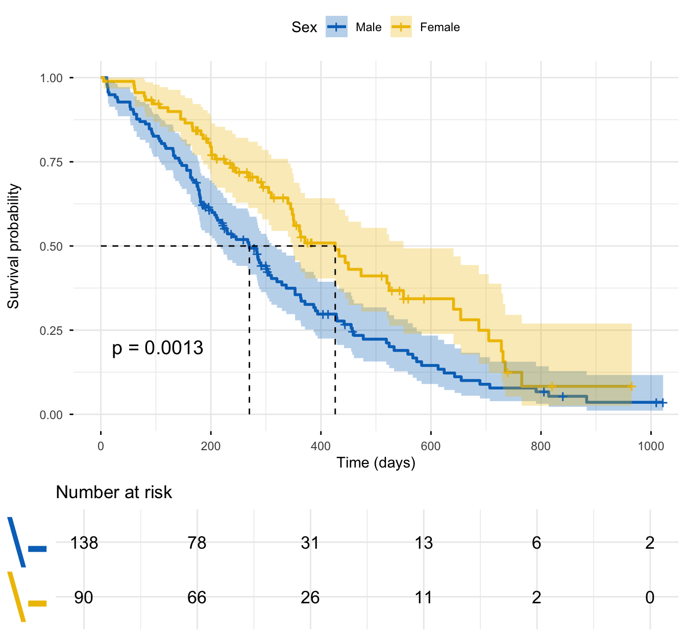
Notice the bands fan out at the right end — few patients remain at risk late, so the tail is uncertain. That’s the risk table’s job to expose.
Step 4 — the log-rank p-value on the plot
pval = TRUE runs the log-rank test comparing the strata and prints the p-value on the plot — no separate test call, no copy-paste. Place it with pval.coord and name the test with pval.method = TRUE:
library(survival)library(survminer)fit <-survfit(Surv(time, status) ~ sex, data = lung)ggsurvplot( fit, data = lung,risk.table =TRUE,conf.int =TRUE,pval =TRUE, # log-rank p-value on the plotpval.method =TRUE, # also print the test namepval.coord =c(750, 0.85) # x, y position of the p-value)
You can also pass pval a value or string for full control — pval = "Log-rank, p < 0.001" — or change the weighting (log.rank.weights = "sqrtN" for Tarone-Ware, which is more sensitive to early differences).
Step 5 — median-survival lines
surv.median.line = "hv" draws the dashed horizontal-then-vertical guides that drop from the 0.5 survival line to each group’s median survival on the x-axis — the headline number, read straight off the figure ("h" horizontal only, "v" vertical only):
library(survival)library(survminer)fit <-survfit(Surv(time, status) ~ sex, data = lung)ggsurvplot( fit, data = lung,risk.table =TRUE,conf.int =TRUE,pval =TRUE,surv.median.line ="hv"# dashed median-survival guides)
The vertical lines meet the x-axis at 270 days (men) and 426 days (women) — the medians from fit, now visible on the plot.
Step 6 — censoring marks
Censored patients (alive at last follow-up) appear as small tick marks on the curves by default — don’t mistake them for events. Toggle them with censor, and change their look with censor.shape and censor.size:
library(survival)library(survminer)fit <-survfit(Surv(time, status) ~ sex, data = lung)# Custom censoring marksggsurvplot( fit, data = lung,censor.shape ="|", censor.size =4# vertical-bar ticks)
# Hide them entirely (useful when overlaying many curves)ggsurvplot(fit, data = lung, censor =FALSE)
Keep censoring marks on for a single figure (they’re informative); hide them only when many overlapping curves make the plot busy.
Step 7 — colourblind-safe journal palettes
palette = "jco" applies the Journal of Clinical Oncology colour scheme from ggsci — colourblind-safe and instantly journal-credible. Other named palettes: "npg" (Nature), "lancet", "nejm", "aaas". You can also pass "grey", an RColorBrewer name ("Dark2"), or your own hex vector:
library(survival)library(survminer)fit <-survfit(Surv(time, status) ~ sex, data = lung)# JCO journal palette (colourblind-safe)ggsurvplot(fit, data = lung, conf.int =TRUE, palette ="jco")
# Nature Publishing Group paletteggsurvplot(fit, data = lung, conf.int =TRUE, palette ="npg")
# Custom colours work too: palette = c("#3a86d4", "#E7B800")
Use a named journal palette for groups; pick one and stay consistent across a paper’s figures.
Step 8 — legend, title, and axis labels
Replace the raw strata names (sex=1, sex=2) with readable labels, move the legend, and label the axes and time scale. The arguments: legend.labs (in strata order), legend.title, legend (position), xlab/ylab/title, and break.time.by (axis tick interval):
library(survival)library(survminer)fit <-survfit(Surv(time, status) ~ sex, data = lung)ggsurvplot( fit, data = lung,risk.table =TRUE,conf.int =TRUE,pval =TRUE,legend.labs =c("Male", "Female"), # in strata orderlegend.title ="Sex",legend ="top", # "top","bottom","left","right", or c(x,y)title ="Overall survival by sex",xlab ="Time (days)",ylab ="Survival probability",break.time.by =200# x-axis tick every 200 days)
To shorten an uninformative tail, add xlim = c(0, 800) — it crops the axis without changing the survival estimates. Use surv.scale = "percent" for a 0–100% y-axis.
Transformed views: cumulative incidence and cumulative hazard
By default ggsurvplot() plots the survival probability S(t). Flip the y-axis with fun = "event" to show cumulative incidence (1 − S(t)) — the natural view when the question is “how many have had the event by time t” rather than “how many are still surviving” — and fun = "cumhaz" for the cumulative hazard, a diagnostic view (a roughly straight line suggests a constant hazard):
library(survival)library(survminer)fit <-survfit(Surv(time, status) ~ sex, data = lung)# Cumulative incidence: 1 - S(t), the curves now RISE from 0ggsurvplot(fit, data = lung, fun ="event", conf.int =TRUE, palette ="jco")
# Cumulative hazard (diagnostic view): fun = "cumhaz"
Same fit, different lens: fun = "event" answers the incidence question for a clinical reader, while fun = "cumhaz" is for checking the hazard shape. Everything else (risk table, pval, palette) still applies on top of the transformed axis.
Step 9 — the publication-ready figure
Put the recipe together. This is the figure you paste into a paper — risk table, confidence bands, p-value, median lines, journal palette, clean labels, and theme_minimal():
Every element is justified: the risk table shows data behind the tail, the band shows uncertainty, the p-value answers “do they differ?”, the median lines give the headline number, and the palette is colourblind-safe. Nothing decorative.
Faceting: one panel per subgroup
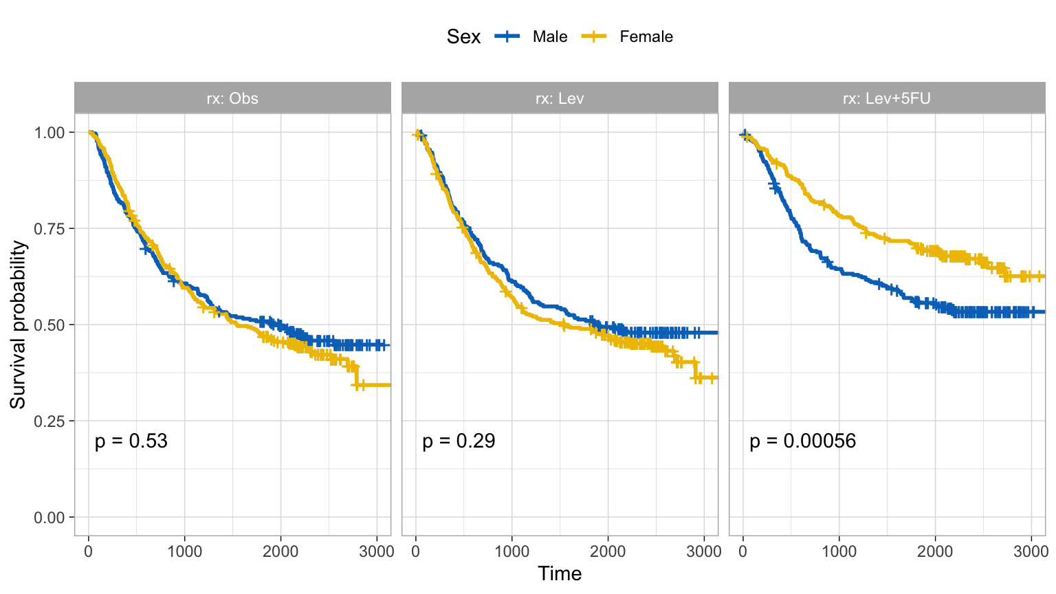
To compare survival within the levels of another variable, ggsurvplot_facet() (or facet.by = inside ggsurvplot) draws a multi-panel figure — one Kaplan-Meier per subgroup, each with its own log-rank p-value. Here, survival by sex, faceted by treatment (rx) on the colon dataset:
library(survival)library(survminer)fit_colon <-survfit(Surv(time, status) ~ sex, data = colon)ggsurvplot_facet( fit_colon, data = colon,facet.by ="rx", # one panel per treatmentpalette ="jco",pval =TRUE,legend.title ="Sex",legend.labs =c("Male", "Female"),ggtheme =theme_light())
Facet by two variables with facet.by = c("rx", "adhere") for a grid. Note: ggsurvplot_facet() returns a plain ggplot, so it does not carry a risk table (that’s the trade-off for the grid layout).
Combining curves: two endpoints on one plot
To overlay separate survfit objects — classically overall survival (OS) vs progression-free survival (PFS) — use ggsurvplot_combine() with a named list of fits. Here, two endpoints built from colon (PFS simulated for illustration):
library(survival)library(survminer)set.seed(123)demo <-data.frame(os.time = colon$time,os.status = colon$status,pfs.time =sample(colon$time),pfs.status = colon$status)os <-survfit(Surv(os.time, os.status) ~1, data = demo)pfs <-survfit(Surv(pfs.time, pfs.status) ~1, data = demo)ggsurvplot_combine(list(OS = os, PFS = pfs), # named list → legend labelsdata = demo,risk.table =TRUE,tables.theme =theme_cleantable(),censor =FALSE,palette ="jco")
The named list keys (OS, PFS) become the legend labels. Use this whenever two curves come from different Surv() responses rather than groups of one fit.
Exporting the figure
A ggsurvplot object is a list ($plot, $table, …), not a single ggplot — so ggsave() on the raw object can drop the risk table. Save print(p) at the size and resolution you need (300 dpi for print); to export the curve with its risk table laid out, wrap a single plot in arrange_ggsurvplots():
library(survival)library(survminer)fit <-survfit(Surv(time, status) ~ sex, data = lung)p <-ggsurvplot(fit, data = lung, risk.table =TRUE, conf.int =TRUE,pval =TRUE, palette ="jco")# Curve + risk table, sized for a journal column, 300 dpiggsave("survival_curve.png",plot =arrange_ggsurvplots(list(p), print =FALSE),width =7, height =6.5, dpi =300)# PDF (vector) for submissionggsave("survival_curve.pdf",plot =arrange_ggsurvplots(list(p), print =FALSE),width =7, height =6.5)
Set width/height in inches to control the aspect ratio; export to PDF (vector) for journals that prefer it, PNG/TIFF at ≥300 dpi for raster submissions.
Try it live
Build your own publication figure — change the palette, the legend labels, or what you facet by. The sandbox boots on first Run.
🟢 With an AI agent
Ask Prova“build a publication-ready ggsurvplot on my survival data — risk table, confidence bands, the log-rank p-value, median lines, a colourblind-safe journal palette, and export it at 300 dpi” — it answers with survminer code you can run on your own data. The runtime is the judge.Ask Prova →
Common issues
The risk table is misaligned or cut off. The table shares the x-axis with the curve, so its alignment breaks if you crop with xlim after the fact or set an awkward figure height. Use xlim =insideggsurvplot() (so both panels crop together), give the table room with risk.table.height = 0.25–0.3, and tidy it with tables.theme = theme_cleantable() and risk.table.y.text = FALSE.
Your legend labels are in the wrong order, or the wrong groups get the wrong colour.legend.labs follows the order of the strata in the fit, not the order you’d write them. Print fit (or names(fit$strata)) to see the order — for ~ sex it’s sex=1 (Male) then sex=2 (Female). If labels look swapped, set the grouping variable as a factor with explicit levels beforesurvfit(), then label in that order.
The exported figure loses the risk table or comes out blurry.ggsave() on the raw ggsurvplot object saves only $plot. Save print(p), or wrap it in arrange_ggsurvplots(list(p), print = FALSE) to keep the table, and set dpi = 300 (raster) or export to PDF (vector) — never screenshot the plot pane.
Frequently asked questions
NoteHow do I add a risk table to a survival curve in R?
Add risk.table = TRUE to ggsurvplot(). It draws a number-at-risk table beneath the curves. Control its size with risk.table.height = 0.25, clean it with tables.theme = theme_cleantable(), and hide the repeated strata names with risk.table.y.text = FALSE.
NoteHow do I change the colors of a ggsurvplot?
Use the palette argument: a journal name (palette = "jco", "npg", "lancet", "nejm"), an RColorBrewer name ("Dark2"), "grey", or your own hex vector (palette = c("#3a86d4", "#E7B800")). The named journal palettes are colourblind-safe — prefer them for publications.
NoteHow do I put the p-value on the survival plot?
Add pval = TRUE — ggsurvplot() runs the log-rank test and prints the p-value on the plot. Position it with pval.coord = c(x, y), show the test name with pval.method = TRUE, or pass your own text (pval = "Log-rank, p < 0.001").
NoteHow do I add the number at risk under a Kaplan-Meier plot?
That is the risk table: set risk.table = TRUE. To combine it with the cumulative number censored or the cumulative events in one table, use risk.table = "nrisk_cumcensor" or "nrisk_cumevents".
NoteHow do I plot survival curves side by side for subgroups?
Use ggsurvplot_facet(fit, data, facet.by = "group") (or facet.by = inside ggsurvplot) for one panel per subgroup, each with its own log-rank p-value. To overlay curves from different Surv() responses (e.g. OS vs PFS), use ggsurvplot_combine() with a named list of fits instead.
NoteHow do I save a ggsurvplot to a high-resolution image?
A ggsurvplot is a list, so ggsave() on it alone drops the risk table. Save print(p), or wrap it with arrange_ggsurvplots(list(p), print = FALSE) to keep the table, then ggsave("fig.png", plot = ..., width = 7, height = 6.5, dpi = 300). Export to PDF for vector-format journal submissions.
Test your understanding
ImportantPractice
Build it. In the live cell below, draw a survival curve by treatment on the colon dataset (Surv(time, status) ~ rx) with a risk table, confidence bands, the log-rank p-value, and the npg palette. Fill the blanks.
Interpret. A reviewer asks you to “show how many patients are still at risk over time” and to “make the colours colourblind-safe.” Which two ggsurvplot() arguments do you change, and to what?
NoteHint
risk.table and pval take TRUE. The Nature palette name is "npg". The strata are the three rx levels, so the legend will show three curves.
NoteSolution
fit <-survfit(Surv(time, status) ~ rx, data = colon)ggsurvplot( fit, data = colon,risk.table =TRUE,conf.int =TRUE,pval =TRUE,palette ="npg")
For question 2: add risk.table = TRUE (the number-at-risk table answers “how many are still at risk”), and set palette = "jco" (or "npg"/"lancet") — the ggsci journal palettes are colourblind-safe, unlike an arbitrary colour vector.
TipQuick check
Why does saving a ggsurvplot with ggsave() directly often drop the risk table?
NoteShow answer
Because ggsurvplot() returns a list of ggplot objects ($plot, $table, $cumevents, …), not a single ggplot. ggsave() saves only the main $plot. Save print(p) to render the laid-out figure, or wrap it in arrange_ggsurvplots(list(p), print = FALSE) to export the curve with its risk table.
Conclusion
You can now build a publication-ready survival curve in R with ggsurvplot(), one element at a time: the number-at-risk table (risk.table), confidence bands (conf.int), the log-rank p-value (pval), median lines (surv.median.line), censoring marks, a colourblind-safe journal palette (palette), and a clean legend, title, and axes. For comparisons across subgroups, ggsurvplot_facet() gives one panel per level; to overlay endpoints like OS and PFS, ggsurvplot_combine() puts them on one plot. Finally, export with ggsave(print(p), ..., dpi = 300) — or arrange_ggsurvplots() to keep the risk table — for a figure that drops straight into a paper.
Related lessons
Kaplan-Meier estimation — estimate the survival curves and read the median survival and 95% CI behind this figure. · Log-rank test — the test behind pval = TRUE, explained in full. · Cox proportional hazards — model covariate effects and draw the hazard-ratio forest plot (ggforest).
Every figure on this page was produced by the code shown, run at build time against a pinned R environment — edit any block and Run to reproduce it yourself.