library(forecast)
library(ggplot2)

autoplot(AirPassengers, colour = "#3a86d4") +
  labs(x = "Year", y = "Passengers (thousands)",
       title = "International airline passengers, 1949–1960") +
  theme_minimal()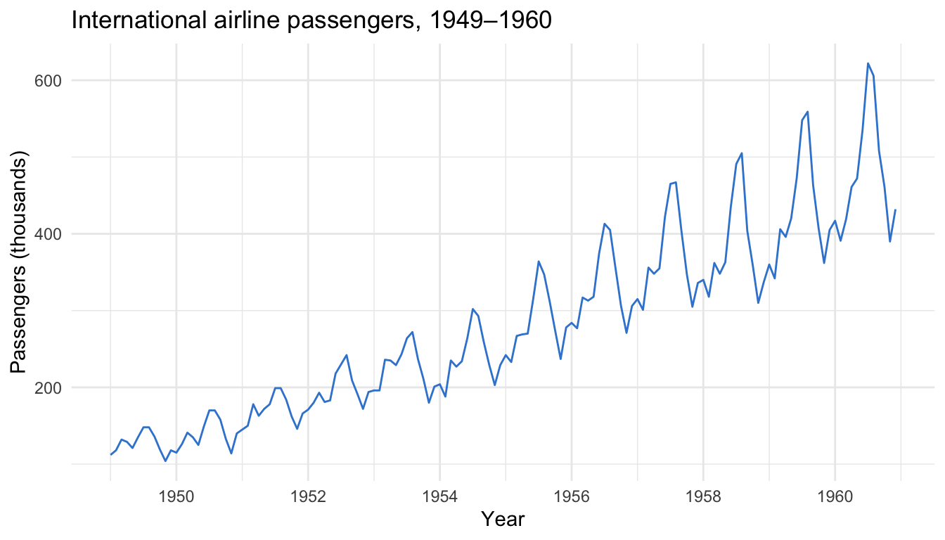
Plot, decompose, split, fit two models, and measure the forecast honestly — a practical workflow with the forecast package
A practical time series forecasting workflow in R with the forecast package on the built-in AirPassengers data: plot and decompose the series into trend and seasonality, hold out a test set, fit ETS and auto.arima, forecast ahead with prediction intervals, and compare accuracy with RMSE and MAE. Every step is runnable base R you can copy.
decompose, stl).auto.arima() — fit in one line each and explained in plain language.Time series forecasting is predicting the future values of a variable measured over time — next quarter’s sales, next month’s server load, next year’s passenger numbers — from its own past. What makes time series different from ordinary data is order: observations arrive in sequence and usually carry two patterns worth naming. Trend is the slow drift up or down (a business growing year over year); seasonality is the repeating within-year cycle (more ice cream in summer, more flights in July). A good forecast learns both, projects them forward, and — crucially — tells you how uncertain it is.
In R, the tidy way to hold a series is a ts object: a numeric vector plus its start date and frequency (12 for monthly, 4 for quarterly). We’ll use the built-in AirPassengers — monthly totals of international airline passengers from 1949 to 1960. It’s the classic teaching series because it has an obvious upward trend and a strong yearly cycle that grows with the level — exactly the two patterns a forecaster has to model.
Everything below runs on the forecast package by Rob Hyndman — the long-standing standard toolkit for this workflow in R.
Always plot the series first. Before any model, your eyes should confirm the trend and the seasonality. AirPassengers is already a ts object, so autoplot() from the forecast package draws it correctly against time:
library(forecast)
library(ggplot2)
autoplot(AirPassengers, colour = "#3a86d4") +
labs(x = "Year", y = "Passengers (thousands)",
title = "International airline passengers, 1949–1960") +
theme_minimal()
Two things jump out. The series trends up — roughly tripling over twelve years — and it cycles every year, peaking each summer. And the seasonal swings get wider as the level rises: the summer-to-winter gap is small in 1949 and large in 1960. That growing amplitude is called multiplicative seasonality (the season scales with the level), and it tells us which model settings to reach for.
Before forecasting, it helps to separate the patterns so you can see each one on its own. decompose() splits a series into three parts: the trend (the smooth long-run movement), the seasonal component (the repeating yearly shape), and the remainder (what’s left — the noise). Because the seasonal swings grow with the level, we ask for a "multiplicative" decomposition:
library(forecast)
library(ggplot2)

decompose(AirPassengers, type = "multiplicative") |>
  autoplot() +
  theme_minimal()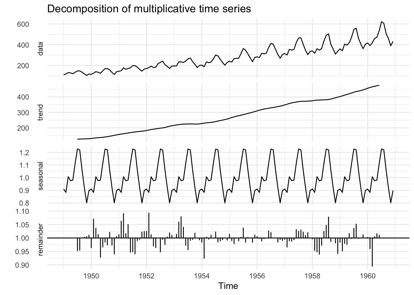
Read the panels top to bottom. The trend panel is the clean upward climb with the seasonality stripped out. The seasonal panel is the repeating yearly wave — the same shape every year, peaking in summer. The remainder is small and patternless, which is what you want: it means trend plus seasonality explain most of the series. A more robust alternative is stl() (seasonal-trend decomposition using loess), which handles a seasonal shape that changes slowly over time — swap it in with stl(AirPassengers, s.window = "periodic") |> autoplot().
Here is the step people skip and regret. To know whether a forecast is any good, you must check it against data the model never saw — otherwise you’re just measuring how well it memorized the past. So hold out the tail of the series as a test set. window() slices a ts by date; we train on 1949–1958 and keep the last 24 months (1959–1960) to score the forecast:
library(forecast)

train <- window(AirPassengers, end = c(1958, 12))
test  <- window(AirPassengers, start = c(1959, 1))

c(train_months = length(train), test_months = length(test))
train_months test_months
120 24 That leaves 120 months to learn from and 24 to test on. The rule of thumb: the test set should be at least as long as the horizon you actually care about forecasting — here, two full seasonal cycles. We never touch test until the evaluation step.
Two model families dominate practical univariate forecasting, and the forecast package fits each in one line.
ETS stands for error, trend, seasonal — the modern name for exponential smoothing. It builds a forecast from three smoothed pieces (a level, a trend, and a seasonal shape), giving more weight to recent observations. ets() searches the variants automatically and picks the best by a fit criterion (AICc, the corrected Akaike information criterion):
library(forecast)

train <- window(AirPassengers, end = c(1958, 12))
fit_ets <- ets(train)
fit_ets
ETS(M,Ad,M)
Call:
ets(y = train)
Smoothing parameters:
alpha = 0.7459
beta = 0.0189
gamma = 3e-04
phi = 0.9793
Initial states:
l = 120.667
b = 1.7375
s = 0.8978 0.7964 0.919 1.0576 1.2072 1.218
1.1113 0.9779 0.9838 1.0253 0.8973 0.9084
sigma: 0.0381
AIC AICc BIC
1110.450 1117.222 1160.625 It chose ETS(M,Ad,M) — multiplicative error, an additive damped trend, and multiplicative seasonality. In plain terms: it recognized the growing seasonal swings (the two “M”s) and a trend that keeps rising but gently flattens (the damped “Ad”) — precisely what we saw in the plots.
ARIMA — autoregressive integrated moving average — takes a different route: instead of smoothing, it models each value as a function of its own recent values and recent forecast errors, differencing the series to remove trend and seasonality first. auto.arima() searches the order parameters for you:
library(forecast)

train <- window(AirPassengers, end = c(1958, 12))
fit_arima <- auto.arima(train)
fit_arima
Series: train
ARIMA(1,1,0)(0,1,0)[12]
Coefficients:
ar1
-0.2397
s.e. 0.0935
sigma^2 = 103.6: log likelihood = -399.64
AIC=803.28 AICc=803.4 BIC=808.63It selected ARIMA(1,1,0)(0,1,0)[12]: one non-seasonal autoregressive term, one difference to remove the trend, and one seasonal difference (the [12]) to remove the yearly cycle. Two very different engines — smoothing vs autocorrelation — now let’s see which forecasts the held-out two years better.
forecast() projects a fitted model forward h steps and — this is the part that matters — returns a prediction interval, not just a single line. We forecast both models 24 months ahead and plot the ETS forecast against what actually happened:
library(forecast)
library(ggplot2)

train <- window(AirPassengers, end = c(1958, 12))
test  <- window(AirPassengers, start = c(1959, 1))
fit_ets <- ets(train)
fc_ets  <- forecast(fit_ets, h = 24)

autoplot(fc_ets) +
  autolayer(test, series = "Actual") +
  scale_colour_manual(values = c("Actual" = "#fb5607")) +
  labs(x = "Year", y = "Passengers (thousands)", colour = NULL,
       title = "ETS forecast vs. actual (held-out 1959–1960)") +
  theme_minimal()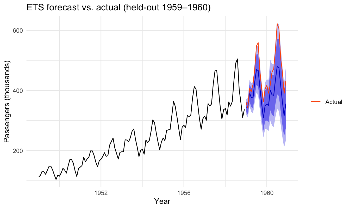
The forecast continues the trend and repeats the seasonal shape, and the shaded bands are the prediction intervals: the inner band is 80% and the outer 95%, meaning the model expects the true value to land inside them 80% and 95% of the time. Notice the bands fan out the further ahead you forecast — honest uncertainty grows with the horizon. The actual values (orange) sit near the top of the intervals: the models slightly under-forecast the real 1959–1960 boom, because passenger growth accelerated beyond the trend they learned. That is exactly the kind of miss the held-out test is designed to expose.
Eyeballing isn’t enough — measure it. accuracy() compares a forecast against the held-out actuals and reports error metrics. The two you’ll use most:
Both are “lower is better.” Pass the forecast and the test set to score the out-of-sample rows:
library(forecast)

train <- window(AirPassengers, end = c(1958, 12))
test  <- window(AirPassengers, start = c(1959, 1))
fit_ets   <- ets(train)
fit_arima <- auto.arima(train)
fc_ets    <- forecast(fit_ets,   h = 24)
fc_arima  <- forecast(fit_arima, h = 24)

rbind(
  ETS   = accuracy(fc_ets,   test)["Test set", c("RMSE", "MAE", "MAPE")],
  ARIMA = accuracy(fc_arima, test)["Test set", c("RMSE", "MAE", "MAPE")]
)
RMSE MAE MAPE
ETS 72.54791 63.21297 13.30345
ARIMA 74.25224 68.57729 14.92756ETS wins on the test set: RMSE 72.5 vs 74.3, MAE 63.2 vs 68.6, and MAPE (mean absolute percentage error) 13.3% vs 14.9%. The margin is modest, but it’s consistent across all three metrics, so ETS is the pick here — its multiplicative seasonality matched this series’ growing swings a little better than ARIMA’s differencing. A MAPE around 13% means the forecasts were off by about an eighth on average — respectable two years out, and a number you can report honestly rather than a single confident line.
Don’t over-read one split. For a sterner test, use time-series cross-validation (tsCV() in the forecast package), which rolls the train/test cut forward across many origins and averages the errors — a much more stable verdict than a single hold-out.
Once you’ve chosen a model, refit it on the entire series — you want every observation informing the real forecast — and project past the end of the data. Here is the payoff: ETS refit on all twelve years, forecasting the next 24 months into genuinely unseen territory:
library(forecast)
library(ggplot2)

fit_full <- ets(AirPassengers)
fc_full  <- forecast(fit_full, h = 24)

autoplot(fc_full) +
  labs(x = "Year", y = "Passengers (thousands)",
       title = "ETS forecast: next 24 months") +
  theme_minimal()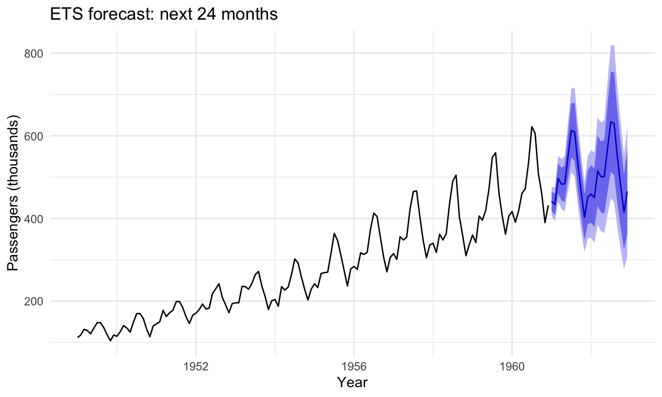
The point forecast carries the trend and the seasonal peaks forward, and the prediction interval widens month by month — by late 1962 the 95% band spans roughly 300 to 620 thousand passengers. That widening band is the most useful part of the picture: a forecast is a range, and a good one is honest about how quickly the range grows.
A workflow you can rerun on any new series, in order:
ts object — the values plus start and frequency (12 monthly, 4 quarterly).autoplot) — confirm the trend and the seasonality with your eyes first.decompose or stl) — separate trend, seasonal, and remainder; note additive vs multiplicative.window) — hold out a test tail at least as long as your forecast horizon.ets() and auto.arima() are the one-line workhorses; fit both.forecast(fit, h = ...)) — always keep the prediction intervals, not just the point line.accuracy(fc, test)) — compare on RMSE / MAE / MAPE; consider tsCV() for a stabler verdict.When to reach beyond forecast. For a series with multiple or irregular seasonalities, holidays, or known changepoints, Prophet (Meta’s additive model, available as the prophet R package) is designed for exactly that and is forgiving of missing data. For a modern tidyverse-native workflow — tidy tsibble data, many series at once, and a consistent grammar across ETS, ARIMA, and more — the fable package is the successor to forecast from the same author. And when the drivers are external variables rather than the series’ own past, a regression or machine-learning model (with lagged features) may fit better. forecast remains the fastest path for a single series with clear trend and seasonality — which covers a large share of real forecasting jobs.
Put your data in a ts object (values plus start and frequency), then fit a model and call forecast(). The shortest reliable path uses the forecast package: fit <- ets(my_ts) (or auto.arima(my_ts)), then fc <- forecast(fit, h = 12) to project 12 steps ahead, and autoplot(fc) to plot the forecast with its prediction intervals. Always hold out a test set with window() first and score the forecast with accuracy() so you know how good it is.
Both are univariate forecasting models but they work differently. ETS (error, trend, seasonal) is exponential smoothing: it builds the forecast from smoothed level, trend, and seasonal components, weighting recent data more. ARIMA (autoregressive integrated moving average) models each value from its own recent values and recent errors, differencing the series to remove trend and seasonality. Neither is universally better — fit both with ets() and auto.arima() and let out-of-sample accuracy on a held-out test set decide.
Hold out the end of your series as a test set, then call accuracy(forecast_object, test_set) from the forecast package. It returns error metrics including RMSE (root mean squared error, which penalizes big misses), MAE (mean absolute error), and MAPE (mean absolute percentage error, unit-free). Compare models on the Test set row — lower is better. For a more stable estimate than a single split, use time-series cross-validation with tsCV(), which rolls the forecast origin forward across the series.
Use auto.arima() (or ets()) for a single series with clear trend and one seasonal cycle — it is fast, well-understood, and gives calibrated prediction intervals. Reach for Prophet when you have multiple or irregular seasonalities, holiday effects, known changepoints, or messy data with gaps, since it is built for those cases and is forgiving of missing values. For a tidyverse-native workflow across many series, the fable package (the successor to forecast) is a strong modern choice.
This post is the practical tour. For the foundations each step builds on, with reproducibility-gated walkthroughs and live code:
autoplot().@online{kassambara2026,
author = {Kassambara, Alboukadel},
title = {Time {Series} {Forecasting} in {R:} {ETS,} {ARIMA} \&
{Accuracy}},
date = {2026-07-17},
url = {https://www.datanovia.com/blog/time-series-forecasting-in-r},
langid = {en}
}