Seriation in R: Reorder a Heatmap to Reveal Its Structure
Find the row and column order that makes a matrix, distance matrix, or correlation matrix show its blocks — with the seriation package
Data Visualization
A heatmap in alphabetical or arbitrary order hides its structure; the right row and column order reveals it. This practical, visual guide uses the seriation package in R to reorder a distance matrix, a raw data matrix, and a correlation matrix on built-in mtcars data — with a before/after you can reproduce, and a plain guide to which method to pick (OLO, TSP, angle-based).
Why a heatmap in alphabetical or arbitrary order hides its structure — and how reordering the rows and columns makes the pattern appear.
Seriation in one idea: find the linear order of objects that puts similar things next to each other, so blocks land on the diagonal.
The core workflow with the seriation package — seriate() a distance matrix, pull the order with get_order(), apply it with permute().
A before/after you can run: a distance matrix, a raw data matrix (rows and columns), and a correlation matrix.
Which method to pick — OLO, TSP, angle-based — as a plain table, plus ordering a correlation matrix with the ggcorrplot package. Every block is base R on built-in mtcars — copy and run it locally to reproduce the figures.
You built a heatmap, and it looks like static. The colours are there, but no pattern jumps out — because the rows and columns are in whatever order they arrived in (alphabetical, or the order of your data frame). That order carries no meaning, and it scatters related rows all over the plot. Seriation fixes this. It is the problem of finding a one-dimensional ordering of a set of objects so that similar objects sit close together. Reorder the rows and columns of a heatmap by a good seriation and its hidden block structure — groups of similar rows, clusters of correlated variables — snaps onto the diagonal where your eye can read it.
A few terms up front, because they recur below. A distance (or dissimilarity) matrix records how far apart every pair of objects is — in R, the output of dist(). A permutation is simply a reordering of the objects (row 3 becomes row 1, and so on). Optimal leaf ordering (OLO) is a specific, deterministic way to produce that permutation from a dendrogram — the tree that hierarchical clustering builds — by rotating the tree’s branches (without breaking them) to put the most similar leaves next to each other. That is the workhorse we lean on.
Start with a distance matrix. We scale the built-in mtcars data (32 cars × 11 measurements) so every variable is on a comparable footing, then compute the Euclidean distance between every pair of cars with dist(). Plotted as a heatmap in alphabetical order, low distances (similar cars) are light and high distances (different cars) are dark:
library(seriation)library(ggplot2)d <-dist(scale(mtcars)) # pairwise distances between the 32 carsM <-as.matrix(d)alpha <-sort(rownames(M)) # arbitrary order: alphabeticalMa <- M[alpha, alpha]df <-as.data.frame(as.table(Ma)) # base-R reshape: Var1, Var2, Freqggplot(df, aes(Var2, Var1, fill = Freq)) +geom_tile() +scale_fill_viridis_c(option ="mako", direction =-1, name ="distance") +labs(x =NULL, y =NULL, title ="Distance matrix in alphabetical order") +theme_minimal(base_size =7) +theme(axis.text.x =element_text(angle =90, hjust =1, vjust =0.5))
Other than the light diagonal — where every car sits at distance zero from itself — this is noise. There are groups of similar cars in mtcars (economy cars, muscle cars, sports cars), but the alphabetical order scatters each group across the plot, so no block ever forms. The data has structure; the ordering is hiding it.
What seriation does
Seriation searches for a permutation of the objects that minimises a cost — typically, the total distance between neighbouring objects in the order (put another way: make consecutive rows as similar as possible). When you then reorder the heatmap by that permutation, similar objects become adjacent, so the low-distance (light) tiles gather into blocks along the diagonal.
The most reliable default is OLO (optimal leaf ordering). It first runs hierarchical clustering to build a dendrogram, then finds the branch rotations that order the leaves optimally — the best ordering consistent with that clustering tree. Two properties make it the safe pick: it respects the cluster structure (so the order and a dendrogram agree), and it is deterministic — the same data always yields the same order, which matters for reproducible figures.
The reveal: seriate a distance matrix
The workflow is three functions. seriate() computes the ordering, get_order() extracts it as a plain integer (or name) vector, and permute() applies it to the object. Here it is on our distance matrix:
library(seriation)d <-dist(scale(mtcars))o <-seriate(d, method ="OLO") # optimal leaf ordering (deterministic)ord <-get_order(o) # the permutation, as a vectorhead(names(ord), 8)
ord is the new order of the cars — heavy sedans at one end, light economy cars at the other, with everything graded in between. Now apply it to both margins of the matrix and redraw. The reordered matrix can be obtained either by indexing (M[ord, ord]) or, equivalently, with seriation’s own permute(), which takes one ordering per dimension:
library(seriation)library(ggplot2)d <-dist(scale(mtcars))o <-seriate(d, method ="OLO")M <-as.matrix(d)Ms <-permute(M, c(o, o)) # reorder rows and columns by the seriation# identical to: M[get_order(o), get_order(o)]df <-as.data.frame(as.table(Ms))ggplot(df, aes(Var2, Var1, fill = Freq)) +geom_tile() +scale_fill_viridis_c(option ="mako", direction =-1, name ="distance") +labs(x =NULL, y =NULL, title ="Distance matrix after seriation (OLO)") +theme_minimal(base_size =7) +theme(axis.text.x =element_text(angle =90, hjust =1, vjust =0.5))
Same data, same distances — only the order changed, and the structure is now obvious. Light blocks sit on the diagonal: the compact Mercedes sedans cluster together, the economy cars (Corolla, Fiat, Civic) form their own block, and the heavy muscle cars (Cadillac, Lincoln, Chrysler) anchor the far corner. The whole matrix reads as a smooth gradient from one car “type” to the next. That contrast — the same figure, unreadable then readable — is the entire point of seriation.
Reorder a raw data matrix (rows and columns)
You don’t need a distance matrix to start. You can seriate a raw data matrix directly — and here the rows and the columns get different orders, because cars and measurements are different kinds of thing. The clean, reproducible recipe is to seriate each margin by its own distances: order the rows (cars) by dist(X), and the columns (variables) by dist(t(X)), both with OLO.
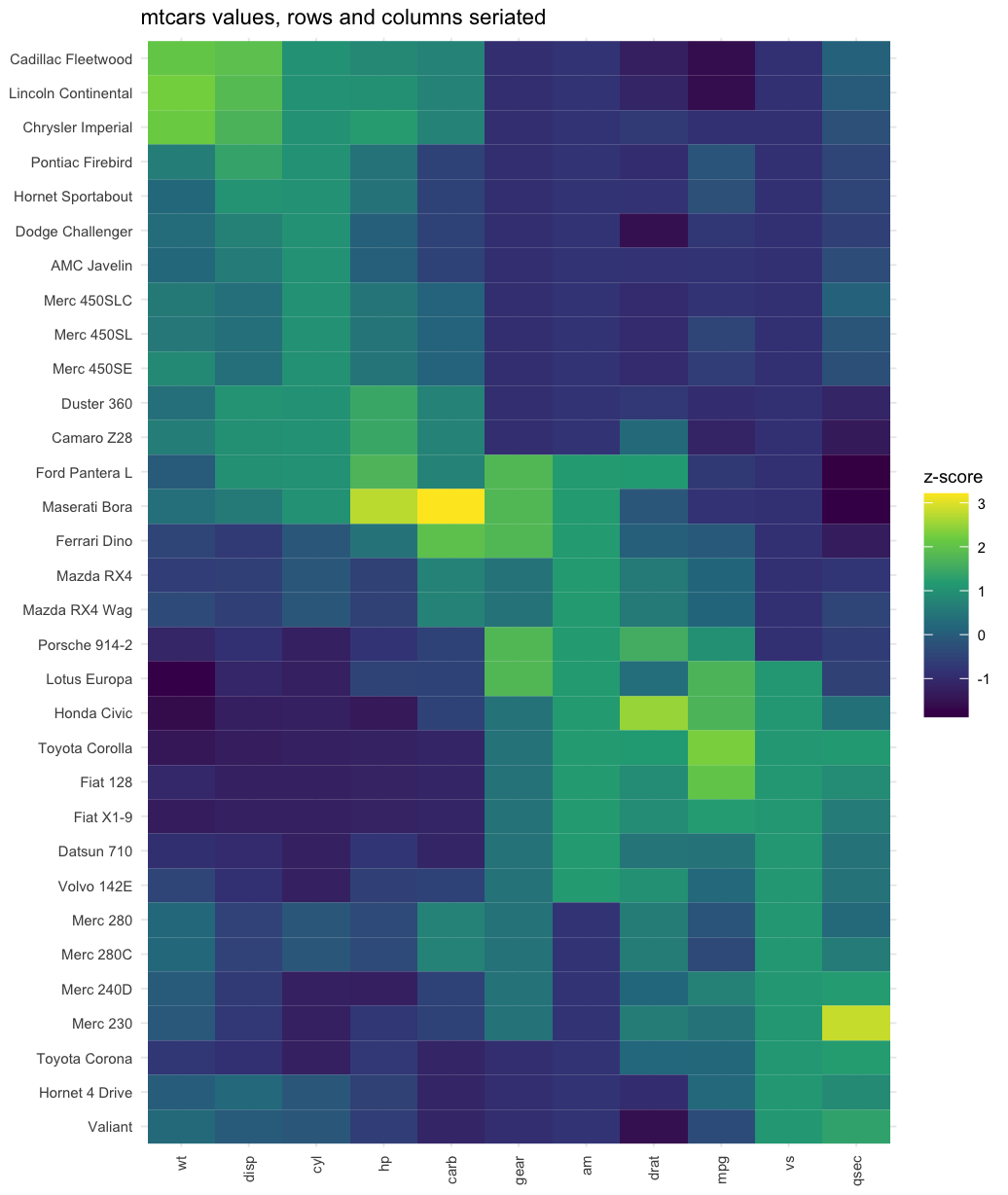
library(seriation)library(ggplot2)X <-scale(mtcars) # 32 cars x 11 measurementsrow_ord <-get_order(seriate(dist(X), method ="OLO")) # order the carscol_ord <-get_order(seriate(dist(t(X)), method ="OLO")) # order the variablesXs <- X[row_ord, col_ord]df <-as.data.frame(as.table(Xs))ggplot(df, aes(Var2, Var1, fill = Freq)) +geom_tile() +scale_fill_viridis_c(option ="viridis", name ="z-score") +labs(x =NULL, y =NULL, title ="mtcars values, rows and columns seriated") +theme_minimal(base_size =7) +theme(axis.text.x =element_text(angle =90, hjust =1, vjust =0.5))
Read it in two directions at once. Down the rows, the cars run heavy to light. Across the columns, the eleven measurements split into two coherent groups: a size-and-power block (wt, disp, cyl, hp, carb) and an efficiency block (mpg, drat, vs, am, gear, qsec). The heavy cars are bright on the first block and dark on the second; the light cars flip. That two-way gradient is exactly the “clustered heatmap” look — and it fell out of ordering each margin, no manual grouping required.
Which method should you use?
seriate() offers many methods (see list_seriation_methods("dist")). You rarely need more than three, and the choice comes down to what you want the order to optimise and whether you need it to be reproducible. All three below run on a dist object:
Method
What it optimises
Reach for it when
"OLO"
Best leaf order consistent with a dendrogram (deterministic)
The safe default — you also show a dendrogram, and you need a reproducible figure.
"TSP"
The tightest neighbour path (shortest total distance), via a travelling-salesperson solver
You want the smoothest possible gradient and don’t need the order to match a specific clustering. Uses random restarts — set.seed() for a reproducible result.
"MDS_angle"
A fast order from the angle of points in a low-dimensional projection
Large matrices where you want a quick, cheap ordering.
You don’t have to guess which order is “tighter” — criterion() scores any ordering against the distances. Lower path length means a smoother order:
Here OLO gives the shortest path (the tightest gradient), edging out TSP — whose random-restart heuristic doesn’t always reach the optimum on a small problem like this. So on this data the deterministic, dendrogram-consistent, seed-free method is also the tightest: OLO is the natural default, and criterion() lets you confirm rather than guess.
Order a correlation matrix with ggcorrplot
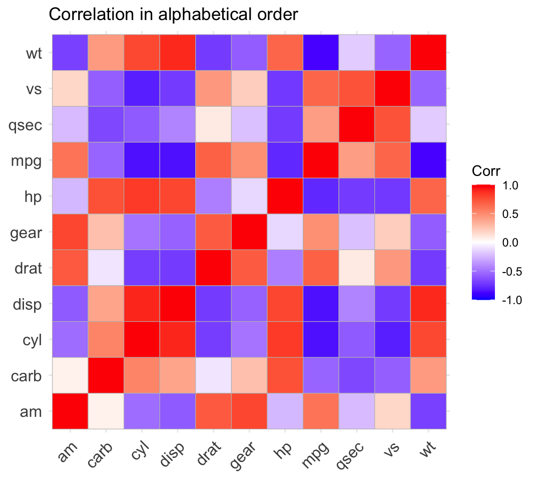
The most common place people meet this problem is a correlation matrix. In variable order, the correlations look like a random patchwork of red and blue; seriated, the mutually-correlated variables gather into blocks. We use the founder’s ggcorrplot package to draw it. First, the correlation of mtcars in plain alphabetical order:
library(ggcorrplot)corr <-cor(mtcars)alpha <-sort(rownames(corr))ggcorrplot(corr[alpha, alpha]) + ggplot2::ggtitle("Correlation in alphabetical order")
A checkerboard — you can’t tell which variables move together. Now seriate. A correlation matrix isn’t a distance, so we turn it into one first: 1 - corr is small when two variables are strongly positively correlated, which is exactly the “closeness” we want to order by. Seriate that distance with OLO, then apply the order to the correlation matrix before plotting:
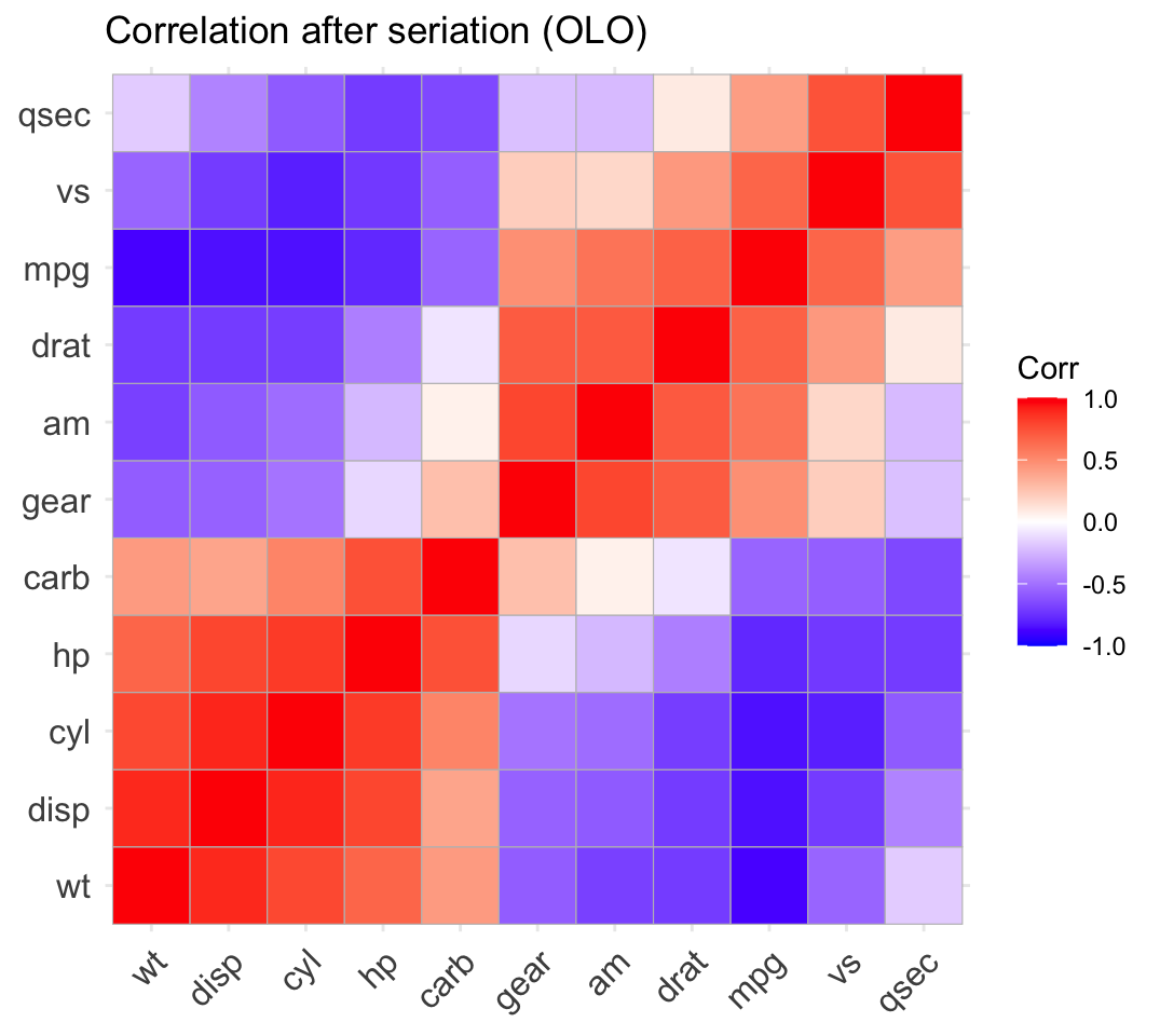
library(seriation)library(ggcorrplot)corr <-cor(mtcars)o <-seriate(as.dist(1- corr), method ="OLO") # 1 - corr = a distanceord <-get_order(o)ggcorrplot(corr[ord, ord]) + ggplot2::ggtitle("Correlation after seriation (OLO)")
Now it reads. Two red blocks sit on the diagonal — the size-and-power variables (wt, disp, cyl, hp, carb) all move together, and the efficiency variables (mpg, drat, am, vs, qsec, plus gear) form the other block — while the strong negative correlations between the two groups get pushed neatly into the corners. ggcorrplot() also has a built-in shortcut, ggcorrplot(corr, hc.order = TRUE), which reorders by hierarchical clustering for you; seriating the distance yourself, as above, gives you the full choice of method (OLO, TSP, angle) and a consistent workflow across heatmaps and correlation matrices. (The base-R corrplot package also has an order = argument, but ggcorrplot keeps you in ggplot2, so you can theme and combine it like any other plot.)
Reorder to reveal — a data-viz habit
The lesson outlasts the package: a heatmap’s order is a design choice, and the default (alphabetical, or data-frame order) is almost always the wrong one. Whenever you draw a matrix, distance matrix, correlation matrix, or clustered heatmap, ask what order would make its structure visible — and reorder to reveal it. This is a quick, reliable place to sanity-check generated code, too: a snippet that plots cor(df) or a dist() straight to a heatmap will render something, but it silently skips the ordering step, so the figure looks patternless even when the data is richly structured. If your heatmap looks like noise, the fix is usually not more data or a different palette — it’s a better row and column order.
Common issues
My heatmap still looks random after reordering. You almost certainly reordered the plot but not the data — or you applied the order to only one margin. A distance or correlation matrix is symmetric, so it must be permuted on both rows and columns with the same order: M[ord, ord], not M[ord, ]. Check that get_order() actually returned a full-length permutation and that you indexed both dimensions.
seriate() on a matrix versus a dist behave differently. Passing a dist object seriates the objects (one order, applied to both margins of the symmetric matrix). Passing a plain matrix seriates it as a data table, ordering the rows and columns independently — and some matrix methods (like BEA) require a non-negative matrix and will error on standardized data. If you want a single object ordering, pass a dist; if you want separate row/column orders, seriate dist(X) and dist(t(X)) as shown above.
My TSP order changes every time I run it. The "TSP" method uses random restarts, so it is non-deterministic unless you fix the seed. Call set.seed() immediately before seriate(..., method = "TSP"), or use "OLO", which is deterministic by construction and needs no seed — the better choice when you want a figure that reproduces exactly.
Frequently asked questions
NoteHow do I reorder a heatmap in R?
Compute a distance matrix with dist(), order it with the seriation package — o <- seriate(d, method = "OLO") — pull the permutation with ord <- get_order(o), then apply that order to both the rows and columns of your matrix before plotting: M[ord, ord]. Drawing that reordered matrix with geom_tile() (or pheatmap, or ggcorrplot for a correlation matrix) puts similar rows next to each other, so the block structure lands on the diagonal.
NoteWhat is seriation?
Seriation is finding a one-dimensional ordering of a set of objects that places similar objects close together. Given a distance or dissimilarity matrix, it searches for the permutation that minimises a cost — usually the total distance between neighbouring objects. Reordering a heatmap or matrix by that permutation reveals its structure: clusters and blocks that were scattered by an arbitrary (alphabetical or data-frame) order gather along the diagonal. The R implementation is the seriation package.
NoteWhat is the difference between seriation and hierarchical clustering order?
Hierarchical clustering builds a tree (dendrogram); any dendrogram can be drawn in many equally-valid leaf orders, because each branch can be flipped without changing the clustering. Seriation chooses which of those orders to use. Optimal leaf ordering (method = "OLO") is the bridge: it takes the clustering tree and rotates its branches to put the most similar leaves adjacent — the best linear order consistent with the tree. Other seriation methods (like TSP) ignore the tree entirely and optimise the order directly, which can give a smoother gradient but no matching dendrogram.
NoteWhich seriation method should I use?
Start with "OLO" (optimal leaf ordering): it is deterministic, respects a dendrogram, and produces reproducible figures — the safe default. Use "TSP" when you want the tightest possible neighbour ordering (the smoothest gradient) and don’t need it to match a clustering tree, but set a seed first because it uses random restarts. Use an angle-based method like "MDS_angle" for a fast, cheap order on large matrices. You can compare any orderings objectively with criterion(d, o, method = "Path_length") — lower is a smoother order.
NoteHow do I order a correlation matrix in R?
A correlation matrix isn’t a distance, so convert it first: 1 - corr is small when two variables are strongly positively correlated. Seriate that with o <- seriate(as.dist(1 - corr), method = "OLO"), get the order with get_order(o), and apply it: corr[ord, ord]. Plot the reordered matrix with ggcorrplot() and the correlated variables gather into red blocks on the diagonal. As a one-line shortcut, ggcorrplot(corr, hc.order = TRUE) reorders by hierarchical clustering for you.
Test your understanding
ImportantYour turn: reveal the structure in a new dataset
Take the built-in USArrests data (violent-crime rates across 50 US states). Standardize it, build a distance matrix between the states, and draw the distance heatmap twice — once in alphabetical order, once after seriating with OLO. Confirm that the seriated version shows blocks of similar states on the diagonal that the alphabetical version hides.
TipHint
The recipe is identical to the mtcars distance example. Start from d <- dist(scale(USArrests)), then sort(rownames(...)) for the “before” order and get_order(seriate(d, method = "OLO")) for the “after” order. Reshape each matrix with as.data.frame(as.table(...)) and plot with geom_tile().
TipSolution
library(seriation)library(ggplot2)d <-dist(scale(USArrests))M <-as.matrix(d)# BEFORE: alphabeticalalpha <-sort(rownames(M))# AFTER: seriatedord <-get_order(seriate(d, method ="OLO"))draw <-function(mat, title) { df <-as.data.frame(as.table(mat))ggplot(df, aes(Var2, Var1, fill = Freq)) +geom_tile() +scale_fill_viridis_c(option ="mako", direction =-1, name ="distance") +labs(x =NULL, y =NULL, title = title) +theme_minimal(base_size =6) +theme(axis.text.x =element_text(angle =90, hjust =1, vjust =0.5))}draw(M[alpha, alpha], "USArrests: alphabetical") # patternlessdraw(M[ord, ord], "USArrests: seriated (OLO)") # blocks on the diagonal
The seriated heatmap groups states with similar crime profiles together — a clear diagonal gradient the alphabetical order scatters into noise.
NoteQuick check
Before seriating a correlation matrix, you convert it with as.dist(1 - corr). Why?
A. To make the matrix symmetric.
B. Because seriate() orders by distance, and 1 - corr turns a strong positive correlation into a small distance.
C. To remove the negative correlations.
D. Because seriate() cannot read a numeric matrix.
TipShow answer
B.seriate() orders by distance, where small means close. A correlation of +1 should make two variables adjacent, so it must map to the smallest distance — and 1 - 1 = 0. A correlation of -1 maps to a distance of 2 (as far apart as possible). Seriating that distance groups the mutually-positive variables into blocks on the diagonal; passing the raw correlation matrix would order it backwards.
Conclusion
A heatmap’s row and column order is data-visualization, not bookkeeping. Left in alphabetical or data-frame order, even richly-structured data reads as noise; a good seriation — seriate() a distance, get_order(), apply it to both margins — gathers the structure onto the diagonal where you can see it. Reach for OLO as your deterministic default, TSP when you want the tightest gradient (with a seed), and an angle-based method for speed on large matrices. Whether it’s a distance matrix, a raw data matrix, or a correlation matrix drawn with ggcorrplot, the habit is the same: reorder to reveal.
Going deeper in /learn
Seriation is a reordering tool; the structure it reveals comes from clustering and distances. For the foundations, with reproducibility-gated walkthroughs and live code:
Clustering heatmap in R — build annotated, clustered heatmaps end to end (the reordering seriation automates).
Ask Prova“reorder my correlation matrix in R so the correlated variables group together, and draw it with ggcorrplot” — it answers with code you can run on your own data. The runtime is the judge.Ask Prova →
Was this page helpful?
Thanks for the feedback!
Get new R & Python lessons by email
Practical, reproducible, no spam. Unsubscribe anytime.