ggcorrplot: Correlation Matrix Heatmap in R with ggplot2
Turn a correlation matrix into a publication-ready ggplot2 heatmap — squares or circles, triangles, reordering, coefficients and significance marks — with ggcorrplot, plus the geom_tile() recipe underneath
Biostatistics
Visualize a correlation matrix as a ggplot2 heatmap in R. Compute it with cor(), then draw it in one call with ggcorrplot() — squares or circles, upper/lower triangles, hierarchical reordering, coefficients on the tiles, and non-significant cells crossed out — and see the underlying geom_tile() + scale_fill_gradient2() recipe the package builds for you.
Published
July 10, 2026
Modified
July 11, 2026
TipKey takeaways
A correlation heatmap is a correlation matrix drawn as a coloured grid — the fastest way to see which variables move together.
Compute the matrix with base cor(), then draw it in one call with ggcorrplot::ggcorrplot() — the result is an ordinary ggplot2 object you can restyle and extend.
Choose a method ("square" or "circle"), a layout (type = "lower"/"upper"), and reorder with hc.order = TRUE to surface clusters of related variables.
Print the coefficients with lab = TRUE, and pass a p-value matrix (cor_pmat()) so non-significant cells are crossed out (insig = "pch") or hidden (insig = "blank").
Under the hood it is just geom_tile() + scale_fill_gradient2() — this lesson also builds that heatmap by hand so you can customise every layer.
Introduction
You have a table of numbers and want to know how they relate — does weight rise as mileage falls? which variables carry the same signal? A correlation heatmap answers this at a glance: it encodes every pairwise correlation in a coloured grid, so strong positive and negative relationships pop out and redundant variables cluster together.
This lesson uses ggcorrplot — a small package that draws a correlation matrix as a ggplot2 plot — on the built-in mtcars data. You will compute the matrix once with base cor(), then draw it in a single call, adding reordering, coefficients and significance marks. Then, because searchers often want the raw recipe, you will build the same heatmap by hand with geom_tile() and scale_fill_gradient2() — which is exactly what ggcorrplot() packages for you.
Prefer round glyphs and a base-graphics workflow? The correlogram lesson does the same job with the corrplot package. Reach for ggcorrplot when you want a ggplot2 object you can theme and compose with +.
Compute the correlation matrix
Every heatmap starts from a correlation matrix. cor() returns the pairwise Pearson correlations; rounding to one decimal keeps the coefficients readable when you print them on the tiles later.
library(ggcorrplot)data(mtcars)corr <-round(cor(mtcars), 1)corr[1:6, 1:6] # a corner of the 11x11 matrix
To mark significance later, you also need the matrix of correlation p-values. cor_pmat() [in ggcorrplot] computes it by running stats::cor.test() on every pair:
ggcorrplot() never computes correlations itself — it takes a matrix you already have, so it works equally well with a Spearman matrix, a partial-correlation matrix, or any square matrix of coefficients.
Draw it in one call with ggcorrplot()
Pass the matrix and you get the full heatmap. The default encodes each correlation as a coloured square: red for positive, blue for negative, with the intensity scaled to the coefficient. (The default palette is colors = c("blue", "white", "red"), read low → mid → high, so +1 is red.)
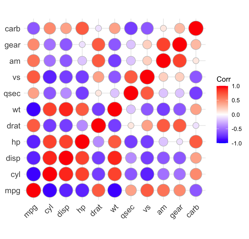
method = "circle" encodes the correlation with the circle’s area instead of a filled square — useful when you want the magnitude, not just the sign, to jump out.
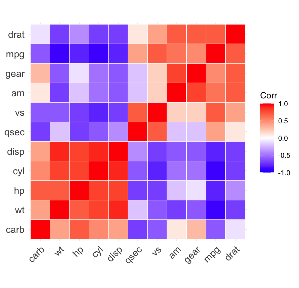
In variable order, the structure is hard to see. Set hc.order = TRUE to reorder the variables by hierarchical clustering so that correlated variables sit next to each other — blocks of related variables become obvious. outline.color draws a clean separator around each tile.
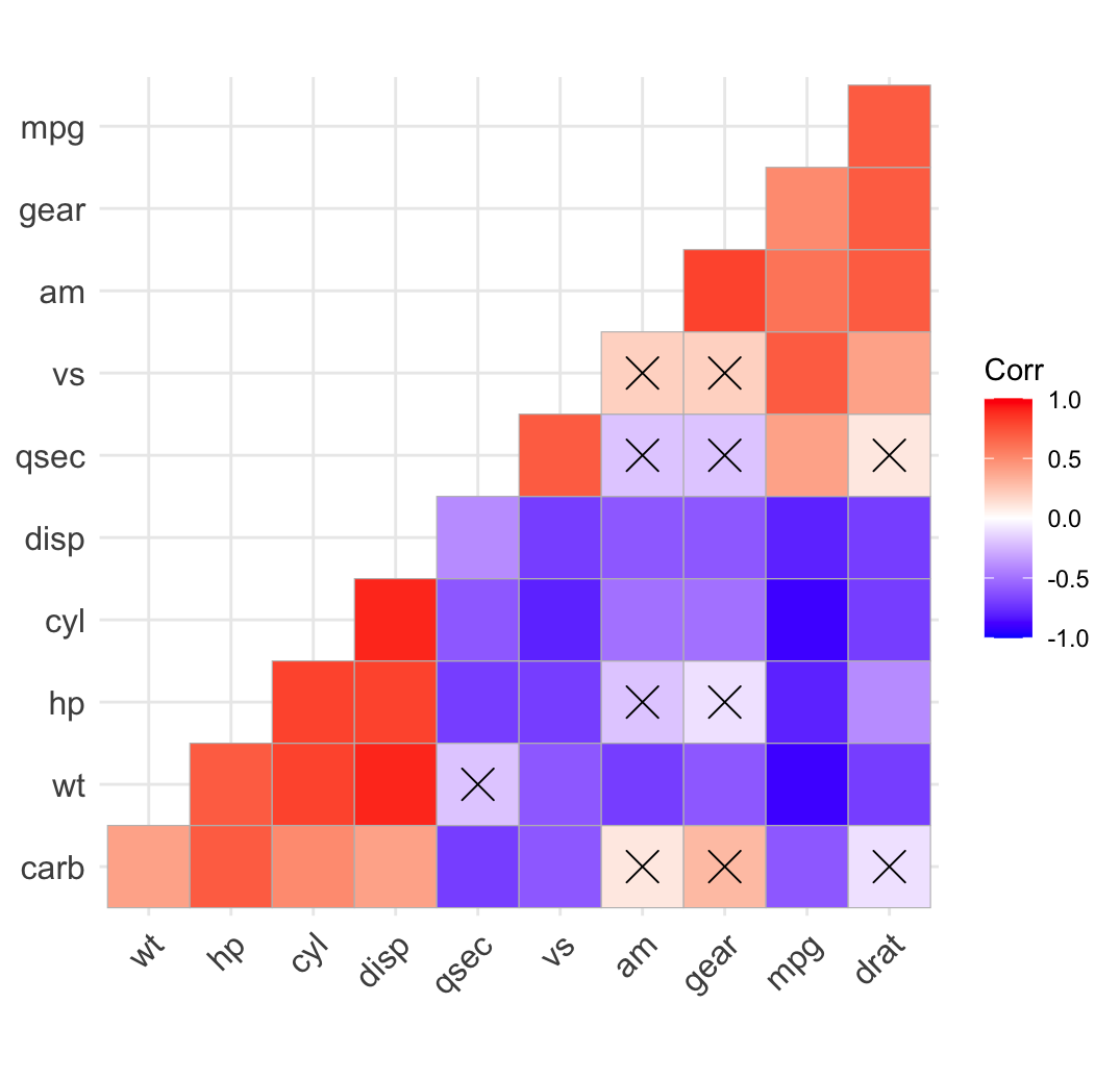
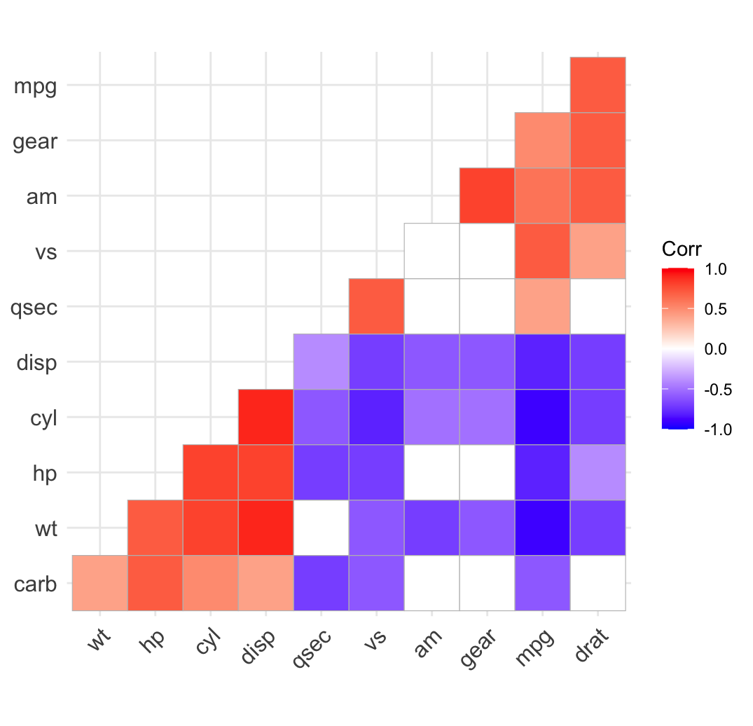
A correlation can be close to zero by chance. Supply the p-value matrix as p.mat and ggcorrplot() flags which correlations are significant at sig.level (default 0.05). Three styles, chosen with insig:
insig = "pch" (the default) crosses out the non-significant cells:
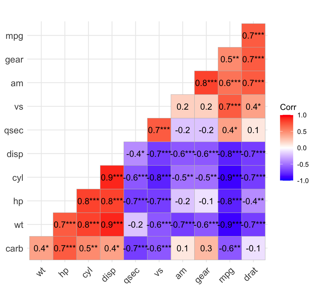
insig = "stars" flips the emphasis: instead of crossing out the non-significant cells, it appends significance stars (***, **, * for p < 0.001, 0.01, 0.05) to the significant ones. With lab = TRUE you get the coefficient and its significance in one figure — the publication-ready view:
colors sets the diverging gradient as a length-3 vector (low / mid / high), and ggtheme swaps the base ggplot2 theme. tl.col and tl.srt style the variable-name labels.
Because ggcorrplot() returns a plain ggplot object, you can also refine it with the usual grammar — add a labs() title, a caption, or any extra layer with +.
Build the same heatmap by hand with geom_tile()
ggcorrplot() is a convenient wrapper around a standard ggplot2 idiom: reshape the matrix to long form, map the correlation to fill, and draw one tile per cell. Building it yourself is worth knowing — you get full control over every layer, and it works for any matrix, not just correlations.
Reshape the matrix to long form
ggplot2 wants one row per cell, not a square matrix. Base R does the reshape without any extra package: as.table() turns the matrix into a contingency-style table and as.data.frame() unrolls it into three columns — Var1, Var2 and Freq (the correlation value):
Older tutorials reach for reshape2::melt() here. Base R’s as.data.frame(as.table(m)) does the same job with no dependency — handy inside the in-browser sandbox.
Map correlation to fill
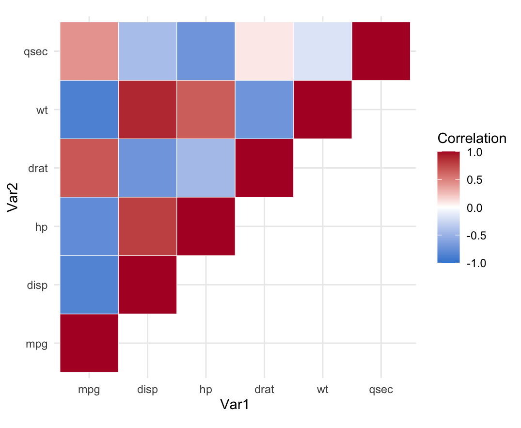
Now draw one tile per cell and colour it by the coefficient. scale_fill_gradient2() is the key: it is a diverging scale anchored at midpoint = 0, so zero correlations are white, positives lean one way and negatives the other. limit = c(-1, 1) fixes the scale to the full correlation range, and coord_fixed() keeps the tiles square.
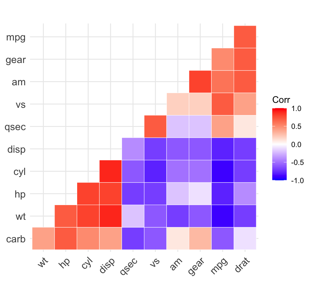
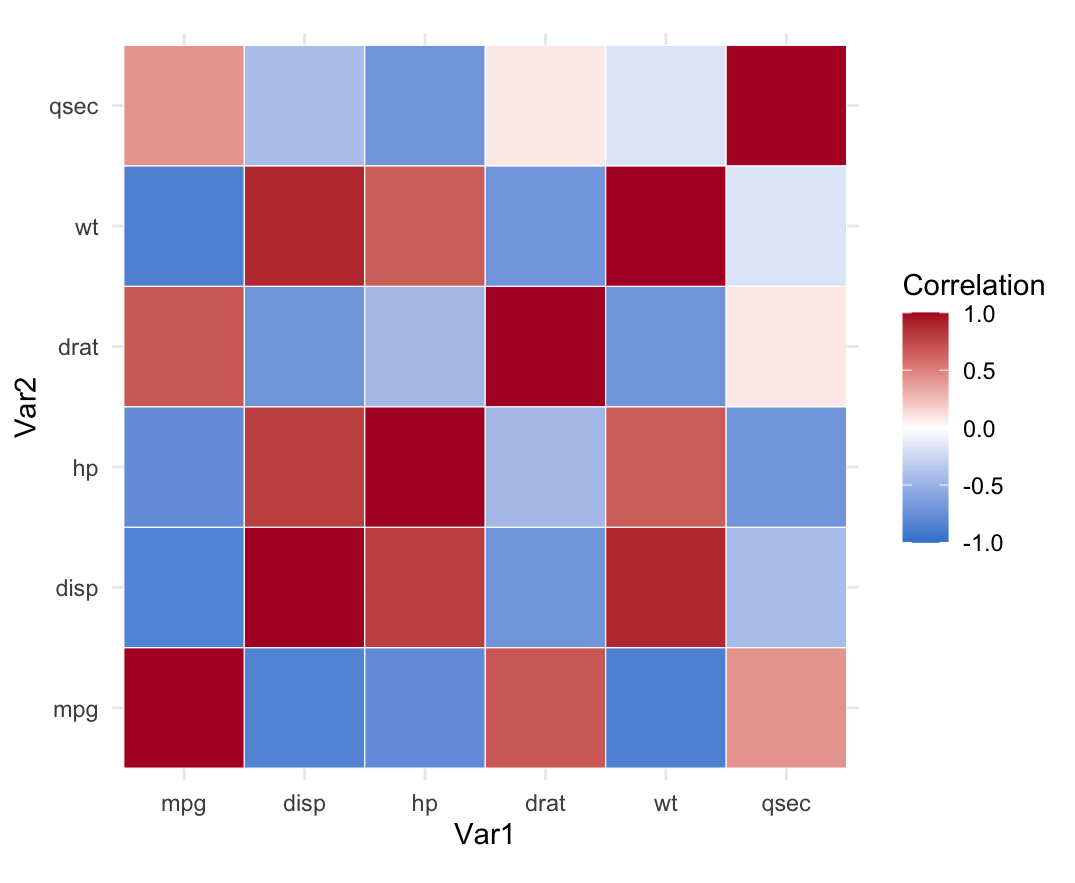
To show only the upper triangle, set the lower half of the matrix to NAbefore reshaping, then drop the empty cells. upper.tri() / lower.tri() give the logical masks:
library(ggplot2)cormat <-round(cor(mtcars[, c("mpg", "disp", "hp", "drat", "wt", "qsec")]), 2)cormat[lower.tri(cormat)] <-NA# keep the upper trianglelong <-as.data.frame(as.table(cormat))long <- long[!is.na(long$Freq), ] # drop the masked cellsggplot(long, aes(Var1, Var2, fill = Freq)) +geom_tile(color ="white") +scale_fill_gradient2(low ="#3a86d4", high ="#b2182b", mid ="white",midpoint =0, limit =c(-1, 1), name ="Correlation") +coord_fixed() +theme_minimal()
Reorder by clustering and add the coefficients
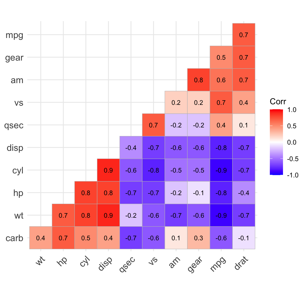
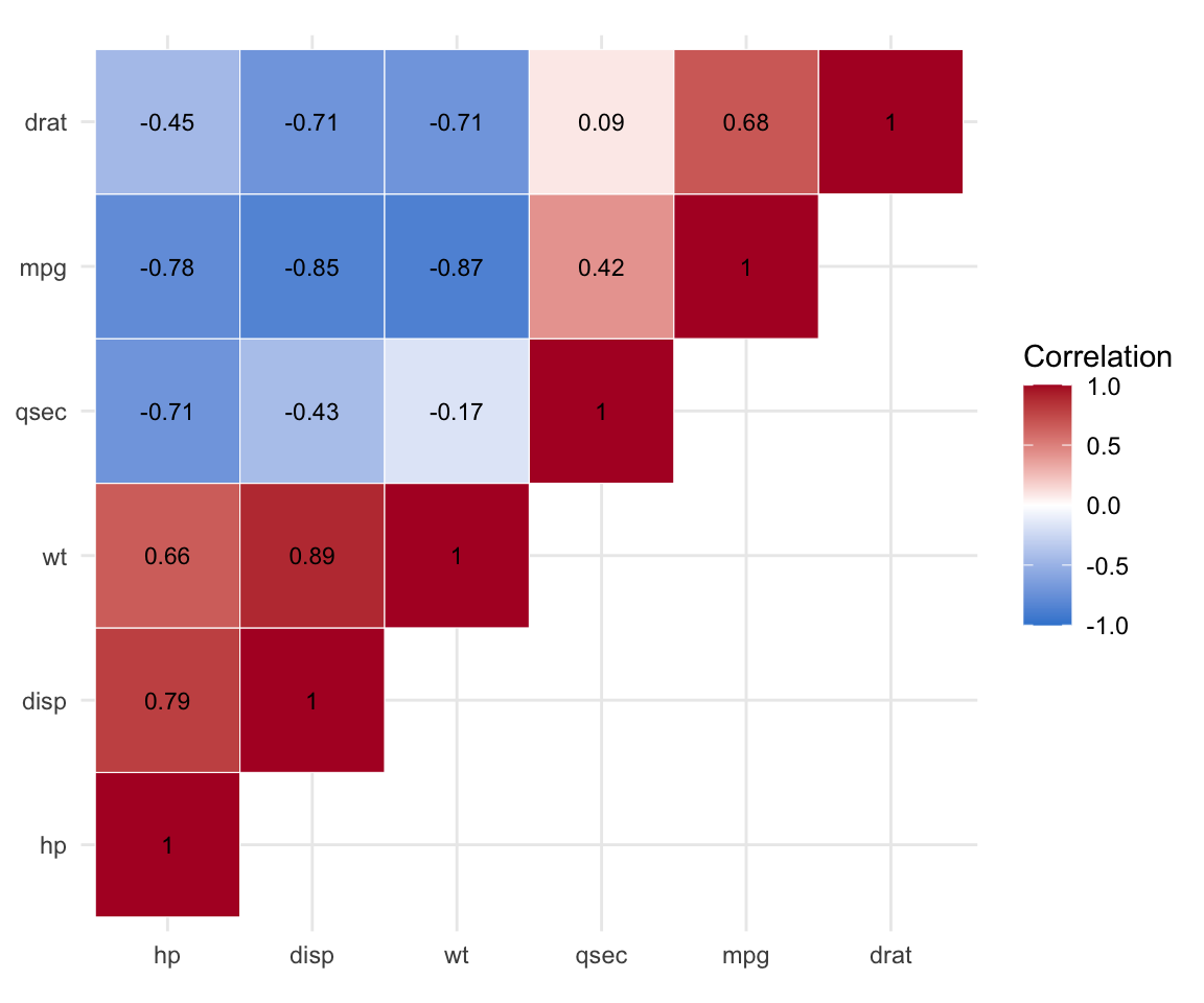
Finally, reproduce the two ggcorrplot touches by hand: reorder the variables by hierarchical clustering (cluster on the correlation-based distance (1 - r) / 2), then print the coefficients with geom_text().
library(ggplot2)cormat <-round(cor(mtcars[, c("mpg", "disp", "hp", "drat", "wt", "qsec")]), 2)# Reorder by hierarchical clustering on a correlation distancedd <-as.dist((1- cormat) /2)ord <-hclust(dd)$ordercormat <- cormat[ord, ord]cormat[lower.tri(cormat)] <-NAlong <-as.data.frame(as.table(cormat))long <- long[!is.na(long$Freq), ]ggplot(long, aes(Var1, Var2, fill = Freq)) +geom_tile(color ="white") +geom_text(aes(label = Freq), size =3) +scale_fill_gradient2(low ="#3a86d4", high ="#b2182b", mid ="white",midpoint =0, limit =c(-1, 1), name ="Correlation") +coord_fixed() +theme_minimal() +theme(axis.title =element_blank())
That is every feature ggcorrplot() gave you in one call — reordering, a masked triangle, coefficients on the tiles — reproduced from the raw grammar. Use the package for speed; drop to geom_tile() when you need a layer it does not expose.
Try it live
Draw a correlation heatmap of a different dataset, or change the method, layout and colours. The sandbox boots on the first Run.
🟢 With an AI agent
Ask Prova“draw a correlation heatmap of my data with ggcorrplot, reorder it to show clusters, print the coefficients, and cross out the non-significant correlations” — it answers with code you can run on your own data. The runtime is the judge.Ask Prova →
Common issues
Non-numeric columns break cor().cor() needs an all-numeric matrix — drop or convert factor and character columns first, e.g. cor(mydata[sapply(mydata, is.numeric)]).
Missing values give NA correlations. With incomplete data, add use = "pairwise.complete.obs" to cor() so each correlation uses the observations that are present.
ggcorrplot() doesn’t compute correlations. It expects a correlation matrix, not raw data. Passing a data frame errors — compute cor() (and cor_pmat()) first, then pass the matrix.
Frequently asked questions
NoteHow do I make a correlation matrix heatmap in R?
Compute the matrix with cor(data), then draw it in one call with ggcorrplot::ggcorrplot(corr). Add hc.order = TRUE to cluster related variables, type = "lower" to drop the redundant half, lab = TRUE to print the coefficients, and a p-value matrix via p.mat to mark significance.
NoteWhat is the difference between ggcorrplot and corrplot?
Both visualize a correlation matrix. ggcorrplot returns a ggplot2 object, so you can restyle it with themes and add layers with +; corrplot is a base-graphics package with more glyph options (pie, ellipse, mixed layouts). If you already work in ggplot2, prefer ggcorrplot; for a base-graphics correlogram, use corrplot.
NoteHow do I add the correlation coefficients to the heatmap?
With ggcorrplot, set lab = TRUE. Building the heatmap by hand, add a geom_text(aes(label = Freq)) layer after geom_tile(). Rounding the matrix first (round(cor(x), 1)) keeps the printed values readable.
NoteHow do I show only statistically significant correlations?
Compute a p-value matrix with cor_pmat(data), then pass it as p.mat. insig = "pch" (the default) crosses out the non-significant cells; insig = "blank" hides them; insig = "stars" instead appends significance stars to the significant ones.
NoteWhy does scale_fill_gradient2() use midpoint = 0?
Correlations range from −1 to 1 and are meaningful in both directions, so a diverging scale centred at 0 maps zero to a neutral colour (white) and pushes positive and negative correlations to opposite hues. limit = c(-1, 1) fixes the scale to the full range so colours are comparable across plots.
Test your understanding
ImportantPractice
Run it. In the live cell below, draw an upper-triangle, hc.ordered ggcorrplot of the four numeric iris columns, with the coefficients printed. Fill the blank.
Conceptual. You pass p.mat and see two cells crossed out. What does a crossed-out cell mean, and why should you not interpret it?
NoteHint
Fill the blank with "upper" (or "lower"). For question 2, recall that p.mat carries the p-values and ggcorrplot() crosses out the cells whose p-value exceeds sig.level.
NoteSolution
corr <-round(cor(iris[, 1:4]), 1)ggcorrplot(corr, type ="upper", hc.order =TRUE, lab =TRUE)#> Petal.Length and Petal.Width cluster together (r near 1).
For question 2: a crossed-out cell is a correlation that is not statistically significant at the chosen sig.level (default 0.05) — its p-value is above the threshold, so the relationship could plausibly be zero. Interpret only the cells that survive.
Quick check. Which argument reorders the variables so correlated ones sit together?
NoteShow answer
hc.order = TRUE — it reorders the matrix by hierarchical clustering. type controls which triangle shows, lab prints the coefficients, and p.mat marks significance.
Conclusion
You can now build a correlation matrix heatmap in R two ways: the fast path with ggcorrplot::ggcorrplot() — one call for squares or circles, reordering, one triangle, coefficients and significance marks — and the manual path with geom_tile() + scale_fill_gradient2(), which is exactly what the package wraps. Reach for ggcorrplot day to day; drop to raw ggplot2 when you need a layer it does not expose.
Related lessons
Correlation matrix in R — computing the matrix and its p-values (the data behind the picture). · Correlogram in R — the same visualization with the corrplot package and round glyphs. · Correlation test in R — testing a single pair of variables with Pearson or Spearman.
Every result on this page was produced by the code shown, run at build time against a pinned R environment — edit any block and Run to reproduce it yourself.