ggpubr Pie Chart in R: Publication-Ready Pie & Donut in One Call
Draw a labelled pie or donut chart with ggpie() and ggdonutchart() — no coord_polar() plumbing
Data Visualization
Draw a publication-ready pie or donut chart in R in a single call with ggpubr — ggpie() and ggdonutchart(). Add percentage labels inside or outside the slices, colour with journal palettes (jco, npg), and get a clean theme with no coord_polar() plumbing.
Published
July 10, 2026
Modified
July 11, 2026
TipKey takeaways
ggpie() draws a publication-ready pie in one call: pass the data frame, the value column, a label column, and colour the slices with fill + a named palette ("jco", "npg", …).
ggdonutchart() takes the same arguments and draws a donut — a pie with a hole — which de-emphasises the centre and is often easier on the eye.
Compute percentage labels in base R with paste0(round(100 * value / sum(value)), "%"), then place them inside the slices with lab.pos = "in" or outside (the default) with lab.pos = "out".
Journal palettes — "jco", "npg", "lancet", "aaas" — are colourblind-aware and publication-grade. palette = accepts a journal name or a hex vector, but not"viridis".
ggpubr applies a clean theme automatically, so a labelled pie is one function — no coord_polar() or theme_void() plumbing.
Want the layer-by-layer grammar instead? See the ggplot2 pie chart lesson for the coord_polar() recipe.
You have a parts-of-a-whole breakdown — market share, survey responses, a budget split — and you want a clean pie or donut for a report or slide. In base ggplot2 there is no geom_pie(): you build a stacked bar and bend it with coord_polar(), then compute label positions by hand (the ggplot2 pie chart lesson walks through that recipe).
ggpubr — the publication-plot package authored by Datanovia’s founder, Alboukadel Kassambara — collapses all of that into one call. ggpie() and its sibling ggdonutchart() take a data frame plus column names as strings, colour the slices with a journal palette, apply a clean theme, and place the labels for you. This lesson covers both: a basic pie, percentage labels inside or outside the slices, the journal colour palettes, and the donut variant.
Two functions carry the whole lesson:
ggpie() — a publication-ready pie. Colour by group with fill + palette, label the slices, and choose where the labels sit (lab.pos).
ggdonutchart() — the same interface, drawn as a donut with a hole in the middle.
We use a small, self-contained survey table throughout — illustrative counts of which primary tool a group of analysts reaches for — so every block runs on its own.
A pie chart in one call
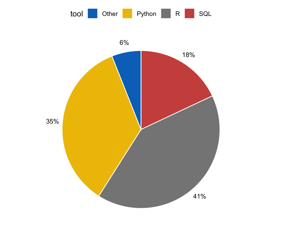
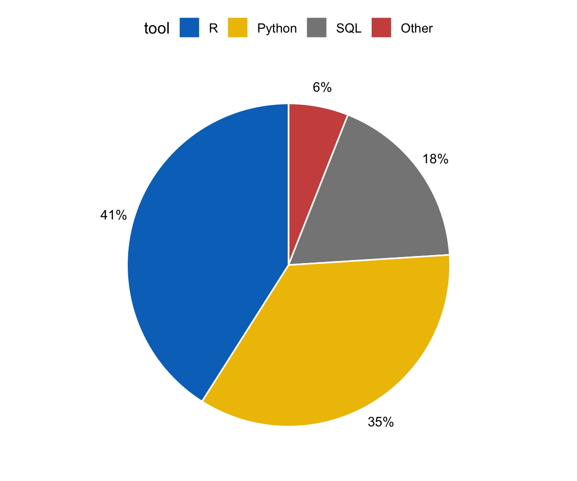
Here is the headline figure. Start with the data: a table of raw counts, one row per category. Add a label column, then call ggpie() with the value column ("users"), colour the slices by fill = "tool", and pass a journal palette. That single call is the whole recipe — no coord_polar(), no theme_void().
library(ggpubr)survey <-data.frame(tool =c("R", "Python", "SQL", "Other"),users =c(410, 350, 180, 60))# percentage labels, computed in base Rsurvey$lab <-paste0(round(100* survey$users /sum(survey$users)), "%")ggpie(survey, "users", label ="lab",fill ="tool", color ="white", palette ="jco")
The arguments read left to right: "users" is the value that sets each slice’s angle, label = "lab" prints the percentage we computed, fill = "tool" colours the slices by category, color = "white" draws the thin white border between them, and palette = "jco" applies the Journal of Clinical Oncology colour scheme. ggpubr adds the legend and a clean theme automatically.
Prefer to build the pie from the grammar — geom_col() + coord_polar(), layer by layer? See the ggplot2 pie chart lesson. ggpie() is the one-call publication shortcut over that same idea.
Percentage labels, inside or outside
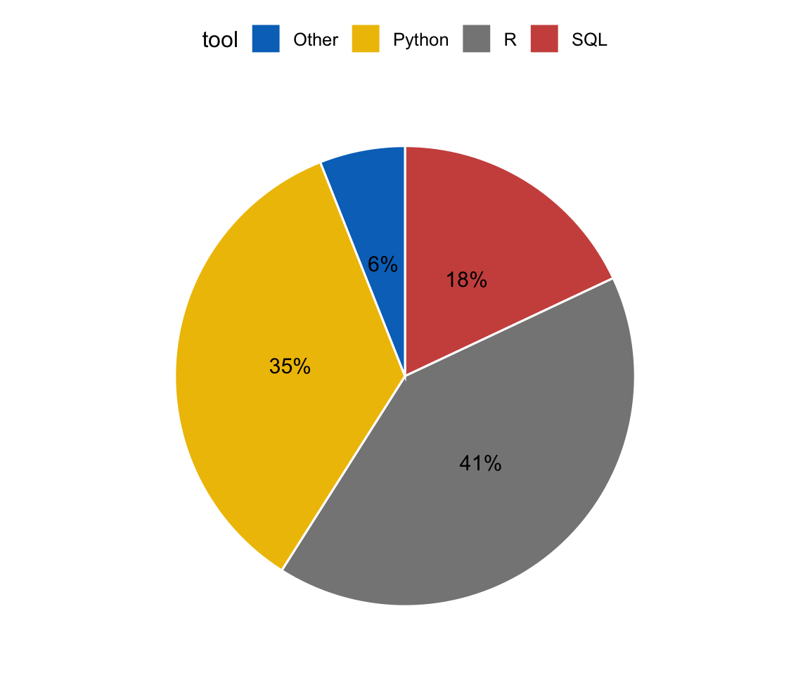
A pie is much easier to read when each slice carries its value. We already built the label in base R — paste0(round(100 * users / sum(users)), "%") turns raw counts into a percentage string. The remaining choice is where the label sits: lab.pos = "out" (the default) prints it just outside the slice, lab.pos = "in" centres it inside.
library(ggpubr)survey <-data.frame(tool =c("R", "Python", "SQL", "Other"),users =c(410, 350, 180, 60))survey$lab <-paste0(round(100* survey$users /sum(survey$users)), "%")ggpie(survey, "users", label ="lab",lab.pos ="in", # centre the label inside each slicefill ="tool", color ="white", palette ="jco")
Put the labels inside when the slices are large enough to hold the text; keep them outside (the default) when a thin slice would clip the label. If a very thin slice still crowds its neighbour, a donut (below) gives the labels more room.
Journal colour palettes
The palette = argument is where ggpubr’s publication polish comes from. It accepts the ready-made journal palettes — colourblind-aware schemes named after the journals that use them:
palette
Scheme
"jco"
Journal of Clinical Oncology (azure, gold, grey, red)
"npg"
Nature Publishing Group
"lancet"
The Lancet
"aaas"
Science / AAAS
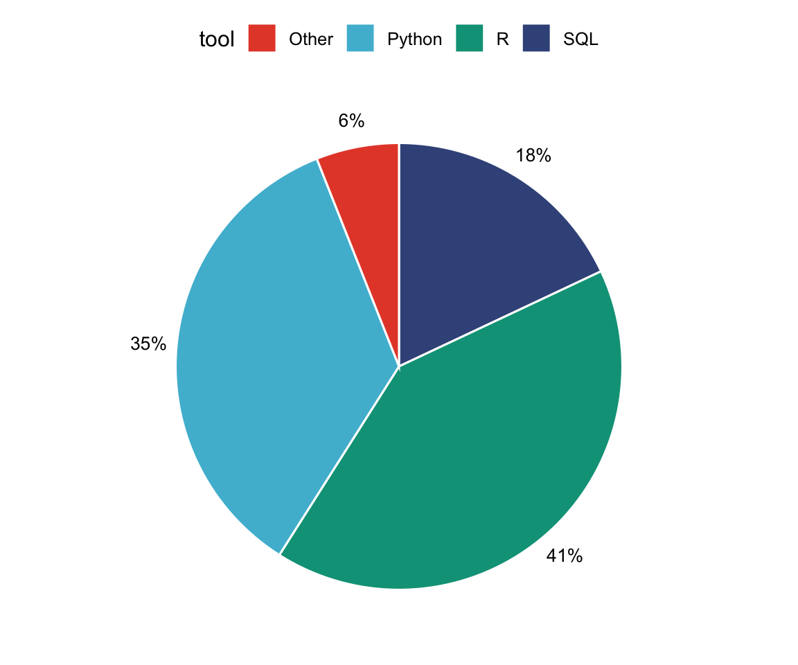
Swap "jco" for "npg" to recolour the same pie with Nature’s muted clinical hues:
You can also pass your own hex vector — palette = c("#3a86d4", "#2a9d8f", "#f4a261", "#adb5bd") — one colour per group in legend order, for a brand or house palette.
WarningThe "viridis" gotcha
palette = does not accept "viridis". Passing palette = "viridis" fails silently — ggpubr falls back to ggplot2’s default hue scale (the evenly-spaced default hues), which is not colourblind-safe. For an actual viridis scale, add a ggplot2 layer to the returned plot: ggpie(...) + scale_fill_viridis_d(). For most publication figures, a journal name ("jco", "npg") is the simpler, safer choice.
A donut chart in one call
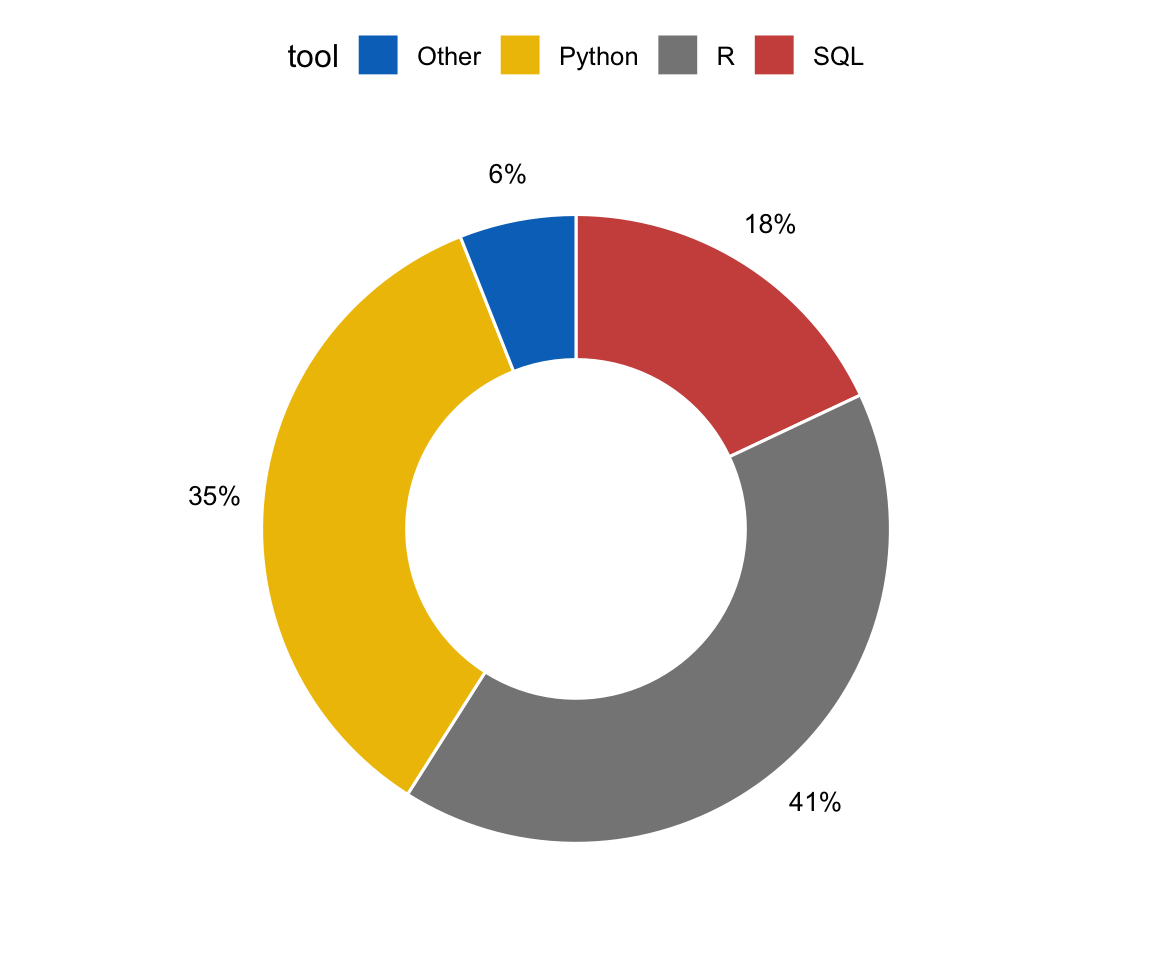
A donut is a pie with a hole punched in the middle. The hole de-emphasises the centre and gives thin slices and their labels a little more breathing room. ggdonutchart() takes the same arguments as ggpie() — only the function name changes.
Everything you learned for the pie — lab.pos, the journal palettes, a custom hex vector — works identically here. Reach for a donut when the centre of the circle is visual noise you would rather drop, or when you want to place a title or total in the middle of the figure.
Ordering the slices
By default the slices follow the order of the rows in your data frame. To fix a specific order — largest first, or a meaningful sequence — make the category a factor with the levels in the order you want. ggpubr then draws the slices in that order.
library(ggpubr)survey <-data.frame(tool =c("R", "Python", "SQL", "Other"),users =c(410, 350, 180, 60))survey$lab <-paste0(round(100* survey$users /sum(survey$users)), "%")# order the slices largest → smallestsurvey$tool <-factor(survey$tool, levels =c("R", "Python", "SQL", "Other"))ggpie(survey, "users", label ="lab",fill ="tool", color ="white", palette ="jco")
Ordering by size (or by any natural sequence) makes the chart easier to scan and keeps the legend in the same order as the slices.
A note on pie charts vs bars
Pies and donuts are perfect for a quick parts-of-a-whole impression with a handful of categories. But the human eye compares lengths far more accurately than angles or areas — two slices of 22% and 25% look almost identical. When your reader needs to rank categories or read values precisely, a sorted bar plot is the clearer choice; see the bar plots lesson for the ggpubr ggbarplot() route. Keep the pie for the “here are the parts of the whole” moment with only a few slices.
Try it live
The plots above were rendered at build time. Want to experiment? Edit the code and press Run — it executes in your browser via webR (no server, no install). Try switching palette to "npg", moving the labels with lab.pos = "in", or changing the counts.
Now the donut version — the only change is the function name. Swap ggdonutchart back to ggpie to compare them side by side.
Working in Python? A matplotlib/plotly pie guide is coming to the Python series.
🟢 With an AI agent
Ask Prova“turn my data frame of category counts into a labelled ggpubr pie chart with percentages” — it answers with code you can run on your own data, so the recipe is reproducible. The runtime is the judge.Ask Prova →
Common issues
The slices aren’t labelled.ggpie() labels from a column, not a computed expression — build a label column first (df$lab <- paste0(round(100 * df$value / sum(df$value)), "%")) and pass its name: label = "lab".
The palette is ignored / the colours look wrong. A named palette only takes effect when you map a variable to fill (e.g. fill = "tool"). And palette = "viridis" silently falls back to the non-colourblind-safe default hue — use "jco"/"npg", a hex vector, or add scale_fill_viridis_d().
The slices are in the wrong order. Slice order follows the data. Set the category as a factor with levels = in the order you want (df$tool <- factor(df$tool, levels = c(...))).
Thin-slice labels overlap. Keep lab.pos = "out" (the default) so small slices don’t clip their text, or switch to ggdonutchart(), which gives the labels a little more room.
Frequently asked questions
NoteHow do I make a pie chart in R with ggpubr?
Use ggpie(): ggpie(df, "value", label = "lab", fill = "group", palette = "jco") draws a publication-ready pie in one call. Pass the value column as the second argument, a label column for the slice text, map fill to your category, and add a journal palette. ggpubr applies a clean theme automatically — no coord_polar() needed.
NoteHow do I make a donut chart in R?
Use ggdonutchart() — it takes the same arguments as ggpie() and draws a donut (a pie with a hole): ggdonutchart(df, "value", label = "lab", fill = "group", palette = "jco"). Switching a pie to a donut is a one-word change from ggpie to ggdonutchart.
NoteHow do I add percentage labels to a ggpubr pie chart?
Compute the percentages in base R and store them in a column: df$lab <- paste0(round(100 * df$value / sum(df$value)), "%"). Then pass that column to ggpie() with label = "lab". Use lab.pos = "in" to centre the labels inside the slices or lab.pos = "out" (the default) to place them just outside.
NoteWhich colour palettes can I use with ggpubr?
palette = accepts the colourblind-aware journal palettes — "jco", "npg", "lancet", "aaas" — or your own hex vector (one colour per group, in legend order). It does not accept "viridis"; for a viridis scale, add scale_fill_viridis_d() to the returned plot instead.
NoteShould I use a pie chart or a bar chart?
Use a pie (or donut) for a quick parts-of-a-whole impression with only a few categories. When readers need to rank categories or compare values precisely, a sorted bar plot is clearer — the eye reads lengths far more accurately than angles.
Test your understanding
ImportantExercise: a labelled donut chart
Complete the code so the survey is drawn as a donut (ggdonutchart), with the percentage label shown, coloured by tool using the "npg" palette and white slice borders.
# The donut function is ggdonutchart (same arguments as ggpie).# White borders: color = "white".# Nature palette: palette = "npg".
Quick check. You call ggpie(df, "value", fill = "group", palette = "viridis") and the slices come out red/green/blue instead of viridis colours. Why?
TipShow answer
palette = does not accept "viridis" — it silently falls back to ggplot2’s default hue scale (red/green/blue), which is not colourblind-safe. Use a journal name like "jco" or "npg", pass your own hex vector, or add scale_fill_viridis_d() to the plot for a real viridis scale.
Conclusion
You drew a publication-ready pie and donut the ggpubr way — ggpie() and ggdonutchart(), each a single call with fill + a journal palette, percentage labels computed in base R and placed inside or outside the slices, and slices ordered with a factor. Because ggpubr applies a clean theme automatically, there is no coord_polar() or theme_void() plumbing to write.
For the layer-by-layer grammar behind a pie, see the ggplot2 pie chart lesson. And remember the trade-off: pies suit a quick parts-of-a-whole with a few categories — for precise ranking, reach for a bar plot.
This lesson is reproducible: the figures are executed at build time (if they render, the code works), and the sandbox + quiz re-run live in your browser. The runtime is the judge.