Venn Diagram in R: How to Make One with VennDiagram
Draw 2-, 3- and 4-set Venn diagrams, colour the circles, label the counts, and save the figure
Data Visualization
Make a Venn diagram in R with the VennDiagram package. Draw two-, three- and four-set diagrams, set the fill colours and transparency, rename the sets, show the counts, and save the figure to a file — plus the ggplot/ggvenn alternative.
Published
June 27, 2026
Modified
July 7, 2026
TipKey takeaways
Draw a Venn diagram in R with VennDiagram — draw.pairwise.venn() (2 sets), draw.triple.venn() (3 sets), and venn.diagram() (any number, from lists).
venn.diagram() takes a named list of vectors and computes every overlap count for you — no manual arithmetic.
Set the circle colours with fill, soften them with alpha (transparency), and rename the sets with category.names.
By default venn.diagram() writes to a file; pass filename = NULL and grid.draw() to show it in R instead.
Prefer the grammar of graphics? ggvenn and ggVennDiagram build Venn diagrams as ggplot objects (alternative shown in prose).
Introduction
You have several gene lists, customer segments, or survey groups, and you want one picture that shows how they overlap — what’s shared, what’s unique. That picture is a Venn diagram: overlapping circles, one per set, with each region labelled by how many items fall in it.
In R the workhorse is the VennDiagram package. It draws publication-quality diagrams for 2 to 4 sets, computes every intersection count for you, and lets you colour, label and save the result. This lesson builds one up from a two-set diagram to a four-set diagram, then covers colours, transparency, set names, counts and saving — and points you to the ggplot-based alternatives at the end.
Install it once:
install.packages("VennDiagram")
The data
We’ll use a small, reproducible example: four sets of “genes” drawn from a common pool of 1000. The same lists drive every diagram below. This is base R — no tidyverse — and self-contained, so you can copy any block and run it on its own.
set.seed(20190708)genes <-paste0("gene", 1:1000)set_list <-list(A =sample(genes, 300),B =sample(genes, 525),C =sample(genes, 440),D =sample(genes, 350))# Sizes of each setsapply(set_list, length)
  A   B   C   D
300 525 440 350
set_list is a named list of character vectors — the shape VennDiagram expects. Each name (A, B, C, D) becomes a circle; the overlaps are computed from the shared elements.
A two-set Venn diagram
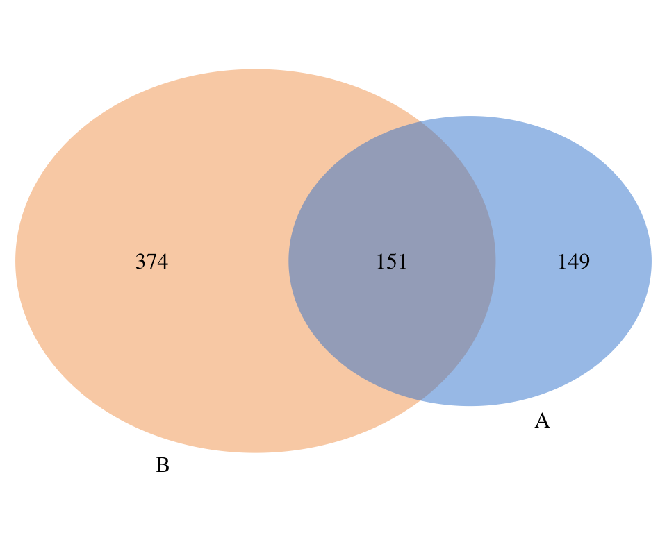
For exactly two sets, draw.pairwise.venn() is the most direct route. It takes the two set sizes and the size of their intersection, then draws the two-circle diagram. We compute the three numbers with base R first.
library(VennDiagram)# The three counts: |A|, |B|, |A and B|n_A <-length(set_list$A)n_B <-length(set_list$B)n_AB <-length(intersect(set_list$A, set_list$B))grid.newpage()draw.pairwise.venn(area1 = n_A, area2 = n_B, cross.area = n_AB,category =c("A", "B"),fill =c("#3a86d4", "#f4a259"),alpha =0.5, lty ="blank",cat.pos =c(-20, 20))
area1/area2 are the two set sizes, cross.area is the overlap, and category names the circles. fill colours them, alpha = 0.5 makes them semi-transparent so the overlap reads clearly, and lty = "blank" drops the circle outlines for a cleaner look. We call grid.newpage() first because VennDiagram draws onto a grid page.
A three-set Venn diagram
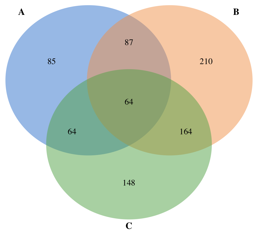
The venn.diagram() function is the general tool: hand it the named list and it computes all the overlaps itself — no manual intersect() calls. By default it writes to a file, so we set filename = NULL to get a drawable object back, then grid.draw() it onto the page. This is our hero figure.
library(VennDiagram)library(grid)venn_obj <-venn.diagram(x = set_list[c("A", "B", "C")],filename =NULL,fill =c("#3a86d4", "#f4a259", "#5fad56"),alpha =0.5, lty ="blank",cex =1.1, # size of the count numberscat.cex =1.2, # size of the set namescat.fontface ="bold")grid.newpage()grid.draw(venn_obj)
x = set_list[c("A", "B", "C")] passes the first three sets. venn.diagram() returns a grid graphics object; grid.draw() renders it. cex controls the count labels, cat.cex and cat.fontface style the set names. The seven regions you see — three “only”, three “pairwise”, one “all three” — are all counted automatically.
A four-set Venn diagram
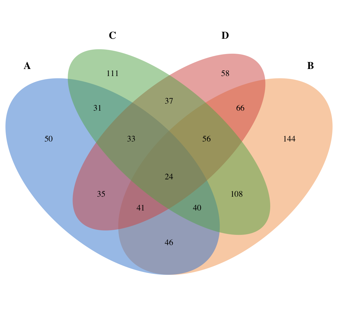
The same venn.diagram() call handles four sets; pass the full list. Four-set diagrams use ellipses (not circles) so every one of the 15 regions has room for its count.
Four sets is the practical ceiling for a readable Venn diagram — beyond four, the regions get too small and the shapes too contorted to label clearly. For five or more sets, an UpSet plot (UpSetR) is the standard alternative.
Colours, transparency and set names
The look of the diagram comes from a few arguments you can mix on any of the calls above:
fill — one colour per set. Use a colourblind-safe set; here azure / orange / green / red.
alpha — transparency of the fill (0 invisible, 1 solid). 0.5 lets overlaps show through.
lty — outline line type; "blank" removes the circle borders.
category.names (in venn.diagram()) or category (in the draw.* helpers) — the labels.
cat.fontface, cat.cex, cat.dist, cat.pos — style and position the set names.
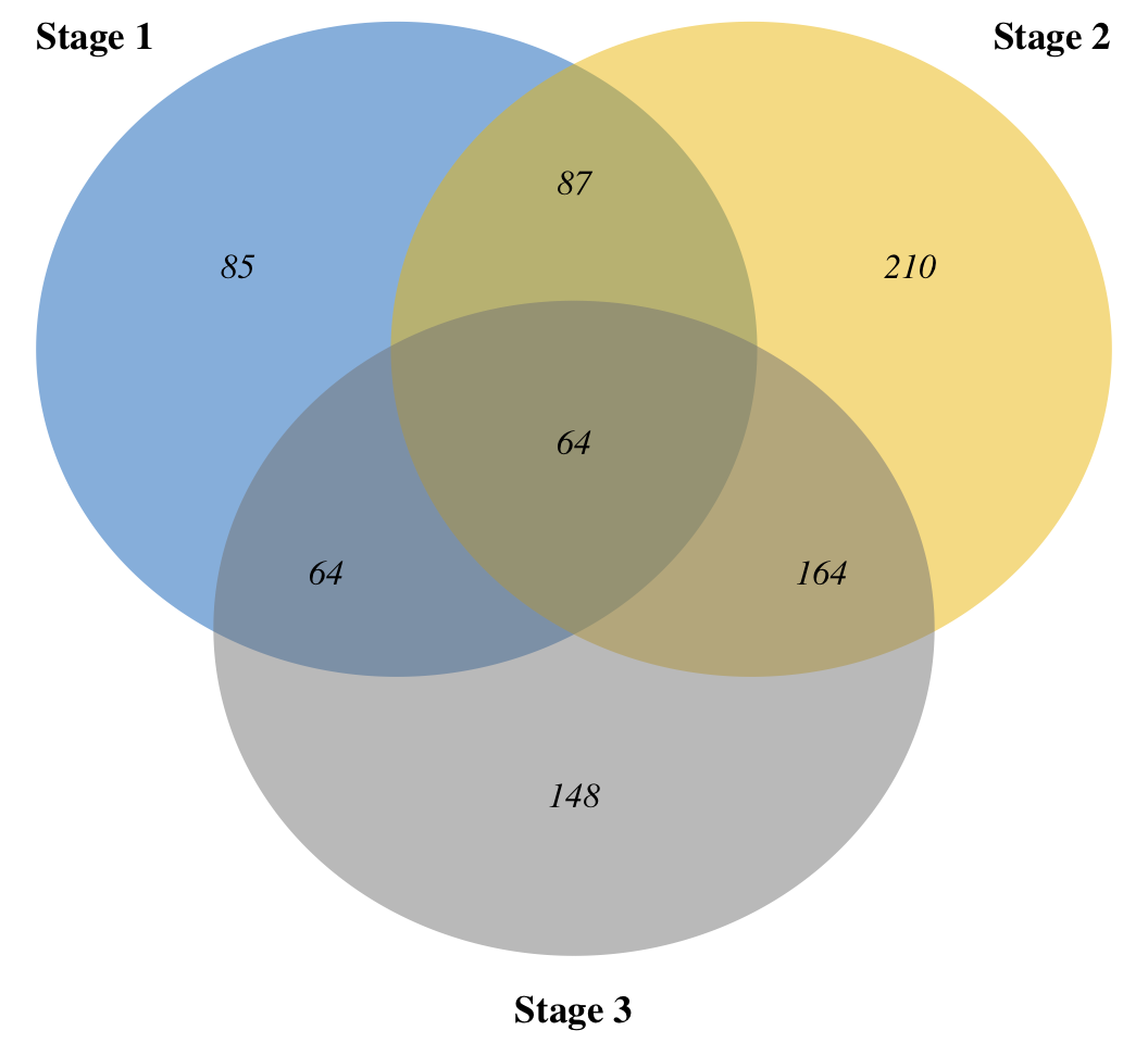
category.names renames the sets, fontface = "italic" styles the counts, and cat.default.pos = "outer" with cat.dist pushes the set labels outside the circles so they don’t collide with the counts.
Getting the overlap counts
Sometimes you want the numbers, not just the picture — which items are shared, and how many. Base R gives you both with intersect() and Reduce():
# Items common to all three setscommon_ABC <-Reduce(intersect, set_list[c("A", "B", "C")])length(common_ABC)
[1] 64
# Items unique to A (in A, in neither B nor C)unique_A <-setdiff(set_list$A, union(set_list$B, set_list$C))length(unique_A)
[1] 85
These are the same counts venn.diagram() prints in each region — handy when you need the actual elements (e.g. the shared gene names) for the next step of an analysis.
Saving the diagram to a file
venn.diagram() was built to write a publication-quality image directly. Give it a filename with an image extension and it saves the figure instead of returning an object:
imagetype accepts "png", "tiff" or "svg"; height/width/resolution set the output size. When you instead want the diagram inside a knitr/R Markdown document or the plot pane, use filename = NULL + grid.draw() as shown above.
The ggplot alternative: ggvenn and ggVennDiagram
If you prefer the grammar of graphics, two ggplot2 extensions build Venn diagrams as ggplot objects you can theme and combine like any other plot (these aren’t executed here, but the recipes are standard):
ggvenn assigns one colour per set, much like VennDiagram:
ggVennDiagram maps each region’s fill colour to its count, so denser overlaps stand out:
library(ggVennDiagram)ggVennDiagram(set_list, label_alpha =0) + ggplot2::scale_fill_gradient(low ="#deebf7", high ="#08519c")
Both return ggplot objects, so you can add theme_minimal(), titles, or facets. Install them with install.packages(c("ggvenn", "ggVennDiagram")). Use VennDiagram for the most control over a classic black-and-white-or-coloured figure; use ggVennDiagram when you want the overlap counts shown as a colour gradient.
🟢 With an AI agent
Ask Prova“why is my Venn diagram saving a file instead of showing in R?” — it answers with R code you can run, so the fix is reproducible. The runtime is the judge.Ask Prova →
Common issues
venn.diagram() writes a file instead of plotting. That’s the default — it’s built to export an image. To show the diagram in R (or embed it in a document), pass filename = NULL so it returns a grid object, then draw it: grid.newpage(); grid.draw(venn.diagram(x, filename = NULL)).
A VennDiagram*.log file keeps appearing.VennDiagram writes a futile.logger log file on each call. Silence it by adding futile.logger::flog.threshold(futile.logger::ERROR, name = "VennDiagramLogger") once at the top of your script, before any venn.diagram() call.
Each call adds to the previous diagram.grid doesn’t clear the page automatically. Call grid.newpage() immediately before grid.draw() (or before a draw.pairwise.venn() / draw.triple.venn() call) so each diagram starts on a fresh page.
Frequently asked questions
NoteHow do I make a Venn diagram in R?
Install and load the VennDiagram package, put your groups in a named list of vectors (list(A = ..., B = ...)), then call venn.diagram(x, filename = NULL) and grid.draw() the result. For just two or three sets you can also use draw.pairwise.venn() or draw.triple.venn() with the counts directly.
NoteHow many sets can a Venn diagram in R show?
VennDiagram draws 2 to 4 sets clearly (four sets use ellipses so every region stays labelled). Beyond four sets the regions become too small to read — switch to an UpSet plot (UpSetR) for five or more groups.
NoteHow do I change the colours of a Venn diagram in R?
Pass a vector of colours to fill — one per set — and control transparency with alpha (e.g. alpha = 0.5). Remove the circle outlines with lty = "blank". The same arguments work in venn.diagram() and the draw.* helpers.
NoteHow do I make a Venn diagram with ggplot in R?
Use a ggplot2 extension: ggvenn (one colour per set) or ggVennDiagram (region colour mapped to count). Both take the same named list and return a ggplot object you can theme and combine — e.g. ggvenn(set_list) or ggVennDiagram(set_list, label_alpha = 0).
NoteHow do I save a Venn diagram to a file in R?
Give venn.diagram() a filename with an image extension and set imagetype ("png", "tiff" or "svg"), plus height, width and resolution. It writes the figure directly — no separate png()/dev.off() needed.
Test your understanding
ImportantExercise: draw and colour a three-set Venn diagram
Starting from a named list of three vectors, draw a three-set Venn diagram with venn.diagram() that: shows it in R (not a file), uses three colourblind-safe fill colours at alpha = 0.5, removes the circle outlines, and renames the sets to "Group 1", "Group 2", "Group 3".
set.seed(1)pool <-paste0("id", 1:200)groups <-list(G1 =sample(pool, 80),G2 =sample(pool, 90),G3 =sample(pool, 70))# Your venn.diagram() call here
TipHint
Pass the list to x, set filename = NULL, give fill three colours and alpha = 0.5, set lty = "blank", and rename with category.names. Then grid.newpage() and grid.draw() the result.
filename = NULL returns a drawable object, fill + alpha colour the semi-transparent circles, and category.names relabels the sets.
Quick check. You call venn.diagram(set_list) and nothing appears in the plot pane — instead a .png shows up in your working directory. What single change displays the diagram in R?
TipShow answer
Add filename = NULL so venn.diagram() returns a grid object, then draw it with grid.newpage(); grid.draw(...). With a non-NULLfilename it always writes to disk instead.
Conclusion
VennDiagram is the direct way to draw a Venn diagram in R: a named list into venn.diagram() (or the draw.pairwise.venn() / draw.triple.venn() helpers for 2–3 sets), fill and alpha for the look, category.names for the labels, and filename to save or filename = NULL + grid.draw() to show. For a ggplot-native figure, reach for ggvenn or ggVennDiagram; for five or more sets, an UpSet plot.
Related lessons
Colours in R — build the colourblind-safe palettes used for the circle fills. · Add a legend — label groups on base-R plots. · Bar plot — another way to compare group sizes and counts.
This lesson is reproducible: every figure was produced by the code shown, executed at build time (if they render, the code works). Copy any block and run it to reproduce them. The runtime is the judge.