diet <- data.frame(
  group = c("Grains", "Vegetables", "Fruits", "Dairy"),
  value = c(40, 30, 20, 10)
)

diet
group value
1 Grains 40
2 Vegetables 30
3 Fruits 20
4 Dairy 10Draw a pie chart with base R pie()
Learn to make a pie chart in R with base graphics — the pie() function, slice labels and percentages, colours, and when a bar chart reads better.
pie(x, labels = names) — no package needed; x is a vector of non-negative numbers and the slices show each value’s share.labels, the colours with col, and the size with radius.paste0(group, " ", pct, "%").clockwise = TRUE, init.angle (where the first slice starts), and border.text(), choosing a readable colour per slice.A pie chart shows how a whole splits into parts. In base R you draw one with pie() — pass a vector of non-negative numbers and it turns each value into a proportional slice. No package, no setup.
This lesson covers the recipe you actually reach for: a basic pie, colourblind-safe colours, percentage labels, a custom start angle and direction, labels placed inside the slices, and the honest caveat — the eye compares lengths far better than angles, so when readers need to rank or compare values precisely, a bar chart is the clearer choice. Pies earn their place for a quick parts-of-a-whole impression with only a handful of categories.
Prefer the grammar of graphics? ggplot2 builds a pie by bending a stacked bar with coord_polar() — see pie chart in the ggplot2 series.
We use a small self-contained data frame — the share of daily servings across four food groups. Every block below rebuilds it, so you can run them in any order.
diet <- data.frame(
group = c("Grains", "Vegetables", "Fruits", "Dairy"),
value = c(40, 30, 20, 10)
)
diet group value
1 Grains 40
2 Vegetables 30
3 Fruits 20
4 Dairy 10group names each slice and value is the quantity it represents. pie() handles the arithmetic — you never compute the angles yourself.
The most common pie is one labelled with percentages. Build the label text yourself in base R: compute each group’s share with round(value / sum(value) * 100), then paste0() the name and the percent sign together. Pass that vector to labels, and a colourblind-safe viridis palette to col via base R’s hcl.colors().
diet <- data.frame(
  group = c("Grains", "Vegetables", "Fruits", "Dairy"),
  value = c(40, 30, 20, 10)
)
pct <- round(diet$value / sum(diet$value) * 100)
labels <- paste0(diet$group, " ", pct, "%")

pie(diet$value,
    labels = labels,
    col = hcl.colors(4, "viridis"),
    border = "white",
    main = "Share of daily servings")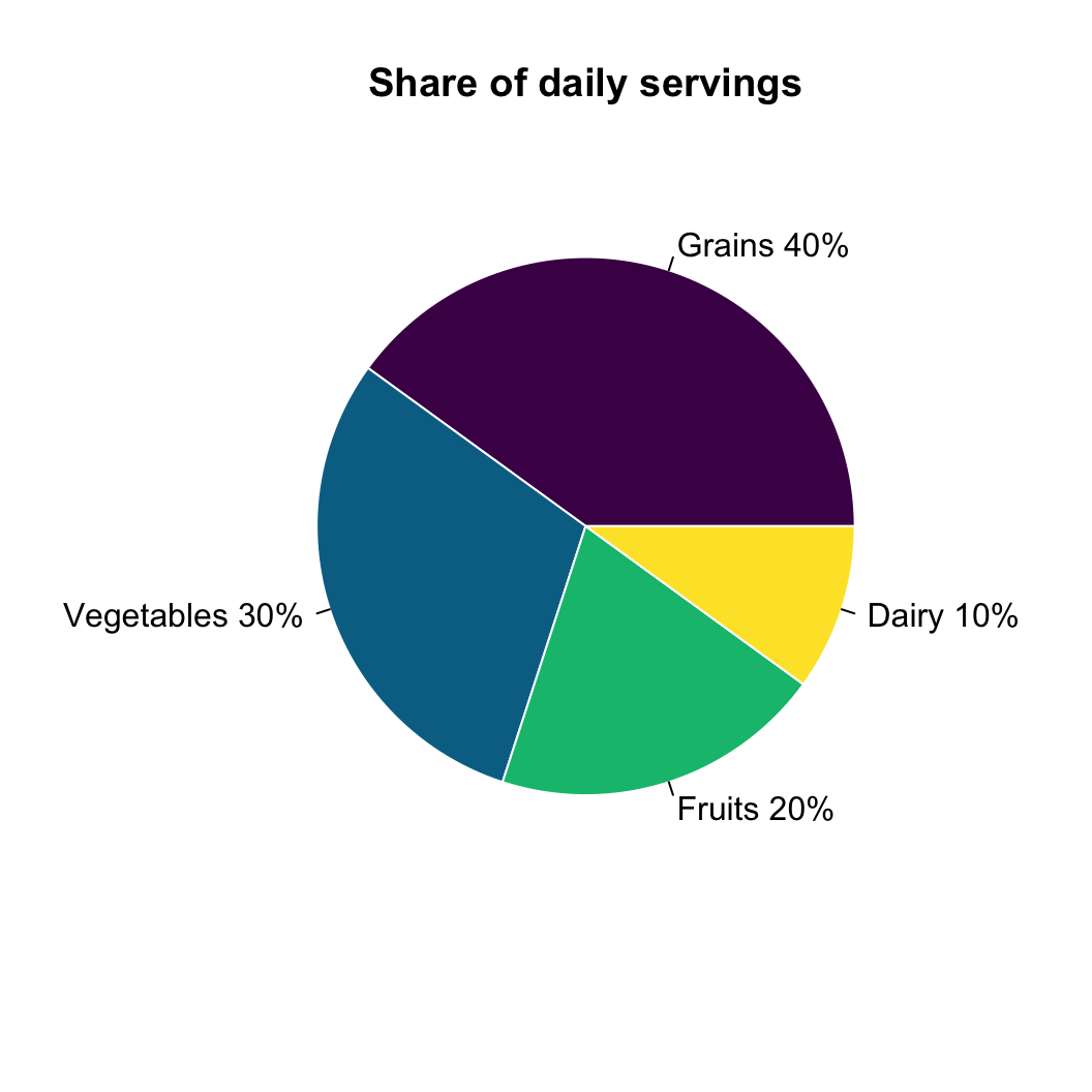
hcl.colors(4, "viridis") returns four evenly spaced, colourblind-safe colours; border = "white" draws a thin gap between slices. The labels sit just outside each slice, on the plain background, so they stay readable whatever the fill colour.
The bare minimum is a vector of values and a vector of labels:
diet <- data.frame(
  group = c("Grains", "Vegetables", "Fruits", "Dairy"),
  value = c(40, 30, 20, 10)
)

pie(diet$value, labels = diet$group)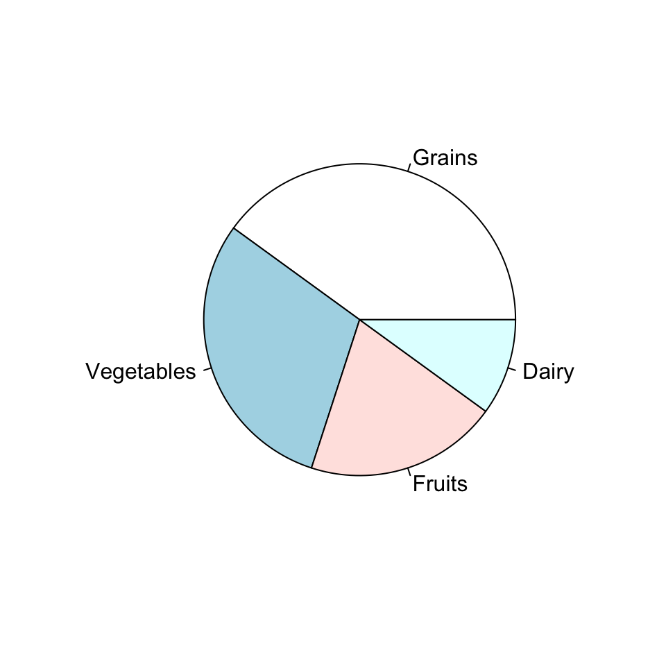
pie() takes the numbers, works out each slice’s angle from its share of the total, and writes the labels at the slice edges. With no col it uses a default pastel palette. The three arguments you touch most:
x — the vector of non-negative values; each becomes a slice sized by its share.labels — the text for each slice (defaults to names(x)).radius — the size of the circle, from 0 to 1. Shrink it (radius = 0.8) when long labels run off the edge.Pass a vector of colours to col — one per slice, in the same order as the values. Use a meaningful, colourblind-safe palette rather than the default pastels. hcl.colors() ships with base R and offers "viridis", "Blues", "YlGnBu" and many more; supply your own hex vector for full control.
op <- par(mfrow = c(1, 2))
diet <- data.frame(
  group = c("Grains", "Vegetables", "Fruits", "Dairy"),
  value = c(40, 30, 20, 10)
)

# Left: a colourblind-safe viridis palette
pie(diet$value, labels = diet$group,
    col = hcl.colors(4, "viridis"), border = "white",
    main = "hcl.colors viridis")

# Right: a custom hex vector
pie(diet$value, labels = diet$group,
    col = c("#3a86d4", "#5fad56", "#f4a259", "#e15759"), border = "white",
    main = "Custom colours")
par(op)Give exactly one colour per slice. A shorter vector recycles — three colours for four slices reuses the first — which is rarely what you want, so match the length to the number of groups.
By default pie() draws counter-clockwise starting at 3 o’clock. Set clockwise = TRUE to go the other way and init.angle (in degrees) to move the first slice’s start. init.angle = 90 with clockwise = TRUE is the familiar “start at the top, go clockwise” layout.
diet <- data.frame(
  group = c("Grains", "Vegetables", "Fruits", "Dairy"),
  value = c(40, 30, 20, 10)
)

pie(diet$value, labels = diet$group,
    col = hcl.colors(4, "viridis"), border = "white",
    clockwise = TRUE, init.angle = 90,
    main = "Clockwise from the top")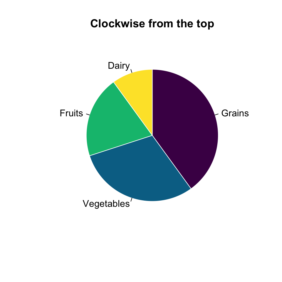
init.angle rotates the whole pie; clockwise flips the direction the slices are laid down. Together they let you match a convention your audience expects.
To print the percentage on each slice, place the text yourself. Each slice’s centre sits at its cumulative mid-angle around the circle; convert that angle to an x/y point with cos() and sin(), then draw with text(). Choose a readable colour per slice — dark text on the light (yellow/green) viridis colours, white on the dark ones — so every label meets the contrast bar.
diet <- data.frame(
  group = c("Grains", "Vegetables", "Fruits", "Dairy"),
  value = c(40, 30, 20, 10)
)
pct  <- round(diet$value / sum(diet$value) * 100)
frac <- diet$value / sum(diet$value)

# mid-angle of each slice (radians), counter-clockwise from 3 o'clock — pie()'s default
mid <- 2 * pi * (cumsum(frac) - frac / 2)
r   <- 0.55                                   # inside the default 0.8 radius
# readable label colour per slice: white on the two dark viridis colours, dark on the light ones
lab_col <- c("white", "white", "grey15", "grey15")

pie(diet$value, labels = diet$group,
    col = hcl.colors(4, "viridis"), border = "white",
    main = "Percentages on the slices")

text(r * cos(mid), r * sin(mid),
     labels = paste0(pct, "%"), col = lab_col, font = 2)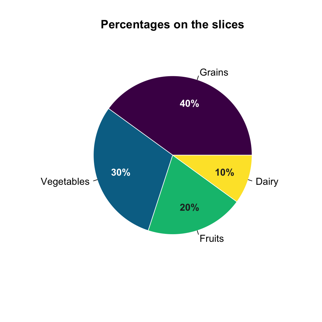
cumsum(frac) - frac / 2 gives the fraction of the circle at each slice’s centre; multiplying by 2 * pi turns it into an angle. Setting the radius r to 0.55 places the text comfortably inside the slice. Set the per-slice colour by hand — there is no automatic contrast, so pick white or dark to match each fill.
Angles and areas are genuinely hard to compare — two slices of 22% and 25% look almost identical. When your reader needs to rank categories or read values precisely, barplot() does the job better: the same numbers as sorted bars are read at a glance.
diet <- data.frame(
  group = c("Grains", "Vegetables", "Fruits", "Dairy"),
  value = c(40, 30, 20, 10)
)
# sort so the bars rank the groups at a glance
o <- order(diet$value)

barplot(diet$value[o], names.arg = diet$group[o],
        horiz = TRUE, las = 1,
        col = "#3a86d4", border = "white",
        xlab = "Servings")
Keep the pie for a quick “these are the parts of the whole” with a few categories; reach for bars the moment precise comparison matters. (A 3D pie tilts the plane and distorts the very areas you’re trying to read, so it is best avoided — a flat pie or a bar chart is always more honest.)
Edit the values, labels or colours and press Run — it executes in your browser via webR, no install needed.
Ask Prova “turn my data frame of category counts into a labelled base R pie chart with percentages” — it answers with base-R code you can run on your own data, so the recipe is reproducible. The runtime is the judge. Ask Prova →
One grey circle, or an error about x. pie() needs a numeric vector, not a data frame. Pass the column — pie(diet$value, labels = diet$group) — not pie(diet).
Labels run off the edge of the plot. Long slice names get clipped at the circle’s rim. Shrink the pie with radius = 0.8 (or smaller) to leave room, or shorten the labels.
The colours don’t line up with the slices. col is matched to the values in order and recycles if it’s too short. Give exactly one colour per slice — col = hcl.colors(length(diet$value), "viridis") scales automatically to however many groups you have.
Call pie() on a numeric vector — pie(c(40, 30, 20, 10)). Add labels for the slice names and col for the colours: pie(diet$value, labels = diet$group, col = hcl.colors(4, "viridis")). It ships with base R, so no package is required.
Compute each share with pct <- round(value / sum(value) * 100), build the label with paste0(group, " ", pct, "%"), and pass it to labels. pie() has no built-in percentage option, so you assemble the label text yourself.
Pass a vector to col, one colour per slice in the order of the values. Use a colourblind-safe palette with hcl.colors(n, "viridis"), or supply your own hex vector like col = c("#3a86d4", "#5fad56", "#f4a259", "#e15759").
The plotrix package offers pie3D(), but 3D pies are discouraged: the tilt distorts the slice areas and makes values harder — not easier — to read. For an honest chart use a flat pie() or, better for precise comparison, a bar chart with barplot().
Use a pie only for a quick parts-of-a-whole impression with a handful of categories. When readers need to rank categories or compare values precisely, a bar chart is clearer — the eye reads lengths far more accurately than angles.
Starting from the sales data frame below, draw a pie chart that uses a viridis palette, labels each slice with its name and percentage, and starts at the top going clockwise.
Build pct and the labels vector first, then call pie(sales$value, labels = labels, ...) with col = hcl.colors(4, "viridis"), clockwise = TRUE and init.angle = 90.
sales <- data.frame(
  region = c("North", "South", "East", "West"),
  value  = c(35, 25, 22, 18)
)
pct <- round(sales$value / sum(sales$value) * 100)
labels <- paste0(sales$region, " ", pct, "%")

pie(sales$value, labels = labels,
    col = hcl.colors(4, "viridis"), border = "white",
    clockwise = TRUE, init.angle = 90,
    main = "Sales by region")
pie() sizes the slices from the values; you supply the percentage text in labels and the palette in col.
Quick check. In pie(x, labels = names, col = cols), which argument sets the text written next to each slice?
labels. It takes one string per value, in the same order as x. Leave it out and pie() falls back to names(x).
pie() is the one function you need for pie charts in base R. Pass a numeric vector, set the labels and col, and size it with radius. Turn values into percentages by building the label with paste0(), orient the chart with clockwise and init.angle, and place text on the slices with a little cos()/sin() and text(). Remember the trade-off: a pie gives a quick parts-of-a-whole feel, but for precise comparison reach for barplot().
@online{2026,
  author = {},
  title = {Pie {Chart} in {R} {Base} {Graphics}},
  date = {2026-07-08},
  url = {https://www.datanovia.com/learn/data-visualization/r-base/pie-chart},
  langid = {en}
}