This chapter describes a cluster analysis example using R software. We provide a quick start R code to compute and visualize K-means and hierarchical clustering.
Related Book
Practical Guide to Cluster Analysis in RLoading required R packages
clusterfor cluster analysisfactoextrafor cluster visualization
library(cluster)
library(factoextra)
Data preparation
We’ll use the demo data set USArrests. We start by standardizing the data:
mydata <- scale(USArrests) K-means clustering
K-means is a clustering techniques that subdivide the data sets into a set of k groups, where k is the number of groups pre-specified by the analyst.
The following R codes show how to determine the optimal number of clusters and how to compute k-means and PAM clustering in R.
- Determining the optimal number of clusters: use
factoextra::fviz_nbclust()
fviz_nbclust(mydata, kmeans, method = "gap_stat")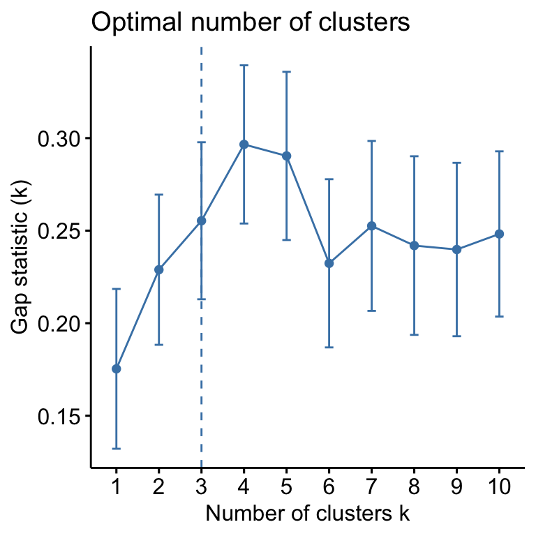
Suggested number of cluster: 3
- Compute and visualize k-means clustering:
set.seed(123) # for reproducibility
km.res <- kmeans(mydata, 3, nstart = 25)
# Visualize
fviz_cluster(km.res, data = mydata, palette = "jco",
             ggtheme = theme_minimal())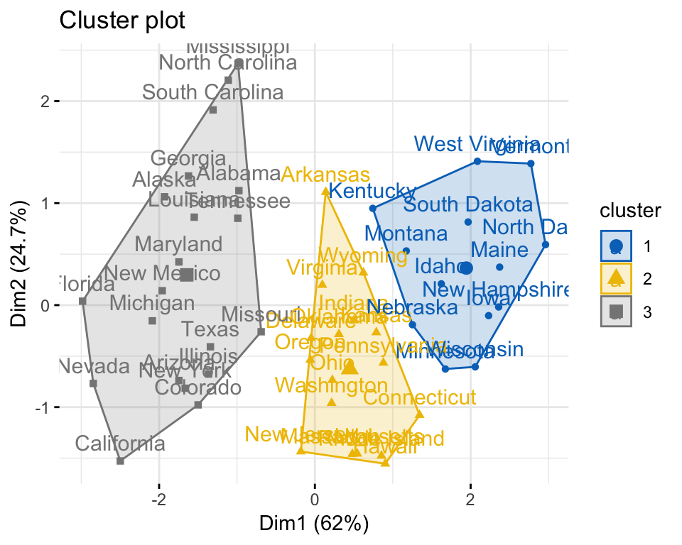
Hierarchical clustering
Hierarchical clustering is an alternative approach to partitioning clustering for identifying groups in the data set. It does not require to pre-specify the number of clusters to be generated.
The result of hierarchical clustering is a tree-based representation of the objects, which is also known as dendrogram. Observations can be subdivided into groups by cutting the dendrogram at a desired similarity level.
- Computation: R function:
hclust(). It takes a dissimilarity matrix as an input, which is calculated using the functiondist(). - Visualization:
fviz_dend()[in factoextra]
R code to compute and visualize hierarchical clustering:
res.hc <- hclust(dist(mydata),  method = "ward.D2")
fviz_dend(res.hc, cex = 0.5, k = 4, palette = "jco") 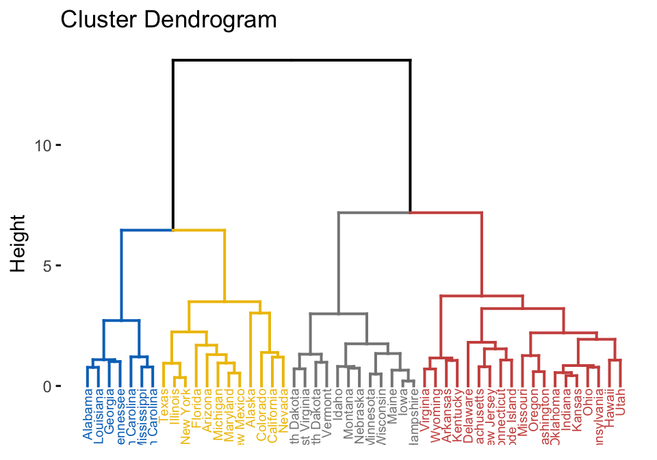
A heatmap is another way to visualize hierarchical clustering. It’s also called a false colored image, where data values are transformed to color scale. Heat maps allow us to simultaneously visualize groups of samples and features. You can easily create a pretty heatmap using the R package pheatmap.
In heatmap, generally, columns are samples and rows are variables. Therefore we start by transposing the data before creating the heatmap.
library(pheatmap)
pheatmap(t(mydata), cutree_cols = 4)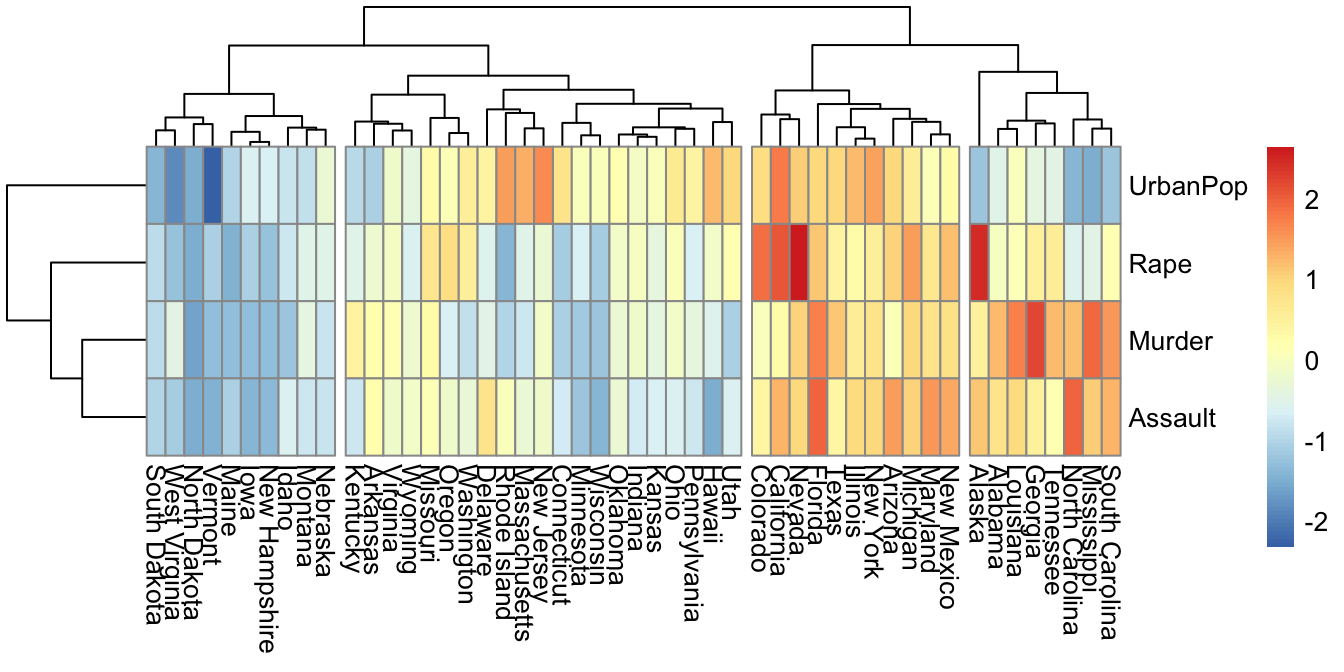
Summary
This chapter presents examples of R code to compute and visualize k-means and hierarchical clustering.
Recommended for you
This section contains best data science and self-development resources to help you on your path.
Books - Data Science
Our Books
- Practical Guide to Cluster Analysis in R by A. Kassambara (Datanovia)
- Practical Guide To Principal Component Methods in R by A. Kassambara (Datanovia)
- Machine Learning Essentials: Practical Guide in R by A. Kassambara (Datanovia)
- R Graphics Essentials for Great Data Visualization by A. Kassambara (Datanovia)
- GGPlot2 Essentials for Great Data Visualization in R by A. Kassambara (Datanovia)
- Network Analysis and Visualization in R by A. Kassambara (Datanovia)
- Practical Statistics in R for Comparing Groups: Numerical Variables by A. Kassambara (Datanovia)
- Inter-Rater Reliability Essentials: Practical Guide in R by A. Kassambara (Datanovia)
Others
- R for Data Science: Import, Tidy, Transform, Visualize, and Model Data by Hadley Wickham & Garrett Grolemund
- Hands-On Machine Learning with Scikit-Learn, Keras, and TensorFlow: Concepts, Tools, and Techniques to Build Intelligent Systems by Aurelien Géron
- Practical Statistics for Data Scientists: 50 Essential Concepts by Peter Bruce & Andrew Bruce
- Hands-On Programming with R: Write Your Own Functions And Simulations by Garrett Grolemund & Hadley Wickham
- An Introduction to Statistical Learning: with Applications in R by Gareth James et al.
- Deep Learning with R by François Chollet & J.J. Allaire
- Deep Learning with Python by François Chollet

Hi,
For some reason my code produces two optimal clusters.
data(“USArrests”)
df = USArrests; df = scale(df)
# k-means clustering; ####
# optimal number of clusters;
fviz_nbclust(
df,
kmeans,
method = “gap_stat”
)
I cant seem to find a difference in the code.
Same here! I suspect that the dataset got updated after the page was published.
I wish I will do the same heatmap but for agglomerative clustering. Is there a way to get this?