A heatmap (or heat map) is another way to visualize hierarchical clustering. It’s also called a false colored image, where data values are transformed to color scale.
Heat maps allow us to simultaneously visualize clusters of samples and features. First hierarchical clustering is done of both the rows and the columns of the data matrix. The columns/rows of the data matrix are re-ordered according to the hierarchical clustering result, putting similar observations close to each other. The blocks of ‘high’ and ‘low’ values are adjacent in the data matrix. Finally, a color scheme is applied for the visualization and the data matrix is displayed. Visualizing the data matrix in this way can help to find the variables that appear to be characteristic for each sample cluster.
Previously, we described how to visualize dendrograms. Here, we’ll demonstrate how to draw and arrange a heatmap in R.
Contents:
- R Packages/functions for drawing heatmaps
- Data preparation
- R base heatmap: heatmap()
- Enhanced heat maps: heatmap.2()
- Pretty heat maps: pheatmap()
- Interactive heat maps: d3heatmap()
- Enhancing heatmaps using dendextend
- Complex heatmap
- Application to gene expression matrix
- Visualizing the distribution of columns in matrix
- Summary
Related Book
Practical Guide to Cluster Analysis in RR Packages/functions for drawing heatmaps
There are a multiple numbers of R packages and functions for drawing interactive and static heatmaps, including:
- heatmap() [R base function, stats package]: Draws a simple heatmap
- heatmap.2() [gplots R package]: Draws an enhanced heatmap compared to the R base function.
- pheatmap() [pheatmap R package]: Draws pretty heatmaps and provides more control to change the appearance of heatmaps.
- d3heatmap() [d3heatmap R package]: Draws an interactive/clickable heatmap
- Heatmap() [ComplexHeatmap R/Bioconductor package]: Draws, annotates and arranges complex heatmaps (very useful for genomic data analysis)
Here, we start by describing the 5 R functions for drawing heatmaps. Next, we’ll focus on the ComplexHeatmap package, which provides a flexible solution to arrange and annotate multiple heatmaps. It allows also to visualize the association between different data from different sources.
Data preparation
We use mtcars data as a demo data set. We start by standardizing the data to make variables comparable:
df <- scale(mtcars)R base heatmap: heatmap()
The built-in R heatmap() function [in stats package] can be used.
A simplified format is:
heatmap(x, scale = "row")- x: a numeric matrix
- scale: a character indicating if the values should be centered and scaled in either the row direction or the column direction, or none. Allowed values are in c(“row”, “column”, “none”). Default is “row”.
# Default plot
heatmap(df, scale = "none")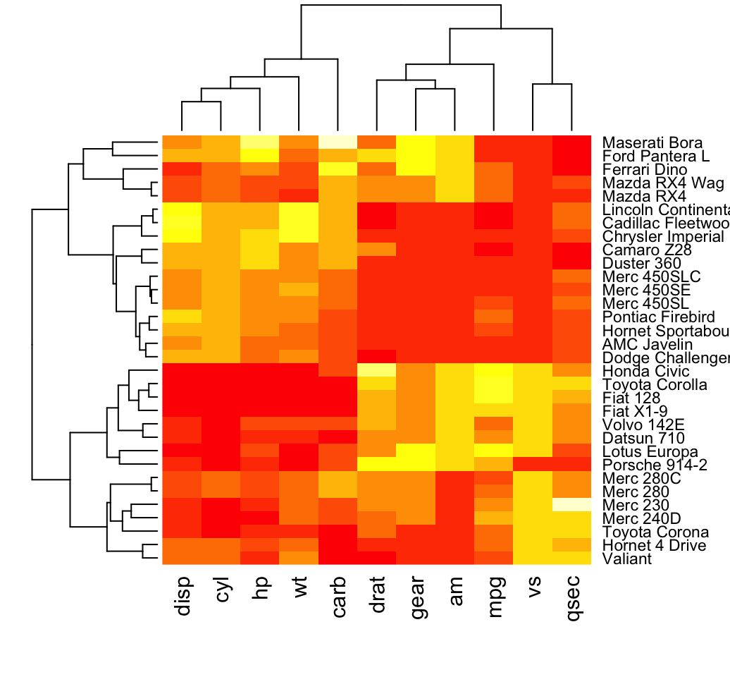
In the plot above, high values are in red and low values are in yellow.
It’s possible to specify a color palette using the argument col, which can be defined as follow:
- Using custom colors:
col<- colorRampPalette(c("red", "white", "blue"))(256)- Or, using RColorBrewer color palette:
library("RColorBrewer")
col <- colorRampPalette(brewer.pal(10, "RdYlBu"))(256)
Additionally, you can use the argument RowSideColors and ColSideColors to annotate rows and columns, respectively.
For example, in the the R code below will customize the heatmap as follow:
- An RColorBrewer color palette name is used to change the appearance
- The argument RowSideColors and ColSideColors are used to annotate rows and columns respectively. The expected values for these options are a vector containing color names specifying the classes for rows/columns.
# Use RColorBrewer color palette names
library("RColorBrewer")
col <- colorRampPalette(brewer.pal(10, "RdYlBu"))(256)
heatmap(df, scale = "none", col =  col,
        RowSideColors = rep(c("blue", "pink"), each = 16),
        ColSideColors = c(rep("purple", 5), rep("orange", 6)))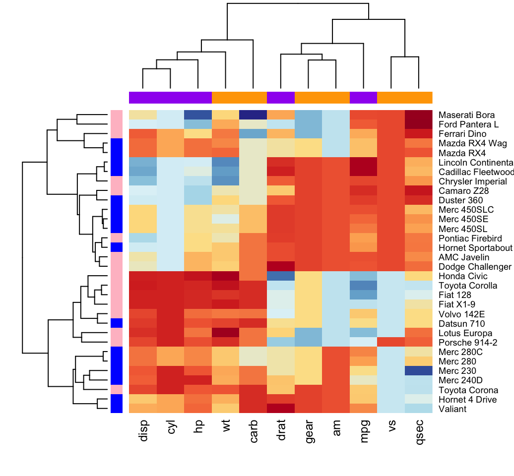
Enhanced heat maps: heatmap.2()
The function heatmap.2() [in gplots package] provides many extensions to the standard R heatmap() function presented in the previous section.
# install.packages("gplots")
library("gplots")
heatmap.2(df, scale = "none", col = bluered(100),
          trace = "none", density.info = "none")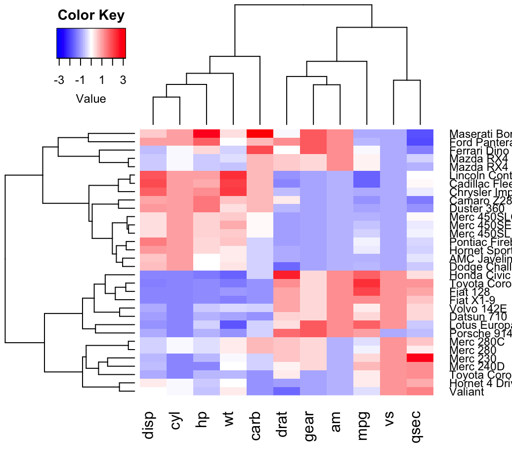
Other arguments can be used including:
- labRow, labCol
- hclustfun: hclustfun=function(x) hclust(x, method=“ward”)
In the R code above, the bluered() function [in gplots package] is used to generate a smoothly varying set of colors. You can also use the following color generator functions:
- colorpanel(n, low, mid, high)
- n: Desired number of color elements to be generated
- low, mid, high: Colors to use for the Lowest, middle, and highest values. mid may be omitted.
- redgreen(n), greenred(n), bluered(n) and redblue(n)
Pretty heat maps: pheatmap()
First, install the pheatmap package: install.packages(“pheatmap”); then type this:
library("pheatmap")
pheatmap(df, cutree_rows = 4)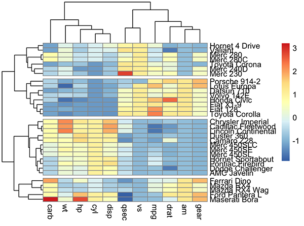
Arguments are available for changing the default clustering metric (“euclidean”) and method (“complete”). It’s also possible to annotate rows and columns using grouping variables.
Interactive heat maps: d3heatmap()
First, install the d3heatmap package: install.packages(“d3heatmap”); then type this:
library("d3heatmap")
d3heatmap(scale(mtcars), colors = "RdYlBu",
          k_row = 4, # Number of groups in rows
          k_col = 2 # Number of groups in columns
          )
The d3heamap() function makes it possible to:
- Put the mouse on a heatmap cell of interest to view the row and the column names as well as the corresponding value.
- Select an area for zooming. After zooming, click on the heatmap again to go back to the previous display
Enhancing heatmaps using dendextend
The package dendextend can be used to enhance functions from other packages. The mtcars data is used in the following sections. We’ll start by defining the order and the appearance for rows and columns using dendextend. These results are used in others functions from others packages.
The order and the appearance for rows and columns can be defined as follow:
library(dendextend)
# order for rows
Rowv  <- mtcars %>% scale %>% dist %>% hclust %>% as.dendrogram %>%
   set("branches_k_color", k = 3) %>% set("branches_lwd", 1.2) %>%
   ladderize
# Order for columns: We must transpose the data
Colv  <- mtcars %>% scale %>% t %>% dist %>% hclust %>% as.dendrogram %>%
   set("branches_k_color", k = 2, value = c("orange", "blue")) %>%
   set("branches_lwd", 1.2) %>%
   ladderize
The arguments above can be used in the functions below:
- The standard heatmap() function [in stats package]:
heatmap(scale(mtcars), Rowv = Rowv, Colv = Colv,
scale = "none")- The enhanced heatmap.2() function [in gplots package]:
library(gplots)
heatmap.2(scale(mtcars), scale = "none", col = bluered(100),
          Rowv = Rowv, Colv = Colv,
trace = "none", density.info = "none")- The interactive heatmap generator d3heatmap() function [in d3heatmap package]:
library("d3heatmap")
d3heatmap(scale(mtcars), colors = "RdBu",
          Rowv = Rowv, Colv = Colv)
Complex heatmap
ComplexHeatmap is an R/bioconductor package, developed by Zuguang Gu, which provides a flexible solution to arrange and annotate multiple heatmaps. It allows also to visualize the association between different data from different sources.
It can be installed as follow:
if (!requireNamespace("BiocManager", quietly = TRUE))
    install.packages("BiocManager")
BiocManager::install("ComplexHeatmap")
Simple heatmap
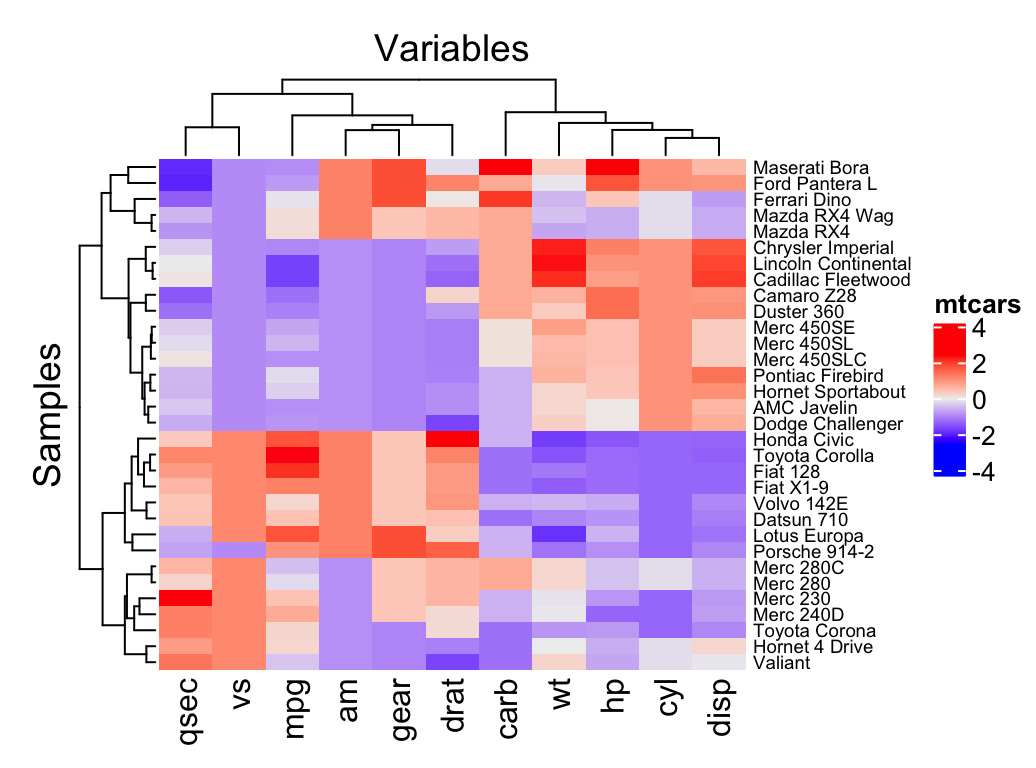
You can draw a simple heatmap as follow:
library(ComplexHeatmap)
Heatmap(df,
        name = "mtcars", #title of legend
        column_title = "Variables", row_title = "Samples",
        row_names_gp = gpar(fontsize = 7) # Text size for row names
        )
Additional arguments:
- show_row_names, show_column_names: whether to show row and column names, respectively. Default value is TRUE
- show_row_hclust, show_column_hclust: logical value; whether to show row and column clusters. Default is TRUE
- clustering_distance_rows, clustering_distance_columns: metric for clustering: “euclidean”, “maximum”, “manhattan”, “canberra”, “binary”, “minkowski”, “pearson”, “spearman”, “kendall”)
- clustering_method_rows, clustering_method_columns: clustering methods: “ward.D”, “ward.D2”, “single”, “complete”, “average”, … (see ?hclust).
To specify a custom colors, you must use the the colorRamp2() function [circlize package], as follow:
library(circlize)
mycols <- colorRamp2(breaks = c(-2, 0, 2),
                    colors = c("green", "white", "red"))
Heatmap(df, name = "mtcars", col = mycols)
It’s also possible to use RColorBrewer color palettes:
library("circlize")
library("RColorBrewer")
Heatmap(df, name = "mtcars",
        col = colorRamp2(c(-2, 0, 2), brewer.pal(n=3, name="RdBu")))
We can also customize the appearance of dendograms using the function color_branches() [dendextend package]:
library(dendextend)
row_dend = hclust(dist(df)) # row clustering
col_dend = hclust(dist(t(df))) # column clustering
Heatmap(df, name = "mtcars",
        row_names_gp = gpar(fontsize = 6.5),
        cluster_rows = color_branches(row_dend, k = 4),
        cluster_columns = color_branches(col_dend, k = 2))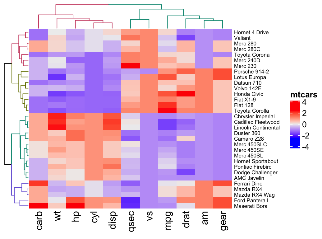
Splitting heatmap by rows
You can split the heatmap using either the k-means algorithm or a grouping variable.
It’s important to use the set.seed() function when performing k-means so that the results obtained can be reproduced precisely at a later time.
- To split the dendrogram using k-means, type this:
# Divide into 2 groups
set.seed(2)
Heatmap(df, name = "mtcars", k = 2)- To split by a grouping variable, use the argument split. In the following example we’ll use the levels of the factor variable cyl [in mtcars data set] to split the heatmap by rows. Recall that the column cyl corresponds to the number of cylinders.
# split by a vector specifying rowgroups
Heatmap(df, name = "mtcars", split = mtcars$cyl,
        row_names_gp = gpar(fontsize = 7))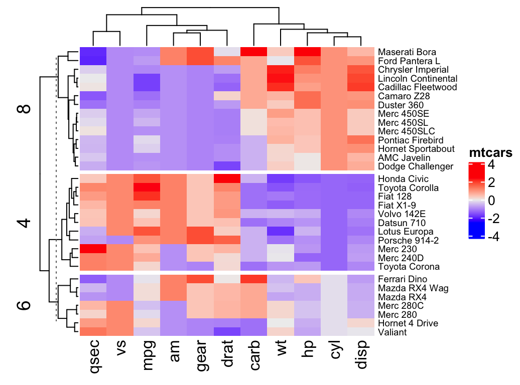
Note that, split can be also a data frame in which different combinations of levels split the rows of the heatmap.
# Split by combining multiple variables
Heatmap(df, name ="mtcars",
        split = data.frame(cyl = mtcars$cyl, am = mtcars$am),
        row_names_gp = gpar(fontsize = 7))
- It’s also possible to combine km and split:
Heatmap(df, name ="mtcars", col = mycol,
km = 2, split = mtcars$cyl)- If you want to use other partitioning method, rather than k-means, you can easily do it by just assigning the partitioning vector to split. In the R code below, we’ll use pam() function [cluster package]. pam() stands for Partitioning of the data into k clusters “around medoids”, a more robust version of K-means.
# install.packages("cluster")
library("cluster")
set.seed(2)
pa = pam(df, k = 3)
Heatmap(df, name = "mtcars", col = mycol,
        split = paste0("pam", pa$clustering))
Heatmap annotation
The HeatmapAnnotation class is used to define annotation on row or column. A simplified format is:
HeatmapAnnotation(df, name, col, show_legend)- df: a data.frame with column names
- name: the name of the heatmap annotation
- col: a list of colors which contains color mapping to columns in df
For the example below, we’ll transpose our data to have the observations in columns and the variables in rows.
df <- t(df)Simple annotation
A vector, containing discrete or continuous values, is used to annotate rows or columns. We’ll use the qualitative variables cyl (levels = “4”, “5” and “8”) and am (levels = “0” and “1”), and the continuous variable mpg to annotate columns.
For each of these 3 variables, custom colors are defined as follow:
# Define colors for each levels of qualitative variables
# Define gradient color for continuous variable (mpg)
col = list(cyl = c("4" = "green", "6" = "gray", "8" = "darkred"),
            am = c("0" = "yellow", "1" = "orange"),
            mpg = circlize::colorRamp2(c(17, 25),
                                       c("lightblue", "purple")) )
# Create the heatmap annotation
ha <- HeatmapAnnotation(
  cyl = mtcars$cyl, am = mtcars$am, mpg = mtcars$mpg,
  col = col
)

# Combine the heatmap and the annotation
Heatmap(df, name = "mtcars",
        top_annotation = ha)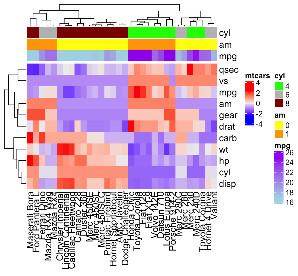
It’s possible to hide the annotation legend using the argument show_legend = FALSE as follow:
ha <- HeatmapAnnotation(
  cyl = mtcars$cyl, am = mtcars$am, mpg = mtcars$mpg,
  col = col, show_legend = FALSE
  )
Heatmap(df, name = "mtcars", top_annotation = ha)
Complex annotation
In this section we’ll see how to combine heatmap and some basic graphs to show the data distribution. For simple annotation graphics, the following functions can be used: anno_points(), anno_barplot(), anno_boxplot(), anno_density() and anno_histogram().
An example is shown below:
# Define some graphics to display the distribution of columns
.hist = anno_histogram(df, gp = gpar(fill = "lightblue"))
.density = anno_density(df, type = "line", gp = gpar(col = "blue"))
ha_mix_top = HeatmapAnnotation(
  hist = .hist, density = .density,
  height = unit(3.8, "cm")
  )
# Define some graphics to display the distribution of rows
.violin = anno_density(df, type = "violin",
                       gp = gpar(fill = "lightblue"), which = "row")
.boxplot = anno_boxplot(df, which = "row")
ha_mix_right = HeatmapAnnotation(violin = .violin, bxplt = .boxplot,
                              which = "row", width = unit(4, "cm"))
# Combine annotation with heatmap
Heatmap(df, name = "mtcars",
        column_names_gp = gpar(fontsize = 8),
        top_annotation = ha_mix_top) + ha_mix_right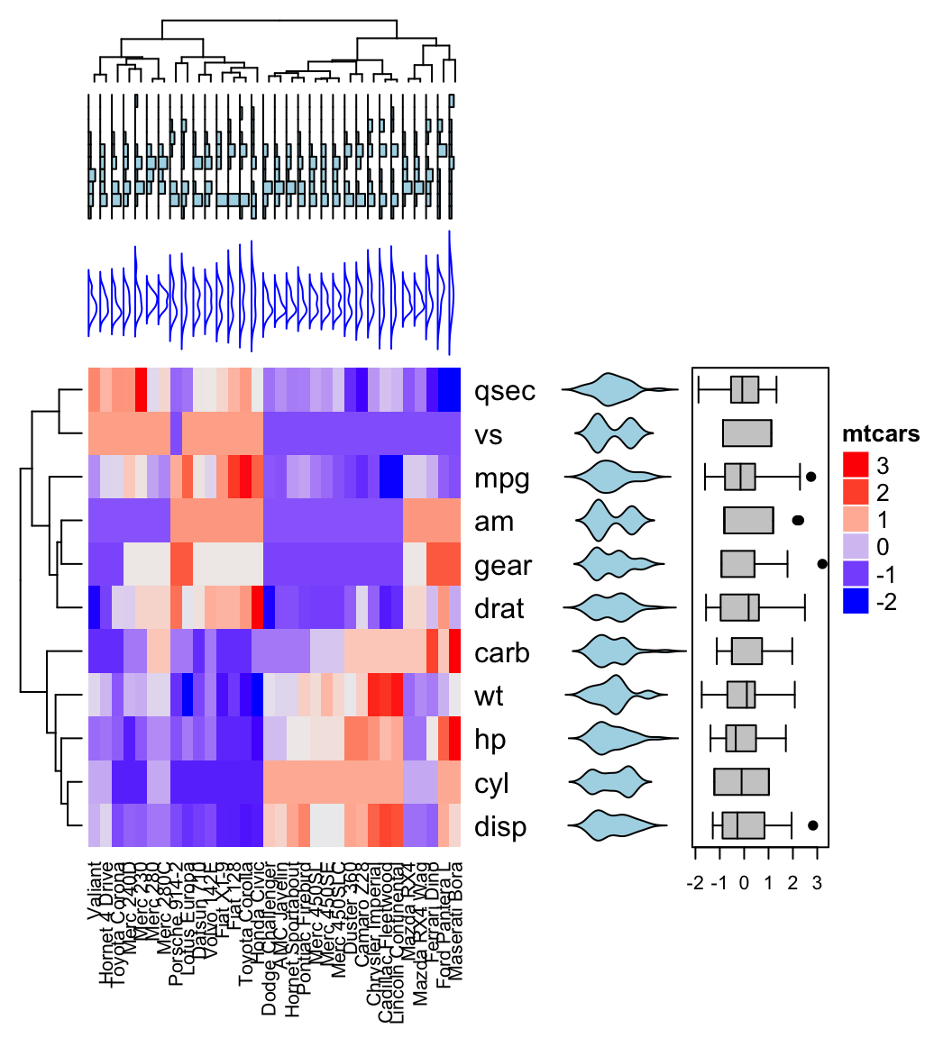
Combining multiple heatmaps
Multiple heatmaps can be arranged as follow:
# Heatmap 1
ht1 = Heatmap(df, name = "ht1", km = 2,
              column_names_gp = gpar(fontsize = 9))
# Heatmap 2
ht2 = Heatmap(df, name = "ht2",
        col = circlize::colorRamp2(c(-2, 0, 2), c("green", "white", "red")),
        column_names_gp = gpar(fontsize = 9))
# Combine the two heatmaps
ht1 + ht2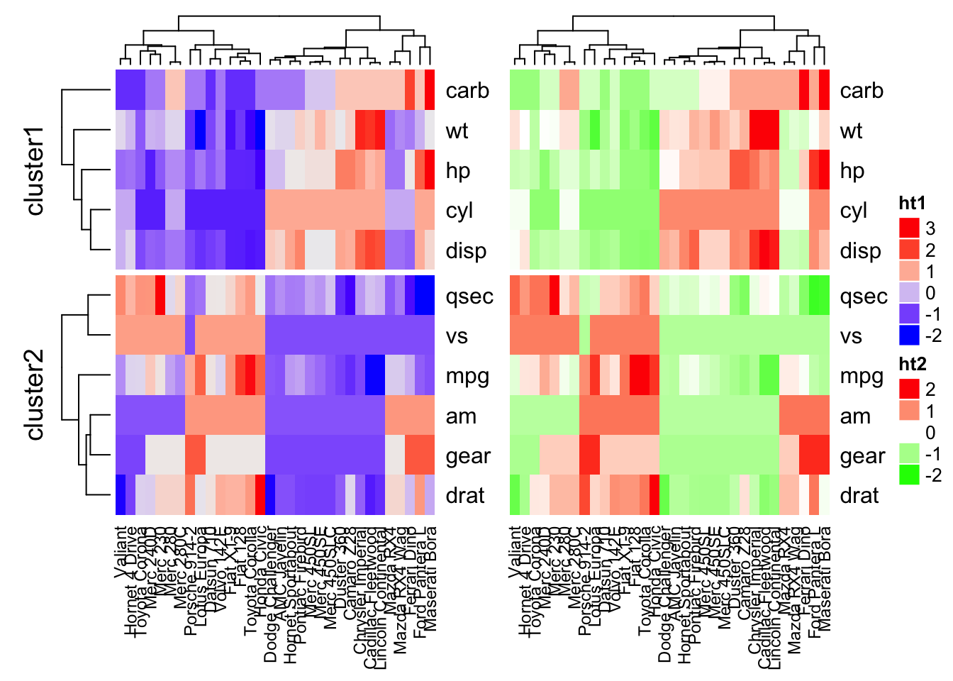
You can use the option width = unit(3, “cm”)) to control the size of the heatmaps.
Note that when combining multiple heatmaps, the first heatmap is considered as the main heatmap. Some settings of the remaining heatmaps are auto-adjusted according to the setting of the main heatmap. These include: removing row clusters and titles, and adding splitting.
The draw() function can be used to customize the appearance of the final image:
draw(ht1 + ht2,
    row_title = "Two heatmaps, row title",
    row_title_gp = gpar(col = "red"),
    column_title = "Two heatmaps, column title",
    column_title_side = "bottom",
    # Gap between heatmaps
    gap = unit(0.5, "cm"))
Legends can be removed using the arguments show_heatmap_legend = FALSE, show_annotation_legend = FALSE.
Application to gene expression matrix
In gene expression data, rows are genes and columns are samples. More information about genes can be attached after the expression heatmap such as gene length and type of genes.
expr <- readRDS(paste0(system.file(package = "ComplexHeatmap"),
                      "/extdata/gene_expression.rds"))
mat <- as.matrix(expr[, grep("cell", colnames(expr))])
type <- gsub("s\\d+_", "", colnames(mat))
ha = HeatmapAnnotation(
  df = data.frame(type = type),
   annotation_height = unit(4, "mm")
  )

Heatmap(mat, name = "expression", km = 5, top_annotation = ha,
    show_row_names = FALSE, show_column_names = FALSE) +
Heatmap(expr$length, name = "length", width = unit(5, "mm"),
    col = circlize::colorRamp2(c(0, 100000), c("white", "orange"))) +
Heatmap(expr$type, name = "type", width = unit(5, "mm")) +
Heatmap(expr$chr, name = "chr", width = unit(5, "mm"),
    col = circlize::rand_color(length(unique(expr$chr))))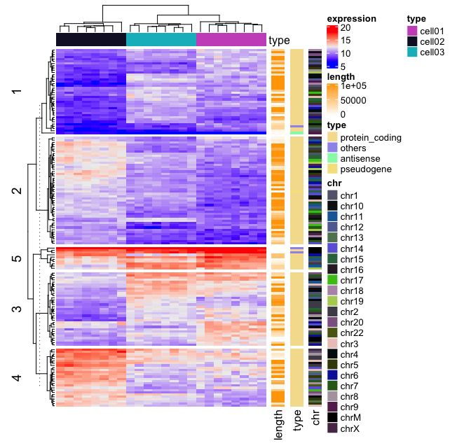
It’s also possible to visualize genomic alterations and to integrate different molecular levels (gene expression, DNA methylation, …). Read the vignette, on Bioconductor, for further examples.
Visualizing the distribution of columns in matrix
densityHeatmap(scale(mtcars))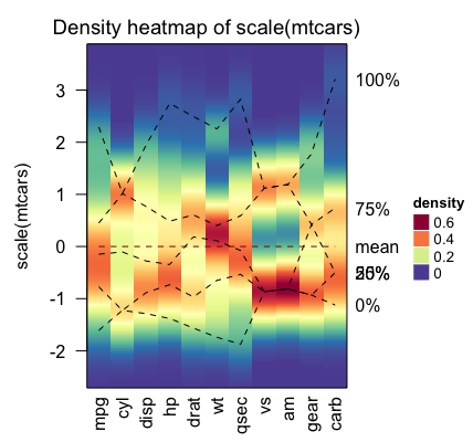
The dashed lines on the heatmap correspond to the five quantile numbers. The text for the five quantile levels are added in the right of the heatmap.
Summary
We described many functions for drawing heatmaps in R (from basic to complex heatmaps). A basic heatmap can be produced using either the R base function heatmap() or the function heatmap.2() [in the gplots package].
The pheatmap() function, in the package of the same name, creates pretty heatmaps, where ones has better control over some graphical parameters such as cell size.
The Heatmap() function [in ComplexHeatmap package] allows us to easily, draw, annotate and arrange complex heatmaps. This might be very useful in genomic fields.
Recommended for you
This section contains best data science and self-development resources to help you on your path.
Books - Data Science
Our Books
- Practical Guide to Cluster Analysis in R by A. Kassambara (Datanovia)
- Practical Guide To Principal Component Methods in R by A. Kassambara (Datanovia)
- Machine Learning Essentials: Practical Guide in R by A. Kassambara (Datanovia)
- R Graphics Essentials for Great Data Visualization by A. Kassambara (Datanovia)
- GGPlot2 Essentials for Great Data Visualization in R by A. Kassambara (Datanovia)
- Network Analysis and Visualization in R by A. Kassambara (Datanovia)
- Practical Statistics in R for Comparing Groups: Numerical Variables by A. Kassambara (Datanovia)
- Inter-Rater Reliability Essentials: Practical Guide in R by A. Kassambara (Datanovia)
Others
- R for Data Science: Import, Tidy, Transform, Visualize, and Model Data by Hadley Wickham & Garrett Grolemund
- Hands-On Machine Learning with Scikit-Learn, Keras, and TensorFlow: Concepts, Tools, and Techniques to Build Intelligent Systems by Aurelien Géron
- Practical Statistics for Data Scientists: 50 Essential Concepts by Peter Bruce & Andrew Bruce
- Hands-On Programming with R: Write Your Own Functions And Simulations by Garrett Grolemund & Hadley Wickham
- An Introduction to Statistical Learning: with Applications in R by Gareth James et al.
- Deep Learning with R by François Chollet & J.J. Allaire
- Deep Learning with Python by François Chollet

I had followed all the code but this error keeps popping up.
ha <- HeatmapAnnotation(annot_df, col = col)
Error: annotations should have names.
Any thought?
Thank you for pointing this out.
The error was due to an update to the ComplexHeatmap package.
I updated the article accordingly:
Hi Kassambara,
is there any chance to do the same heatmap without the mtcars legend? This may lead to a single colour in the heatmap. A single color in the heatmap with my own categorical variables is what I trying to do.
Also, when scaling the data, I tried to scale using the euclidean distance.. but then I can not make the heatmap. which distance is used by default when df <- scale (df)?
Thank you
could you please write a tutorial of consensus clustering heatmap? thanks
Thank you for your input, I will do that!
Hi Kassambara,
I tried to follow the steps given in the course to make a simple heatmap with my own data, but I received the following error message:
> bamboo head(bamboo, n = 8L)
Compounds LeavesDS LeavesRS CulmsDS CulmsRS
1 Arachidic acid 0.00 0.00 3.08 2.47
2 Behenic acid 0.00 0.00 3.43 2.52
3 Heptadecanoic acid 0.66 1.43 5.22 5.51
4 Hexacosanoic acid 3.61 3.58 9.57 9.81
5 Lignoceric acid 0.54 1.21 5.51 6.39
6 Linoleic acid 23.14 35.24 78.13 109.18
7 Linolenic acid 133.28 201.37 66.01 64.60
8 Myristic acid 0.00 1.70 4.32 2.37
> df bambooscale heatmap(bambooscale, scale = “row”)
I would like to know what I need to do to consider my column with categorical data in the heatmap, like the example using mtcars data.
Thanks!!!
Hey Kassambara, thanks for doing this posts and the site, I find myself using it rather often. I was wondering how is that scale() works with the mtcars as it looks like the whole data frame is not numeric (car numbers). Thanks a lot!
Have you ever tried using the NGCHMR package for making interactive heatmaps using R?
https://github.com/MD-Anderson-Bioinformatics/NGCHM-R
https://bioinformatics.mdanderson.org/public-software/ngchm/
Hi Kassambara,
Thanks for your tutorials, it’s really helpfull.
Concerning the “Application to gene expression matrix” part, i was wondering if you can choose spceific color for each type (for instance “protein coding” in red and “other” in black in your example) .
If so, let me know 🙂
Thank again,
Eldu
What does (256) mean in the color code?