In this article, you will learn how to easily create a ggplot histogram with density curve in R using a secondary y-axis. We’ll use the ggpubr package to create the plots and the cowplot package to align the graphs.
Contents:
Prerequisites
Load the required R packages:
library(ggpubr)
library(cowplot)
Data preparation
set.seed(1234)
wdata = data.frame(
  sex = factor(rep(c("F", "M"), each=200)),
  weight = c(rnorm(200, 55), rnorm(200, 58)))
head(wdata)
## sex weight
## 1 F 53.8
## 2 F 55.3
## 3 F 56.1
## 4 F 52.7
## 5 F 55.4
## 6 F 55.5Create histogram with density distribution on the same y axis
# Basic histogram without the density curve
gghistogram(
  wdata, x = "weight",
  add = "mean", rug = TRUE,
  fill = "sex", palette = c("#00AFBB", "#E7B800")
  )
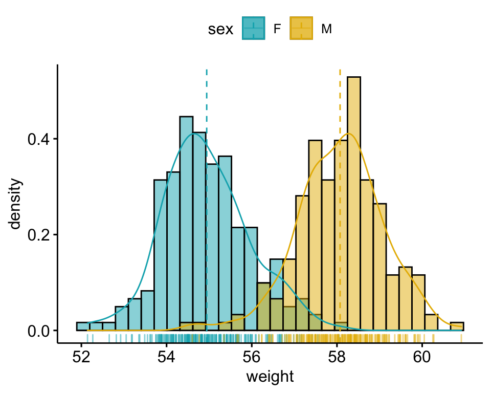
# Add the density curve on the same axis
gghistogram(
  wdata, x = "weight", y = "..density..",
  add = "mean", rug = TRUE,
  fill = "sex", palette = c("#00AFBB", "#E7B800"),
  add_density = TRUE
  )
Using a secondary y-axis for the density distribution
# 1. Create the histogram plot
phist <- gghistogram(
  wdata, x = "weight",
  add = "mean", rug = TRUE,
  fill = "sex", palette = c("#00AFBB", "#E7B800")
)

# 2. Create the density plot with y-axis on the right
# Remove x axis elements
pdensity <- ggdensity(
  wdata, x = "weight",
  color= "sex", palette = c("#00AFBB", "#E7B800"),
  alpha = 0
) +
  scale_y_continuous(expand = expansion(mult = c(0, 0.05)), position = "right")  +
  theme_half_open(11, rel_small = 1) +
  rremove("x.axis")+
  rremove("xlab") +
  rremove("x.text") +
  rremove("x.ticks") +
  rremove("legend")

# 3. Align the two plots and then overlay them.
aligned_plots <- align_plots(phist, pdensity, align="hv", axis="tblr")
ggdraw(aligned_plots[[1]]) + draw_plot(aligned_plots[[2]])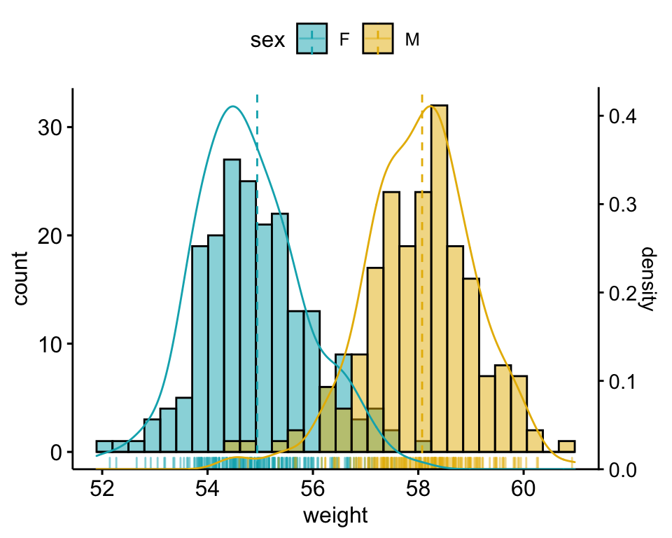
Conclusion
This article describes how to create a ggplot histogram with density curve in R using a secondary y-axis
Recommended for you
This section contains best data science and self-development resources to help you on your path.
Books - Data Science
Our Books
- Practical Guide to Cluster Analysis in R by A. Kassambara (Datanovia)
- Practical Guide To Principal Component Methods in R by A. Kassambara (Datanovia)
- Machine Learning Essentials: Practical Guide in R by A. Kassambara (Datanovia)
- R Graphics Essentials for Great Data Visualization by A. Kassambara (Datanovia)
- GGPlot2 Essentials for Great Data Visualization in R by A. Kassambara (Datanovia)
- Network Analysis and Visualization in R by A. Kassambara (Datanovia)
- Practical Statistics in R for Comparing Groups: Numerical Variables by A. Kassambara (Datanovia)
- Inter-Rater Reliability Essentials: Practical Guide in R by A. Kassambara (Datanovia)
Others
- R for Data Science: Import, Tidy, Transform, Visualize, and Model Data by Hadley Wickham & Garrett Grolemund
- Hands-On Machine Learning with Scikit-Learn, Keras, and TensorFlow: Concepts, Tools, and Techniques to Build Intelligent Systems by Aurelien Géron
- Practical Statistics for Data Scientists: 50 Essential Concepts by Peter Bruce & Andrew Bruce
- Hands-On Programming with R: Write Your Own Functions And Simulations by Garrett Grolemund & Hadley Wickham
- An Introduction to Statistical Learning: with Applications in R by Gareth James et al.
- Deep Learning with R by François Chollet & J.J. Allaire
- Deep Learning with Python by François Chollet
Version:
 Français


No Comments