This article describes how to add p-values onto horizontal ggplots using the R function stat_pvalue_manual() available in the ggpubr R package.
- Horizontal plots can be created using the function
coord_flip()[in ggplot2 package]. - When adding the p-values to a horizontal ggplot, you need to specify the option
coord.flip = TRUEin the functionstat_pvalue_manual()[in ggpubr package]. The optionsvjust(vertical adjustment) andhjust(horizontal adjustment) can be also specified to adapt the position of the p-value labels.
Note that, in some situations, the p-value labels are partially hidden by the plot top border. In these cases, the ggplot2 function scale_y_continuous(expand = expansion(mult = c(0, 0.1))) can be used to add more spaces between labels and the plot top border. The option mult = c(0, 0.1) indicates that 0% and 10% spaces are respectively added at the bottom and the top of the plot.
Contents:
Prerequisites
Make sure you have installed the following R packages:
ggpubrfor creating easily publication ready plotsrstatixprovides pipe-friendly R functions for easy statistical analyses.
Start by loading the following required packages:
library(ggpubr)
library(rstatix)
Data preparation
# Transform `dose` into factor variable
df <- ToothGrowth
df$dose <- as.factor(df$dose)
head(df, 3)
## len supp dose
## 1 4.2 VC 0.5
## 2 11.5 VC 0.5
## 3 7.3 VC 0.5Create simple plots
# Box plots
bxp <- ggboxplot(df, x = "dose", y = "len", fill = "dose",
                 palette = c("#00AFBB", "#E7B800", "#FC4E07"))

# Bar plots showing mean +/- SD
bp <- ggbarplot(df, x = "dose", y = "len", add = "mean_sd", fill = "dose",
                palette = c("#00AFBB", "#E7B800", "#FC4E07"))
Pairwise comparisons
Statistical test
In the following example, we’ll perform T-test using the function t_test() [rstatix package]. It’s also possible to use the function wilcox_test().
stat.test <- df %>% t_test(len ~ dose)
stat.test
## # A tibble: 3 x 10
## .y. group1 group2 n1 n2 statistic df p p.adj p.adj.signif
## * <chr> <chr> <chr> <int> <int> <dbl> <dbl> <dbl> <dbl> <chr>
## 1 len 0.5 1 20 20 -6.48 38.0 1.27e- 7 2.54e- 7 ****
## 2 len 0.5 2 20 20 -11.8 36.9 4.40e-14 1.32e-13 ****
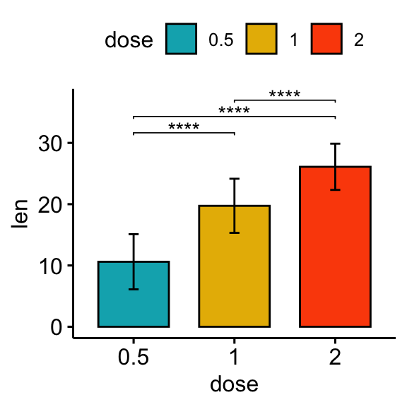
## 3 len 1 2 20 20 -4.90 37.1 1.91e- 5 1.91e- 5 ****Vertical plots with p-values
# Box plot
stat.test <- stat.test %>% add_xy_position(x = "dose")
bxp + stat_pvalue_manual(stat.test, label = "p.adj.signif", tip.length = 0.01)

# Bar plot
stat.test <- stat.test %>% add_xy_position(fun = "mean_sd", x = "dose")
bp + stat_pvalue_manual(stat.test, label = "p.adj.signif", tip.length = 0.01)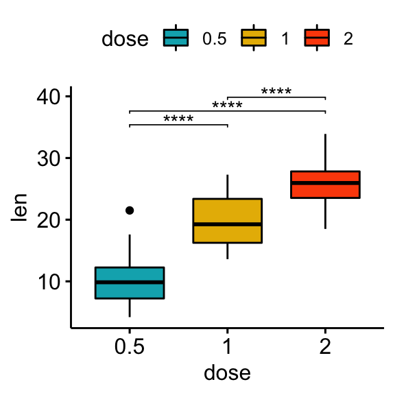
Horizontal plots with p-values
Using the adjusted p-value significance levels as labels
# Horizontal box plot with p-values
stat.test <- stat.test %>% add_xy_position(x = "dose")
bxp +
  stat_pvalue_manual(
    stat.test, label = "p.adj.signif", tip.length = 0.01,
    coord.flip = TRUE
    ) +
  coord_flip()

# Horizontal bar plot with p-values
stat.test <- stat.test %>% add_xy_position(fun = "mean_sd", x = "dose")
bp + stat_pvalue_manual(
  stat.test, label = "p.adj.signif", tip.length = 0.01,
  coord.flip = TRUE
  ) +
  coord_flip()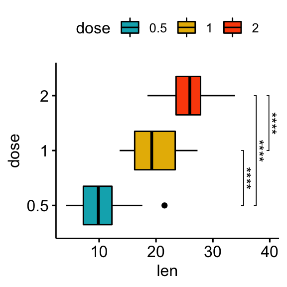

Using the adjusted p-values as labels
# Using `p.adj` as labels
stat.test <- stat.test %>% add_xy_position(x = "dose")
bxp +
  stat_pvalue_manual(
    stat.test, label = "p.adj", tip.length = 0.01,
    coord.flip = TRUE
    ) +
  coord_flip()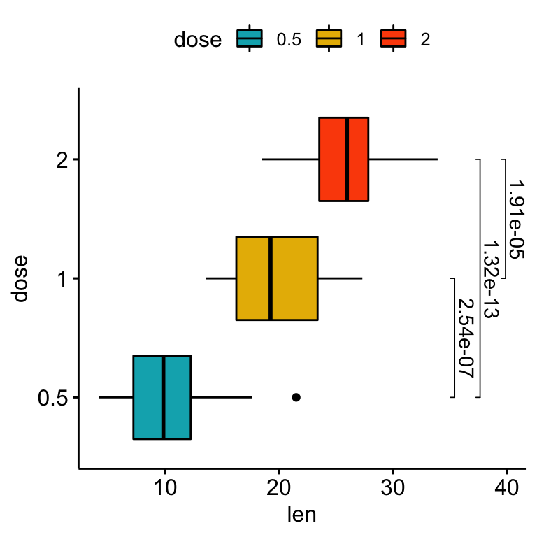
# Change the orientation angle of the p-values
# Adjust the position of p-values using vjust and hjust
# Add more spaces between labels and the plot border
bxp +
  stat_pvalue_manual(
    stat.test, label = "p.adj", tip.length = 0.01,
    coord.flip = TRUE, angle = 0,
    hjust = 0, vjust = c(0, 1.2, 0)
    ) +
  scale_y_continuous(expand = expansion(mult = c(0.05, 0.3))) +
coord_flip() 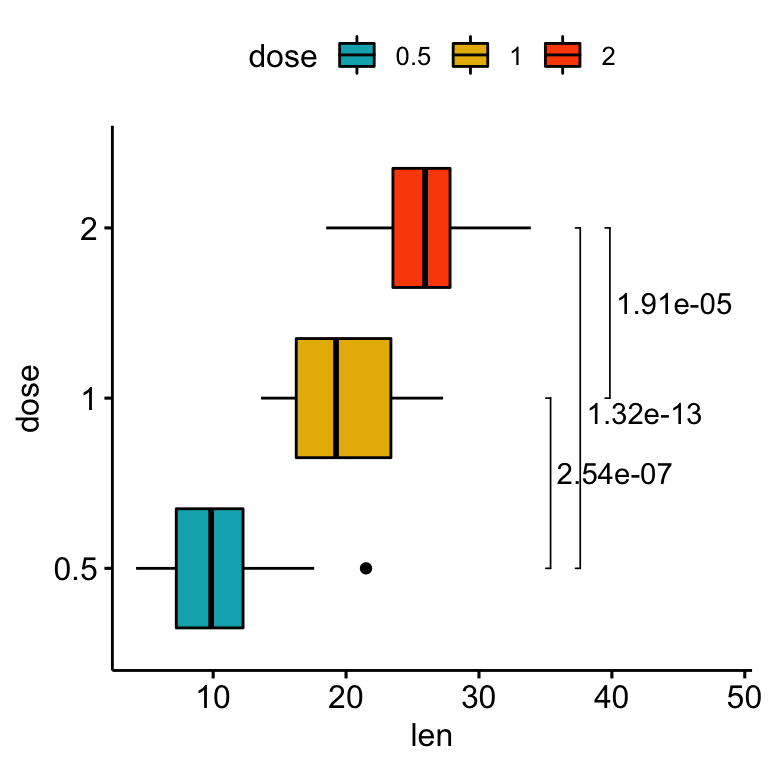
Comparisons against reference groups
Statistical tests
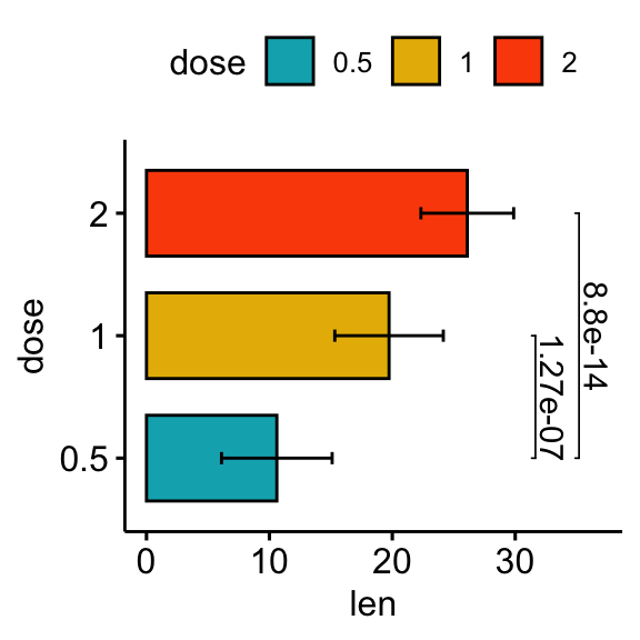
stat.test <- df %>% t_test(len ~ dose, ref.group = "0.5")
stat.test
## # A tibble: 2 x 10
## .y. group1 group2 n1 n2 statistic df p p.adj p.adj.signif
## * <chr> <chr> <chr> <int> <int> <dbl> <dbl> <dbl> <dbl> <chr>
## 1 len 0.5 1 20 20 -6.48 38.0 1.27e- 7 1.27e- 7 ****
## 2 len 0.5 2 20 20 -11.8 36.9 4.40e-14 8.80e-14 ****Vertical plots with p-values
# Vertical box plot with p-values
stat.test <- stat.test %>% add_xy_position(x = "dose")
bxp +
stat_pvalue_manual(stat.test, label = "p.adj", tip.length = 0.01) +
scale_y_continuous(expand = expansion(mult = c(0.05, 0.1)))
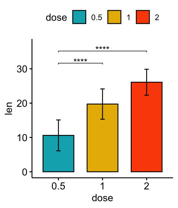
# Vertical bar plot with p-values
stat.test <- stat.test %>% add_xy_position(fun = "mean_sd", x = "dose")
bp +
stat_pvalue_manual(stat.test, label = "p.adj.signif", tip.length = 0.01) +
scale_y_continuous(expand = expansion(mult = c(0.05, 0.1)))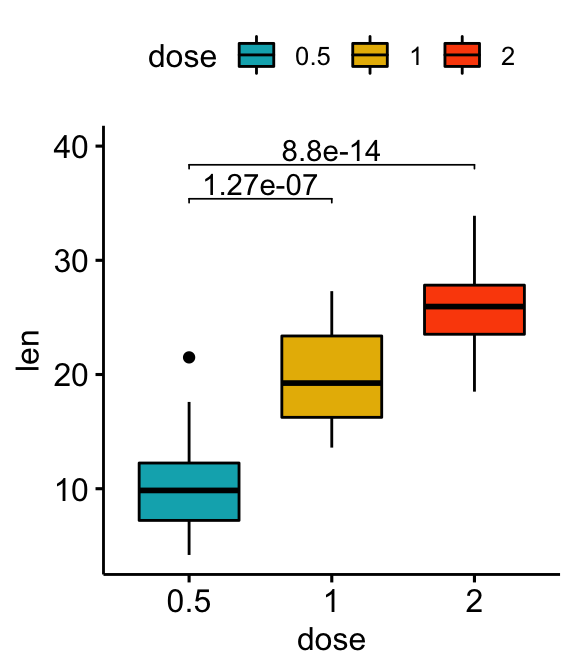
Horizontal plots with p-values
# Horizontal box plot with p-values
stat.test <- stat.test %>% add_xy_position(x = "dose")
bxp +
  stat_pvalue_manual(
    stat.test, label = "p.adj", tip.length = 0.01,
    coord.flip = TRUE
    ) +
  scale_y_continuous(expand = expansion(mult = c(0.05, 0.1))) +
  coord_flip()

# Horizontal bar plot with p-values
stat.test <- stat.test %>% add_xy_position(fun = "mean_sd", x = "dose")
bp +
  stat_pvalue_manual(
    stat.test, label = "p.adj", tip.length = 0.01,
    coord.flip = TRUE
    ) +
  scale_y_continuous(expand = expansion(mult = c(0.05, 0.1))) +
  coord_flip()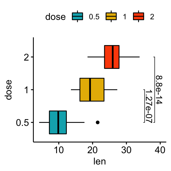
# Show p-values at x = "group2"
stat.test <- stat.test %>% add_xy_position(x = "dose")
bxp +
stat_pvalue_manual(
stat.test, label = "p = {p.adj}", tip.length = 0.01,
coord.flip = TRUE, x = "group2", hjust = 0.4
) +
scale_y_continuous(expand = expansion(mult = c(0.05, 0.2))) +
coord_flip()
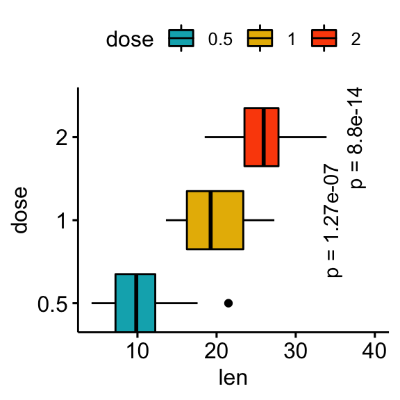
# Make the p-values horizontal using the option angle
stat.test <- stat.test %>% add_xy_position(x = "dose")
bxp +
stat_pvalue_manual(
stat.test, label = "p = {p.adj}", tip.length = 0.01,
coord.flip = TRUE, x = "group2", angle = 90
) +
scale_y_continuous(expand = expansion(mult = c(0.05, 0.1))) +
scale_x_discrete(expand = expansion(mult = c(0.05, 0.3))) +
coord_flip()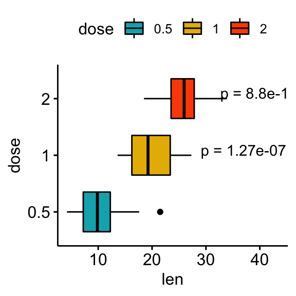
Conclusion
This article describes how to add p-values onto horizontal ggplots using the R function stat_pvalue_manual() available in the ggpubr R package. See other related frequently asked questions: ggpubr FAQ.
Recommended for you
This section contains best data science and self-development resources to help you on your path.
Books - Data Science
Our Books
- Practical Guide to Cluster Analysis in R by A. Kassambara (Datanovia)
- Practical Guide To Principal Component Methods in R by A. Kassambara (Datanovia)
- Machine Learning Essentials: Practical Guide in R by A. Kassambara (Datanovia)
- R Graphics Essentials for Great Data Visualization by A. Kassambara (Datanovia)
- GGPlot2 Essentials for Great Data Visualization in R by A. Kassambara (Datanovia)
- Network Analysis and Visualization in R by A. Kassambara (Datanovia)
- Practical Statistics in R for Comparing Groups: Numerical Variables by A. Kassambara (Datanovia)
- Inter-Rater Reliability Essentials: Practical Guide in R by A. Kassambara (Datanovia)
Others
- R for Data Science: Import, Tidy, Transform, Visualize, and Model Data by Hadley Wickham & Garrett Grolemund
- Hands-On Machine Learning with Scikit-Learn, Keras, and TensorFlow: Concepts, Tools, and Techniques to Build Intelligent Systems by Aurelien Géron
- Practical Statistics for Data Scientists: 50 Essential Concepts by Peter Bruce & Andrew Bruce
- Hands-On Programming with R: Write Your Own Functions And Simulations by Garrett Grolemund & Hadley Wickham
- An Introduction to Statistical Learning: with Applications in R by Gareth James et al.
- Deep Learning with R by François Chollet & J.J. Allaire
- Deep Learning with Python by François Chollet
Version:
 Français


Thank you for another excellent guide.
I would like to ask if it is possible to show only the upper standard deviation line (+ sd) on the barplot (ggbarplot) chart.
Best wishes
Thank you for the positive feedback, highly appreciated.
It’s possible to show only the upper error bars by specifying the option
error.plot = "upper_errorbar":Thank you for the quick reply.
Works perfectly 🙂
Thank you! Especially the part on how to rotate the angle of the p-values on the barplot was extremely helpful to me 🙂