This article how to visualize distribution in R using density ridgeline. The density ridgeline plot [ggridges package] is an alternative to the standard geom_density() [ggplot2 R package] function that can be useful for visualizing changes in distributions, of a continuous variable, over time or space. Ridgeline plots are partially overlapping line plots that create the impression of a mountain range.
You will learn how to:
- Create basic density ridgeline plots
- Add gradient fill colors under the curves
- Add summary statistics such as quantile lines on the density plots
- Add original data points onto the density curves
![]()
Contents:
Prerequisites
Load required R packages:
library(ggplot2)
library(ggridges)
theme_set(theme_minimal())
Key R functions:
geom_density_ridges(): first estimates data densities and then draws those using ridgelines. It arranges multiple density plots in a staggered fashion.
Basic density ridgeline plots
Key R functions:
geom_density_ridges(): Estimates data densities and then draws those using ridgelines. It arranges multiple density plots in a staggered fashion.
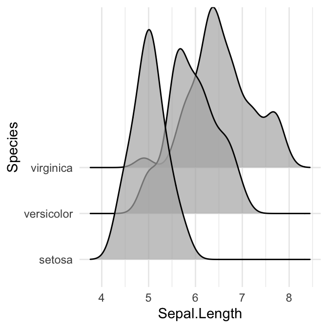
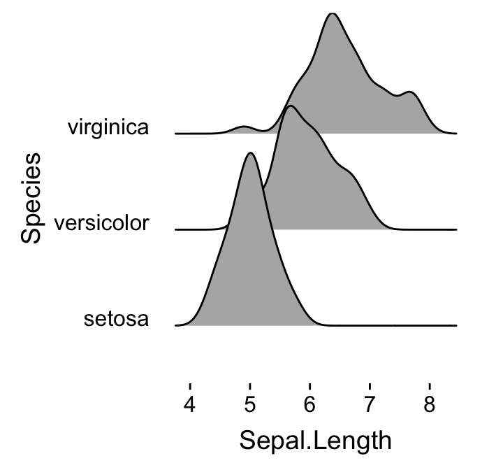
# Opened polygons
ggplot(iris, aes(x = Sepal.Length, y = Species, group = Species)) +
geom_density_ridges(fill = "#00AFBB")
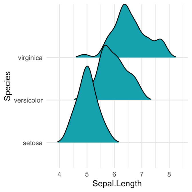
# Closed polygons
ggplot(iris, aes(x = Sepal.Length, y = Species, group = Species)) +
geom_density_ridges2(fill = "#00AFBB")
# Cut off the trailin tails.
# Specify `rel_min_height`: a percent cutoff
ggplot(iris, aes(x = Sepal.Length, y = Species)) +
geom_density_ridges(fill = "#00AFBB", rel_min_height = 0.01)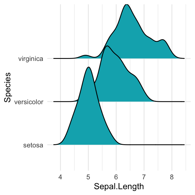

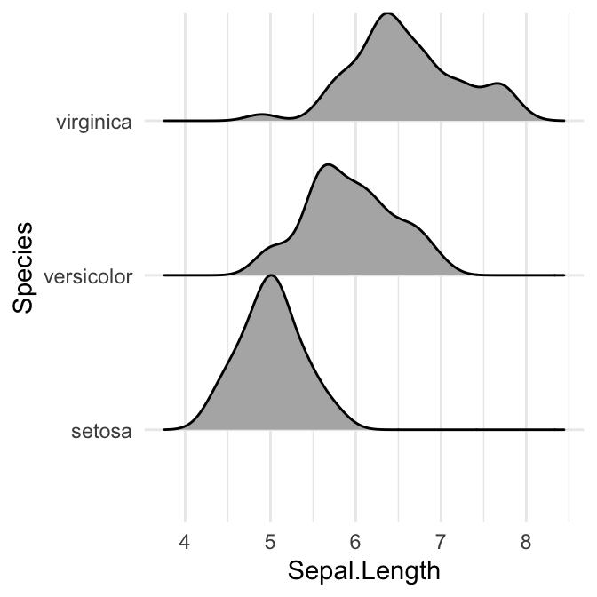
Note that, the grouping aesthetic does not need to be provided if a categorical variable is mapped onto the y axis, but it does need to be provided if the variable is numerical.
Control the extent to which the different densities overlap. You can control the overlap between the different density plots using the scale option. Default value is 1. Smaller values create a separation between the curves, and larger values create more overlap.
# scale = 0.6, not touching
ggplot(iris, aes(x = Sepal.Length, y = Species)) +
geom_density_ridges(scale = 0.6)
# scale = 1, exactly touching
ggplot(iris, aes(x = Sepal.Length, y = Species)) +
geom_density_ridges(scale = 1)
# scale = 5, substantial overlap
ggplot(iris, aes(x = Sepal.Length, y = Species)) +
geom_density_ridges(scale = 5, alpha = 0.7)
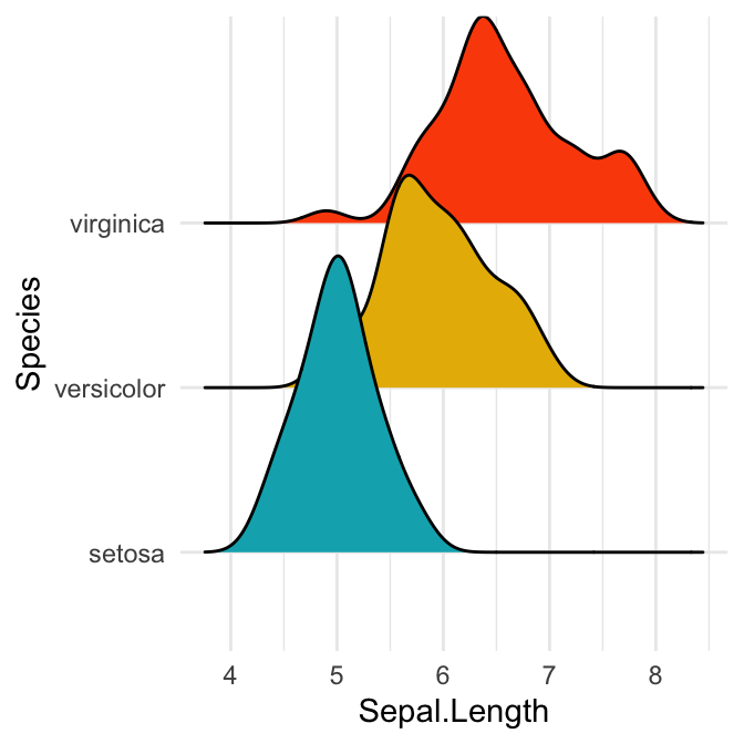
# Change the density area fill colors by groups
ggplot(iris, aes(x = Sepal.Length, y = Species)) +
geom_density_ridges(aes(fill = Species)) +
scale_fill_manual(values = c("#00AFBB", "#E7B800", "#FC4E07")) +
theme(legend.position = "none")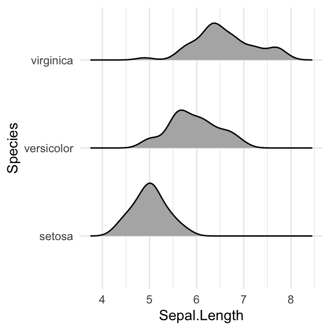
Density curves with gradient fill colors along the x axis
This effect can be achieved with the function geom_density_ridges_gradient(), which works like geom_density_ridges, except that it allows for varying fill colors.
Note that, for technical reasons, the geom_density_ridges_gradient() do not allow for alpha transparency in the fill.
Visualize the Lincoln weather data:
- Data set:
lincoln_weather[in ggridges]. Weather in Lincoln, Nebraska in 2016. - Create the density ridge plots of the
Mean TemperaturebyMonthand change the fill color according to the temperature value (on x axis).
ggplot(
  lincoln_weather,
  aes(x = `Mean Temperature [F]`, y = `Month`, fill = stat(x))
  ) +
  geom_density_ridges_gradient(scale = 3, size = 0.3, rel_min_height = 0.01) +
  scale_fill_viridis_c(name = "Temp. [F]", option = "C") +
labs(title = 'Temperatures in Lincoln NE') 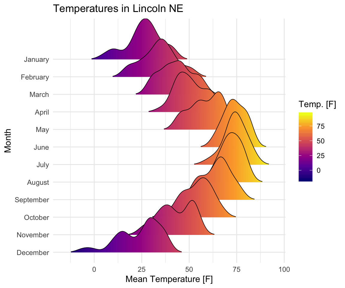
Add summary statistic lines
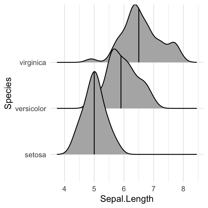
Add quantile lines
Key R function: stat_density_ridges(). By default, three lines are drawn, corresponding to the first, second, and third quartile.
# Add quantiles Q1, Q2 (median) and Q3
ggplot(iris, aes(x = Sepal.Length, y = Species)) +
stat_density_ridges(quantile_lines = TRUE)
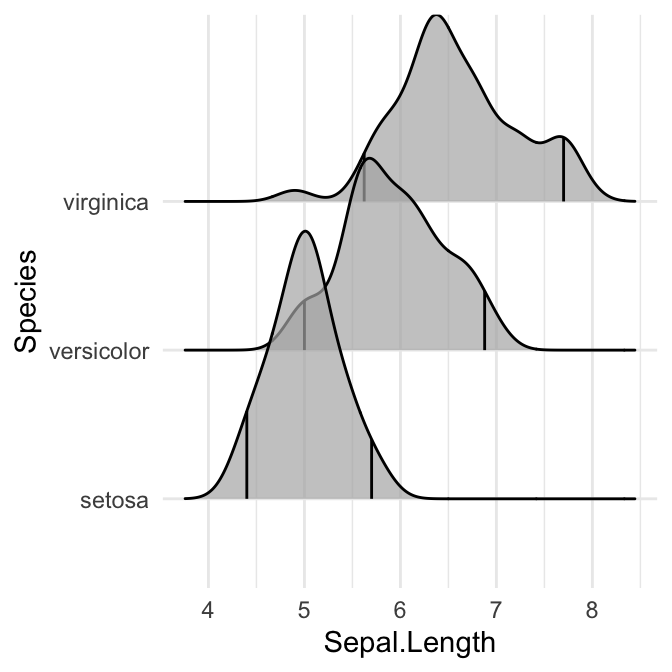
# Show only the median line (50%)
# Use quantiles = 2 (for Q2) or quantiles = 50/100
ggplot(iris, aes(x = Sepal.Length, y = Species)) +
stat_density_ridges(quantile_lines = TRUE, quantiles = 0.5)
# Indicate the 2.5% and 97.5% tails
ggplot(iris, aes(x = Sepal.Length, y = Species)) +
stat_density_ridges(quantile_lines = TRUE, quantiles = c(0.025, 0.975), alpha = 0.7)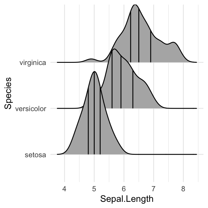
Color the density area by quantiles
You need to specify the option calc_ecdf = TRUE required for calculating quantiles. The ECDF represents the empirical cumulative density function for the distribution.
# Color by quantiles
ggplot(iris, aes(x = Sepal.Length, y = Species, fill = factor(stat(quantile)))) +
  stat_density_ridges(
    geom = "density_ridges_gradient", calc_ecdf = TRUE,
    quantiles = 4, quantile_lines = TRUE
  ) +
  scale_fill_viridis_d(name = "Quartiles")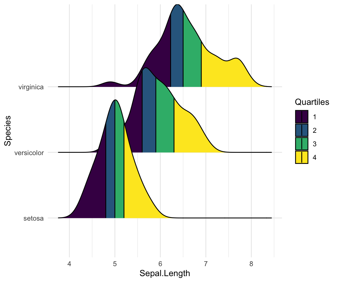
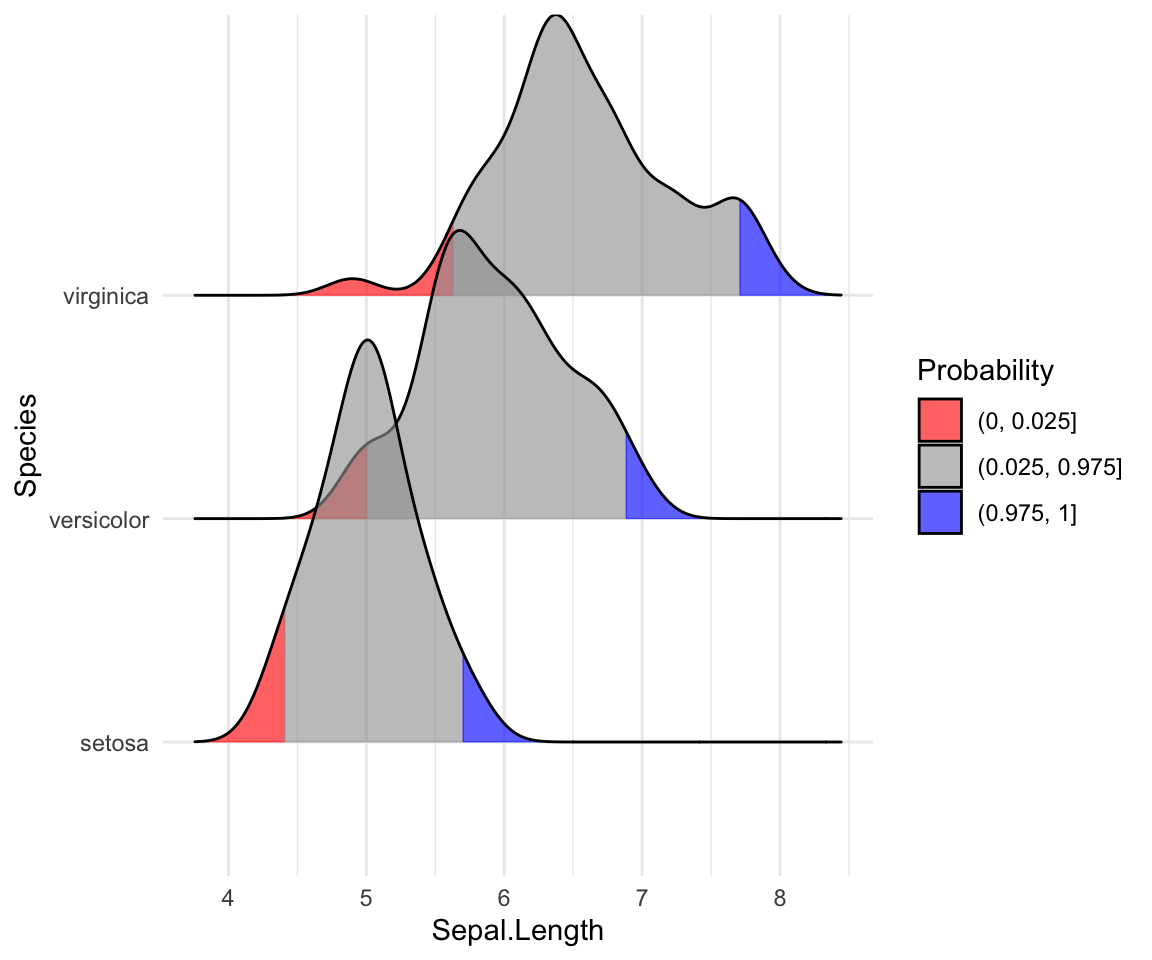
# Highlight the tails of the distributions
ggplot(iris, aes(x = Sepal.Length, y = Species, fill = factor(stat(quantile)))) +
  stat_density_ridges(
    geom = "density_ridges_gradient",
    calc_ecdf = TRUE,
    quantiles = c(0.025, 0.975)
  ) +
  scale_fill_manual(
    name = "Probability", values = c("#FF0000A0", "#A0A0A0A0", "#0000FFA0"),
    labels = c("(0, 0.025]", "(0.025, 0.975]", "(0.975, 1]")
  )
Color the density curves by probabilities
When calc_ecdf = TRUE, we also have access to a calculated aesthetic stat(ecdf), which represents the empirical cumulative density function for the distribution. This allows us to map the probabilities directly onto color.
ggplot(iris, aes(x = Sepal.Length, y = Species, fill = 0.5 - abs(0.5 - stat(ecdf)))) +
  stat_density_ridges(geom = "density_ridges_gradient", calc_ecdf = TRUE) +
  scale_fill_viridis_c(name = "Tail probability", direction = -1)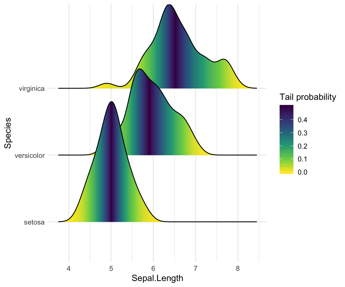
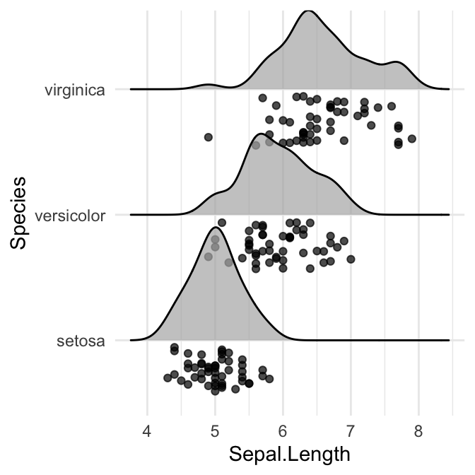
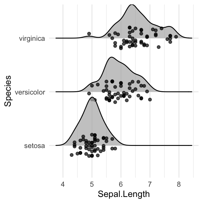
Add the original data points onto the density curves
This can be done by setting jittered_points = TRUE, either in stat_density_ridges or in geom_density_ridges.
The position of data points can be controlled using the following options:
position = "sina": Randomly distributes points in a ridgeline plot between baseline and ridgeline. This is the default option.position = "jitter": Randomly jitter the points in a ridgeline plot. Points are randomly shifted up and down and/or left and right.position = "raincloud": Creates a cloud of randomly jittered points below a ridgeline plot.
# Add jittered points
ggplot(iris, aes(x = Sepal.Length, y = Species)) +
geom_density_ridges(jittered_points = TRUE)
# Control the position of points
# position = "raincloud"
ggplot(iris, aes(x = Sepal.Length, y = Species)) +
geom_density_ridges(
jittered_points = TRUE, position = "raincloud",
alpha = 0.7, scale = 0.9
)
# position = "points_jitter"
ggplot(iris, aes(x = Sepal.Length, y = Species)) +
geom_density_ridges(
jittered_points = TRUE, position = "points_jitter",
alpha = 0.7, scale = 0.9
)
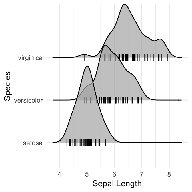
# Add marginal rug
ggplot(iris, aes(x = Sepal.Length, y = Species)) +
geom_density_ridges(
jittered_points = TRUE,
position = position_points_jitter(width = 0.05, height = 0),
point_shape = '|', point_size = 3, point_alpha = 1, alpha = 0.7,
)
Styling the jittered points and add quantile lines.
# Styling jittered points
ggplot(iris, aes(x = Sepal.Length, y = Species, fill = Species)) +
  geom_density_ridges(
    aes(point_color = Species, point_fill = Species, point_shape = Species),
    alpha = .2, point_alpha = 1, jittered_points = TRUE
  ) +
  scale_point_color_hue(l = 40) +
  scale_discrete_manual(aesthetics = "point_shape", values = c(21, 22, 23))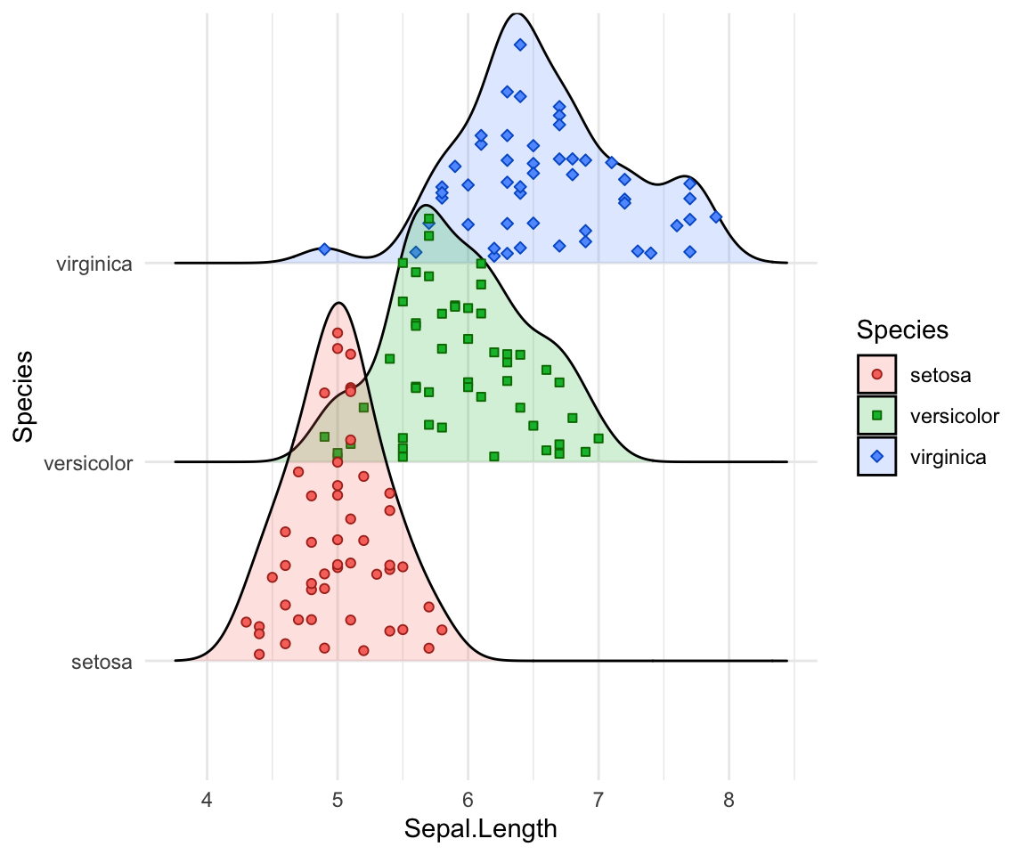
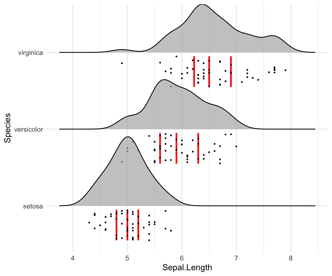
# Styling vertical quantile lines
ggplot(iris, aes(x = Sepal.Length, y = Species)) +
  geom_density_ridges(
    jittered_points = TRUE, quantile_lines = TRUE, scale = 0.9, alpha = 0.7,
    vline_size = 1, vline_color = "red",
    point_size = 0.4, point_alpha = 1,
    position = position_raincloud(adjust_vlines = TRUE)
  )
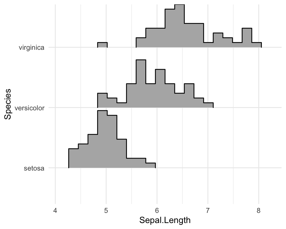
Create histogram distributions using ridgeline
Use the following options:
stat = "binline": Creates histogram plotsdraw_baseline = FALSE: Removes trailing lines to either side of the histogram. For histograms, therel_min_heightparameter doesn’t work very well.
ggplot(iris, aes(x = Sepal.Length, y = Species, height = stat(density))) +
  geom_density_ridges(
    stat = "binline", bins = 20, scale = 0.95,
    draw_baseline = FALSE
    )
Change themes
# Use theme_ridges()
ggplot(iris, aes(x = Sepal.Length, y = Species)) +
  geom_density_ridges() +
  theme_ridges()
# Remove grids
ggplot(iris, aes(x = Sepal.Length, y = Species)) +
  geom_density_ridges() +
  theme_ridges(grid = FALSE, center_axis_labels = TRUE)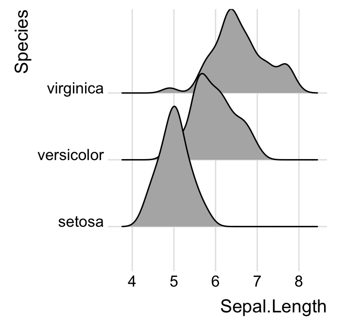
Conclusion
This article how to visualize distribution in R using density ridgeline.
Recommended for you
This section contains best data science and self-development resources to help you on your path.
Books - Data Science
Our Books
- Practical Guide to Cluster Analysis in R by A. Kassambara (Datanovia)
- Practical Guide To Principal Component Methods in R by A. Kassambara (Datanovia)
- Machine Learning Essentials: Practical Guide in R by A. Kassambara (Datanovia)
- R Graphics Essentials for Great Data Visualization by A. Kassambara (Datanovia)
- GGPlot2 Essentials for Great Data Visualization in R by A. Kassambara (Datanovia)
- Network Analysis and Visualization in R by A. Kassambara (Datanovia)
- Practical Statistics in R for Comparing Groups: Numerical Variables by A. Kassambara (Datanovia)
- Inter-Rater Reliability Essentials: Practical Guide in R by A. Kassambara (Datanovia)
Others
- R for Data Science: Import, Tidy, Transform, Visualize, and Model Data by Hadley Wickham & Garrett Grolemund
- Hands-On Machine Learning with Scikit-Learn, Keras, and TensorFlow: Concepts, Tools, and Techniques to Build Intelligent Systems by Aurelien Géron
- Practical Statistics for Data Scientists: 50 Essential Concepts by Peter Bruce & Andrew Bruce
- Hands-On Programming with R: Write Your Own Functions And Simulations by Garrett Grolemund & Hadley Wickham
- An Introduction to Statistical Learning: with Applications in R by Gareth James et al.
- Deep Learning with R by François Chollet & J.J. Allaire
- Deep Learning with Python by François Chollet
Version:
 Français


Very nice and useful tutorial! I would just like to ask how you could add the frequency value on the y-axis. In some cases it might be useful to display it.