
This article describes how to display the last value of each line as a label using the ggplot2 R package. Different solutions are provided using either the ggrepel text labeling or the ggplot2 secondary axis functions.
Contents:
Prerequisites
Required R packages:
tidyverse: easy data manipulation and visualizationggrepel: providesgeomsfor ggplot2 to repel overlapping text labels:geom_text_repel() and geom_label_repel()
# Load required R packages
library(tidyverse)
library(ggrepel)
# Set ggplot2 default theme to theme_bw()
theme_set(theme_bw())

# Demo data
df <- tibble::tribble(
      ~Species, ~Petal.Length, ~Petal.Width, ~Sepal.Length, ~Sepal.Width,
      "setosa",         1.462,        0.246,         5.006,        3.428,
  "versicolor",          4.26,        1.326,         5.936,         2.77,
   "virginica",         5.552,        2.026,         6.588,        2.974
  )
df
## # A tibble: 3 x 5
## Species Petal.Length Petal.Width Sepal.Length Sepal.Width
## <chr> <dbl> <dbl> <dbl> <dbl>
## 1 setosa 1.46 0.246 5.01 3.43
## 2 versicolor 4.26 1.33 5.94 2.77
## 3 virginica 5.55 2.03 6.59 2.97# Transform the data into long format
# Put Petal.Length to Sepal.Width in the same column
df_long <- df %>%
pivot_longer(
Petal.Length:Sepal.Width,
names_to = "variable", values_to = "value"
)
df_long## # A tibble: 12 x 3
## Species variable value
## <chr> <chr> <dbl>
## 1 setosa Petal.Length 1.46
## 2 setosa Petal.Width 0.246
## 3 setosa Sepal.Length 5.01
## 4 setosa Sepal.Width 3.43
## 5 versicolor Petal.Length 4.26
## 6 versicolor Petal.Width 1.33
## # … with 6 more rowsUsing ggrepel to add labels to the line ends
Examples for discrete x-axis
# Basic line plot
lp <- ggplot(df_long, aes(x = Species, y = value, group = variable)) +
  geom_line(aes(color = variable)) +
  geom_point() +
  theme(legend.position = "top")

# Filter the last values and add onto the line plot
# Corresponds to the `virginica` species
data_ends <- df_long %>% filter(Species == "virginica")
lp +
  geom_text_repel(
    aes(label = value), data = data_ends,
    fontface ="plain", color = "black", size = 3
    )
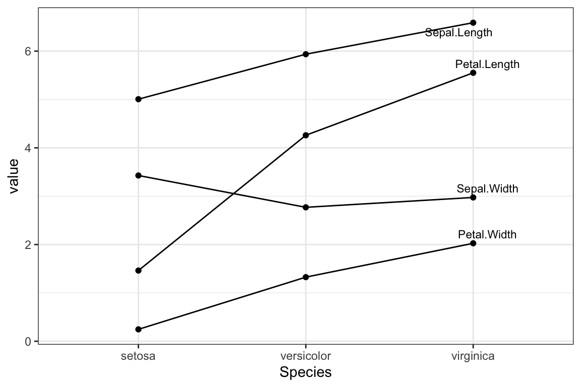
# Use variable names as labels
lp2 <- ggplot(df_long, aes(x = Species, y = value, group = variable)) +
  geom_line() +
  geom_point()
lp2 +
  geom_text_repel(
    aes(label = variable), data = data_ends,
    color = "black", size = 3
    )
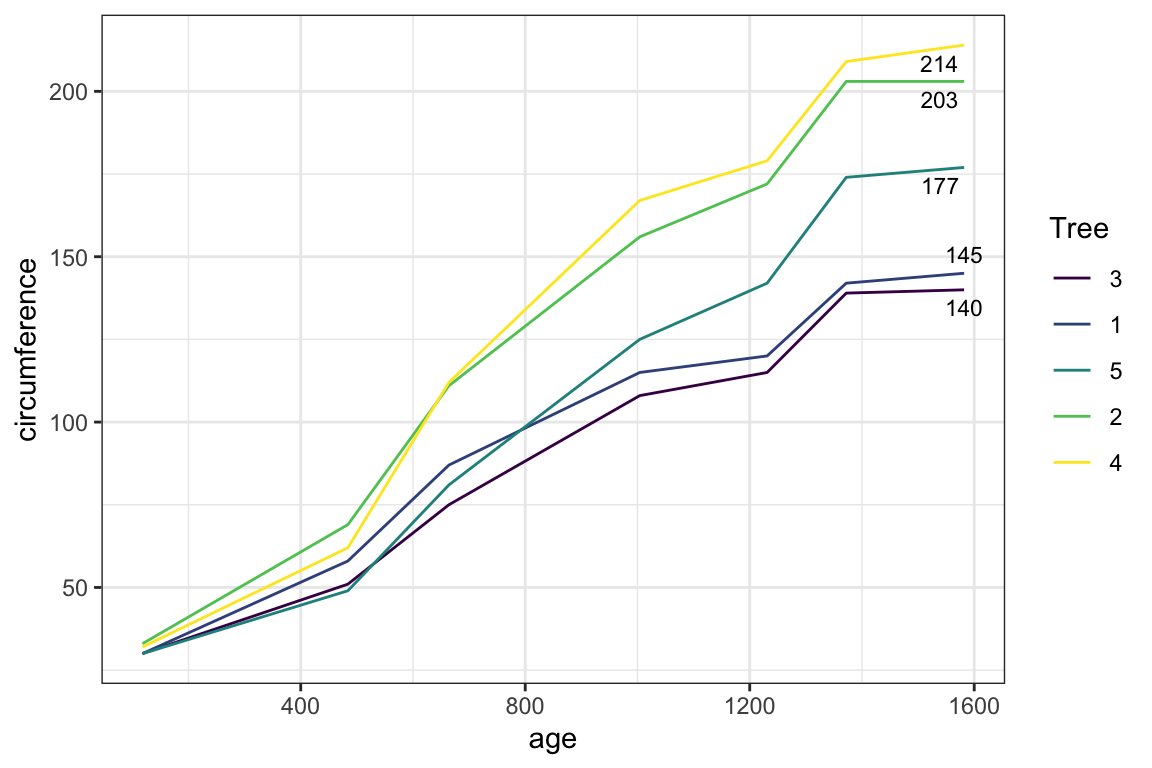
Examples for time series data
# Demo data
df2 <- Orange
head(df2)
## Grouped Data: circumference ~ age | Tree
## Tree age circumference
## 1 1 118 30
## 2 1 484 58
## 3 1 664 87
## 4 1 1004 115
## 5 1 1231 120
## 6 1 1372 142# Filter the last values
data_ends <- df2 %>%
group_by(Tree) %>%
top_n(1, age)
data_ends## # A tibble: 5 x 3
## # Groups: Tree [5]
## Tree age circumference
## <ord> <dbl> <dbl>
## 1 1 1582 145
## 2 2 1582 203
## 3 3 1582 140
## 4 4 1582 214
## 5 5 1582 177ggplot(df2, aes(age, circumference)) +
geom_line(aes(color = Tree)) +
geom_text_repel(
aes(label = circumference), data = data_ends,
size = 3
)
Using a secondary y axis to show the line labels
Key R functions: The ggplot2 scale_y_continuous() function is used in combination with the argument sec.axis to create a second axis on the right. The numbers to be displayed at breaks is defined by the vector of values corresponding to the line ends.
# Pull the vector of last values
data_ends <- df2 %>%
  group_by(Tree) %>%
  top_n(1, age) %>%
  pull(circumference)
data_ends
## [1] 145 203 140 214 177# Create the line plot with labels
ggplot(df2, aes(x = age, y = circumference)) +
geom_line(aes(color = Tree)) +
scale_y_continuous(sec.axis = sec_axis(~ ., breaks = data_ends))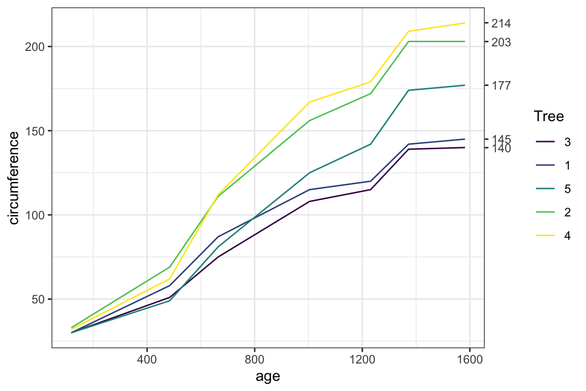
Conclusion
This article describes how to display the last value of each line as a label.
Recommended for you
This section contains best data science and self-development resources to help you on your path.
Books - Data Science
Our Books
- Practical Guide to Cluster Analysis in R by A. Kassambara (Datanovia)
- Practical Guide To Principal Component Methods in R by A. Kassambara (Datanovia)
- Machine Learning Essentials: Practical Guide in R by A. Kassambara (Datanovia)
- R Graphics Essentials for Great Data Visualization by A. Kassambara (Datanovia)
- GGPlot2 Essentials for Great Data Visualization in R by A. Kassambara (Datanovia)
- Network Analysis and Visualization in R by A. Kassambara (Datanovia)
- Practical Statistics in R for Comparing Groups: Numerical Variables by A. Kassambara (Datanovia)
- Inter-Rater Reliability Essentials: Practical Guide in R by A. Kassambara (Datanovia)
Others
- R for Data Science: Import, Tidy, Transform, Visualize, and Model Data by Hadley Wickham & Garrett Grolemund
- Hands-On Machine Learning with Scikit-Learn, Keras, and TensorFlow: Concepts, Tools, and Techniques to Build Intelligent Systems by Aurelien Géron
- Practical Statistics for Data Scientists: 50 Essential Concepts by Peter Bruce & Andrew Bruce
- Hands-On Programming with R: Write Your Own Functions And Simulations by Garrett Grolemund & Hadley Wickham
- An Introduction to Statistical Learning: with Applications in R by Gareth James et al.
- Deep Learning with R by François Chollet & J.J. Allaire
- Deep Learning with Python by François Chollet
Version:
 Français


Good post, Kassambara – (as always!).
Question:
how to add BOTH the min and also the MAX values
at the end of each line?.
Thanks/Merci!
It is possible to add min-max values as follow: