You will learn how to create beautiful plots in R and add summary summary statistics table such as sample size (n), median, mean and IQR onto the plot. We will also describes how to create multipanel graphics combined with the summary table. Examples of plots illustrated here, include: box plot, violin plot, bar plot, line plot; etc.
Contents:
Prerequisites
Load required R packages
library(tidyverse)
library(rstatix)
library(ggpubr)
Data preparation:
# Demo data
data("ToothGrowth")
df <- ToothGrowth
df$dose <- as.factor(df$dose)
# Add random QC column
set.seed(123)
qc <- rep(c("pass", "fail"), 30)
df$qc <- as.factor(sample(qc, 60))
# Inspect the data
head(df)
## len supp dose qc
## 1 4.2 VC 0.5 fail
## 2 11.5 VC 0.5 pass
## 3 7.3 VC 0.5 fail
## 4 5.8 VC 0.5 pass
## 5 6.4 VC 0.5 pass
## 6 10.0 VC 0.5 passBasic box plots with add summary statistics
In the following R code, possible values for the argument ggfunc are the ggpubr R package functions, including: ggboxplot, ggviolin, ggdotplot, ggbarplot, ggline, etc. It can be also any other ggplot function that accepts the following arguments: data, x, color, fill, palette, ggtheme, facet.by.
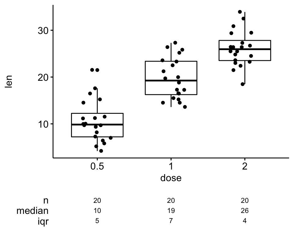
# Basic plot
ggsummarystats(
  df, x = "dose", y = "len",
  ggfunc = ggboxplot, add = "jitter"
  )
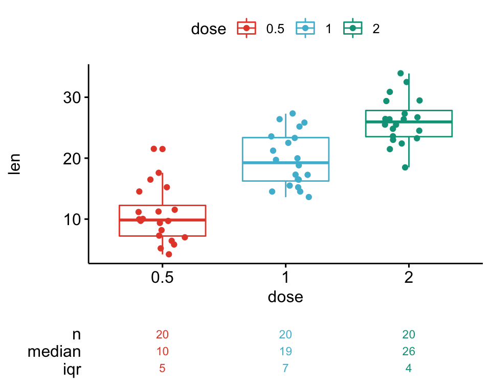
# Color by groups
ggsummarystats(
  df, x = "dose", y = "len",
  ggfunc = ggboxplot, add = "jitter",
  color = "dose", palette = "npg"
  )
Note that, you can create step by step your own graph and summary table. The following R code describes how to combine the main graph and the summary table into one figure.
# Compute summary statistics
summary.stats <- df %>%
  group_by(dose) %>%
  get_summary_stats() %>%
  select(dose, n, median, iqr)
summary.stats

# Create a boxplot
bxp <- ggboxplot(
  df, x = "dose", y = "len", add = "jitter",
  ggtheme = theme_bw()
)

# Visualize the summary statistics
summary.plot <- ggsummarytable(
  summary.stats, x = "dose", y = c("n", "median", "iqr"),
  ggtheme = theme_bw()
  ) +
  clean_table_theme()

# Combine the boxplot and the summary statistics plot
ggarrange(
  bxp, summary.plot, ncol = 1, align = "v",
  heights = c(0.80, 0.20)
  )
Grouped plots with summary table
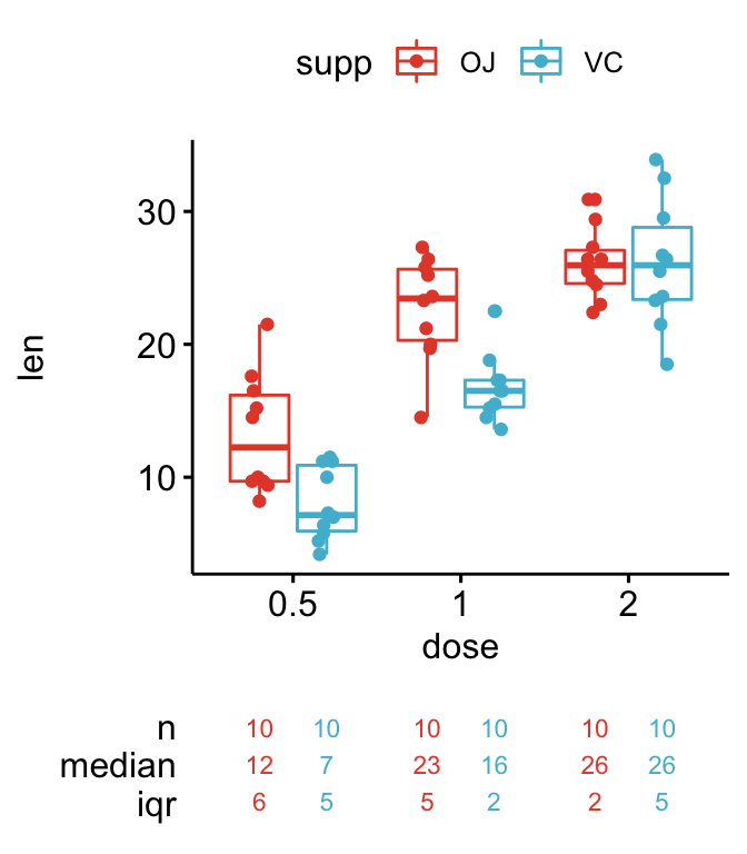
Grouped box plots and violin plots
# Grouped plots
ggsummarystats(
df, x = "dose", y = "len",
ggfunc = ggboxplot, add = "jitter",
color = "supp", palette = "npg"
)
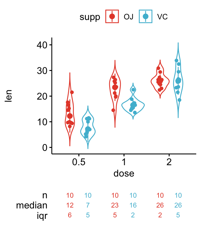
# Change plot type to violin
ggsummarystats(
df, x = "dose", y = "len",
ggfunc = ggviolin, add = c("jitter", "median_iqr"),
color = "supp", palette = "npg"
)
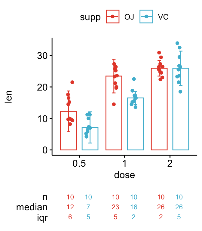
Grouped bar plots and line plots
# Create barplot
ggsummarystats(
  df, x = "dose", y = "len",
  ggfunc = ggbarplot, add = c("jitter", "median_iqr"), position = position_dodge(),
  color = "supp", palette = "npg"
  )

# Create line plots
ggsummarystats(
  df, x = "dose", y = "len",
  ggfunc = ggline, add = c("jitter", "median_iqr"),
  color = "supp", palette = "npg"
  )

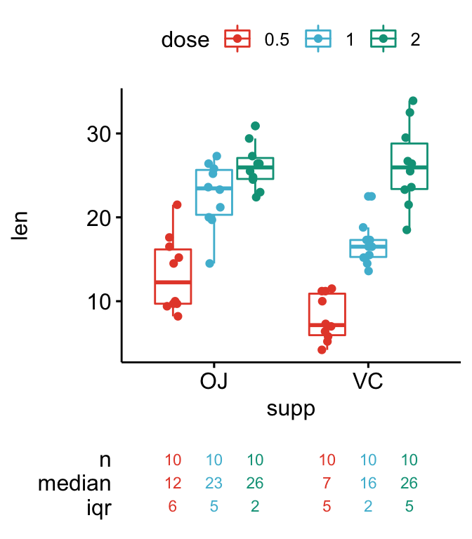
Three groups on the x axis
ggsummarystats(
  df, x = "supp", y = "len",
  ggfunc = ggboxplot, add = c("jitter"),
  color = "dose", palette = "npg"
  )
Multipanel plots with summary table
Key arguments:
facet.by: character vector, of length 1 or 2, specifying grouping variables for faceting the plot into multiple panels. Should be in the data.labeller: Character vector. Possible values are one oflabel_both(panel labelled by both grouping variable names and levels) andlabel_value(panel labelled with only grouping levels).
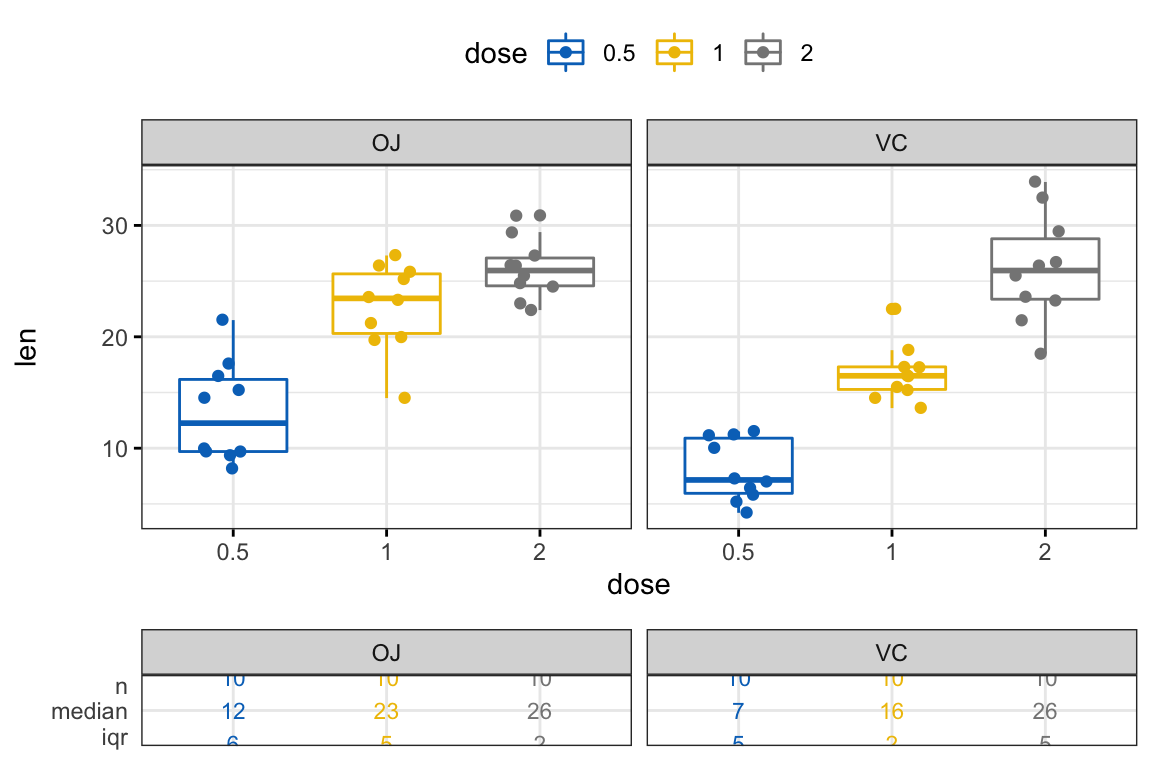
Create panels according to one grouping variable:
ggsummarystats(
  df, x = "dose", y = "len",
  ggfunc = ggboxplot, add = c("jitter"),
  color = "dose", palette = "jco",
  facet.by = "supp", labeller = "label_value",
  ggtheme = theme_bw(), legend = "top"
)
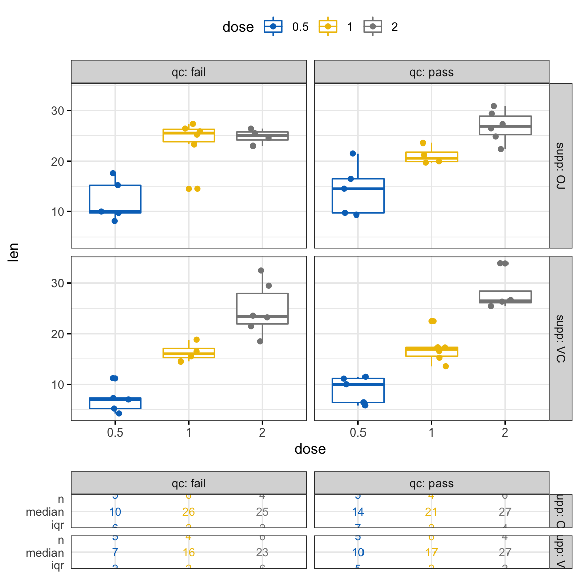
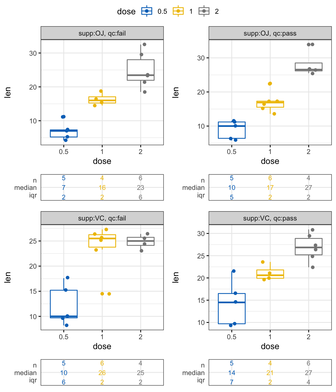
Create panels according to two grouping variables
ggsummarystats(
  df, x = "dose", y = "len",
  ggfunc = ggboxplot, add = c("jitter"),
  color = "dose", palette = "jco",
  facet.by = c("supp", "qc"), labeller = "label_both",
  ggtheme = theme_bw(), legend = "top"
)
Create independent panels using the argument free:
ggsummarystats(
  df, x = "dose", y = "len",
  ggfunc = ggboxplot, add = c("jitter"),
  color = "dose", palette = "jco",
  facet.by = c("supp", "qc"), labeller = "label_both",
  free.panels = TRUE,
  ggtheme = theme_bw(), legend = "top"
)
Build step by step a custom multipanel plot
Create a multipanel box plot using one grouping variable (supp):
# Group the data by supp
# Apply the function ggsummarystats to each subset
df.grouped <- df %>%
  df_split_by(supp, label_col = "panel", labeller = df_label_both) %>%
  mutate(plot_list = map(
    data, ggsummarystats, x = "dose", y = "len",
    ggfunc = ggbarplot,
    add = c("jitter", "median_iqr"),
    facet.by = "panel"
    )
  )
df.grouped
## # A tibble: 2 x 4
## supp data panel plot_list
## <fct> <list> <fct> <list>
## 1 VC <tibble [30 × 4]> supp:OJ <ggsmmrys>
## 2 OJ <tibble [30 × 4]> supp:VC <ggsmmrys># Print the plots
plot_list <- df.grouped$plot_list
class(plot_list) <- c("ggsummarystats_list", "list")
print(plot_list)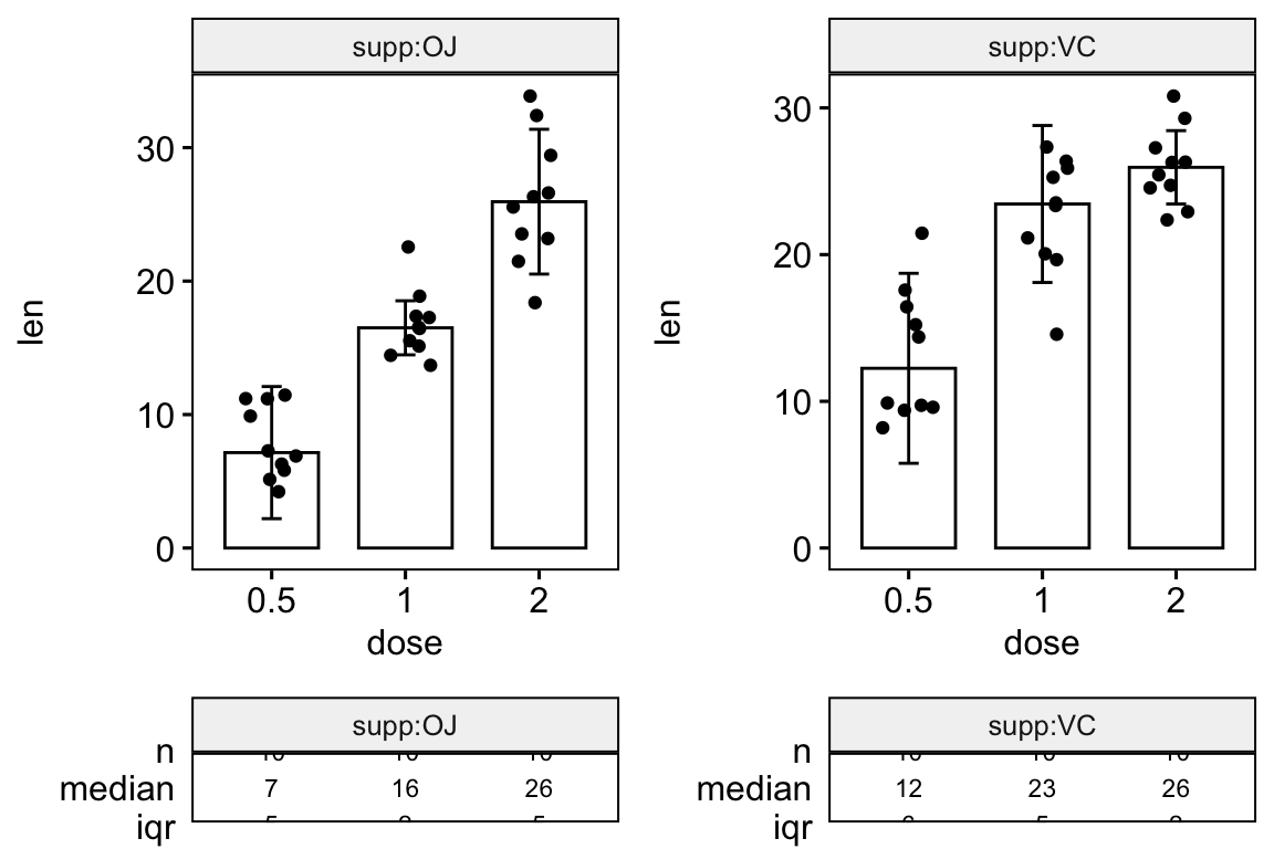
Recommended for you
This section contains best data science and self-development resources to help you on your path.
Books - Data Science
Our Books
- Practical Guide to Cluster Analysis in R by A. Kassambara (Datanovia)
- Practical Guide To Principal Component Methods in R by A. Kassambara (Datanovia)
- Machine Learning Essentials: Practical Guide in R by A. Kassambara (Datanovia)
- R Graphics Essentials for Great Data Visualization by A. Kassambara (Datanovia)
- GGPlot2 Essentials for Great Data Visualization in R by A. Kassambara (Datanovia)
- Network Analysis and Visualization in R by A. Kassambara (Datanovia)
- Practical Statistics in R for Comparing Groups: Numerical Variables by A. Kassambara (Datanovia)
- Inter-Rater Reliability Essentials: Practical Guide in R by A. Kassambara (Datanovia)
Others
- R for Data Science: Import, Tidy, Transform, Visualize, and Model Data by Hadley Wickham & Garrett Grolemund
- Hands-On Machine Learning with Scikit-Learn, Keras, and TensorFlow: Concepts, Tools, and Techniques to Build Intelligent Systems by Aurelien Géron
- Practical Statistics for Data Scientists: 50 Essential Concepts by Peter Bruce & Andrew Bruce
- Hands-On Programming with R: Write Your Own Functions And Simulations by Garrett Grolemund & Hadley Wickham
- An Introduction to Statistical Learning: with Applications in R by Gareth James et al.
- Deep Learning with R by François Chollet & J.J. Allaire
- Deep Learning with Python by François Chollet
Version:
 Français


I the function ggsummarystats in the package that is available on CRAN? Because I dont find it.
The
ggsummarystats()is available in theggpubrdev version. You can install it as follow:A CRAN released is planned for next week.
Hi, I keep getting all this warnings nonstop:
Warning message in stats::qt(alpha/2, .data$n – 1):
“NaNs produced”
Warning message in stats::qt(alpha/2, .data$n – 1):
“NaNs produced”
Warning message in stats::qt(alpha/2, .data$n – 1):
“NaNs produced”
Warning message in stats::qt(alpha/2, .data$n – 1):
“NaNs produced”
Warning message in stats::qt(alpha/2, .data$n – 1):
“NaNs produced”
Can you please help? Thanks a lot! Sorry I am a beginner.
Hello !
Do you think it’s possible to not rounding the values in a ggsummarytable ?
Thank you !
Is there away to remove the summary tables from the bottom of these plots?
Hi, this package is amazing! However, when I try to use it starting from my own ggplot, I get in trouble with interaction variables : my story was that one:
ggplot(table_all_class, aes(x = slope_class, y = soil_loss)) +
geom_boxplot(aes(group = interaction(slope_class,
slope_length_class),
color = slope_length_class)) +
facet_grid(soil~Cover, scales = “free”)
And I don’t manage to keep my interaction variables with ggsummarystats. Many thanks if you have idea !
How can I get the ‘ToothGrowth’ file?