
This R graphics tutorial describes how to change line types in R for plots created using either the R base plotting functions or the ggplot2 package.
In R base plot functions, the options lty and lwd are used to specify the line type and the line width, respectively. In ggplot2, the parameters linetype and size are used to decide the type and the size of lines, respectively.
You will learn how to:
- Display easily the list of the different types line graphs present in R.
- Plot two lines and modify automatically the line style for base plots and ggplot by groups.
- Adjust the R line thickness by specifying the options lwd (base plot) and size (ggplot2).
- Change manually the appearance (linetype, color and size) of ggplot lines by using, respectively, the function scale_linetype_manual(), scale_color_manual() and scale_size_manual().
Contents:
Key R functions
plot(x, y, type = "b", lty = 1, lwd = 1, col = "blue")andlines(x, y, lty = 2, lwd = 1): Base R plot functions to create line plots.geom_line(aes(x, y), data = NULL, linetype = "dashed", color = "black", size = 1): ggplot2 function to create line plots.scale_linetype_manual(),scale_color_manual()andscale_size_manual(): ggplot2 functions to set manually lines type, color and size.
Show the different line types in R
The list of line types available in R, includes:
- “blank”, 1. “solid”, 2. “dashed”, 3. “dotted”, 4. “dotdash”, 5. “longdash” and 6. “twodash”.
Note that, to specify line types, you can use either full names or numbers : 0, 1, 2, 3, 4, 5, 6. 0 is for “blank”, 1 is for “solid”, 2 is for “dashed”, and so on
The graph below illustrates the list of line types available in R:
library(ggpubr)
show_line_types()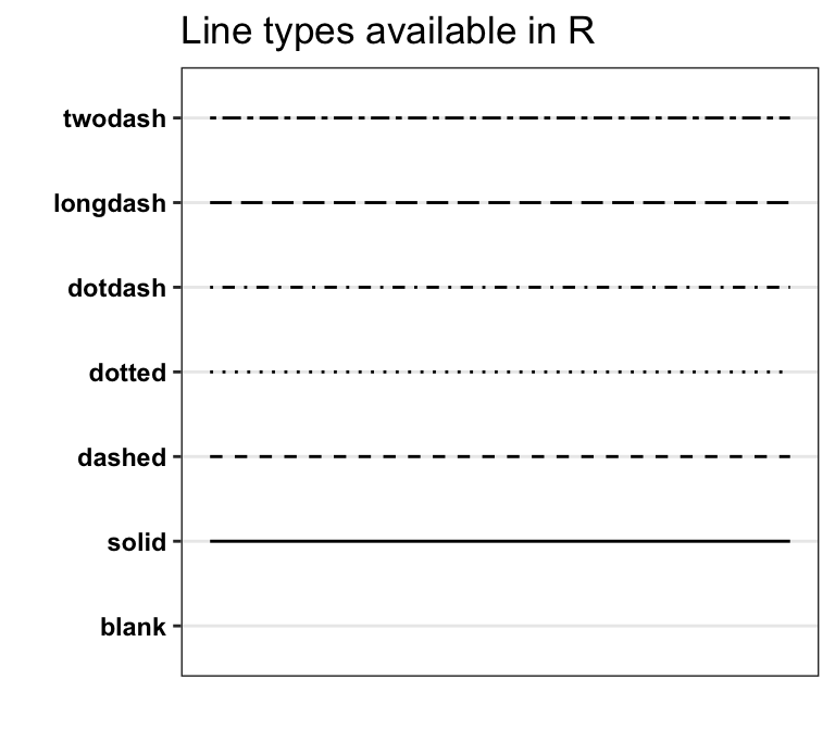
In the next sections, we’ll illustrate line type modification using the example of line plots created with the geom_line(). However, note that, the option linetype can be also applied on other ggplot functions, such as: geom_smooth, geom_density, geom_sgment, geom_hline, geom_vline, geom_abline, geom_smooth and more.
Change R base plot line types
Simple format of R lines functions:
plot(x, y, type = "l", lty = 1). Create the main R base plot frame.lines(x, y, type = "l", lty = 1). Add lines onto the plot.
Key options:
x,y: variables to be used for the x and y axes, respectively.type: display the data as line and/or point. Lowed values:l(display line only),p(show point only) andb(show both).pchandcex: set points shape and size, respectively.lty,lwd: set line types and thickness.col: change the color of point and line.xlabandylab: for x and y axis labels, respectively.
Create a plot with multiple lines and set the legend lty. We start by plotting a first single line with a solid line type (lty = 1). Next, we add a second line with a dashed line style (lty = 2). Finally, we add a legend on the plot using the R base function legend(), which take the same col and lty arguments as the lines function. The option cex is used to set the legend text size.
# 1. Create some variables
x <- 1:10
y1 <- x*x
y2  <- 2*y1

# 2. Plot a first line
plot(x, y1, type = "b", frame = FALSE, pch = 19,
     col = "red", xlab = "x", ylab = "y",
     lty = 1, lwd = 1)

# 3. Add a second line
lines(x, y2, pch = 18, col = "blue", type = "b",
      lty = 2, lwd = 1)

# 4. Add a legend to the plot and set legend lty
legend("topleft", legend = c("Line 1", "Line 2"),
       col = c("red", "blue"), lty = 1:2, cex = 0.8)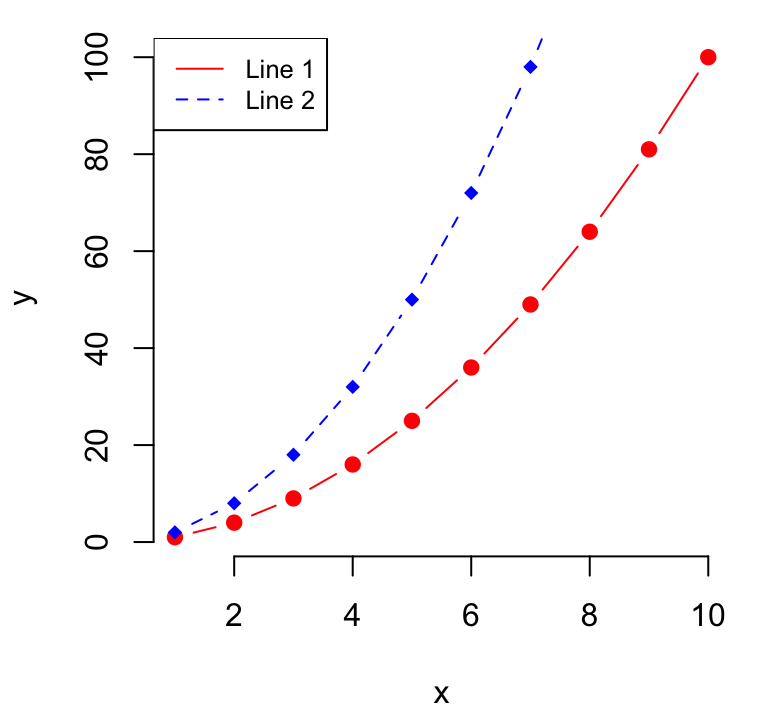
Change ggplot line types
Data set: ToothGrowth
ToothGrowth$dose <- as.factor(ToothGrowth$dose)
head(ToothGrowth, 3)
## len supp dose
## 1 4.2 VC 0.5
## 2 11.5 VC 0.5
## 3 7.3 VC 0.5- Basic line plot showing the mean value of tooth length (
len) by the dose of vitamin C (dose):
- Compute the mean of tooth length grouped by dose:
library(dplyr)
df <- ToothGrowth %>%
  group_by(dose) %>%
  summarise(len.mean = mean(len))
df
## # A tibble: 3 x 2
## dose len.mean
## <fct> <dbl>
## 1 0.5 10.6
## 2 1 19.7
## 3 2 26.1- Create a single line plot. Change the linetype option to “dashed”.
library(ggplot2)
ggplot(data = df, aes(x = dose, y = len.mean, group = 1)) +
  geom_line(linetype = "dashed")+
  geom_point()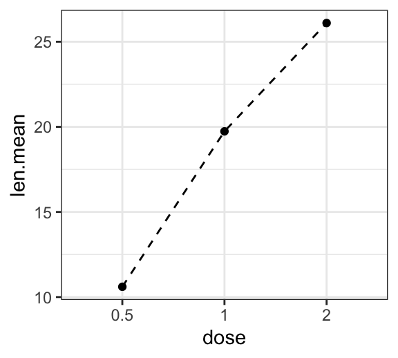
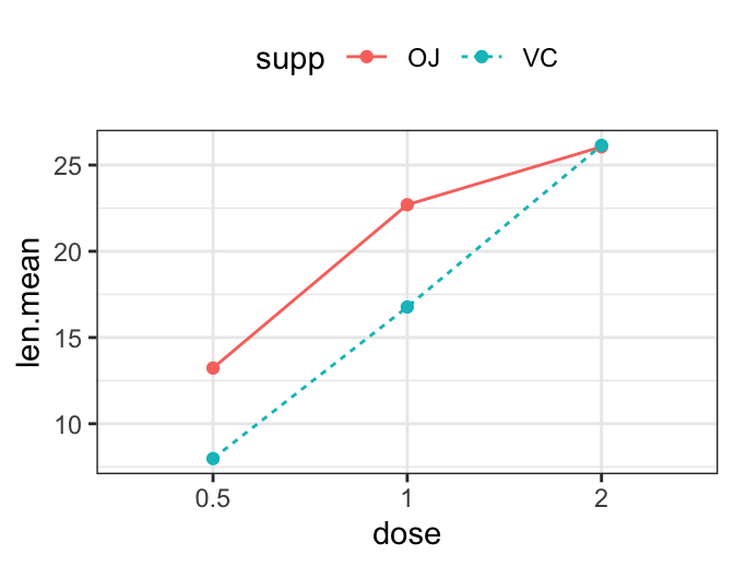
- Create a line plot for multiple groups. Change line types by groups.
- Data:
# Compute the mean of `len` grouped by dose and supp
library(dplyr)
df2 <- ToothGrowth %>%
  group_by(dose, supp) %>%
  summarise(len.mean = mean(len))
df2
## # A tibble: 6 x 3
## # Groups: dose [?]
## dose supp len.mean
## <fct> <fct> <dbl>
## 1 0.5 OJ 13.2
## 2 0.5 VC 7.98
## 3 1 OJ 22.7
## 4 1 VC 16.8
## 5 2 OJ 26.1
## 6 2 VC 26.1- Line plot:
# Change line types by groups
ggplot(df2, aes(x = dose, y = len.mean, group = supp)) +
  geom_line(aes(linetype = supp))+
  geom_point()+
  theme(legend.position = "top")

# Change line types + colors by groups
ggplot(df2, aes(x = dose, y = len.mean, group = supp)) +
  geom_line(aes(linetype = supp, color = supp))+
  geom_point(aes(color = supp))+
  theme(legend.position = "top")
- Change the appearance of line types manually:
- scale_linetype_manual(): change line types
- scale_color_manual(): change line colors
- scale_size_manual(): change the size of lines
To be able to apply these functions, you should create a geom_line, which line types, color and size should be controlled by groups.
# Change manually line type and color manually
ggplot(df2, aes(x = dose, y = len.mean, group = supp)) +
  geom_line(aes(linetype = supp, color = supp))+
  geom_point(aes(color = supp))+
  scale_linetype_manual(values=c("solid", "dashed"))+
  scale_color_manual(values=c("#00AFBB","#FC4E07"))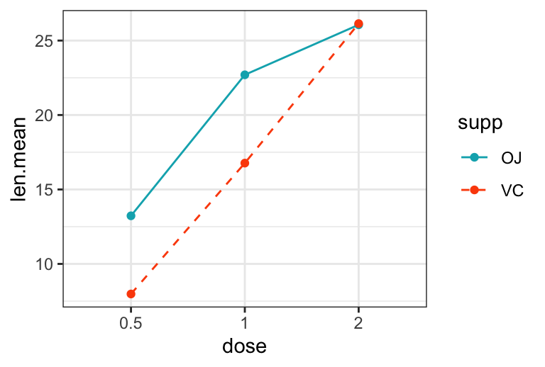
Conclusion
- Use lty and lwd options, for changing lines type and thickness in R base graphics:
x <- 1:10; y1 <- x*x; y2  <- 2*y1
# Draw two lines
plot(x, y1, type = "b", pch = 19, col = "red", lty = 1, lwd = 1)
lines(x, y2, pch = 18, col = "blue", type = "b", lty = 2, lwd = 1)
# Add legend
legend("topleft", legend = c("Line 1", "Line 2"),
col = c("red", "blue"), lty = 1:2)- Use linetype and size arguments in ggplot2 :
# Create some data
x <- 1:10; y1 <- x*x; y2  <- 2*y1
df <- data.frame(
  x = c(x, x), y = c(y1, y2),
  grp = as.factor(rep(c("A", "B"), each = 10))
  )
# Plot
library(ggplot2)
ggplot(data = df, aes(x, y, group = grp)) +
  geom_line(aes(linetype = grp))+
  geom_point()
Recommended for you
This section contains best data science and self-development resources to help you on your path.
Books - Data Science
Our Books
- Practical Guide to Cluster Analysis in R by A. Kassambara (Datanovia)
- Practical Guide To Principal Component Methods in R by A. Kassambara (Datanovia)
- Machine Learning Essentials: Practical Guide in R by A. Kassambara (Datanovia)
- R Graphics Essentials for Great Data Visualization by A. Kassambara (Datanovia)
- GGPlot2 Essentials for Great Data Visualization in R by A. Kassambara (Datanovia)
- Network Analysis and Visualization in R by A. Kassambara (Datanovia)
- Practical Statistics in R for Comparing Groups: Numerical Variables by A. Kassambara (Datanovia)
- Inter-Rater Reliability Essentials: Practical Guide in R by A. Kassambara (Datanovia)
Others
- R for Data Science: Import, Tidy, Transform, Visualize, and Model Data by Hadley Wickham & Garrett Grolemund
- Hands-On Machine Learning with Scikit-Learn, Keras, and TensorFlow: Concepts, Tools, and Techniques to Build Intelligent Systems by Aurelien Géron
- Practical Statistics for Data Scientists: 50 Essential Concepts by Peter Bruce & Andrew Bruce
- Hands-On Programming with R: Write Your Own Functions And Simulations by Garrett Grolemund & Hadley Wickham
- An Introduction to Statistical Learning: with Applications in R by Gareth James et al.
- Deep Learning with R by François Chollet & J.J. Allaire
- Deep Learning with Python by François Chollet
Version:
 Français


Dear Kassambara,
Is it possible to shift the line with respect to the x axis? I mean the situation when I put error bars together with the line, then when I have two or more lines, these bars often overlap. This is the case, for example, when presenting the results from ANOVA.