# Required packages
import pandas as pd
import numpy as np
import seaborn as sns
import matplotlib.pyplot as pltIntroduction
Seaborn is a powerful Python library built on top of Matplotlib that simplifies the creation of beautiful, informative statistical visualizations. In this tutorial, we’ll delve into advanced visualization techniques with Seaborn that go beyond basic plotting. You’ll learn how to create complex plots, customize chart aesthetics, and leverage statistical insights—all tailored for data science applications.
Importing Required Packages
To ensure all code blocks have access to the necessary libraries without repetition, we start by importing them here:
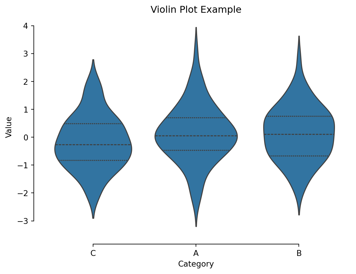
Seaborn offers a variety of categorical plots such as box plots, violin plots, and swarm plots that help reveal data distributions across different categories.
Box Plot and Violin Plot Example
# Create a sample DataFrame
np.random.seed(42)
df = pd.DataFrame({
    "Category": np.random.choice(["A", "B", "C"], size=200),
    "Value": np.random.randn(200)
})

# Create a box plot
sns.boxplot(x="Category", y="Value", data=df)
sns.despine(offset=10, trim=True)
plt.title("Box Plot Example")
plt.show()

# Create a violin plot
sns.violinplot(x="Category", y="Value", data=df, inner="quartile")
sns.despine(offset=10, trim=True)
plt.title("Violin Plot Example")
plt.show()
Regression and Scatter Plots
Seaborn’s regression plots, such as regplot, combine scatter plots with linear regression models to help you explore relationships between variables.
Regression Plot Example
# Load a built-in dataset from Seaborn
df = sns.load_dataset("mpg")
# Create a regression plot
sns.regplot(data=df, x="weight", y="acceleration", ci=None, scatter_kws={"s": 50, "alpha": 0.7})
plt.title("Regression Plot Example")
plt.show()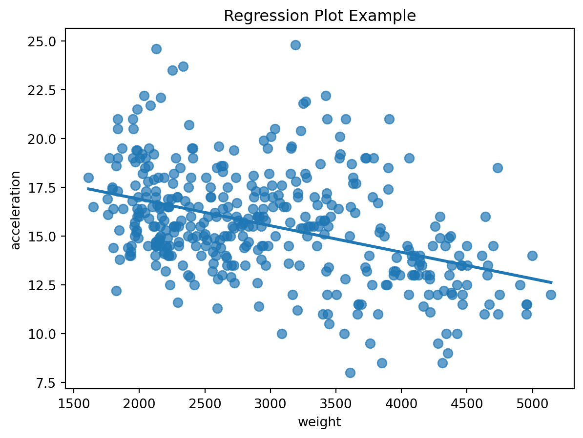
Pair Plots for Multivariate Analysis
Pair plots provide an excellent way to visualize relationships across multiple variables in a dataset.
Pair Plot Example
# Load a built-in dataset from Seaborn
df = sns.load_dataset("iris")
columns_of_interest = ["sepal_length", "sepal_width", "petal_length", "species"]
df = df[columns_of_interest]

# Create a pair plot
sns.pairplot(df, hue="species", markers=["o", "s", "D"])
plt.show()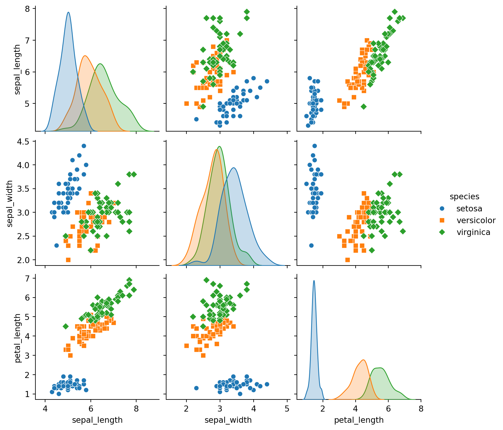
Heatmaps for Correlation Matrices
Heatmaps are ideal for visualizing correlation matrices and identifying relationships between numerical variables.
Heatmap Example
# Load a built-in dataset from Seaborn
df = sns.load_dataset("glue")
df = df.pivot(index="Model", columns="Task", values="Score")

# Compute the correlation matrix
corr = df.corr()

# Create a heatmap of the correlation matrix
sns.heatmap(corr, annot=True, cmap="coolwarm", fmt=".2f")
plt.title("Heatmap of Correlation Matrix")
plt.show()
Customizing Seaborn Visualizations
Seaborn provides several customization options to enhance the aesthetics of your plots:
- Themes: Use
sns.set_style()to change the overall look of your plots (e.g.,whitegrid,dark,ticks). - Color Palettes: Experiment with different color palettes using
sns.color_palette()to match your branding or presentation needs. - Context Settings: Adjust context (e.g.,
'paper','notebook','talk','poster') withsns.set_context()to control the scale of plot elements.
Conclusion
Advanced data visualization with Seaborn empowers you to create compelling, informative charts that enhance your data analysis. By mastering categorical plots, regression plots, pair plots, and heatmaps, you can uncover deeper insights and present your data in a visually appealing way. Experiment with these techniques and customize them to fit your specific data science needs.
Further Reading
Happy coding, and enjoy creating compelling visualizations with Seaborn!
Explore More Articles
Note
Here are more articles from the same category to help you dive deeper into the topic.
No matching items
Reuse
Citation
BibTeX citation:
@online{kassambara2024,
  author = {Kassambara, Alboukadel},
  title = {Data {Visualization} with {Seaborn}},
  date = {2024-02-07},
  url = {https://www.datanovia.com/learn/programming/python/data-science/data-visualization-with-seaborn.html},
  langid = {en}
}
For attribution, please cite this work as:
Kassambara, Alboukadel. 2024. “Data Visualization with
Seaborn.” February 7, 2024. https://www.datanovia.com/learn/programming/python/data-science/data-visualization-with-seaborn.html.