library(ggplot2)Introduction
ggplot2 is one of the most powerful and versatile visualization libraries in R, based on the Grammar of Graphics. In this tutorial, you’ll learn how to create various types of plots and customize them to effectively communicate your data insights. Whether you’re a beginner or looking to refine your visualization skills, this guide will walk you through the basics, as well as some advanced customization techniques.
Getting Started
Before diving into plot creation, ensure that ggplot2 is installed and loaded in your R session:
Install the package if you haven’t already:
#| label: install-ggplot2
install.packages("ggplot2")
Load the library:
Basic Plotting with ggplot2
Let’s start by creating a simple scatter plot using the built-in mtcars dataset. This dataset contains various attributes of different car models.
# Create a basic scatter plot of mpg (miles per gallon) vs. wt (weight)
ggplot(data = mtcars, aes(x = wt, y = mpg)) +
  geom_point() +
  labs(
    title = "Scatter Plot of MPG vs. Weight",
    x = "Car Weight (1000 lbs)",
    y = "Miles per Gallon"
  )
Customizing Your Plot
Customization is key to making your visualizations informative and appealing. Here are a few ways to enhance your plots:
Changing Aesthetics and Themes
You can modify the appearance of your plot by changing colors, sizes, and themes.
ggplot(data = mtcars, aes(x = wt, y = mpg, color = factor(cyl))) +
  geom_point(size = 3) +
  labs(
    title = "MPG vs. Weight by Cylinder Count",
    x = "Car Weight (1000 lbs)",
    y = "Miles per Gallon",
    color = "Cylinders"
  ) +
  theme_minimal()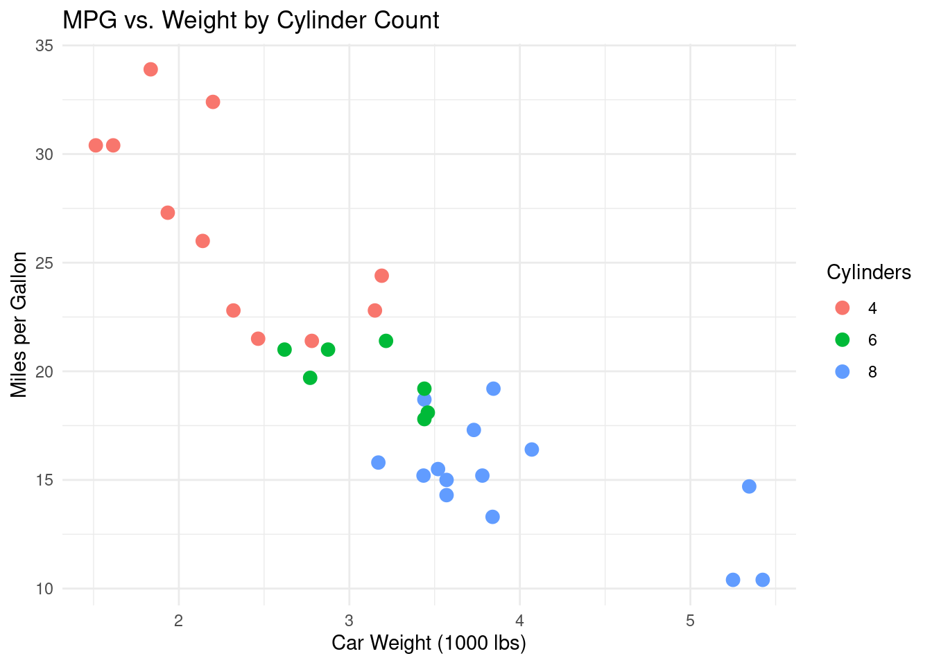
Adding Smoothers
Smoothers help reveal trends in the data by fitting a line to the points.
ggplot(data = mtcars, aes(x = wt, y = mpg)) +
  geom_point(color = "steelblue", size = 3) +
  geom_smooth(method = "lm", se = FALSE, color = "red") +
  labs(
    title = "MPG vs. Weight with Linear Trend Line",
    x = "Car Weight (1000 lbs)",
    y = "Miles per Gallon"
  ) +
  theme_classic()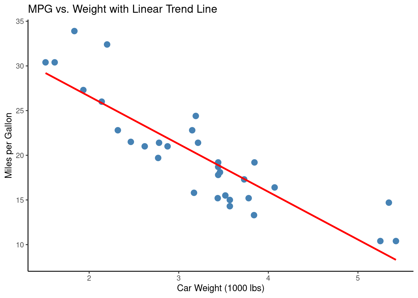
Advanced Techniques
Faceting
Faceting splits your plot into multiple panels based on a factor variable, which is useful for comparing subsets of data.
ggplot(data = mtcars, aes(x = wt, y = mpg)) +
  geom_point(color = "darkgreen", size = 3) +
  facet_wrap(~ factor(cyl)) +
  labs(
    title = "MPG vs. Weight by Cylinder Count",
    x = "Car Weight (1000 lbs)",
    y = "Miles per Gallon"
  ) +
  theme_light()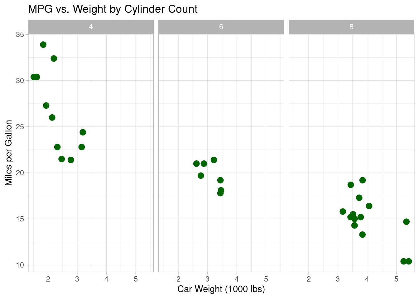
Multi-Layering
Combine multiple layers, such as text annotations and additional geoms, to create complex visualizations.
ggplot(data = mtcars, aes(x = wt, y = mpg, color = factor(cyl))) +
  geom_point(size = 3) +
  geom_smooth(method = "loess", se = FALSE, color = "black") +
  geom_text(aes(label = rownames(mtcars)), vjust = -0.5, size = 3) +
  labs(
    title = "Enhanced Scatter Plot of MPG vs. Weight",
    x = "Car Weight (1000 lbs)",
    y = "Miles per Gallon",
    color = "Cylinders"
  ) +
  theme_bw()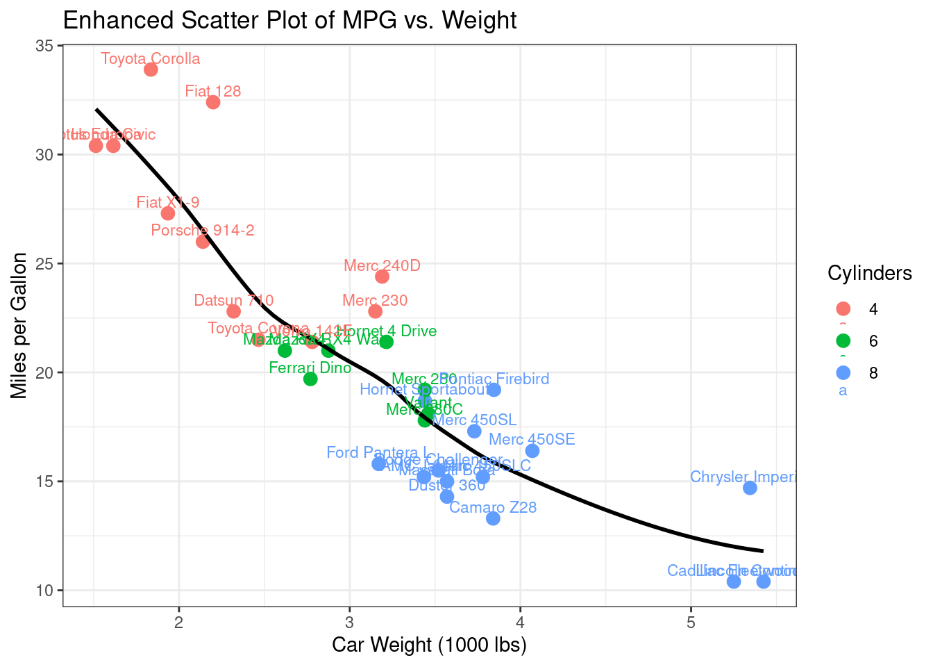
Conclusion
With ggplot2, you can transform raw data into compelling visualizations that clearly communicate insights. This tutorial has covered the essentials of creating basic plots, customizing aesthetics, and using advanced techniques such as faceting and multi-layering. Experiment with these examples and explore further customization options to create publication-ready graphics.
Further Reading
- Data Wrangling with dplyr
- Statistical Modeling with lm() and glm()
- Interactive Dashboards with Shiny
Happy coding, and enjoy creating beautiful visualizations with ggplot2!
Explore More Articles
Note
Here are more articles from the same category to help you dive deeper into the topic.
Reuse
Citation
BibTeX citation:
@online{kassambara2024,
  author = {Kassambara, Alboukadel},
  title = {Data {Visualization} with Ggplot2},
  date = {2024-02-10},
  url = {https://www.datanovia.com/learn/programming/r/data-science/data-visualization-with-ggplot2.html},
  langid = {en}
}
For attribution, please cite this work as:
Kassambara, Alboukadel. 2024. “Data Visualization with
Ggplot2.” February 10, 2024. https://www.datanovia.com/learn/programming/r/data-science/data-visualization-with-ggplot2.html.