Data Visualization for R Users: ggplot2 vs. matplotlib/Seaborn
Comparing Visualizations in R and Python
Compare data visualization techniques by contrasting ggplot2 in R with matplotlib and Seaborn in Python. This tutorial provides side-by-side examples—such as scatter, bar, and line charts—to highlight similarities and differences between the two ecosystems.
ggplot2 vs matplotlib, data visualization in R and Python, Seaborn tutorial, ggplot2 tutorial, R vs Python visualization
Introduction
Creating effective visualizations is key to communicating data insights. Many R users are familiar with ggplot2, a powerful visualization package built on the Grammar of Graphics. On the Python side, matplotlib and Seaborn are popular tools for crafting similar plots. In this tutorial, we provide side-by-side examples that compare how to create similar visualizations—such as scatter plots, bar charts, and line charts—in both R and Python. This guide will help you understand the syntax differences and choose the best approach for your projects.
Comparative Examples
Below, you will find examples displayed using a panel-tabset. Each tab presents a visualization example in R (using ggplot2) and the equivalent Python version (using matplotlib/Seaborn).
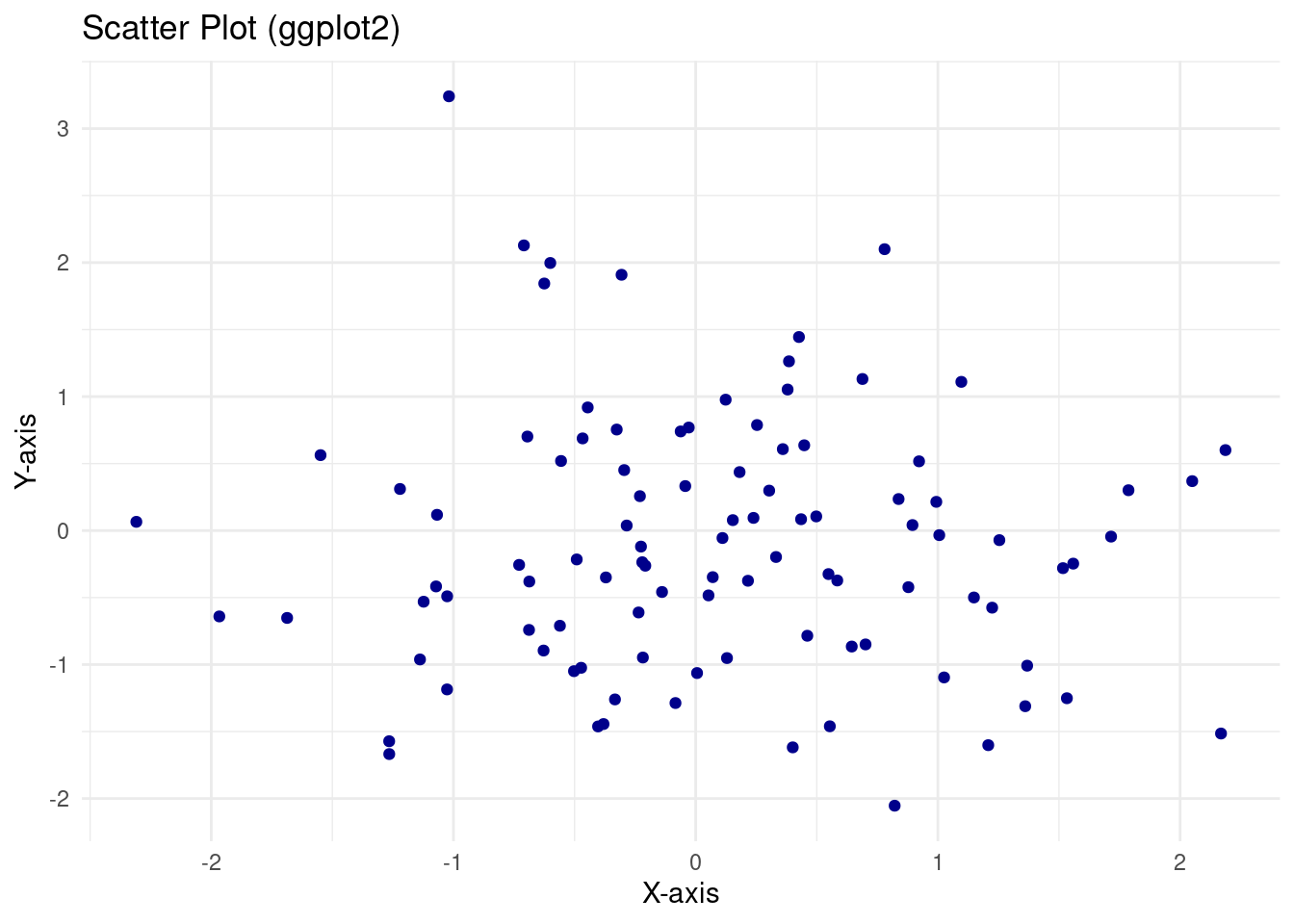
library(ggplot2)# Generate sample dataset.seed(123)df <-data.frame(x =rnorm(100), y =rnorm(100))# Create scatter plot using ggplot2ggplot(df, aes(x = x, y = y)) +geom_point(color ="darkblue") +labs(title ="Scatter Plot (ggplot2)", x ="X-axis", y ="Y-axis") +theme_minimal()
Python (matplotlib & Seaborn) Example:
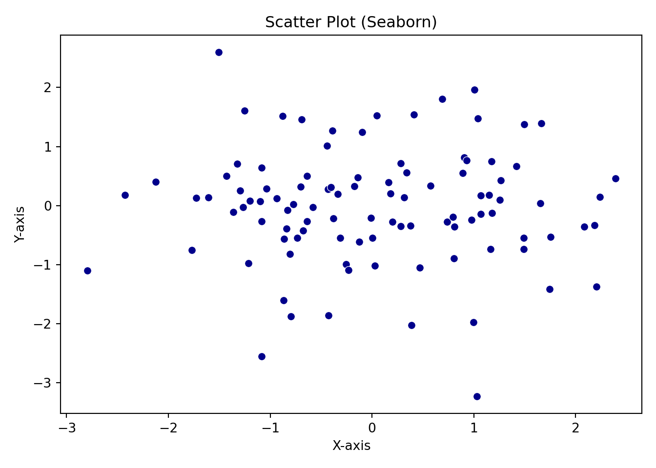
import pandas as pdimport numpy as npimport matplotlib.pyplot as pltimport seaborn as sns# Generate sample datanp.random.seed(123)df = pd.DataFrame({'x': np.random.randn(100),'y': np.random.randn(100)})# Create scatter plot using Seabornsns.scatterplot(x='x', y='y', data=df, color='darkblue')plt.title("Scatter Plot (Seaborn)")plt.xlabel("X-axis")plt.ylabel("Y-axis")plt.tight_layout()plt.show()
R (ggplot2) Example:
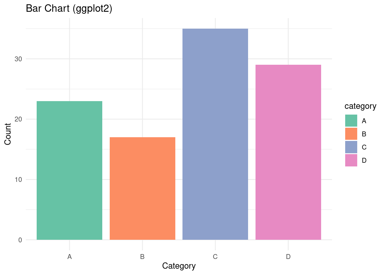
library(ggplot2)# Create sample data for bar chartdf_bar <-data.frame(category =c("A", "B", "C", "D"),count =c(23, 17, 35, 29))# Create a bar chart using ggplot2ggplot(df_bar, aes(x = category, y = count, fill = category)) +geom_bar(stat ="identity") +labs(title ="Bar Chart (ggplot2)", x ="Category", y ="Count") +theme_minimal() +scale_fill_brewer(palette ="Set2")
Python (matplotlib & Seaborn) Example:
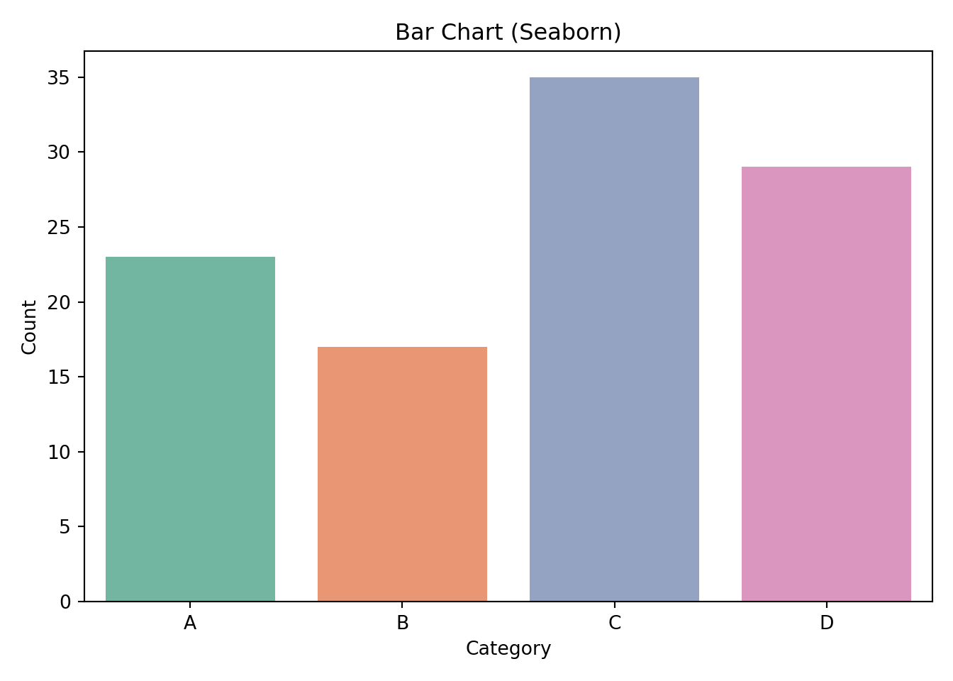
import pandas as pdimport matplotlib.pyplot as pltimport seaborn as sns# Create sample data for bar chartdf_bar = pd.DataFrame({'category': ["A", "B", "C", "D"],'count': [23, 17, 35, 29]})# Create a bar chart using Seabornsns.barplot(x='category', y='count', data=df_bar, palette="Set2")plt.title("Bar Chart (Seaborn)")plt.xlabel("Category")plt.ylabel("Count")plt.tight_layout()plt.show()
R (ggplot2) Example:
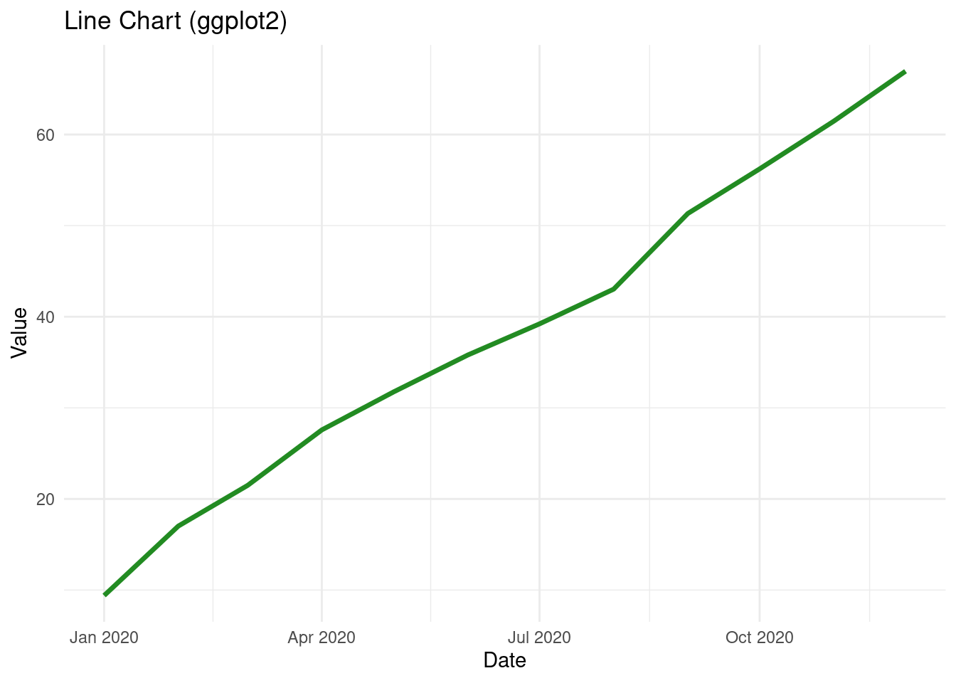
library(ggplot2)# Generate sample time series datadf_line <-data.frame(date =seq(as.Date("2020-01-01"), by ="month", length.out =12),value =cumsum(rnorm(12, mean =5, sd =2)))# Create a line chart using ggplot2ggplot(df_line, aes(x = date, y = value)) +geom_line(color ="forestgreen", size =1.2) +labs(title ="Line Chart (ggplot2)", x ="Date", y ="Value") +theme_minimal()
Python (matplotlib & Seaborn) Example:
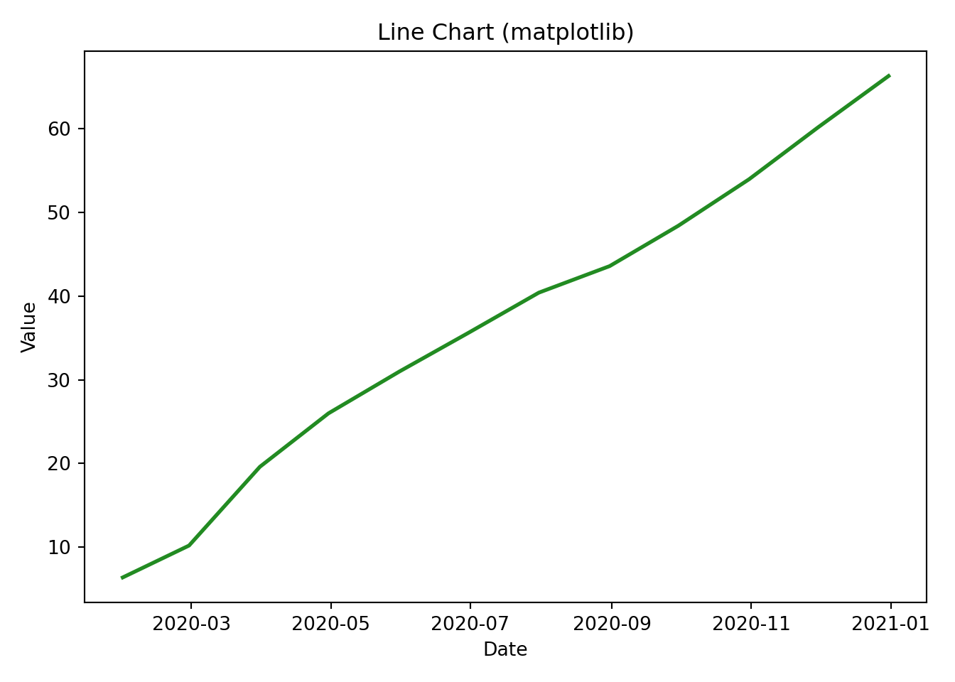
import pandas as pdimport numpy as npimport matplotlib.pyplot as pltimport seaborn as sns# Generate sample time series datadates = pd.date_range(start="2020-01-01", periods=12, freq="M")values = np.cumsum(np.random.randn(12) *2+5)df_line = pd.DataFrame({'date': dates, 'value': values})# Create a line chart using matplotlibplt.plot(df_line['date'], df_line['value'], color='forestgreen', linewidth=2)plt.title("Line Chart (matplotlib)")plt.xlabel("Date")plt.ylabel("Value")plt.tight_layout()plt.show()
Conclusion
Both R and Python offer robust capabilities for data visualization. While ggplot2 in R provides a grammar-of-graphics approach, Python’s matplotlib and Seaborn libraries deliver similarly powerful tools with their own unique syntax and customization options. By comparing these side-by-side examples, you can better understand the nuances of each ecosystem and select the best toolset for your data visualization needs.