Learn how to harness the power of the tidyverse for data science. This tutorial provides an in-depth look at dplyr for data manipulation, tidyr for data tidying, and ggplot2 for data visualization in R.
tidyverse tutorial, dplyr guide, tidyverse in R, data science tidyverse, R dplyr, R tidyr, ggplot2 tutorial
Introduction
The tidyverse is a collection of R packages that share a common design philosophy and are tailored for data science. In this tutorial, we’ll explore three core packages:
dplyr for data manipulation,
tidyr for data tidying, and
ggplot2 for data visualization.
By mastering these tools, you can transform, clean, and visualize your data with elegant and efficient code. Whether you’re preparing data for analysis or creating publication-ready graphics, the tidyverse offers powerful functions to streamline your workflow.
Using dplyr for Data Manipulation
dplyr provides a set of intuitive functions for filtering, selecting, mutating, and summarizing data.
Example: Filtering and Summarizing with dplyr
library(dplyr)# Use the built-in mtcars datasetdata("mtcars")# Filter cars, select key columns and summarize mtcars_summary <- mtcars %>%1filter(cyl >4) %>%2select(mpg, cyl, hp) %>%3group_by(cyl) %>%4summarize(avg_mpg =mean(mpg), avg_hp =mean(hp))
1
Filter cars with more than 4 cylinders.
2
Select specific columns for analysis.
3
Group data by the number of cylinders.
4
Compute average miles per gallon (mpg) and horsepower (hp) for each cylinder count.
This example demonstrates how to filter data, select specific columns, group data, and compute summary statistics all in one pipeline.
tidyr is designed to help you reshape and tidy your data, making it easier to analyze. Common tasks include pivoting data from wide to long format and vice versa.
Example: Pivoting Data with tidyr
library(tidyr)library(dplyr)# Create a sample data frame in wide formatwide_data <-data.frame(id =1:3,measure_A =c(10, 20, 30),measure_B =c(40, 50, 60))print(wide_data)
# Convert the data from wide to long formatlong_data <- wide_data %>%pivot_longer(cols =starts_with("measure"),names_to ="measure",values_to ="value")print(long_data)
This example shows how to tidy data by reshaping it into a more analysis-friendly long format.
Visualizing Data with ggplot2
ggplot2 is a versatile and powerful package for creating high-quality data visualizations in R.
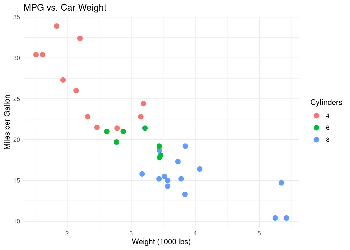
Example: Creating a Scatter Plot with ggplot2
library(ggplot2)# Use the built-in mtcars datasetdata("mtcars")# Create a basic scatter plot of mpg vs. weight, # Color by the number of cylindersggplot(data = mtcars, aes(x = wt, y = mpg, color =factor(cyl))) +geom_point(size =3) +labs(title ="MPG vs. Car Weight",x ="Weight (1000 lbs)",y ="Miles per Gallon",color ="Cylinders") +theme_minimal()
This example illustrates how to use ggplot2 to create a scatter plot with custom labels and themes.
Conclusion
The tidyverse is an essential toolkit for data science in R. By mastering dplyr, tidyr, and ggplot2, you can efficiently manipulate, tidy, and visualize data. These tools not only simplify your workflow but also help you write clear and reproducible code. Experiment with the examples provided and explore further customization options to tailor the tidyverse to your data analysis needs.