Introduction
Shiny is a powerful R package that enables you to build interactive web applications directly from R. With Shiny, you can turn your analyses into dynamic dashboards that allow users to explore data in real time. This tutorial will guide you through the basics of Shiny—from setting up the user interface to managing reactivity and deploying your app. Whether you’re new to Shiny or looking to expand your skills, this guide will help you create engaging, interactive dashboards for your data projects.
Getting Started with Shiny
Before you begin, make sure that Shiny is installed. You can install it from CRAN if needed:
#| label: install-shiny
install.packages("shiny")
library(shiny)
Basic Structure of a Shiny App
A Shiny app typically consists of two main components: - UI (User Interface): Defines the layout and appearance of your app. - Server: Contains the logic that controls the app’s behavior and responds to user inputs.
Here’s a minimal Shiny app structure:
#| label: minimal-shiny-app
library(shiny)
# Define UI for application
ui <- fluidPage(
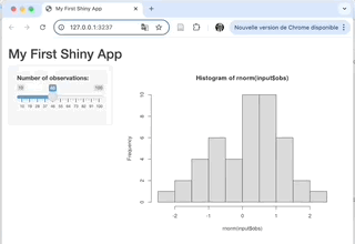
titlePanel("My First Shiny App"),
sidebarLayout(
sidebarPanel(
sliderInput("obs", "Number of observations:",
min = 10, max = 100, value = 50)
),
mainPanel(
plotOutput("distPlot")
)
)
)
# Define server logic required to draw a histogram
server <- function(input, output) {
output$distPlot <- renderPlot({
hist(rnorm(input$obs))
})
}
# Run the application
shinyApp(ui = ui, server = server)In this example, the app generates a histogram based on a random normal distribution, with the number of observations controlled by a slider input.
Building a More Interactive Dashboard
Let’s build a slightly more complex example that includes multiple inputs and outputs, demonstrating reactivity and dynamic content. In this example, we’ll create a dashboard that allows users to filter and visualize data from the built-in mtcars dataset.
#| label: interactive-dashboard
library(shiny)
library(ggplot2)
library(dplyr)
# Define UI for the dashboard
ui <- fluidPage(
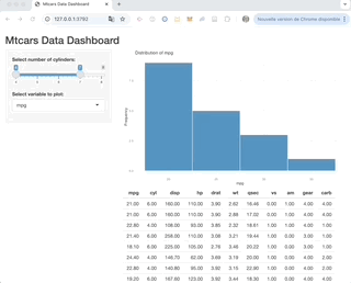
titlePanel("Mtcars Data Dashboard"),
sidebarLayout(
sidebarPanel(
sliderInput("cyl", "Select number of cylinders:",
min = min(mtcars$cyl), max = max(mtcars$cyl),
value = c(min(mtcars$cyl), max(mtcars$cyl))),
selectInput("var", "Select variable to plot:",
choices = c("mpg", "hp", "wt"), selected = "mpg")
),
mainPanel(
plotOutput("dataPlot"),
tableOutput("dataTable")
)
)
)
# Define server logic for the dashboard
server <- function(input, output) {
# Reactive expression to filter data based on the slider input
filteredData <- reactive({
mtcars %>%
filter(cyl >= input$cyl[1], cyl <= input$cyl[2])
})
# Render a plot based on filtered data and selected variable
output$dataPlot <- renderPlot({
ggplot(filteredData(), aes_string(x = input$var)) +
geom_histogram(binwidth = 5, fill = "steelblue", color = "white") +
labs(title = paste("Distribution of", input$var),
x = input$var, y = "Frequency") +
theme_minimal()
})
# Render the filtered data as a table
output$dataTable <- renderTable({
filteredData()
})
}
# Run the Shiny app
shinyApp(ui = ui, server = server)In this example, users can select the number of cylinders and a variable to plot, with the dashboard updating dynamically based on their inputs.
Best Practices and Tips
Modularize Your Code:
For larger applications, consider modularizing your UI and server components into separate files.Utilize Shiny Themes:
Customize the look and feel of your app using Shiny themes (e.g., via theshinythemespackage).Performance Optimization:
Use reactive expressions efficiently to minimize redundant calculations and improve app performance.Testing and Debugging:
Regularly test your app to ensure that all reactive components update as expected, and use Shiny’s built-in debugging tools when issues arise.
Deployment Options
Once your dashboard is complete, you can deploy it using various platforms:
- ShinyApps.io: A cloud service for hosting Shiny applications.
- RStudio Connect: For enterprise-level deployment and collaboration.
- Docker: Containerize your Shiny app for reproducible and scalable deployments.
Conclusion
Shiny empowers you to turn your R analyses into interactive dashboards that are both engaging and functional. This tutorial provided a step-by-step guide to building a Shiny app, from the basic app structure to a more interactive dashboard example using the mtcars dataset. Experiment with these examples, customize the layouts, and explore advanced features to create dynamic data-driven applications.
Further Reading
- Automating Reports with RMarkdown
- Web Scraping with rvest
- R Markdown for Reproducible Research (Placeholder for related content)
Happy coding, and enjoy building interactive dashboards with Shiny!
Explore More Articles
Here are more articles from the same category to help you dive deeper into the topic.
Reuse
Citation
@online{kassambara2024,
  author = {Kassambara, Alboukadel},
  title = {Interactive {Dashboards} with {Shiny}},
  date = {2024-02-10},
  url = {https://www.datanovia.com/learn/programming/r/tools/interactive-dashboards-with-shiny.html},
  langid = {en}
}