Different distance measures are available for clustering analysis. This article describes how to perform clustering in R using correlation as distance metrics.
Contents:
Prerequisites
The following R packages will be used:
pheatmap[pheatmap package]: Creates pretty heatmaps.heatmap.2()[gplots package]: Another alternative for drawing heatmaps.
Demo data
Generate a demo dataset:
set.seed(123)
mydata <- matrix(rnorm(200), 20, 10)
mydata[1:10, seq(1, 10, 2)] = mydata[1:10, seq(1, 10, 2)] + 3
mydata[11:20, seq(2, 10, 2)] = mydata[11:20, seq(2, 10, 2)] + 2
mydata[15:20, seq(2, 10, 2)] = mydata[15:20, seq(2, 10, 2)] + 4
colnames(mydata) = paste("Sple", 1:10, sep = "")
rownames(mydata) = paste("Gene", 1:20, sep = "")
head(mydata[, 1:4], 4)
## Sple1 Sple2 Sple3 Sple4
## Gene1 2.44 -1.068 2.31 0.380
## Gene2 2.77 -0.218 2.79 -0.502
## Gene3 4.56 -1.026 1.73 -0.333
## Gene4 3.07 -0.729 5.17 -1.019Prepare your data as described at : Data Preparation and R Packages for Cluster Analysis
Draw heatmaps using pheatmap
The default is to use the euclidean distance as dissimilarity measure.
library("pheatmap")
pheatmap(mydata, scale = "row")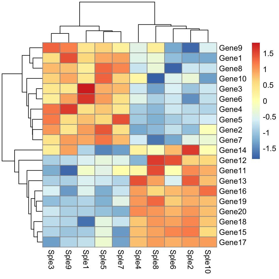
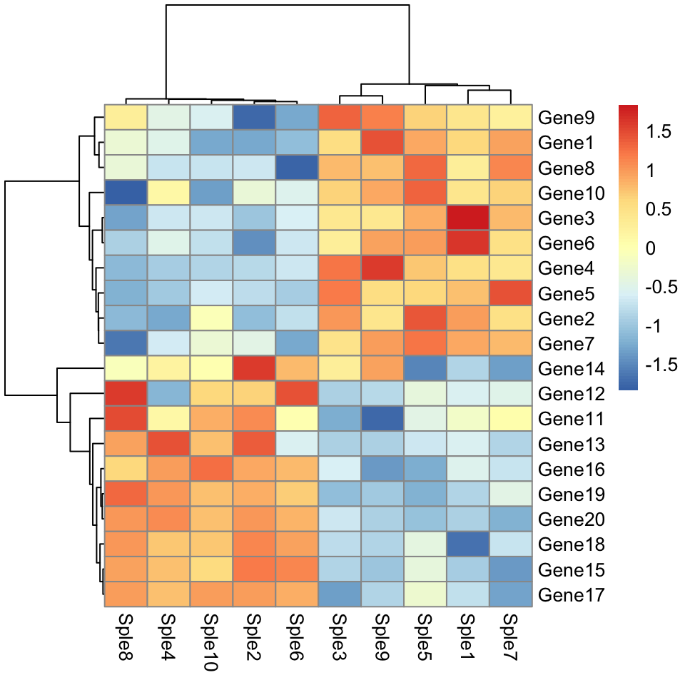
Use correlation as dissimilarity measures:
# Pairwise correlation between samples (columns)
cols.cor <- cor(mydata, use = "pairwise.complete.obs", method = "pearson")
# Pairwise correlation between rows (genes)
rows.cor <- cor(t(mydata), use = "pairwise.complete.obs", method = "pearson")

# Plot the heatmap
library("pheatmap")
pheatmap(
  mydata, scale = "row",
  clustering_distance_cols = as.dist(1 - cols.cor),
  clustering_distance_rows = as.dist(1 - rows.cor)
  )
Draw heatmaps using gplots
Default heatmap using the euclidean distance as dissimilarity measure.
library("gplots")
heatmap.2(mydata, scale = "row", col = bluered(100),
          trace = "none", density.info = "none")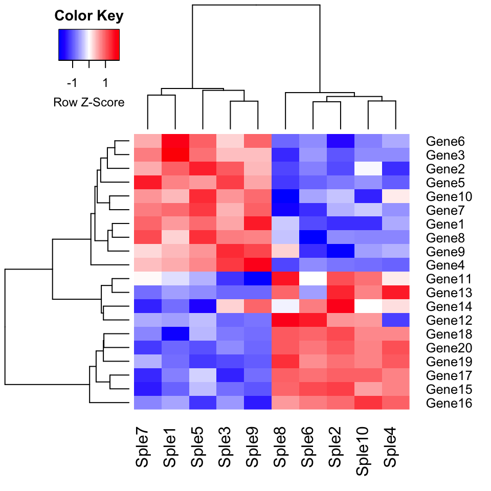
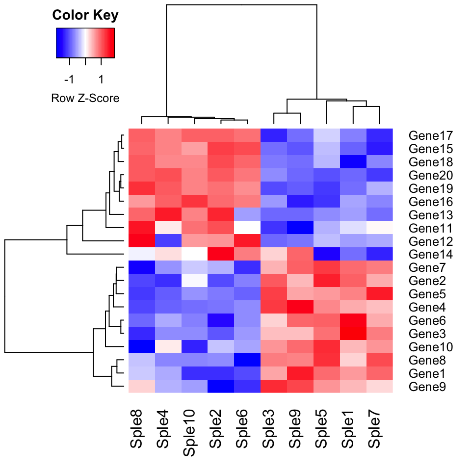
Use correlation as dissimilarity measures:
# Pairwise correlation between samples (columns)
cols.cor <- cor(mydata, use = "pairwise.complete.obs", method = "pearson")
# Pairwise correlation between rows (genes)
rows.cor <- cor(t(mydata), use = "pairwise.complete.obs", method = "pearson")

## Row- and column-wise clustering using correlation
hclust.col <- hclust(as.dist(1-cols.cor))
hclust.row <- hclust(as.dist(1-rows.cor))


# Plot the heatmap
library("gplots")
heatmap.2(mydata, scale = "row", col = bluered(100),
          trace = "none", density.info = "none",
          Colv = as.dendrogram(hclust.col),
          Rowv = as.dendrogram(hclust.row)
          )
Summary
In this article we introduce how perform clustering analysis and draw heatmaps in R using the pheatmap and the gplots package
Recommended for you
This section contains best data science and self-development resources to help you on your path.
Books - Data Science
Our Books
- Practical Guide to Cluster Analysis in R by A. Kassambara (Datanovia)
- Practical Guide To Principal Component Methods in R by A. Kassambara (Datanovia)
- Machine Learning Essentials: Practical Guide in R by A. Kassambara (Datanovia)
- R Graphics Essentials for Great Data Visualization by A. Kassambara (Datanovia)
- GGPlot2 Essentials for Great Data Visualization in R by A. Kassambara (Datanovia)
- Network Analysis and Visualization in R by A. Kassambara (Datanovia)
- Practical Statistics in R for Comparing Groups: Numerical Variables by A. Kassambara (Datanovia)
- Inter-Rater Reliability Essentials: Practical Guide in R by A. Kassambara (Datanovia)
Others
- R for Data Science: Import, Tidy, Transform, Visualize, and Model Data by Hadley Wickham & Garrett Grolemund
- Hands-On Machine Learning with Scikit-Learn, Keras, and TensorFlow: Concepts, Tools, and Techniques to Build Intelligent Systems by Aurelien Géron
- Practical Statistics for Data Scientists: 50 Essential Concepts by Peter Bruce & Andrew Bruce
- Hands-On Programming with R: Write Your Own Functions And Simulations by Garrett Grolemund & Hadley Wickham
- An Introduction to Statistical Learning: with Applications in R by Gareth James et al.
- Deep Learning with R by François Chollet & J.J. Allaire
- Deep Learning with Python by François Chollet
Version:




No Comments