
This article describes how to plot a correlation network in R using the corrr package.
Related article: Easy Correlation Matrix Analysis in R Using Corrr Package
Contents:
Load required R packages
tidyverse: easy data manipulation and visualizationcorrr: correlation matrix analysis
library(tidyverse)
library(corrr)
Data
data("airquality")
head(airquality)
## Ozone Solar.R Wind Temp Month Day
## 1 41 190 7.4 67 5 1
## 2 36 118 8.0 72 5 2
## 3 12 149 12.6 74 5 3
## 4 18 313 11.5 62 5 4
## 5 NA NA 14.3 56 5 5
## 6 28 NA 14.9 66 5 6Compute correlation matrix
res.cor <- correlate(airquality)
res.cor
## # A tibble: 6 x 7
## rowname Ozone Solar.R Wind Temp Month Day
## <chr> <dbl> <dbl> <dbl> <dbl> <dbl> <dbl>
## 1 Ozone NA 0.348 -0.602 0.698 0.165 -0.0132
## 2 Solar.R 0.348 NA -0.0568 0.276 -0.0753 -0.150
## 3 Wind -0.602 -0.0568 NA -0.458 -0.178 0.0272
## 4 Temp 0.698 0.276 -0.458 NA 0.421 -0.131
## 5 Month 0.165 -0.0753 -0.178 0.421 NA -0.00796
## 6 Day -0.0132 -0.150 0.0272 -0.131 -0.00796 NAfashion() the correlations for pleasant viewing:
res.cor %>% fashion()## rowname Ozone Solar.R Wind Temp Month Day
## 1 Ozone .35 -.60 .70 .16 -.01
## 2 Solar.R .35 -.06 .28 -.08 -.15
## 3 Wind -.60 -.06 -.46 -.18 .03
## 4 Temp .70 .28 -.46 .42 -.13
## 5 Month .16 -.08 -.18 .42 -.01
## 6 Day -.01 -.15 .03 -.13 -.01Create a correlation network
The R function network_plot() can be used to visualize and explore correlations.
airquality %>% correlate() %>%
  network_plot(min_cor = 0.3)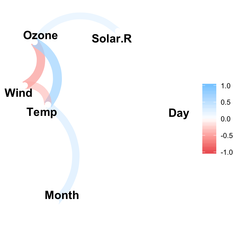
The option min_cor indicates the required minimum correlation value for a correlation to be plotted.
Each point reprents a variable. Variable that are highly correlated are clustered together. The positioning of variables is handled by multidimensional scaling of the absolute values of the correlations.
For example, it can be seen from the above plot that the variables Ozone, Wind and Temp are clustering together (which makes sense).
Each path represents a correlation between the two variables that it joins. Blue color represents a positive correlation, and a red color corresponds to a negative correlation.
The width and transparency of the path represent the strength of the correlation (wider and less transparent = stronger correlation).
For example, it can be seen that the positive correlation between Ozone and Temp is stronger than the positive correlation between Ozone and Solar.R.
Cleaning up the correlation network
We can clean this up by increasing the min_cor, thus plotting fewer correlation paths:
mtcars %>% correlate() %>%
  network_plot(min_cor = .7)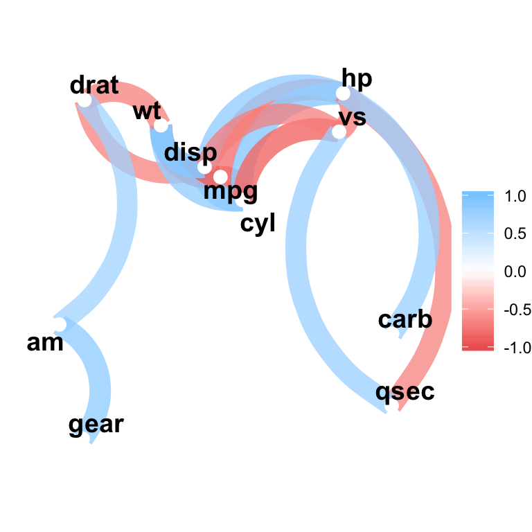
Recommended for you
This section contains best data science and self-development resources to help you on your path.
Books - Data Science
Our Books
- Practical Guide to Cluster Analysis in R by A. Kassambara (Datanovia)
- Practical Guide To Principal Component Methods in R by A. Kassambara (Datanovia)
- Machine Learning Essentials: Practical Guide in R by A. Kassambara (Datanovia)
- R Graphics Essentials for Great Data Visualization by A. Kassambara (Datanovia)
- GGPlot2 Essentials for Great Data Visualization in R by A. Kassambara (Datanovia)
- Network Analysis and Visualization in R by A. Kassambara (Datanovia)
- Practical Statistics in R for Comparing Groups: Numerical Variables by A. Kassambara (Datanovia)
- Inter-Rater Reliability Essentials: Practical Guide in R by A. Kassambara (Datanovia)
Others
- R for Data Science: Import, Tidy, Transform, Visualize, and Model Data by Hadley Wickham & Garrett Grolemund
- Hands-On Machine Learning with Scikit-Learn, Keras, and TensorFlow: Concepts, Tools, and Techniques to Build Intelligent Systems by Aurelien Géron
- Practical Statistics for Data Scientists: 50 Essential Concepts by Peter Bruce & Andrew Bruce
- Hands-On Programming with R: Write Your Own Functions And Simulations by Garrett Grolemund & Hadley Wickham
- An Introduction to Statistical Learning: with Applications in R by Gareth James et al.
- Deep Learning with R by François Chollet & J.J. Allaire
- Deep Learning with Python by François Chollet


No Comments