This article describes how to easily set ggplot axis ticks for both x and y axes. We’ll also explain how to rotate axis labels by specifying a rotation angle.
In this R graphics tutorial, you will learn how to:
- Change the font style (size, color and face) of the axis tick mark labels.
- Rotate axis text labels. For example, for a vertical x axis text label you can specify the argument angle as follow:
p + theme(axis.text.x = element_text(angle = 90)). - Remove axis ticks mark and text:
p + theme(axis.text.x = element_blank(), axis.ticks = element_blank()). - Remove grid lines and customize axis lines.
- Customize axis ticks for discrete and continuous axes:
- Manually label / rename tick marks and change the order of items in the plot for a discrete x axis.
- Format continuous axis tick labels using
percent,dollarandscientificscale transformations. - Change the axis ticks interval (or breaks) by specifying custom values.
Contents:
Key ggplot2 R functions
- Main functions:
The following function will be used to modify the axis theme and scale:
- theme(axis.text.x = element_text(), axis.text.y = element_text()). Change the appearance of axes text.
- theme(axis.line = element_line()). Change the axis lines
- scale_x_discrete() and scale_y_discrete(). Customize discrete x and y axes, respectively.
- scale_x_continuous() and scale_y_continuous(). Customize continuous x and y axes, respectively.
The scale functions take the arguments breaks, labels and limits as inputs.
- Key ggplot2 theme options to modify the axis line, axis ticks and tick text labels:
theme(
  # Change axis lines
  axis.line = element_line(),

  # Change axis ticks text labels: font color, size and face
  axis.text = element_text(),       # Change tick labels for all axes
  axis.text.x = element_text(),     # Change x axis tick labels only
  axis.text.x.top = element_text(), # x axis tick labels on top axis
  axis.text.y = element_text(),     # Change y axis tick labels only
  axis.text.y.right = element_text(),# y  axis tick labels on top axis

  # Change axis ticks line: font color, size, linetype and length
  axis.ticks = element_line(),      # Change ticks line fo all axes
  axis.ticks.x = element_line(),    # Change x axis ticks only
  axis.ticks.y = element_line(),    # Change y axis ticks only
  axis.ticks.length = unit(3, "pt") # Change the length of tick marks
)
Arguments of the helper functions:
element_text(color, size, face, family, angle, hjust, vjust). Modify the appearance and the rotation angle of axis texts.element_line(color, size, linetype). Modify the appearance of line elements.unit(). Change axis ticks length. Example: unit(4, “pt”).
To remove a particular axis text or ticks, use element_blank() for the corresponding theme argument. For example to remove all axis ticks, use this: p + theme(axis.ticks = element_blank()).
Example of plots
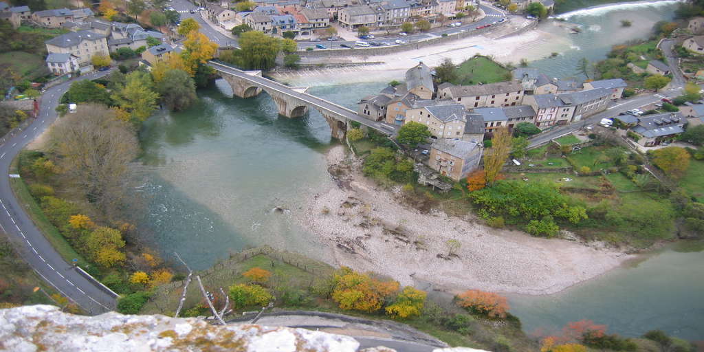
Start by creating a box plot using the ToothGrowth data set:
library(ggplot2)
p <- ggplot(ToothGrowth, aes(x = factor(dose), y = len)) +
  geom_boxplot()
p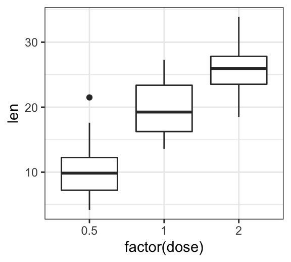
Change axis tick mark labels
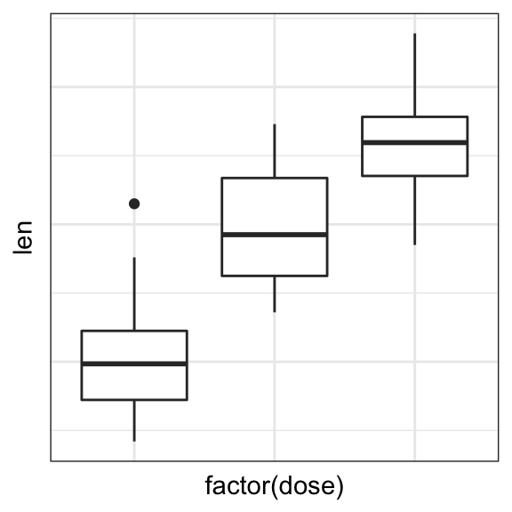
The functions theme() and element_text() are used to set the font size, color and face of axis tick mark labels. You can also specify the argument angle in the function element_text() to rotate the tick text.
Change the style and the orientation angle of axis tick labels. For a vertical rotation of x axis labels use angle = 90.
# Rotate x and y axis text by 45 degree
# face can be "plain", "italic", "bold" or "bold.italic"
p + theme(axis.text.x = element_text(face = "bold", color = "#993333",
                           size = 12, angle = 45),
          axis.text.y = element_text(face = "bold", color = "blue",
                           size = 12, angle = 45))

# Vertical rotation of x axis text
p + theme(axis.text.x = element_text(angle = 90))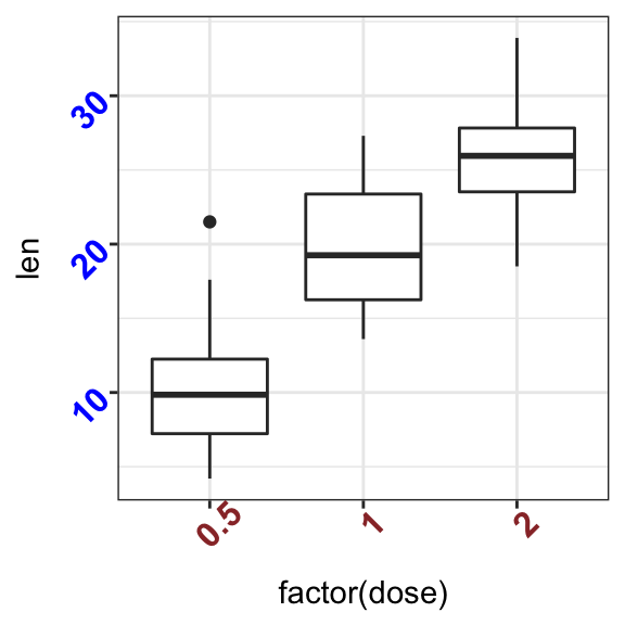
To adjust the position of the axis text, you can specify the argument hjust and vjust, which values should be comprised between 0 and 1. For example:
# Create a new simple box plot
p2 <- ggplot(iris, aes(Species, Sepal.Length)) +
  geom_boxplot()

# Rotated but not adjusted x axis text
p2 + theme(axis.text.x = element_text(angle = 45))

# Rotate and adjust x axis text
p2 + theme(axis.text.x = element_text(angle = 45, hjust = 1))

Remove x and y axis tick mark labels
Key function: element_blank()
# Remove x and y axis tick mark labels
p + theme(
  axis.text.x = element_blank(),
  axis.text.y = element_blank())

# Remove axis ticks and tick mark labels
p + theme(
  axis.text.x = element_blank(),
  axis.text.y = element_blank(),
  axis.ticks = element_blank())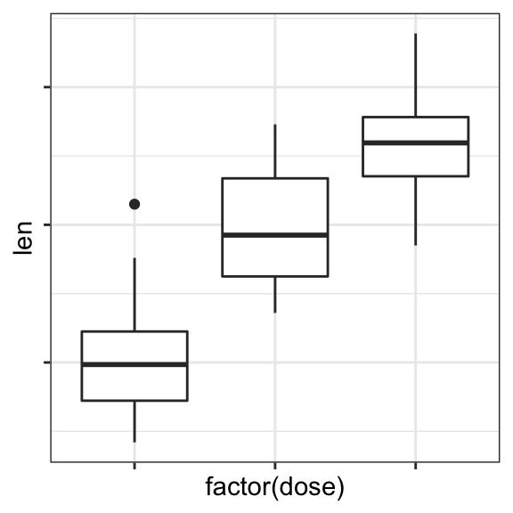
Change axis lines
- Key function:
theme()andelement_line() - Allowed values for line types: (“blank”, “solid”, “dashed”, “dotted”, “dotdash”, “longdash”, “twodash”) or number (0, 1, 2, 3, 4, 5, 6).
linetype = "solid"is identical tolinetype = 1.
Change the color, the size and the line type of axis lines:
p + theme(
  axis.line = element_line(color = "darkblue",
                           size = 1, linetype = "solid")
  )
Customize continuous and discrete axes
x or y axis can be discrete (grouping variable) or continuous (numeric variable). In each of these two cases, the functions to be used for setting axis ticks are different.
Key ggplot2 R functions:
- Discrete axes:
- scale_x_discrete(name, breaks, labels, limits): for x axis
- scale_y_discrete(name, breaks, labels, limits): for y axis
- Continuous axes:
- scale_x_continuous(name, breaks, labels, limits, trans): for x axis
- scale_y_continuous(name, breaks, labels, limits, trans): for x axis
Function arguments definition:
name: x or y axis labelsbreaks: vector specifying which breaks to displaylabels: labels of axis tick markslimits: vector indicating the data range
The scale_xx() functions can be used to change the following x or y axis parameters :
- axis titles or labels
- axis limits (data range to display)
- choose where tick marks appear
- manually label tick marks
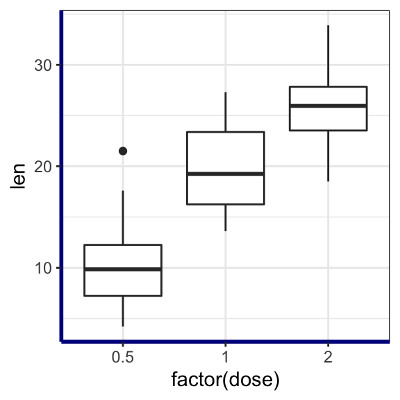
Discrete axes
In the examples below, we’ll use only the functions scale_x_discrete() and xlim() to customize x axis tick marks. The same type of examples can be applied to a discrete y axis using the functions scale_y_discrete() and ylim().
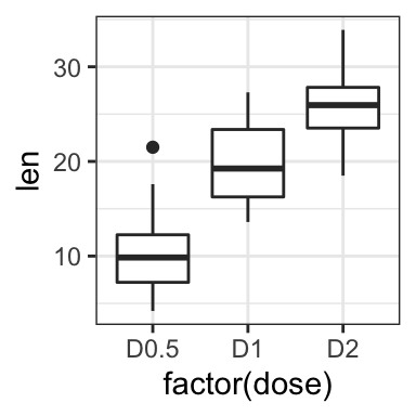
# Change x axis label and the order of items
p + scale_x_discrete(name ="Dose (mg)",
limits=c("2","1","0.5"))
# Rename / Change tick mark labels
p + scale_x_discrete(breaks=c("0.5","1","2"),
labels=c("D0.5", "D1", "D2"))
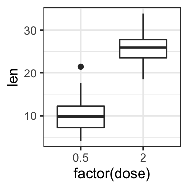
# Choose which items to display
p + scale_x_discrete(limits=c("0.5", "2"))
# or use this:
# p + xlim("0.5", "2") # same as above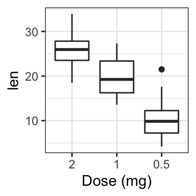
Continuous axes
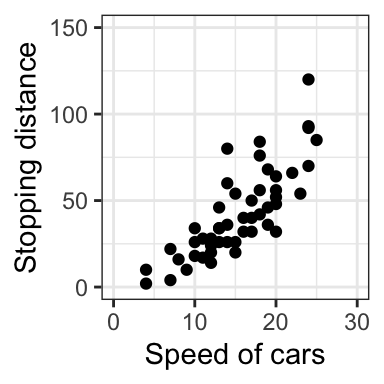
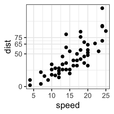
- Create a simple scatter plot
- Change axis labels and limits. Break axis by a user defined value.
# Simple scatter plot
sp <- ggplot(cars, aes(x = speed, y = dist)) + geom_point()
sp


# Change x and y axis labels, and limits
sp + scale_x_continuous(name="Speed of cars", limits=c(0, 30)) +
  scale_y_continuous(name="Stopping distance", limits=c(0, 150))
- Change axis ticks interval:
# Break y axis by a specified value
# a tick mark is shown on every 50
sp + scale_y_continuous(breaks=seq(0, 150, 50))

# Tick marks can be spaced randomly
sp + scale_y_continuous(breaks=c(0, 50, 65, 75, 150))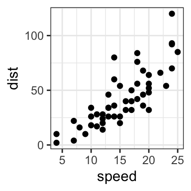
- Remove tick mark labels and gridlines
- Format axis tick labels. Possible values for labels are comma, percent, dollar and scientific. For more examples, read the documentation of the function trans_new() in the
scalesR package.
# Remove y tick mark labels and grid lines
sp + scale_y_continuous(breaks=NULL)
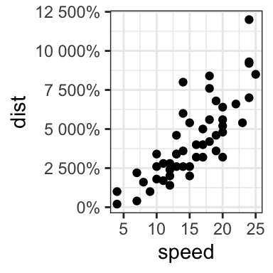
# Format y axis labels in percent (%)
require(scales)
sp + scale_y_continuous(labels = percent) 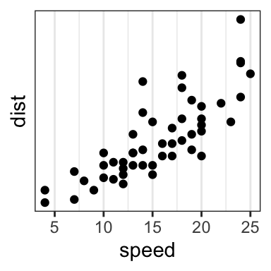
For dollar and scientific formats, type this:
require(scales)

# Dollar
p + scale_y_continuous(labels = dollar)

# Scientific
p + scale_y_continuous(labels = scientific)
Conclusion
- Create an example of ggplot:
library(ggplot2)
p <- ggplot(iris, aes(Species, Sepal.Length)) +
geom_boxplot()- Change tick font:
# Change tick text for both x and y axis
p + theme(
  axis.text = element_text(size = 11, color = "blue")
)
# Change tick text for x axis ony
p + theme(axis.text.x = element_text(color = "blue", face = "italic"))- Rotate x axis text:
# Vertical rotation: 90 degree
p + theme(
  axis.text.x = element_text(angle = 90, hjust = 1, vjust = 0.5)
)
# Rotate by 45 degree
p + theme(
  axis.text.x = element_text(angle = 45, hjust = 1)
)- Remove x axis ticks and rename tick labels:
p + theme(axis.ticks.x = element_blank())+
  scale_x_discrete(
    breaks=c("setosa","versicolor","virginica"),
    labels=c("SE", "VE", "VI")
    )
Recommended for you
This section contains best data science and self-development resources to help you on your path.
Books - Data Science
Our Books
- Practical Guide to Cluster Analysis in R by A. Kassambara (Datanovia)
- Practical Guide To Principal Component Methods in R by A. Kassambara (Datanovia)
- Machine Learning Essentials: Practical Guide in R by A. Kassambara (Datanovia)
- R Graphics Essentials for Great Data Visualization by A. Kassambara (Datanovia)
- GGPlot2 Essentials for Great Data Visualization in R by A. Kassambara (Datanovia)
- Network Analysis and Visualization in R by A. Kassambara (Datanovia)
- Practical Statistics in R for Comparing Groups: Numerical Variables by A. Kassambara (Datanovia)
- Inter-Rater Reliability Essentials: Practical Guide in R by A. Kassambara (Datanovia)
Others
- R for Data Science: Import, Tidy, Transform, Visualize, and Model Data by Hadley Wickham & Garrett Grolemund
- Hands-On Machine Learning with Scikit-Learn, Keras, and TensorFlow: Concepts, Tools, and Techniques to Build Intelligent Systems by Aurelien Géron
- Practical Statistics for Data Scientists: 50 Essential Concepts by Peter Bruce & Andrew Bruce
- Hands-On Programming with R: Write Your Own Functions And Simulations by Garrett Grolemund & Hadley Wickham
- An Introduction to Statistical Learning: with Applications in R by Gareth James et al.
- Deep Learning with R by François Chollet & J.J. Allaire
- Deep Learning with Python by François Chollet
Version:
 Français


Thank you for this! Super helpful
I appreciate your positive feedback!
Hi Kassambara,
Your site is rich with helpful R tricks. Thanks for sharing.
Thank you fr this positive feedback!
Muchas gracias!!! // Thank you very much!!!
Hi is posible combinate 2 codigos scale_X_discrete? maybe #Change and # remove?
I am looking for a way of including texts to number ticks. For instance, instead of 7, I want to alternate it with “7 as pure water”, instead of 4, I want to alternate it with “4 like apple juice” on a pH scatter plot.