
This article describes how to format ggplot date axis using the R functions scale_x_date() and scale_y_date().
In this R graphics tutorial, you’ll learn how to:
- Change date axis labels using different combinations of days, weeks, months, year
- Modify date axis limits.
Contents:
Key ggplot2 R functions
scale_x_date(date_labels, limits)andscale_y_date(date_labels, limits): Format date axesscale_x_datetime(date-labels, limits)and `scale_y_datetime(date_labels, limits): Format a datetime axis
Time series data
Create some time series data sets:
set.seed(1234)
last_month <- Sys.Date() - 0:29
df <- data.frame(
  date = last_month,
  price = runif(30)
)
head(df)
## date price
## 1 2018-11-13 0.114
## 2 2018-11-12 0.622
## 3 2018-11-11 0.609
## 4 2018-11-10 0.623
## 5 2018-11-09 0.861
## 6 2018-11-08 0.640Create a simple ggplot with date axis
library(ggplot2)
p <- ggplot(data=df, aes(x = date, y = price)) +
  geom_line()
p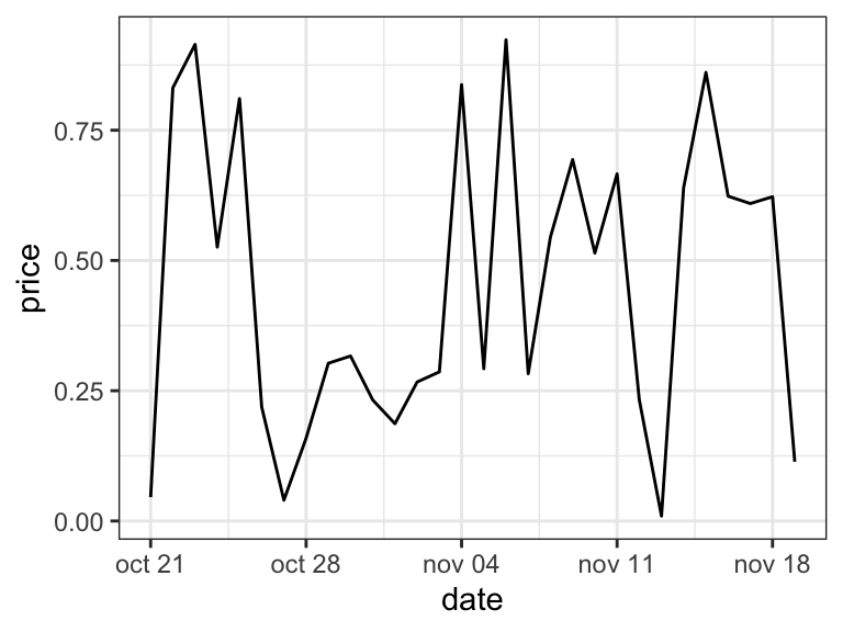
Format date axis labels: scale_x_date
To format date axis labels, you can use different combinations of days, weeks, months and years:
- Weekday name: use
%aand%Afor abbreviated and full weekday name, respectively - Month name: use
%band%Bfor abbreviated and full month name, respectively %d: day of the month as decimal number%U: week of the year as decimal number (00–53)%Y: Year with century.- See more options in the documentation of the function
?strptime
# Format : month/day
p + scale_x_date(date_labels = "%b/%d")
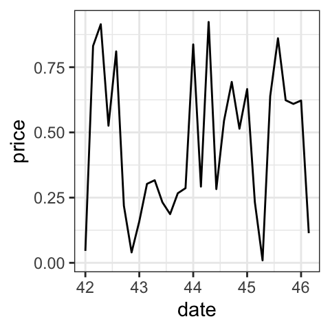
# Format : Week
p + scale_x_date(date_labels = "%U")
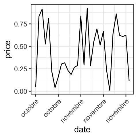
# Months only
p + scale_x_date(date_labels = "%B")+
theme(axis.text.x = element_text(angle=45, hjust = 1))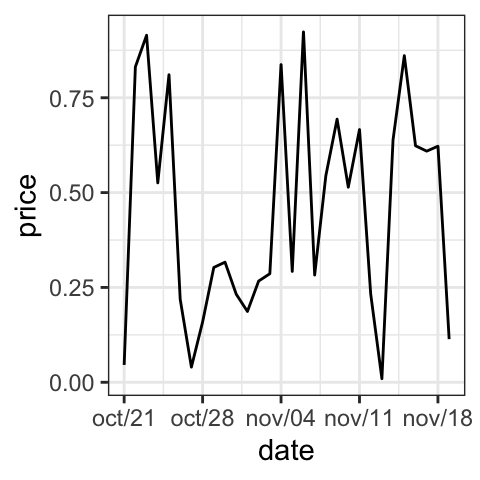
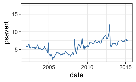
Set date axis limits
Use the economics time series data sets [in ggplot2]:
data("economics")
# Base plot with date axis
p <- ggplot(data = economics, aes(x = date, y = psavert)) +
     geom_line(color = "steelblue")
p

# Set axis limits c(min, max)
min <- as.Date("2002-1-1")
max <- NA
p + scale_x_date(limits = c(min, max))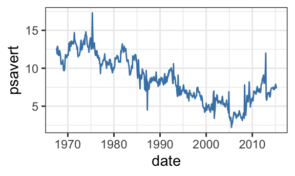
Conclusion
To change the format of data axis labels, first read the help page of the R base function strptime() to see the available date format.
Then, use the following example of R code:
p + scale_x_date(date_labels = "%b/%d")Recommended for you
This section contains best data science and self-development resources to help you on your path.
Books - Data Science
Our Books
- Practical Guide to Cluster Analysis in R by A. Kassambara (Datanovia)
- Practical Guide To Principal Component Methods in R by A. Kassambara (Datanovia)
- Machine Learning Essentials: Practical Guide in R by A. Kassambara (Datanovia)
- R Graphics Essentials for Great Data Visualization by A. Kassambara (Datanovia)
- GGPlot2 Essentials for Great Data Visualization in R by A. Kassambara (Datanovia)
- Network Analysis and Visualization in R by A. Kassambara (Datanovia)
- Practical Statistics in R for Comparing Groups: Numerical Variables by A. Kassambara (Datanovia)
- Inter-Rater Reliability Essentials: Practical Guide in R by A. Kassambara (Datanovia)
Others
- R for Data Science: Import, Tidy, Transform, Visualize, and Model Data by Hadley Wickham & Garrett Grolemund
- Hands-On Machine Learning with Scikit-Learn, Keras, and TensorFlow: Concepts, Tools, and Techniques to Build Intelligent Systems by Aurelien Géron
- Practical Statistics for Data Scientists: 50 Essential Concepts by Peter Bruce & Andrew Bruce
- Hands-On Programming with R: Write Your Own Functions And Simulations by Garrett Grolemund & Hadley Wickham
- An Introduction to Statistical Learning: with Applications in R by Gareth James et al.
- Deep Learning with R by François Chollet & J.J. Allaire
- Deep Learning with Python by François Chollet
Version:
 Français


No Comments