This article provides a gallery of ggplot examples, including: scatter plot, density plots and histograms, bar and line plots, error bars, box plots, violin plots and more.
Contents:
Related Book
GGPlot2 Essentials for Great Data Visualization in RPrerequisites
Load required packages and set the theme function theme_bw() as the default theme:
library(tidyverse)
library(ggpubr)
theme_set(
  theme_bw() +
  theme(legend.position = "top")
  )
Scatter plot
- Basic scatter plot with correlation coefficient. The function
stat_cor()[ggpubr R package] is used to add the correlation coefficient.
library("ggpubr")
p <- ggplot(mtcars, aes(mpg, wt)) +
  geom_point() +
  geom_smooth(method = lm) +
  stat_cor(method = "pearson", label.x = 20)
p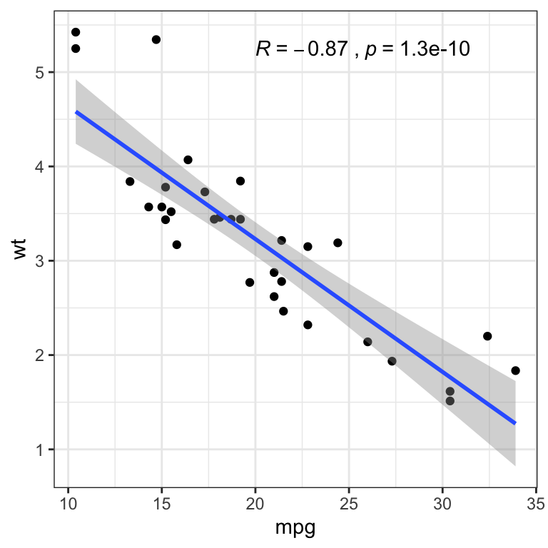
- Contextual zoom. Key R function
facet_zoom()[ggforce]
library(ggforce)
ggplot(iris, aes(Petal.Length, Petal.Width, colour = Species)) +
    geom_point() +
    facet_zoom(x = Species == "versicolor")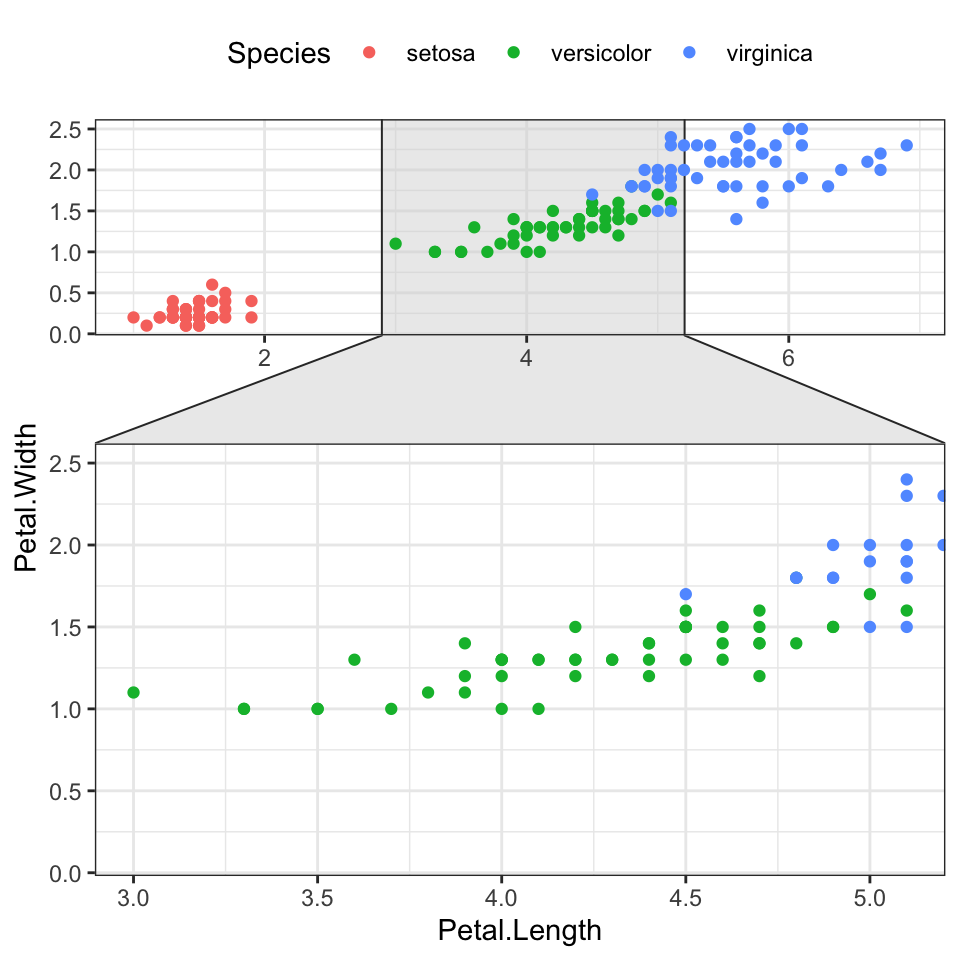
- Encircle some points. The function
geom_encircle()[ggalt R package] can be used to encircle a certain group of points
# Encircle setosa group
library("ggalt")
circle.df <- iris %>% filter(Species == "setosa")
ggplot(iris, aes(Petal.Length, Petal.Width)) +
    geom_point(aes(colour = Species)) +
  geom_encircle(data = circle.df, linetype = 2)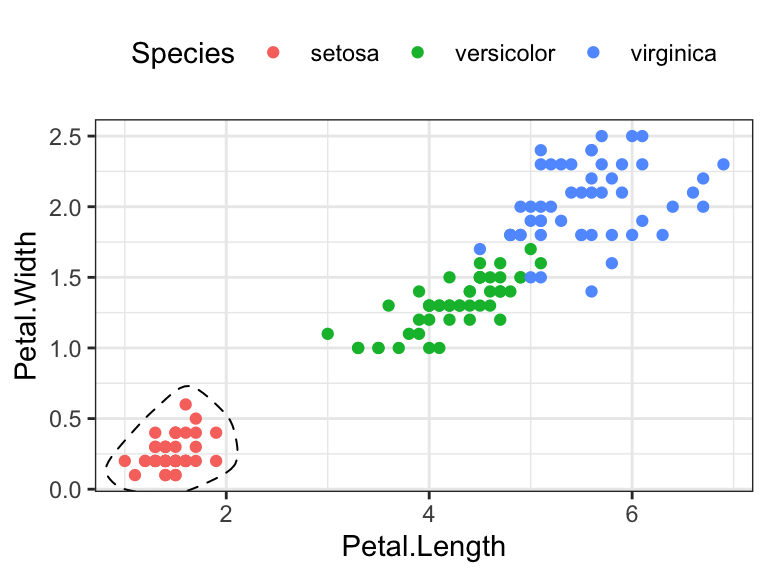
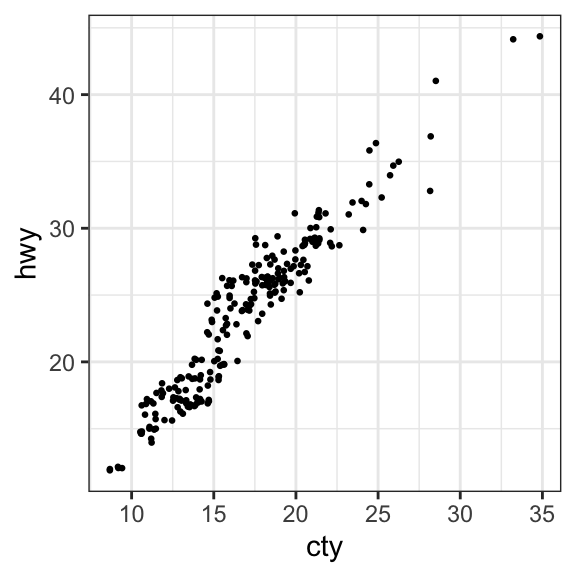
- Create jittered points to avoid overlap. The overlapping points are randomly jittered around their original position based on a threshold controlled by the
widthargument in the function `geom_jitter()
# Basic scatter plot
ggplot(mpg, aes(cty, hwy)) +
  geom_point(size = 0.5)

# Jittered points
ggplot(mpg, aes(cty, hwy)) +
  geom_jitter(size = 0.5, width = 0.5)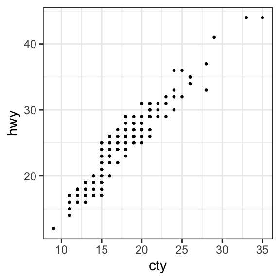
- Create count charts to avoid overlap. Wherever there is more points overlap, the size of the circle gets bigger.
ggplot(mpg, aes(cty, hwy)) +
  geom_count()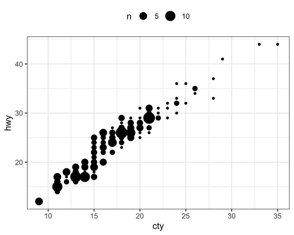
- Bubble chart. In a bubble chart, points size is controlled by a continuous variable, here qsec.
ggplot(mtcars, aes(mpg, wt)) +
  geom_point(aes(size = qsec), alpha = 0.5) +
  scale_size(range = c(0.5, 12))  # Adjust the range of points size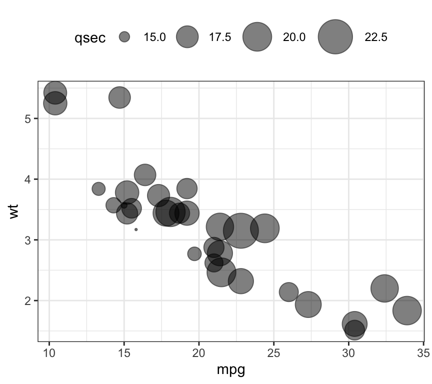
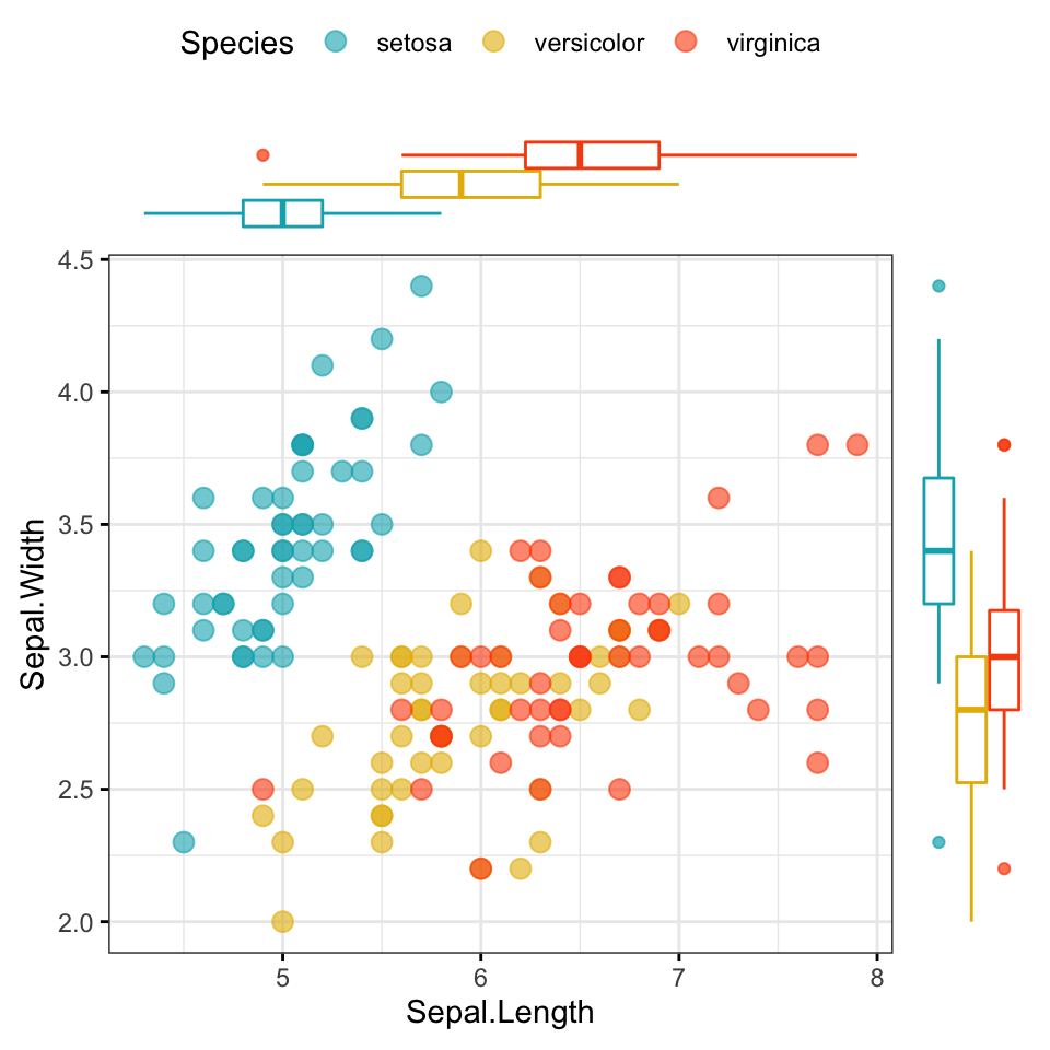
- Marginal density plots
library(ggpubr)
# Grouped Scatter plot with marginal density plots
ggscatterhist(
  iris, x = "Sepal.Length", y = "Sepal.Width",
  color = "Species", size = 3, alpha = 0.6,
  palette = c("#00AFBB", "#E7B800", "#FC4E07"),
  margin.params = list(fill = "Species", color = "black", size = 0.2)
  )
# Use box plot as marginal plots
ggscatterhist(
  iris, x = "Sepal.Length", y = "Sepal.Width",
  color = "Species", size = 3, alpha = 0.6,
  palette = c("#00AFBB", "#E7B800", "#FC4E07"),
  margin.plot = "boxplot",
  ggtheme = theme_bw()
  )
Distribution
Density plot
- Basic density plot:
# Basic density plot
ggplot(iris, aes(Sepal.Length)) +
geom_density()
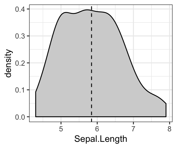
# Add mean line
ggplot(iris, aes(Sepal.Length)) +
geom_density(fill = "lightgray") +
geom_vline(aes(xintercept = mean(Sepal.Length)), linetype = 2)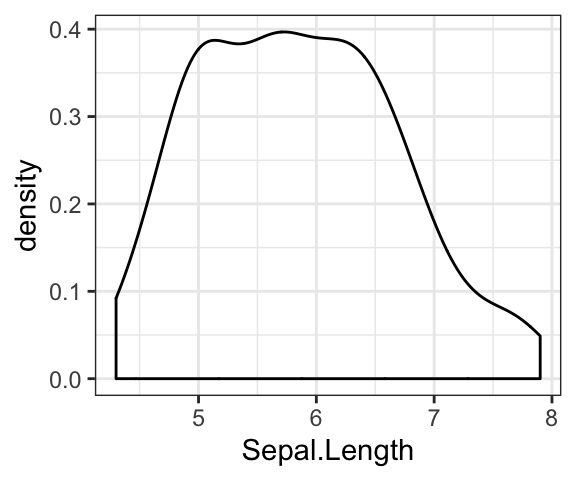
- Change color by groups
# Change line color by groups
ggplot(iris, aes(Sepal.Length, color = Species)) +
  geom_density() +
  scale_color_viridis_d()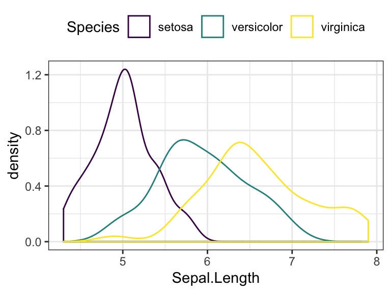
# Add mean line by groups
mu <- iris %>%
  group_by(Species) %>%
  summarise(grp.mean = mean(Sepal.Length))

ggplot(iris, aes(Sepal.Length, color = Species)) +
  geom_density() +
  geom_vline(aes(xintercept = grp.mean, color = Species),
             data = mu, linetype = 2) +
  scale_color_viridis_d()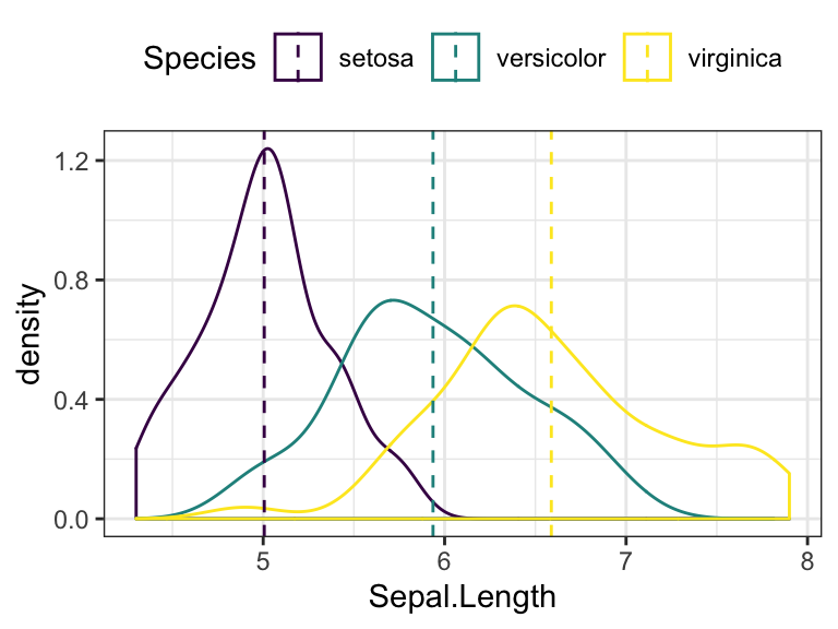
Histogram
- Basic histograms
# Basic histogram with mean line
ggplot(iris, aes(Sepal.Length)) +
geom_histogram(bins = 20, fill = "white", color = "black") +
geom_vline(aes(xintercept = mean(Sepal.Length)), linetype = 2)
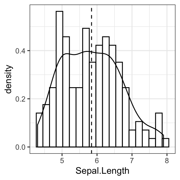
# Add density curves
ggplot(iris, aes(Sepal.Length, stat(density))) +
geom_histogram(bins = 20, fill = "white", color = "black") +
geom_density() +
geom_vline(aes(xintercept = mean(Sepal.Length)), linetype = 2)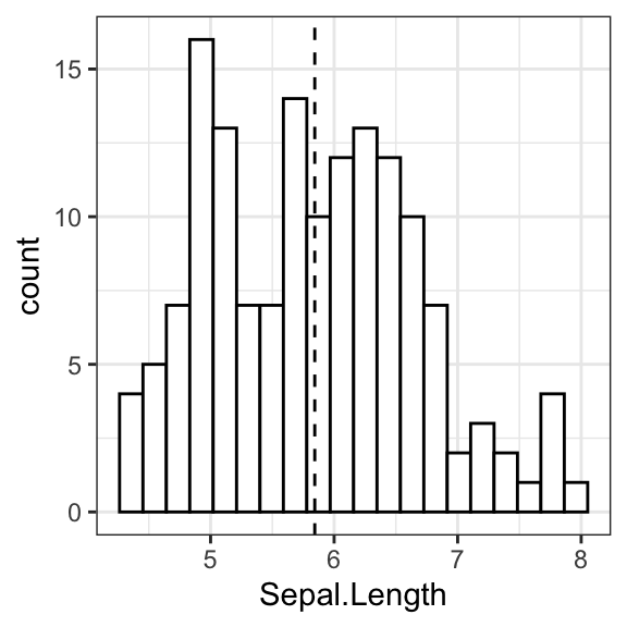
- Change color by groups
ggplot(iris, aes(Sepal.Length)) +
  geom_histogram(aes(fill = Species, color = Species), bins = 20,
                 position = "identity", alpha = 0.5) +
  scale_fill_viridis_d() +
  scale_color_viridis_d()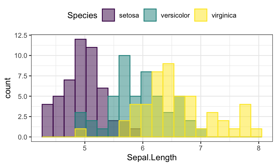
QQ Plot
library(ggpubr)
ggqqplot(iris, x = "Sepal.Length",
   ggtheme = theme_bw())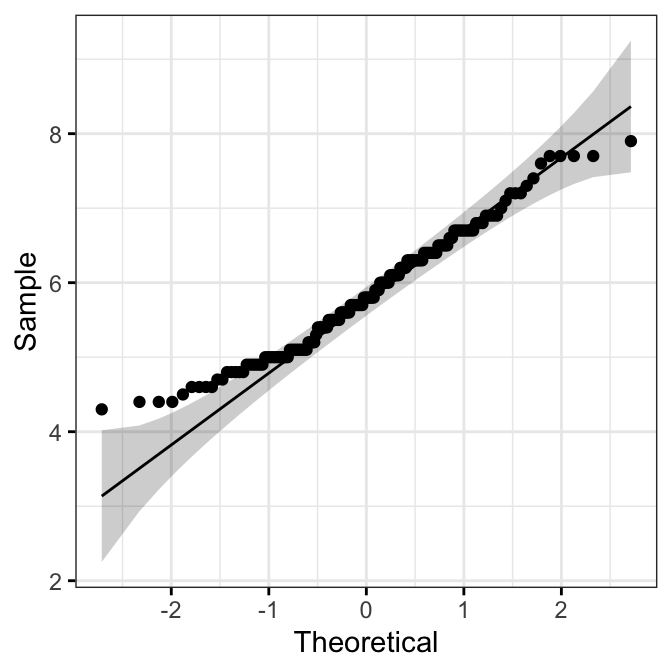
Empirical cumulative distribution (ECDF)
ggplot(iris, aes(Sepal.Length)) +
  stat_ecdf(aes(color = Species)) +
  scale_color_viridis_d()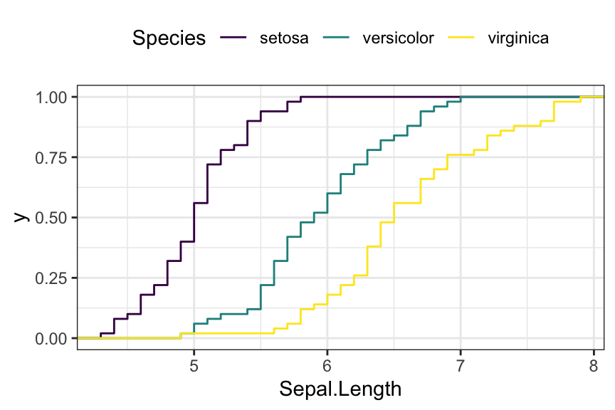
Density ridgeline plots
The density ridgeline plot is an alternative to the standard geom_density() function that can be useful for visualizing changes in distributions, of a continuous variable, over time or space. Ridgeline plots are partially overlapping line plots that create the impression of a mountain range.
library(ggridges)
ggplot(iris, aes(x = Sepal.Length, y = Species)) +
  geom_density_ridges(aes(fill = Species)) +
  scale_fill_manual(values = c("#00AFBB", "#E7B800", "#FC4E07"))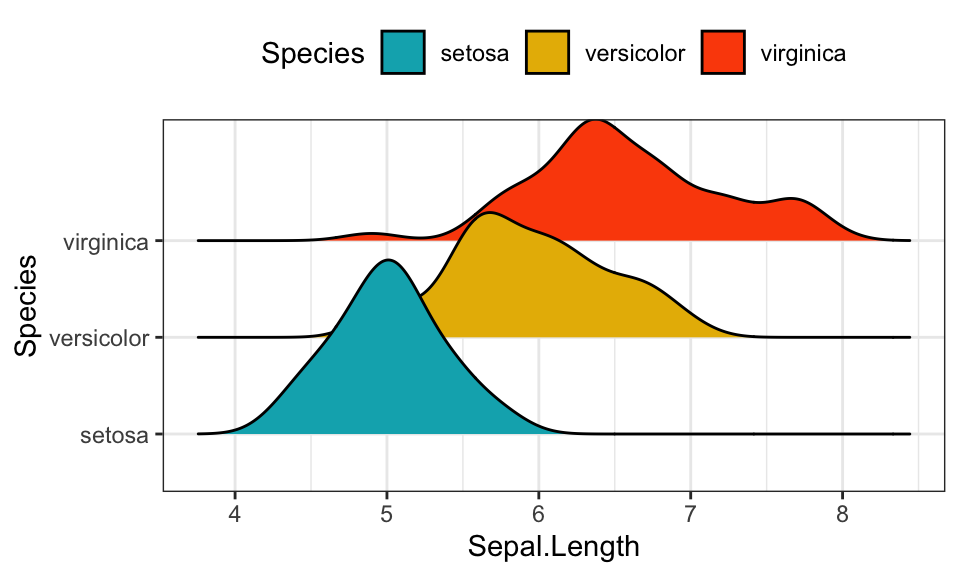
Bar charts and alternatives
- Data
df <- mtcars %>%
  rownames_to_column() %>%
  as_data_frame() %>%
  mutate(cyl = as.factor(cyl)) %>%
  select(rowname, wt, mpg, cyl)
df
## # A tibble: 32 x 4
## rowname wt mpg cyl
## <chr> <dbl> <dbl> <fct>
## 1 Mazda RX4 2.62 21 6
## 2 Mazda RX4 Wag 2.88 21 6
## 3 Datsun 710 2.32 22.8 4
## 4 Hornet 4 Drive 3.22 21.4 6
## 5 Hornet Sportabout 3.44 18.7 8
## 6 Valiant 3.46 18.1 6
## # ... with 26 more rows- Basic bar plots
# Basic bar plots
ggplot(df, aes(x = rowname, y = mpg)) +
  geom_col() +
  rotate_x_text(angle = 45)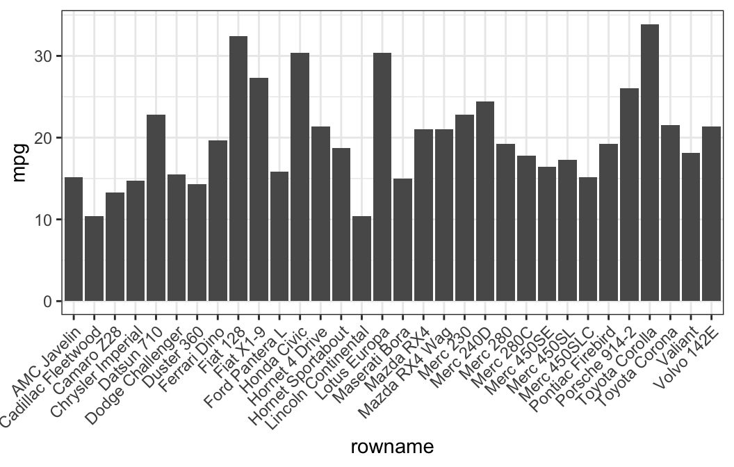
# Reorder row names by mpg values
ggplot(df, aes(x = reorder(rowname, mpg), y = mpg)) +
  geom_col()  +
  rotate_x_text(angle = 45)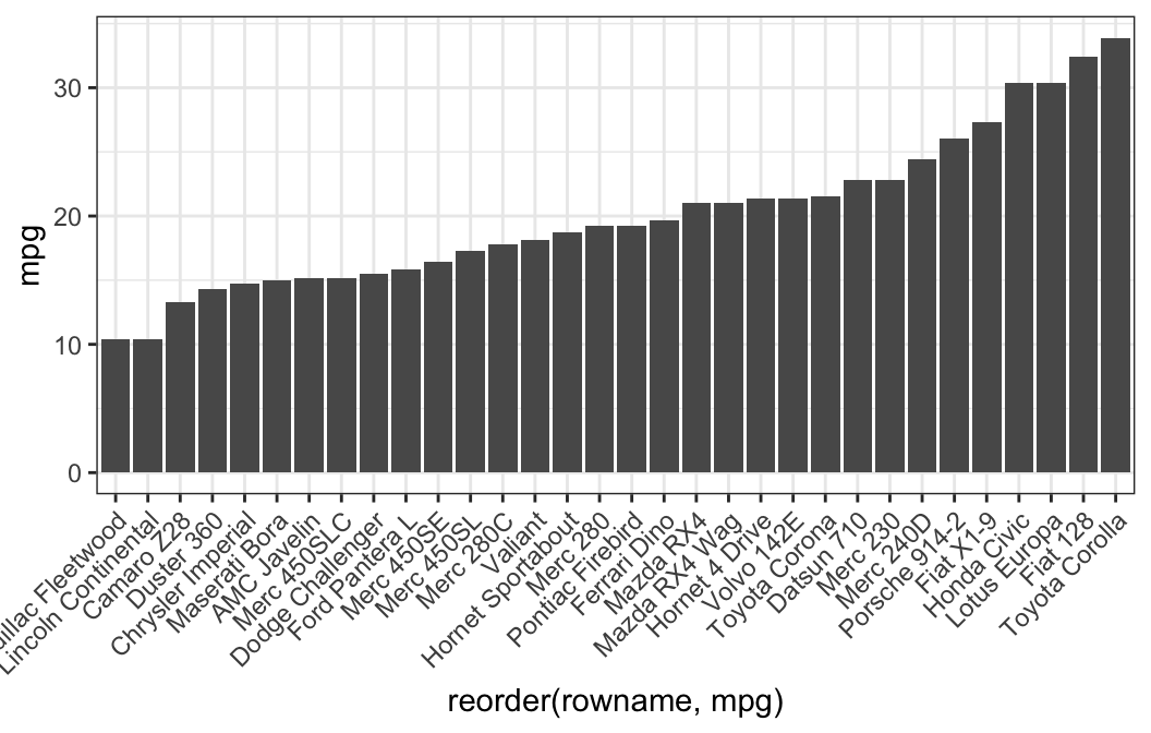
- Horizontal bar plots
# Horizontal bar plots,
# change fill color by groups and add text labels
ggplot(df, aes(x = reorder(rowname, mpg), y = mpg)) +
  geom_col( aes(fill = cyl)) +
  geom_text(aes(label = mpg), nudge_y = 2) +
  coord_flip() +
  scale_fill_viridis_d()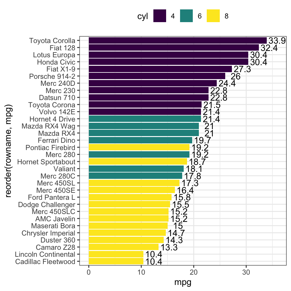
- Order bars by groups and by mpg values
df2 <- df %>%
  arrange(cyl, mpg) %>%
  mutate(rowname = factor(rowname, levels = rowname))

ggplot(df2, aes(x = rowname, y = mpg)) +
  geom_col( aes(fill = cyl)) +
  scale_fill_viridis_d() +
  rotate_x_text(45)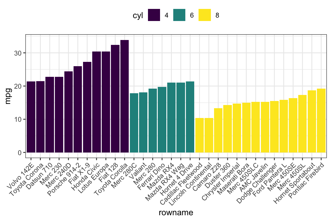
- Lollipop chart: Lollipop is an alternative to bar charts when you have large data sets.
ggplot(df2, aes(x = rowname, y = mpg)) +
  geom_segment(
    aes(x = rowname, xend = rowname, y = 0, yend = mpg),
    color = "lightgray"
    ) +
  geom_point(aes(color = cyl), size = 3) +
  scale_color_viridis_d() +
  theme_pubclean() +
  rotate_x_text(45)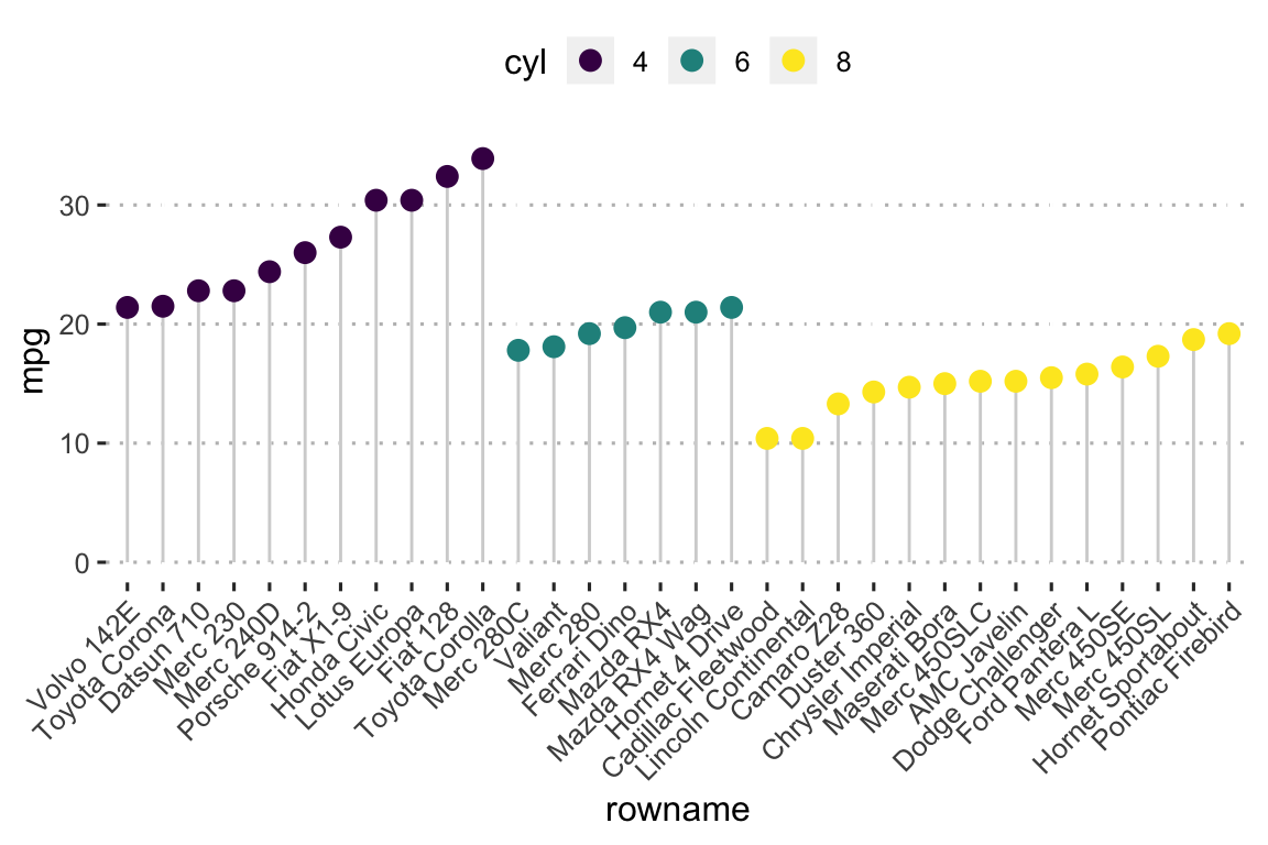
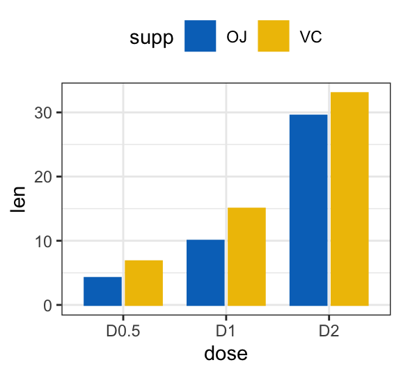
- Bar plot with multiple groups
# Data
df3 <- data.frame(supp=rep(c("VC", "OJ"), each=3),
                dose=rep(c("D0.5", "D1", "D2"),2),
                len=c(6.8, 15, 33, 4.2, 10, 29.5))


# Stacked bar plots of y = counts by x = cut,
# colored by the variable color
ggplot(df3, aes(x = dose, y = len)) +
  geom_col(aes(color = supp, fill = supp), position = position_stack()) +
  scale_color_manual(values = c("#0073C2FF", "#EFC000FF"))+
  scale_fill_manual(values = c("#0073C2FF", "#EFC000FF"))

# Use position = position_dodge()
ggplot(df3, aes(x = dose, y = len)) +
  geom_col(aes(color = supp, fill = supp), position = position_dodge(0.8), width = 0.7) +
  scale_color_manual(values = c("#0073C2FF", "#EFC000FF"))+
  scale_fill_manual(values = c("#0073C2FF", "#EFC000FF"))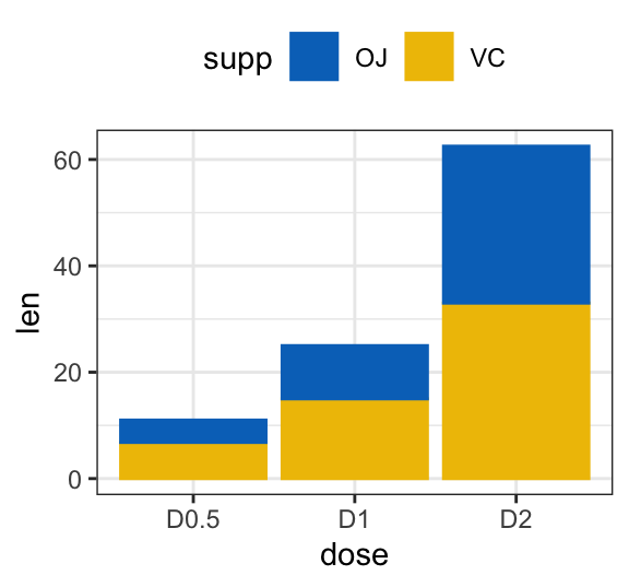
Line plot
# Data
df3 <- data.frame(supp=rep(c("VC", "OJ"), each=3),
                dose=rep(c("D0.5", "D1", "D2"),2),
                len=c(6.8, 15, 33, 4.2, 10, 29.5))

# Line plot
ggplot(df3, aes(x = dose, y = len, group = supp)) +
  geom_line(aes(linetype = supp)) +
  geom_point(aes(shape = supp))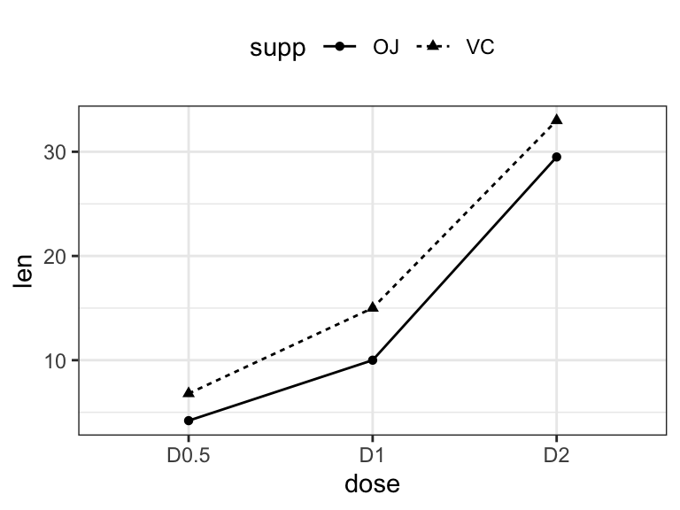
Error bars
- Data
# Raw data
df <- ToothGrowth %>% mutate(dose = as.factor(dose))
head(df, 3)
## len supp dose
## 1 4.2 VC 0.5
## 2 11.5 VC 0.5
## 3 7.3 VC 0.5# Summary statistics
df.summary <- df %>%
group_by(dose) %>%
summarise(sd = sd(len, na.rm = TRUE), len = mean(len))
df.summary## # A tibble: 3 x 3
## dose sd len
## <fct> <dbl> <dbl>
## 1 0.5 4.50 10.6
## 2 1 4.42 19.7
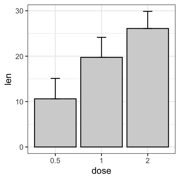
## 3 2 3.77 26.1- Basic line and bar plots with error bars
# (1) Line plot
ggplot(df.summary, aes(dose, len)) +
  geom_line(aes(group = 1)) +
  geom_errorbar( aes(ymin = len-sd, ymax = len+sd),width = 0.2) +
  geom_point(size = 2)

# (2) Bar plot
ggplot(df.summary, aes(dose, len)) +
  geom_bar(stat = "identity", fill = "lightgray", color = "black") +
geom_errorbar(aes(ymin = len, ymax = len+sd), width = 0.2) 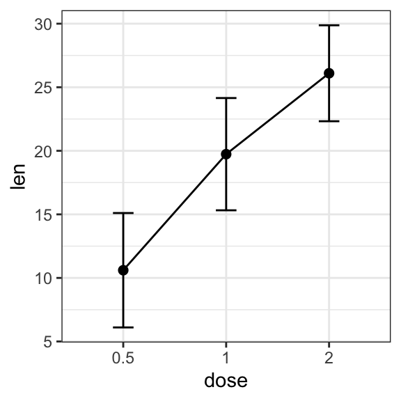
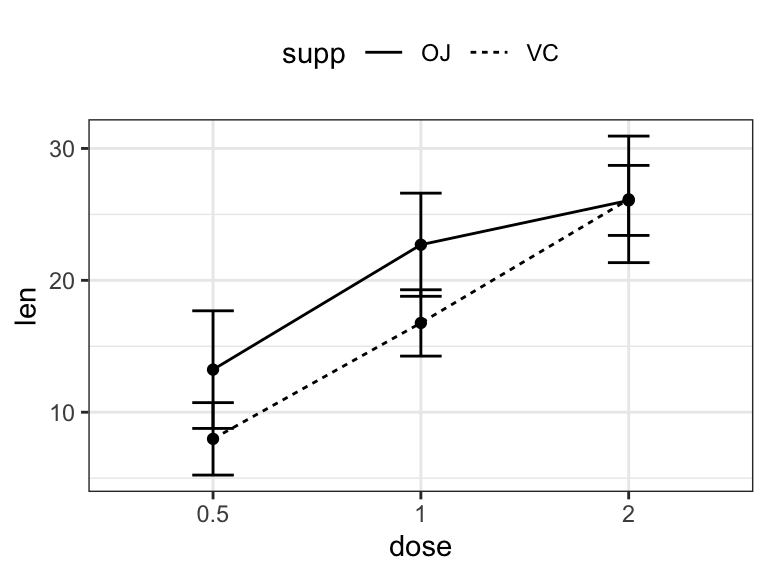
- Grouped line/bar plots
# Data preparation
df.summary2 <- df %>%
  group_by(dose, supp) %>%
  summarise( sd = sd(len), len = mean(len))
df.summary2
## # A tibble: 6 x 4
## # Groups: dose [?]
## dose supp sd len
## <fct> <fct> <dbl> <dbl>
## 1 0.5 OJ 4.46 13.2
## 2 0.5 VC 2.75 7.98
## 3 1 OJ 3.91 22.7
## 4 1 VC 2.52 16.8
## 5 2 OJ 2.66 26.1
## 6 2 VC 4.80 26.1# (1) Line plot + error bars
ggplot(df.summary2, aes(dose, len)) +
geom_line(aes(linetype = supp, group = supp))+
geom_point()+
geom_errorbar(
aes(ymin = len-sd, ymax = len+sd, group = supp),
width = 0.2
)
# (2) Bar plots + upper error bars.
ggplot(df.summary2, aes(dose, len)) +
  geom_bar(aes(fill = supp), stat = "identity",
           position = position_dodge(0.8), width = 0.7)+
  geom_errorbar(
    aes(ymin = len, ymax = len+sd, group = supp),
    width = 0.2, position = position_dodge(0.8)
    )+
  scale_fill_manual(values = c("grey80", "grey30"))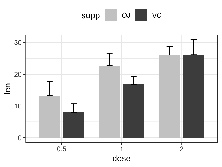
Box plots and alternatives
- Data
ToothGrowth$dose <- as.factor(ToothGrowth$dose)- Basic box plots
# Basic
ggplot(ToothGrowth, aes(dose, len)) +
geom_boxplot()
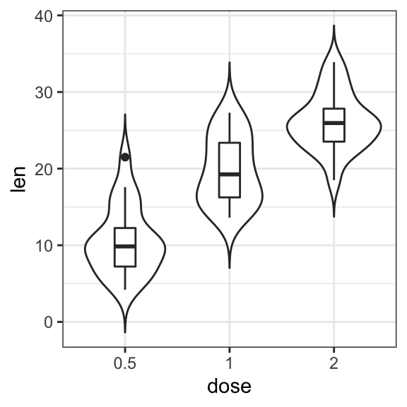
# Box plot + violin plot
ggplot(ToothGrowth, aes(dose, len)) +
geom_violin(trim = FALSE) +
geom_boxplot(width = 0.2)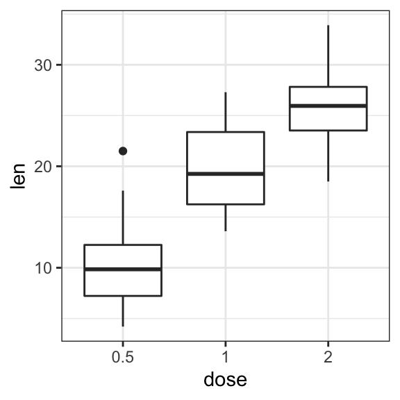
- Add jittered points and dot plot
# Add jittered points
ggplot(ToothGrowth, aes(dose, len)) +
geom_boxplot() +
geom_jitter(width = 0.2)
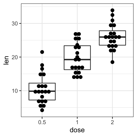
# Dot plot + box plot
ggplot(ToothGrowth, aes(dose, len)) +
geom_boxplot() +
geom_dotplot(binaxis = "y", stackdir = "center")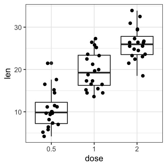
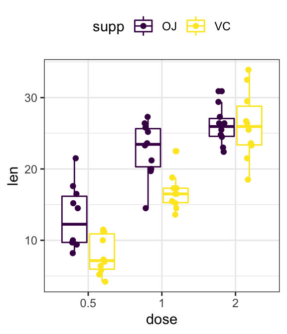
- Grouped plots
# Box plots
ggplot(ToothGrowth, aes(dose, len)) +
  geom_boxplot(aes(color = supp)) +
  scale_color_viridis_d()

# Add jittered points
ggplot(ToothGrowth, aes(dose, len, color = supp)) +
  geom_boxplot() +
  geom_jitter(position = position_jitterdodge(jitter.width = 0.2)) +
  scale_color_viridis_d()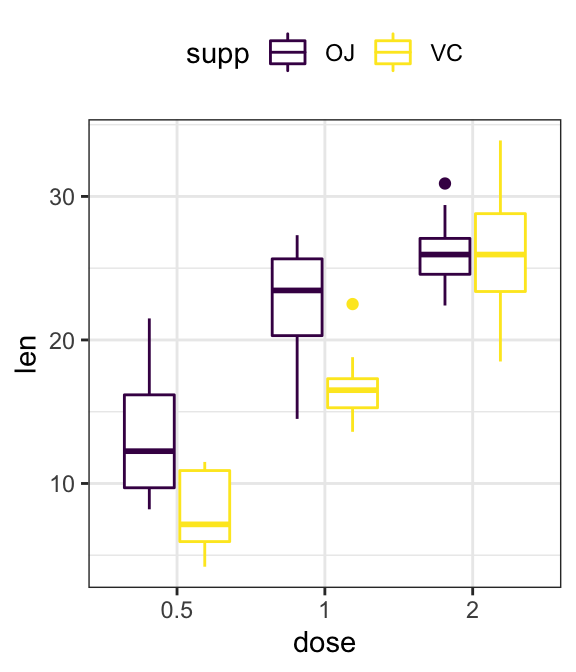
Time series data visualization
# Data preparation
df <- economics %>%
  select(date, psavert, uempmed) %>%
  gather(key = "variable", value = "value", -date)
head(df, 3)
## # A tibble: 3 x 3
## date variable value
## <date> <chr> <dbl>
## 1 1967-07-01 psavert 12.5
## 2 1967-08-01 psavert 12.5
## 3 1967-09-01 psavert 11.7# Multiple line plot
ggplot(df, aes(x = date, y = value)) +
geom_line(aes(color = variable), size = 1) +
scale_color_manual(values = c("#00AFBB", "#E7B800")) +
theme_minimal()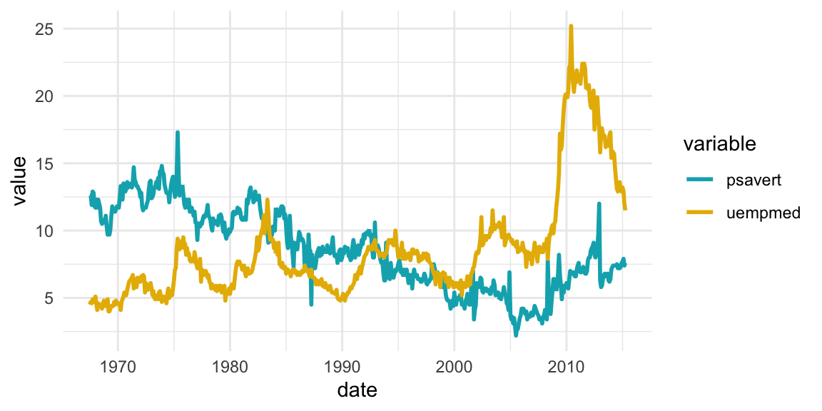
scatter plot matrix
library(GGally)
ggpairs(iris[,-5])+ theme_bw()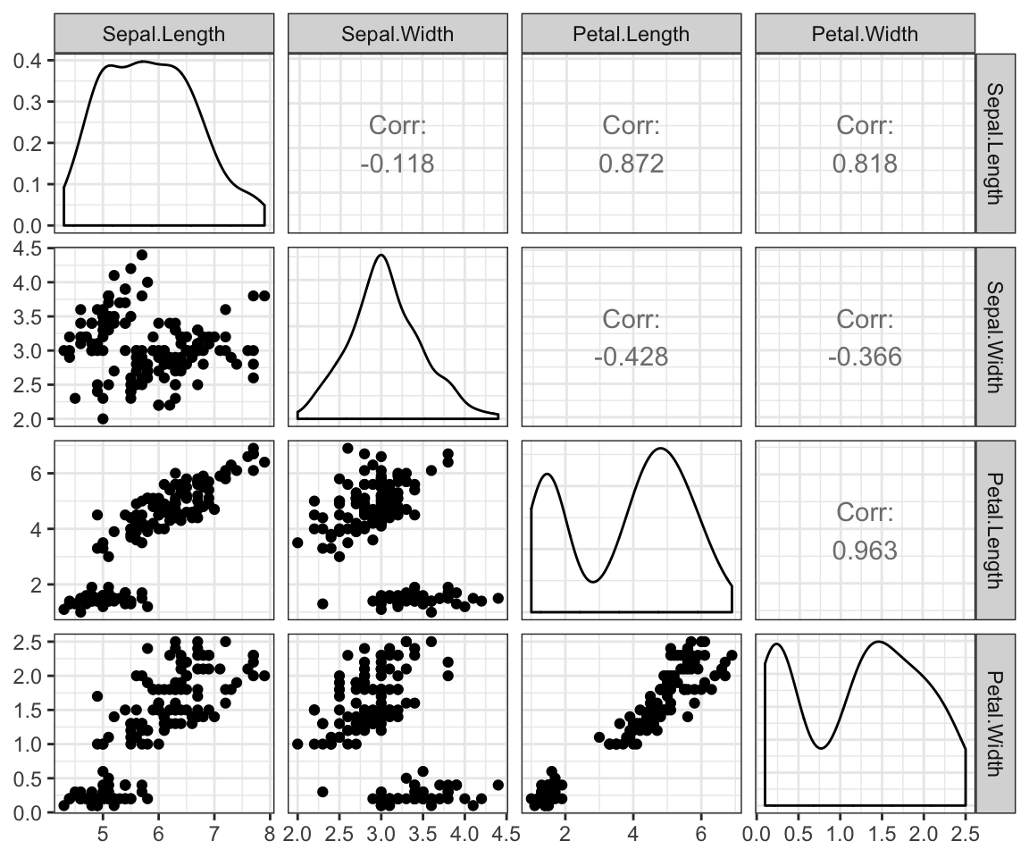
Correlation analysis
library("ggcorrplot")
# Compute a correlation matrix
my_data <- mtcars[, c(1,3,4,5,6,7)]
corr <- round(cor(my_data), 1)
# Visualize
ggcorrplot(corr, p.mat = cor_pmat(my_data),
           hc.order = TRUE, type = "lower",
           color = c("#FC4E07", "white", "#00AFBB"),
           outline.col = "white", lab = TRUE)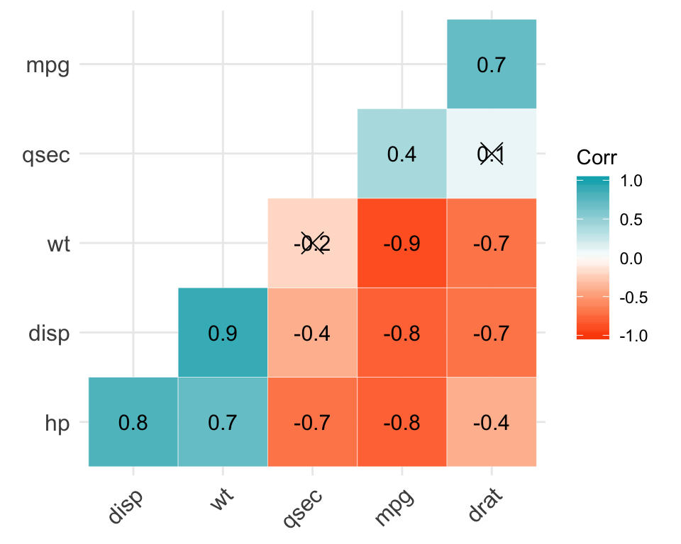
Cluster analysis
library(factoextra)
USArrests %>%
  scale() %>%                           # Scale the data
  dist() %>%                            # Compute distance matrix
  hclust(method = "ward.D2") %>%        # Hierarchical clustering
  fviz_dend(cex = 0.5, k = 4, palette = "jco") # Visualize and cut
                                              # into 4 groups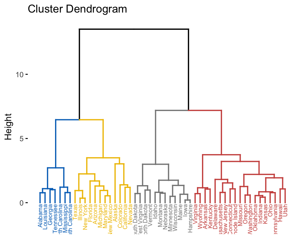
Balloon plot
Balloon plot is an alternative to bar plot for visualizing a large categorical data.
library(ggpubr)
# Data preparation
housetasks <- read.delim(
  system.file("demo-data/housetasks.txt", package = "ggpubr"),
  row.names = 1
  )
head(housetasks, 4)
## Wife Alternating Husband Jointly
## Laundry 156 14 2 4
## Main_meal 124 20 5 4
## Dinner 77 11 7 13
## Breakfeast 82 36 15 7# Visualization
ggballoonplot(housetasks, fill = "value")+
scale_fill_viridis_c(option = "C")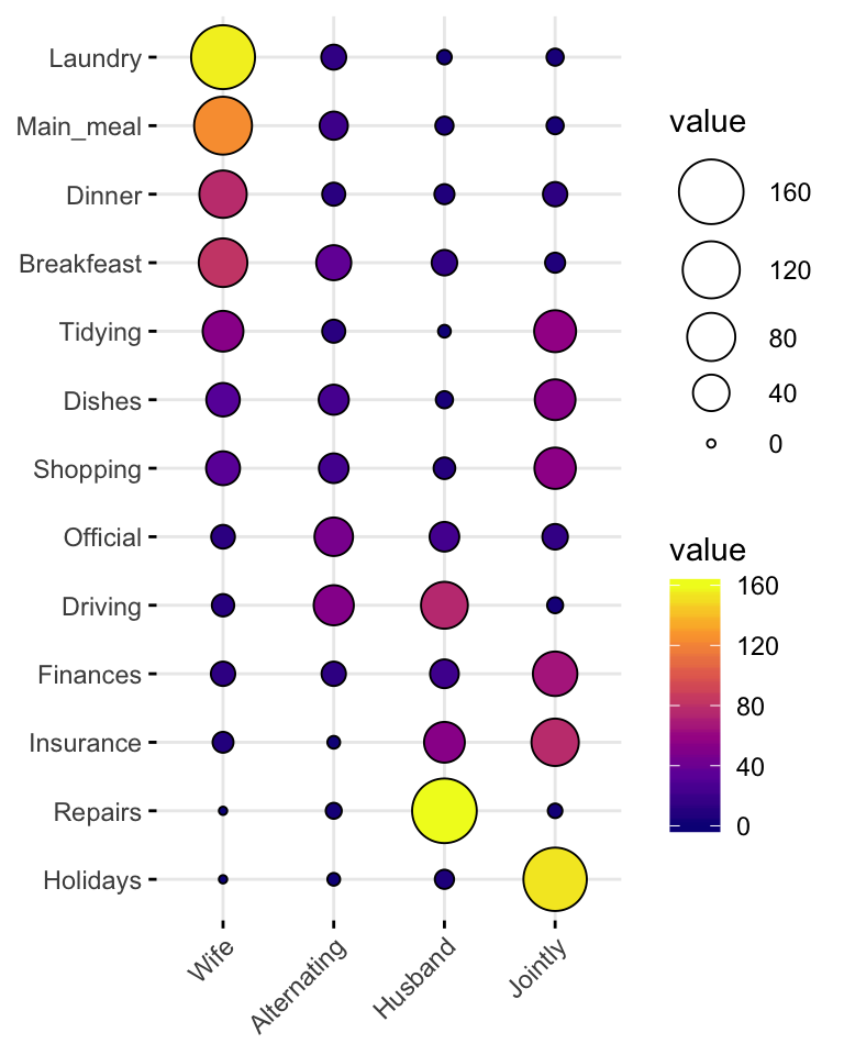
Recommended for you
This section contains best data science and self-development resources to help you on your path.
Coursera - Online Courses and Specialization
Data science
- Course: Machine Learning: Master the Fundamentals by Stanford
- Specialization: Data Science by Johns Hopkins University
- Specialization: Python for Everybody by University of Michigan
- Courses: Build Skills for a Top Job in any Industry by Coursera
- Specialization: Master Machine Learning Fundamentals by University of Washington
- Specialization: Statistics with R by Duke University
- Specialization: Software Development in R by Johns Hopkins University
- Specialization: Genomic Data Science by Johns Hopkins University
Popular Courses Launched in 2020
- Google IT Automation with Python by Google
- AI for Medicine by deeplearning.ai
- Epidemiology in Public Health Practice by Johns Hopkins University
- AWS Fundamentals by Amazon Web Services
Trending Courses
- The Science of Well-Being by Yale University
- Google IT Support Professional by Google
- Python for Everybody by University of Michigan
- IBM Data Science Professional Certificate by IBM
- Business Foundations by University of Pennsylvania
- Introduction to Psychology by Yale University
- Excel Skills for Business by Macquarie University
- Psychological First Aid by Johns Hopkins University
- Graphic Design by Cal Arts
Amazon FBA
Amazing Selling Machine
Books - Data Science
Our Books
- Practical Guide to Cluster Analysis in R by A. Kassambara (Datanovia)
- Practical Guide To Principal Component Methods in R by A. Kassambara (Datanovia)
- Machine Learning Essentials: Practical Guide in R by A. Kassambara (Datanovia)
- R Graphics Essentials for Great Data Visualization by A. Kassambara (Datanovia)
- GGPlot2 Essentials for Great Data Visualization in R by A. Kassambara (Datanovia)
- Network Analysis and Visualization in R by A. Kassambara (Datanovia)
- Practical Statistics in R for Comparing Groups: Numerical Variables by A. Kassambara (Datanovia)
- Inter-Rater Reliability Essentials: Practical Guide in R by A. Kassambara (Datanovia)
Others
- R for Data Science: Import, Tidy, Transform, Visualize, and Model Data by Hadley Wickham & Garrett Grolemund
- Hands-On Machine Learning with Scikit-Learn, Keras, and TensorFlow: Concepts, Tools, and Techniques to Build Intelligent Systems by Aurelien Géron
- Practical Statistics for Data Scientists: 50 Essential Concepts by Peter Bruce & Andrew Bruce
- Hands-On Programming with R: Write Your Own Functions And Simulations by Garrett Grolemund & Hadley Wickham
- An Introduction to Statistical Learning: with Applications in R by Gareth James et al.
- Deep Learning with R by François Chollet & J.J. Allaire
- Deep Learning with Python by François Chollet
Version:
 Français


Kassambara
– thanks for this great reference!.
Q:
In the 1st example,
what would the code be
to print (as top legend):
R and R2 and p ?
(right now, the ex. only shows R and P…).
Thanks,
SFer
Kassambara
– thanks for this great reference!.
Q:
In the 1st example,
what would the code be
to print (as top legend):
R and R2 and P ?
(right now, the ex. only shows: R and P…).
Thanks,
SFer
San Francisco
—
Thank Sfer for your feedback!
Please try the following R code:
library("ggpubr")
ggplot(mtcars, aes(mpg, wt)) +
  geom_point() +
  geom_smooth(method = lm) +
  stat_cor(
    aes(label = paste(..r.label.., ..rr.label.., ..p.label.., sep = "~`,`~")),
    method = "pearson", label.x = 20
    )
The output should look like this: