
Introduction
In this article, you will learn how to modify ggplot labels, including main title, subtitle, axis labels, caption, legend titles and tag.
- Plot title and subtitle provides insights into the main findings
- Caption are generally used to describe the data source
- Tag can be used for differentiating between multiple plots.
Related Book
GGPlot2 Essentials for Great Data Visualization in RPrerequisites
Load required packages and set the theme function theme_classic() as the default theme:
library(ggplot2)
theme_set(theme_classic())
Create a basic plot using the dataset ToothGrowth:
# Convert the variable dose from numeric to factor variable
ToothGrowth$dose <- as.factor(ToothGrowth$dose)

# Create a boxplot colored by dose group levels
bxp <- ggplot(ToothGrowth, aes(x = dose, y = len)) +
  geom_boxplot(aes(color = dose)) +
  scale_color_manual(values = c("#00AFBB", "#E7B800", "#FC4E07"))
bxp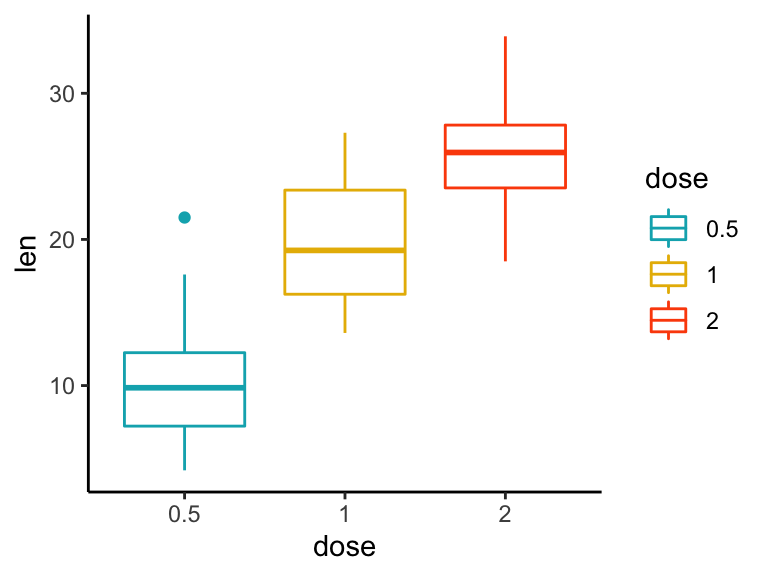
Key R functions
labs(..., title = waiver(), subtitle = waiver(), caption = waiver(),
  tag = waiver())

xlab(label)

ylab(label)

ggtitle(label, subtitle = waiver())...: A list of new name-value pairs. The name should be an aesthetic. For examplep + labs(title = "Main title", x = "X axis label", y = "Y axis label")changes main title and axis labels.title: plot main title.subtitle: the text for the subtitle for the plot which will be displayed below the title.caption: the text for the caption which will be displayed in the bottom-right of the plot by default.tag: the text for the tag label which will be displayed at the top-left of the plot by default.label: the title of the respective axis (for xlab() or ylab()) or of the plot (for ggtitle()).
Add titles and axis labels
In this section, we’ll use the function labs() to change the main title, the subtitle, the axis labels and captions.
It’s also possible to use the functions ggtitle(), xlab() and ylab() to modify the plot title, subtitle, x and y axis labels.
Add a title, subtitle, caption and change axis labels:
bxp <- bxp + labs(title = "Effect of Vitamin C on Tooth Growth",
              subtitle = "Plot of length by dose",
              caption = "Data source: ToothGrowth",
              x = "Dose (mg)", y = "Teeth length",
              tag = "A")
bxp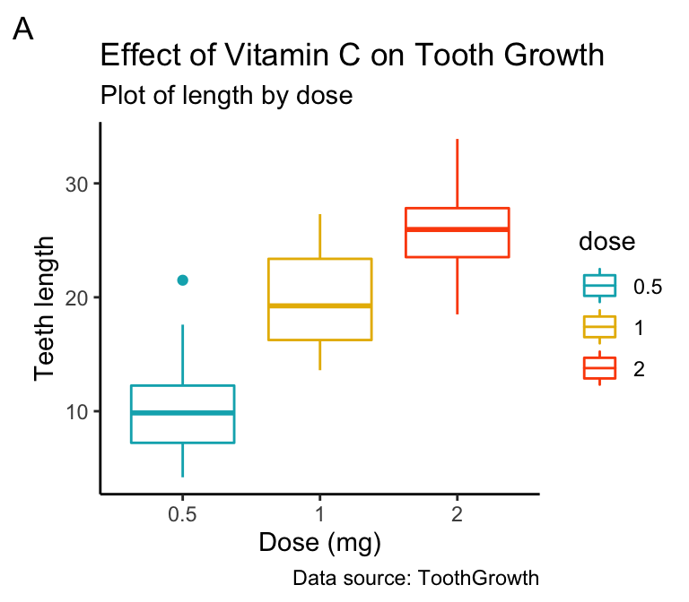
Modify legend titles
You can use labs() to changes the legend title for a given aesthetics (fill, color, size, shape, . . . ). For example:
- Use
p + labs(fill = "dose")for geom_boxplot(aes(fill = dose)) - Use
p + labs(color = "dose")for geom_boxplot(aes(color = dose)) - and so on for linetype, shape, etc
bxp + labs(color = "Dose (mg)")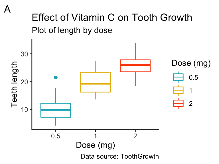
Split long titles
If the title is too long, you can split it into multiple lines using \n. In this case you can adjust the space between text lines by specifying the argument lineheight in the theme function element_text():
bxp + labs(title = "Effect of Vitamin C on Tooth Growth \n in Guinea Pigs")+
  theme(plot.title = element_text(lineheight = 0.9))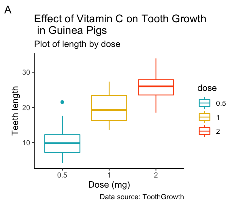
Recommended for you
This section contains best data science and self-development resources to help you on your path.
Books - Data Science
Our Books
- Practical Guide to Cluster Analysis in R by A. Kassambara (Datanovia)
- Practical Guide To Principal Component Methods in R by A. Kassambara (Datanovia)
- Machine Learning Essentials: Practical Guide in R by A. Kassambara (Datanovia)
- R Graphics Essentials for Great Data Visualization by A. Kassambara (Datanovia)
- GGPlot2 Essentials for Great Data Visualization in R by A. Kassambara (Datanovia)
- Network Analysis and Visualization in R by A. Kassambara (Datanovia)
- Practical Statistics in R for Comparing Groups: Numerical Variables by A. Kassambara (Datanovia)
- Inter-Rater Reliability Essentials: Practical Guide in R by A. Kassambara (Datanovia)
Others
- R for Data Science: Import, Tidy, Transform, Visualize, and Model Data by Hadley Wickham & Garrett Grolemund
- Hands-On Machine Learning with Scikit-Learn, Keras, and TensorFlow: Concepts, Tools, and Techniques to Build Intelligent Systems by Aurelien Géron
- Practical Statistics for Data Scientists: 50 Essential Concepts by Peter Bruce & Andrew Bruce
- Hands-On Programming with R: Write Your Own Functions And Simulations by Garrett Grolemund & Hadley Wickham
- An Introduction to Statistical Learning: with Applications in R by Gareth James et al.
- Deep Learning with R by François Chollet & J.J. Allaire
- Deep Learning with Python by François Chollet
Version:
 Français


How would I go about changing the size of the tag at the corner of the plot?
Inside theme() you can use plot.tag to change the font size etc, e.g. theme(plot.tag = element_text(size = 20, face = “bold”))
Thank you for your input, highly appreciated!
Hi there, Very useful!
I am wondering how to add legend as a label. For example, ‘Dose of 0.5, 1, 2’ are added in place of the y axis as tick marks.