In this article, you will learn how to create a bubble chart in R using the ggplot2 package.
Related Book
GGPlot2 Essentials for Great Data Visualization in RPrerequisites
- Load the ggplot2 package and set the theme function
theme_bw()as the default theme:
library(ggplot2)
theme_set(
  theme_bw() +
    theme(legend.position = "top")
)- Data preparation
Demo dataset: mtcars. The variable cyl is used as grouping variable.
# Load data
data("mtcars")
df <- mtcars

# Convert cyl as a grouping variable
df$cyl <- as.factor(df$cyl)

# Inspect the data
head(df[, c("wt", "mpg", "cyl", "qsec")], 4)
## wt mpg cyl qsec
## Mazda RX4 2.62 21.0 6 16.5
## Mazda RX4 Wag 2.88 21.0 6 17.0
## Datsun 710 2.32 22.8 4 18.6
## Hornet 4 Drive 3.21 21.4 6 19.4Create a bubble chart
In a bubble chart, points size is controlled by a continuous variable, here qsec. In the R code below, the argument alpha is used to control color transparency. alpha should be between 0 and 1.
ggplot(df, aes(x = wt, y = mpg)) +
  geom_point(aes(color = cyl, size = qsec), alpha = 0.5) +
  scale_color_manual(values = c("#00AFBB", "#E7B800", "#FC4E07")) +
  scale_size(range = c(0.5, 12))  # Adjust the range of points size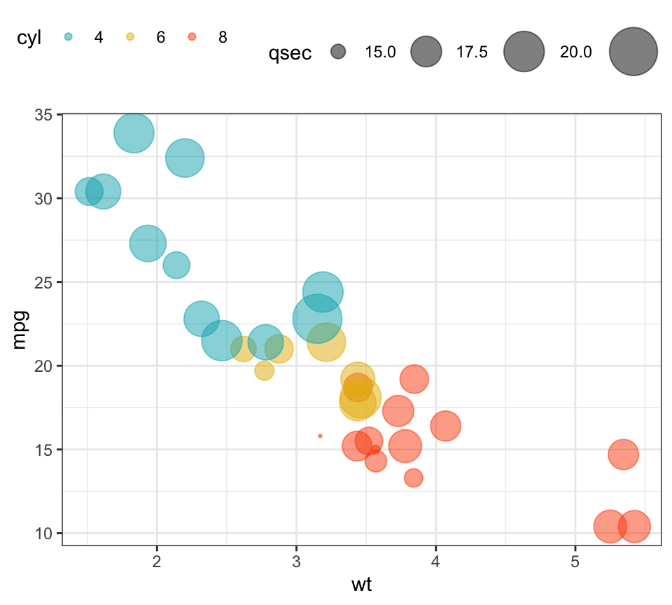
Recommended for you
This section contains best data science and self-development resources to help you on your path.
Books - Data Science
Our Books
- Practical Guide to Cluster Analysis in R by A. Kassambara (Datanovia)
- Practical Guide To Principal Component Methods in R by A. Kassambara (Datanovia)
- Machine Learning Essentials: Practical Guide in R by A. Kassambara (Datanovia)
- R Graphics Essentials for Great Data Visualization by A. Kassambara (Datanovia)
- GGPlot2 Essentials for Great Data Visualization in R by A. Kassambara (Datanovia)
- Network Analysis and Visualization in R by A. Kassambara (Datanovia)
- Practical Statistics in R for Comparing Groups: Numerical Variables by A. Kassambara (Datanovia)
- Inter-Rater Reliability Essentials: Practical Guide in R by A. Kassambara (Datanovia)
Others
- R for Data Science: Import, Tidy, Transform, Visualize, and Model Data by Hadley Wickham & Garrett Grolemund
- Hands-On Machine Learning with Scikit-Learn, Keras, and TensorFlow: Concepts, Tools, and Techniques to Build Intelligent Systems by Aurelien Géron
- Practical Statistics for Data Scientists: 50 Essential Concepts by Peter Bruce & Andrew Bruce
- Hands-On Programming with R: Write Your Own Functions And Simulations by Garrett Grolemund & Hadley Wickham
- An Introduction to Statistical Learning: with Applications in R by Gareth James et al.
- Deep Learning with R by François Chollet & J.J. Allaire
- Deep Learning with Python by François Chollet
Version:
 Français


No Comments