This tutorial describes how to create a ggplot stacked bar chart. You will also learn how to add labels to a stacked bar plot.
Related Book
GGPlot2 Essentials for Great Data Visualization in RPrerequisites
Load required packages and set the theme function theme_minimal() as the default theme:
library(dplyr)   # For data manipulation
library(ggplot2) # For data visualization
theme_set(theme_minimal())
Data preparation
Data derived from ToothGrowth data sets are used. ToothGrowth describes the effect of Vitamin C on tooth growth in Guinea pigs. Three dose levels of Vitamin C (0.5, 1, and 2 mg) with each of two delivery methods [orange juice (OJ) or ascorbic acid (VC)] are used :
df <- data.frame(
  supp = rep(c("VC", "OJ"), each = 3),
  dose = rep(c("D0.5", "D1", "D2"), 2),
  len = c(6.8, 15, 33, 4.2, 10, 29.5)
  )

head(df)
## supp dose len
## 1 VC D0.5 6.8
## 2 VC D1 15.0
## 3 VC D2 33.0
## 4 OJ D0.5 4.2
## 5 OJ D1 10.0
## 6 OJ D2 29.5- len : Tooth length
- dose : Dose in milligrams (0.5, 1, 2)
- supp : Supplement type (VC or OJ)
Basic plots
p <- ggplot(df, aes(x = dose, y = len))+
  geom_col(aes(fill = supp), width = 0.7)
p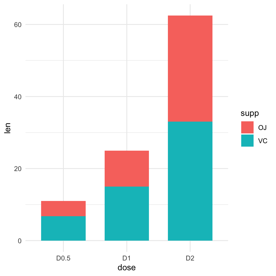
Add labels
4 steps required to compute the position of text labels:
- Group the data by the dose variable
- Sort the data by
doseandsuppcolumns. As stacked plot reverse the group order,suppcolumn should be sorted in descending order. - Calculate the cumulative sum of
lenfor eachdosecategory. Used as the y coordinates of labels. To put the label in the middle of the bars, we’ll usecumsum(len) - 0.5 * len. - Create the bar graph and add labels
# Arrange/sort and compute cumulative summs
library(dplyr)
 df2 <- df %>%
  group_by(dose) %>%
  arrange(dose, desc(supp)) %>%
  mutate(lab_ypos = cumsum(len) - 0.5 * len)
df2
## # A tibble: 6 x 4
## # Groups: dose [3]
## supp dose len lab_ypos
## <fct> <fct> <dbl> <dbl>
## 1 VC D0.5 6.8 3.4
## 2 OJ D0.5 4.2 8.9
## 3 VC D1 15 7.5
## 4 OJ D1 10 20
## 5 VC D2 33 16.5
## 6 OJ D2 29.5 47.8# Create stacked bar graphs with labels
p <- ggplot(data = df2, aes(x = dose, y = len)) +
geom_col(aes(fill = supp), width = 0.7)+
geom_text(aes(y = lab_ypos, label = len, group =supp), color = "white")
p
Customized bar plots
Use the function scale_fill_manual() to set manually the bars border line colors and area fill colors.
p + scale_fill_manual(values = c("#0073C2FF", "#EFC000FF"))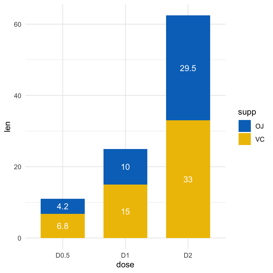
Recommended for you
This section contains best data science and self-development resources to help you on your path.
Books - Data Science
Our Books
- Practical Guide to Cluster Analysis in R by A. Kassambara (Datanovia)
- Practical Guide To Principal Component Methods in R by A. Kassambara (Datanovia)
- Machine Learning Essentials: Practical Guide in R by A. Kassambara (Datanovia)
- R Graphics Essentials for Great Data Visualization by A. Kassambara (Datanovia)
- GGPlot2 Essentials for Great Data Visualization in R by A. Kassambara (Datanovia)
- Network Analysis and Visualization in R by A. Kassambara (Datanovia)
- Practical Statistics in R for Comparing Groups: Numerical Variables by A. Kassambara (Datanovia)
- Inter-Rater Reliability Essentials: Practical Guide in R by A. Kassambara (Datanovia)
Others
- R for Data Science: Import, Tidy, Transform, Visualize, and Model Data by Hadley Wickham & Garrett Grolemund
- Hands-On Machine Learning with Scikit-Learn, Keras, and TensorFlow: Concepts, Tools, and Techniques to Build Intelligent Systems by Aurelien Géron
- Practical Statistics for Data Scientists: 50 Essential Concepts by Peter Bruce & Andrew Bruce
- Hands-On Programming with R: Write Your Own Functions And Simulations by Garrett Grolemund & Hadley Wickham
- An Introduction to Statistical Learning: with Applications in R by Gareth James et al.
- Deep Learning with R by François Chollet & J.J. Allaire
- Deep Learning with Python by François Chollet
Version:
 Français


Thank you so much, this is the first instruction for stacked plots that easily works!
Thank you for the positive feedback, highly appreciated!
Easy to understand and well-explained instructions ! Thank you Kassambara