This article provide many examples for creating a ggplot map. You will also learn how to create a choropleth map, in which areas are patterned in proportion to a given variable values being displayed on the map, such as population life expectancy or density.
Contents:
Related Book
GGPlot2 Essentials for Great Data Visualization in RPrerequisites
Key R functions and packages:
- map_data() [in ggplot2] to retrieve the map data. Require the
mapspackage. - geom_polygon() [in ggplot2] to create the map
We’ll use the viridis package to set the color palette of the choropleth map.
Load required packages and set default theme:
library(ggplot2)
library(dplyr)
require(maps)
require(viridis)
theme_set(
  theme_void()
  )
Create a simple map
World map
Retrieve the world map data:
world_map <- map_data("world")
ggplot(world_map, aes(x = long, y = lat, group = group)) +
  geom_polygon(fill="lightgray", colour = "white")
Map for specific regions
- Retrieve map data for one or multiple specific regions:
# Some EU Contries
some.eu.countries <- c(
  "Portugal", "Spain", "France", "Switzerland", "Germany",
  "Austria", "Belgium", "UK", "Netherlands",
  "Denmark", "Poland", "Italy",
  "Croatia", "Slovenia", "Hungary", "Slovakia",
  "Czech republic"
)
# Retrievethe map data
some.eu.maps <- map_data("world", region = some.eu.countries)

# Compute the centroid as the mean longitude and lattitude
# Used as label coordinate for country's names
region.lab.data <- some.eu.maps %>%
  group_by(region) %>%
summarise(long = mean(long), lat = mean(lat))- Visualize
ggplot(some.eu.maps, aes(x = long, y = lat)) +
  geom_polygon(aes( group = group, fill = region))+
  geom_text(aes(label = region), data = region.lab.data,  size = 3, hjust = 0.5)+
  scale_fill_viridis_d()+
  theme_void()+
  theme(legend.position = "none")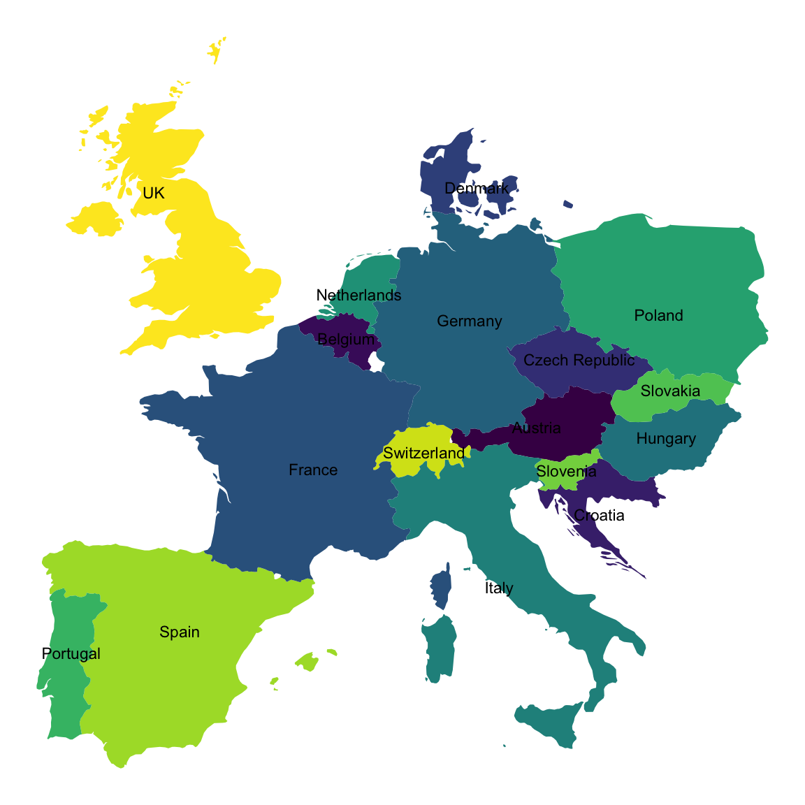
Make a choropleth Map
World map colored by life expectancy
Here, we’ll create world map colored according to the value of life expectancy at birth in 2015. The data is retrieved from the WHO (World Health Organozation) data base using the WHO R package.
- Retrieve life expectancy data and prepare the data:
library("WHO")
library("dplyr")
life.exp <- get_data("WHOSIS_000001")             # Retrieve the data
life.exp <- life.exp %>%
  filter(year == 2015 & sex == "Both sexes") %>%  # Keep data for 2015 and for both sex
  select(country, value) %>%                      # Select the two columns of interest
  rename(region = country, lifeExp = value) %>%   # Rename columns
  # Replace "United States of America" by USA in the region column
  mutate(
    region = ifelse(region == "United States of America", "USA", region)
) - Merge map and life expectancy data:
world_map <- map_data("world")
life.exp.map <- left_join(life.exp, world_map, by = "region")- Create the choropleth map. Note that, data are missing for some region in the map below:
- Use the function
geom_polygon():
ggplot(life.exp.map, aes(long, lat, group = group))+
  geom_polygon(aes(fill = lifeExp ), color = "white")+
  scale_fill_viridis_c(option = "C")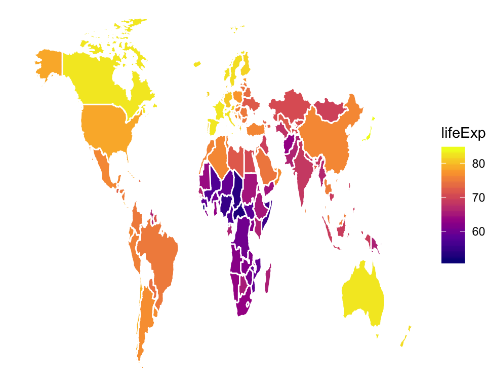
- Or use the function
geom_map():
ggplot(life.exp.map, aes(map_id = region, fill = lifeExp))+
  geom_map(map = life.exp.map,  color = "white")+
  expand_limits(x = life.exp.map$long, y = life.exp.map$lat)+
  scale_fill_viridis_c(option = "C")
US map colored by violent crime rates
Demo data set: USArrests (Violent Crime Rates by US State, in 1973).
# Prepare the USArrests data
library(dplyr)
arrests <- USArrests
arrests$region <- tolower(rownames(USArrests))
head(arrests)
## Murder Assault UrbanPop Rape region
## Alabama 13.2 236 58 21.2 alabama
## Alaska 10.0 263 48 44.5 alaska
## Arizona 8.1 294 80 31.0 arizona
## Arkansas 8.8 190 50 19.5 arkansas
## California 9.0 276 91 40.6 california
## Colorado 7.9 204 78 38.7 colorado# Retrieve the states map data and merge with crime data
states_map <- map_data("state")
arrests_map <- left_join(states_map, arrests, by = "region")
# Create the map
ggplot(arrests_map, aes(long, lat, group = group))+
geom_polygon(aes(fill = Assault), color = "white")+
scale_fill_viridis_c(option = "C")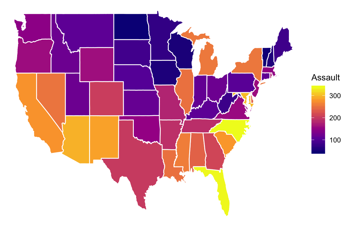
Recommended for you
This section contains best data science and self-development resources to help you on your path.
Books - Data Science
Our Books
- Practical Guide to Cluster Analysis in R by A. Kassambara (Datanovia)
- Practical Guide To Principal Component Methods in R by A. Kassambara (Datanovia)
- Machine Learning Essentials: Practical Guide in R by A. Kassambara (Datanovia)
- R Graphics Essentials for Great Data Visualization by A. Kassambara (Datanovia)
- GGPlot2 Essentials for Great Data Visualization in R by A. Kassambara (Datanovia)
- Network Analysis and Visualization in R by A. Kassambara (Datanovia)
- Practical Statistics in R for Comparing Groups: Numerical Variables by A. Kassambara (Datanovia)
- Inter-Rater Reliability Essentials: Practical Guide in R by A. Kassambara (Datanovia)
Others
- R for Data Science: Import, Tidy, Transform, Visualize, and Model Data by Hadley Wickham & Garrett Grolemund
- Hands-On Machine Learning with Scikit-Learn, Keras, and TensorFlow: Concepts, Tools, and Techniques to Build Intelligent Systems by Aurelien Géron
- Practical Statistics for Data Scientists: 50 Essential Concepts by Peter Bruce & Andrew Bruce
- Hands-On Programming with R: Write Your Own Functions And Simulations by Garrett Grolemund & Hadley Wickham
- An Introduction to Statistical Learning: with Applications in R by Gareth James et al.
- Deep Learning with R by François Chollet & J.J. Allaire
- Deep Learning with Python by François Chollet
Version:
 Français


hi! just the post I was looking for, thanks! What is the difference between geom_polygon() and geom_map() when doing a map?
I wonder how to change the color of the countries to white instead?
In the geom_polygon() function and OUTSIDE the aes() function, use
If you set fill, color, size or shape outsithe the aes() function, its value wont be related to any variable and will remain constant for all polygons you plot (polygons, dots, lines or whatever you plot.
As an example: the last plot of American Assault data, the variable fill is mapped to Assault, and therefore the filling color of polygons represent that variable value. The color variable is defined to be “white” and used outside aes(), here color stands for border color (map frontiers). This color parameter could be defined as other colors, or declared inside the aes() to link border color to other variable. A list of the colors that can be used in R can be found by googling a litte (R colors ggplot), as well as all information to work with personalized colors by using RGB scales and symilar stuff
HI THANK YOU VERY USEFUL BYE
thank you for the positive feedback!
In Examples – some countries are not shown in output of World life expectancy (so at my machine), something wrong with the code – look at Russia – it not displayed.
Where to obtain the WHO package? It’s not available.