
This article provides examples of codes for K-means clustering visualization in R using the factoextra and the ggpubr R packages. You can learn more about the k-means algorithm by reading the following blog post: K-means clustering in R: Step by Step Practical Guide.
Contents:
Required R packages
- ggpubr: creates publication ready plots.
- factoextra: Extract and Visualize the Results of Multivariate Data Analyses.
library(ggpubr)
library(factoextra)
Data preparation
data("iris")
df <- iris
head(df, 3)
## Sepal.Length Sepal.Width Petal.Length Petal.Width Species
## 1 5.1 3.5 1.4 0.2 setosa
## 2 4.9 3.0 1.4 0.2 setosa
## 3 4.7 3.2 1.3 0.2 setosaK-means clustering calculation example
- Removing the 5th column (
Species) and scale the data to make variables comparable - Calculate k-means clustering using k = 3. As the final result of k-means clustering result is sensitive to the random starting assignments, we specify nstart = 25. This means that R will try 25 different random starting assignments and then select the best results.
# Compute k-means with k = 3
set.seed(123)
res.km <- kmeans(scale(df[, -5]), 3, nstart = 25)
# K-means clusters showing the group of each individuals
res.km$cluster
## [1] 1 1 1 1 1 1 1 1 1 1 1 1 1 1 1 1 1 1 1 1 1 1 1 1 1 1 1 1 1 1 1 1 1 1 1 1 1 1 1 1 1 1 1 1 1 1 1 1 1 1 3 3 3 2 2 2 3 2 2 2
## [61] 2 2 2 2 2 3 2 2 2 2 3 2 2 2 2 3 3 3 2 2 2 2 2 2 2 3 3 2 2 2 2 2 2 2 2 2 2 2 2 2 3 2 3 3 3 3 2 3 3 3 3 3 3 2 2 3 3 3 3 2
## [121] 3 2 3 2 3 3 2 3 3 3 3 3 3 2 2 3 3 3 2 3 3 3 2 3 3 3 2 3 3 2Plot k-means
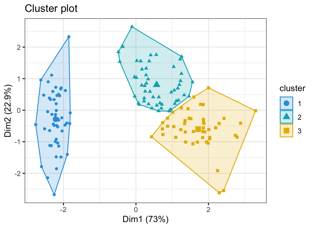
Using the factoextra R package
The function fviz_cluster() [factoextra package] can be used to easily visualize k-means clusters. It takes k-means results and the original data as arguments. In the resulting plot, observations are represented by points, using principal components if the number of variables is greater than 2. It’s also possible to draw concentration ellipse around each cluster.
fviz_cluster(res.km, data = df[, -5],
             palette = c("#2E9FDF", "#00AFBB", "#E7B800"),
             geom = "point",
             ellipse.type = "convex",
             ggtheme = theme_bw()
             )
Using the ggpubr R package
If you want to adapt the k-means clustering plot, you can follow the steps below:
- Compute principal component analysis (PCA) to reduce the data into small dimensions for visualization
- Use the
ggscatter()R function [in ggpubr] or ggplot2 function to visualize the clusters
Compute PCA and extract individual coordinates
# Dimension reduction using PCA
res.pca <- prcomp(df[, -5],  scale = TRUE)
# Coordinates of individuals
ind.coord <- as.data.frame(get_pca_ind(res.pca)$coord)
# Add clusters obtained using the K-means algorithm
ind.coord$cluster <- factor(res.km$cluster)
# Add Species groups from the original data sett
ind.coord$Species <- df$Species
# Data inspection
head(ind.coord)
## Dim.1 Dim.2 Dim.3 Dim.4 cluster Species
## 1 -2.26 -0.478 0.1273 0.02409 1 setosa
## 2 -2.07 0.672 0.2338 0.10266 1 setosa
## 3 -2.36 0.341 -0.0441 0.02828 1 setosa
## 4 -2.29 0.595 -0.0910 -0.06574 1 setosa
## 5 -2.38 -0.645 -0.0157 -0.03580 1 setosa
## 6 -2.07 -1.484 -0.0269 0.00659 1 setosa# Percentage of variance explained by dimensions
eigenvalue <- round(get_eigenvalue(res.pca), 1)
variance.percent <- eigenvalue$variance.percent
head(eigenvalue)## eigenvalue variance.percent cumulative.variance.percent
## Dim.1 2.9 73.0 73.0
## Dim.2 0.9 22.9 95.8
## Dim.3 0.1 3.7 99.5
## Dim.4 0.0 0.5 100.0Visualize k-means clusters
- Color individuals according to the cluster groups
- Change point shapes according to the
Speciesgroups (ground truth of grouping) - Add concentration ellipses
- Add cluster centroid using the
stat_mean()[ggpubr] R function
ggscatter(
  ind.coord, x = "Dim.1", y = "Dim.2",
  color = "cluster", palette = "npg", ellipse = TRUE, ellipse.type = "convex",
  shape = "Species", size = 1.5,  legend = "right", ggtheme = theme_bw(),
  xlab = paste0("Dim 1 (", variance.percent[1], "% )" ),
  ylab = paste0("Dim 2 (", variance.percent[2], "% )" )
) +
  stat_mean(aes(color = cluster), size = 4)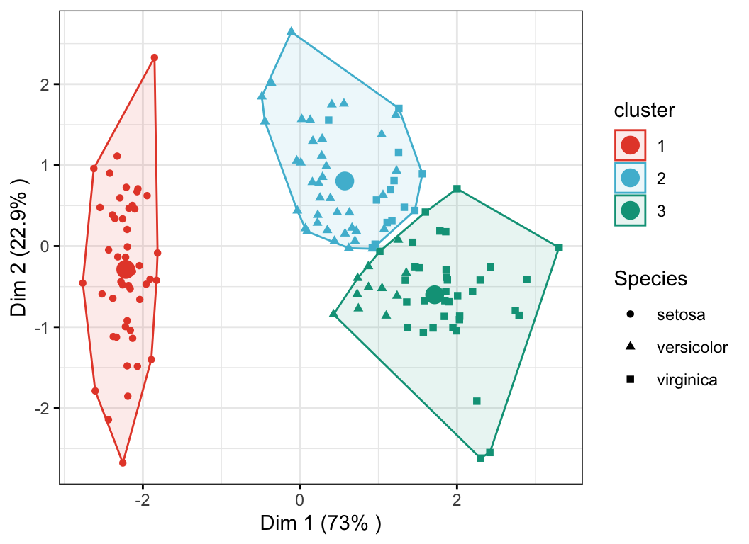
Conclusion
This article provides examples of codes for K-means clustering visualization in R using the factoextra and the ggpubr R packages. Read more about the k-means clustering algorithm at: K-means clustering in R: Step by Step Practical Guide.
Recommended for you
This section contains best data science and self-development resources to help you on your path.
Books - Data Science
Our Books
- Practical Guide to Cluster Analysis in R by A. Kassambara (Datanovia)
- Practical Guide To Principal Component Methods in R by A. Kassambara (Datanovia)
- Machine Learning Essentials: Practical Guide in R by A. Kassambara (Datanovia)
- R Graphics Essentials for Great Data Visualization by A. Kassambara (Datanovia)
- GGPlot2 Essentials for Great Data Visualization in R by A. Kassambara (Datanovia)
- Network Analysis and Visualization in R by A. Kassambara (Datanovia)
- Practical Statistics in R for Comparing Groups: Numerical Variables by A. Kassambara (Datanovia)
- Inter-Rater Reliability Essentials: Practical Guide in R by A. Kassambara (Datanovia)
Others
- R for Data Science: Import, Tidy, Transform, Visualize, and Model Data by Hadley Wickham & Garrett Grolemund
- Hands-On Machine Learning with Scikit-Learn, Keras, and TensorFlow: Concepts, Tools, and Techniques to Build Intelligent Systems by Aurelien Géron
- Practical Statistics for Data Scientists: 50 Essential Concepts by Peter Bruce & Andrew Bruce
- Hands-On Programming with R: Write Your Own Functions And Simulations by Garrett Grolemund & Hadley Wickham
- An Introduction to Statistical Learning: with Applications in R by Gareth James et al.
- Deep Learning with R by François Chollet & J.J. Allaire
- Deep Learning with Python by François Chollet
Version:
 Français


No Comments