This article describes seriation methods, which consists of finding a suitable linear order for a set of objects in data using loss or merit functions.
There are different seriation algorithms. The input data can be either a dissimilarity matrix or a standard data matrix.
You will learn how to perform seriation in R and visualize the reordered data using the seriation R package.
Contents:
Prerequisites
Load required R packages:
library(seriation)Data preparation
Demo data: iris
# Load the data
data("iris")
df <- iris
head(df, 2)
## Sepal.Length Sepal.Width Petal.Length Petal.Width Species
## 1 5.1 3.5 1.4 0.2 setosa
## 2 4.9 3.0 1.4 0.2 setosa# Remove the column `species` (column 5)
df <- df[, -5]
# Reorder the objects randomly
set.seed(123)
df <- df[sample(seq_len(nrow(df))),]
head(df, 2)## Sepal.Length Sepal.Width Petal.Length Petal.Width
## 44 5.0 3.5 1.6 0.6
## 118 7.7 3.8 6.7 2.2Basic example of seriation
Reorder objects and inspect the effect of seriation on dissimilarity matrix:
# Compute dissimilarity matrix
dist_result <- dist(df)
# Seriate objects, reorder rows based on their similarity
object_order <- seriate(dist_result)
# Extract object orders
head(get_order(object_order), 15)
## [1] 78 2 52 83 76 139 148 32 59 20 129 103 143 4 85# Visualize the effect of seriation on dissimilarity matrix
pimage(dist_result, main = "Random order")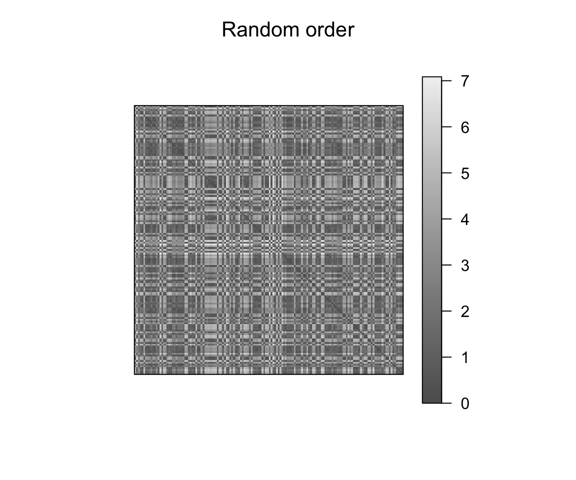
pimage(dist_result, order = object_order, main = "Reordered")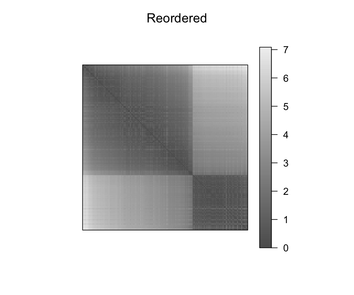
Effect of the seriation on the original data scale. We standardize the data using scale such that the visualized value is the number of standard diviations an object differs from the variable mean. For matrices containing negative values, pimage() uses automatically a divergent palette.
Since the seriation above only produced an order for the rows of the data, we use NA for columns orders in the R code below.
# Heamap of the raw data
pimage(scale(df), main = "Random")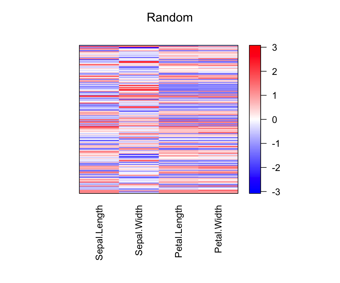
# Heatmap of the reordered data
pimage(scale(df), order = c(object_order, NA), main = "Reordered")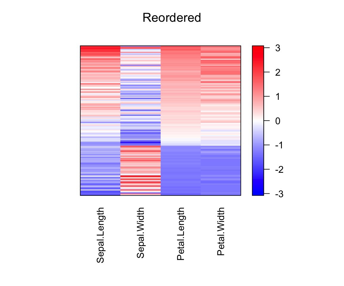
Heat maps
A heat map is a color coded data matrix with a dendrogram added to one side and to the top to indicate the order of rows and columns.
Typically, reordering is done according to row or column means within the restrictions imposed by the dendrogram.
It is possible to find the optimal ordering of the leaf nodes of a dendrogram which minimizes the distances between adjacent objects. Such an order might provide an improvement over using simple reordering such as the row or column means with respect to presentation.
The R function hmap() [seriation package] uses optimal ordering and can also use seriation directly on distance matrices without using hierarchical clustering to produce dendrograms first. It uses the function gplots::heatmap.2() to create the heatmap.
For the following example, we use again the randomly reordered iris data set from the examples above. To make the variables (columns) comparable, we use standard scaling.
# Standardize the data
df_scaled <- scale(df, center = FALSE)

# Produce a heat map with optimally reordered dendrograms
# Hierarchical clustering is used to produce dendrograms
hmap(df_scaled, margin = c(7, 4), cexCol = 1, labRow = FALSE)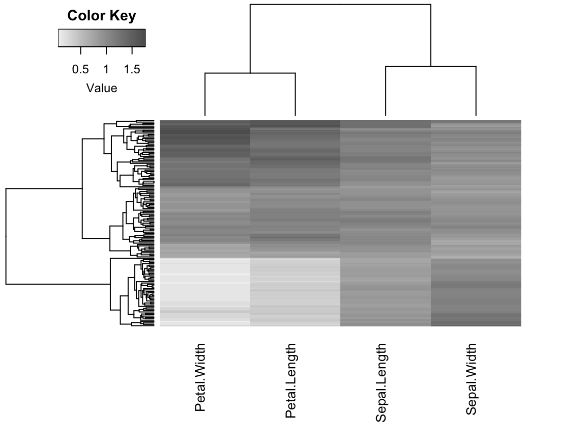
# Specify seriation method
# seriation on the dissimilarity matrices for rows and columns is performed
hmap(df_scaled, method = "MDS")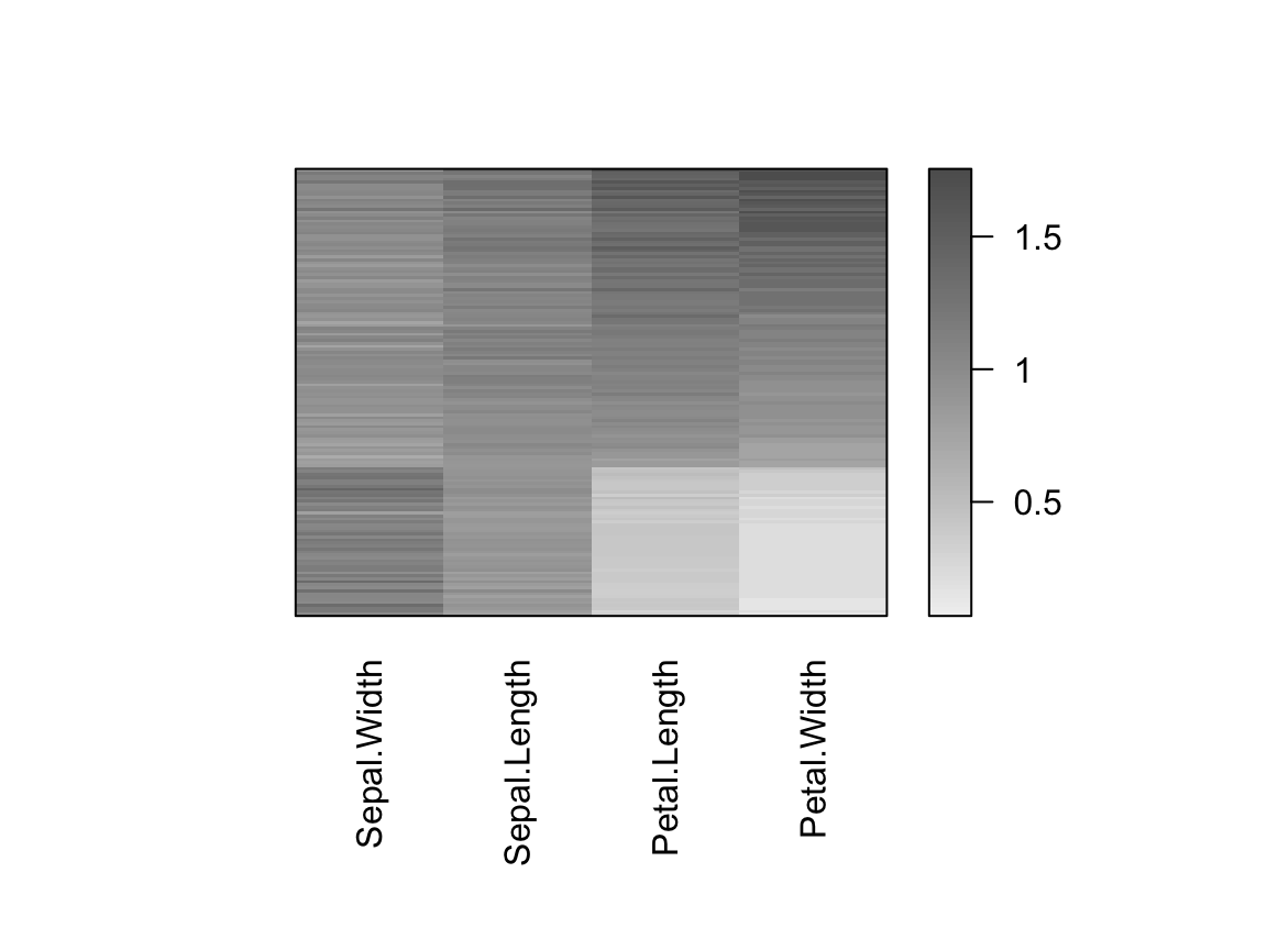
Bertin’s permutation matrix
The idea is to reveal a more homogeneous structure in a data matrix by simultaneously rearranging rows and columns. The rearranged matrix is displayed and cases and variables can be grouped manually to gain a better understanding of the data.
As an example, we use the USArrests dataset, which contains the violent crime rates by US states in 1973. To make values comparable across columns (variables), the ranks of the values for each variable are used instead of the original values.
For seriation, we calculate distances between rows and between columns using the sum of absolute rank differences (this is equal to the Minkowski distance with power 1).
In the example, below the output is illustrated as a matrix of bars. High values are highlighted (filled blocks). The cases are displayed as the columns and the variables as rows.
# Data preparation
# Load the dataset
data("USArrests")
# Replace original values by their ranks
df <- head(apply(USArrests, 2, rank), 30)

# Perform seriation on row and columns
row_order <- seriate(dist(df, "minkowski", p = 1),  method ="TSP")
col_order <- seriate(dist(t(df), "minkowski", p = 1),  method ="TSP")
orders <- c(row_order, col_order)

# Visualization: matrix of bars
# Original matrix
bertinplot(df)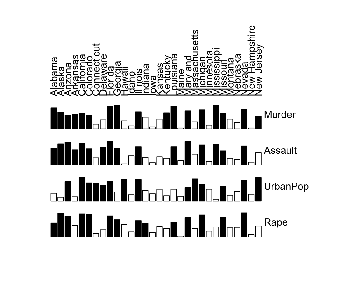
# Rearranged matrix
bertinplot(df, orders)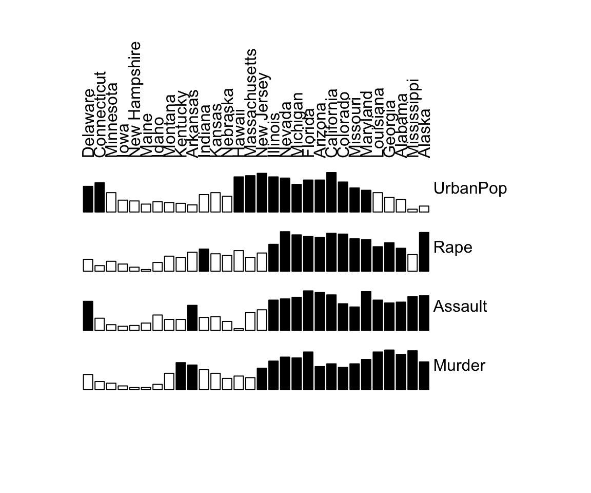
Binary data matrices
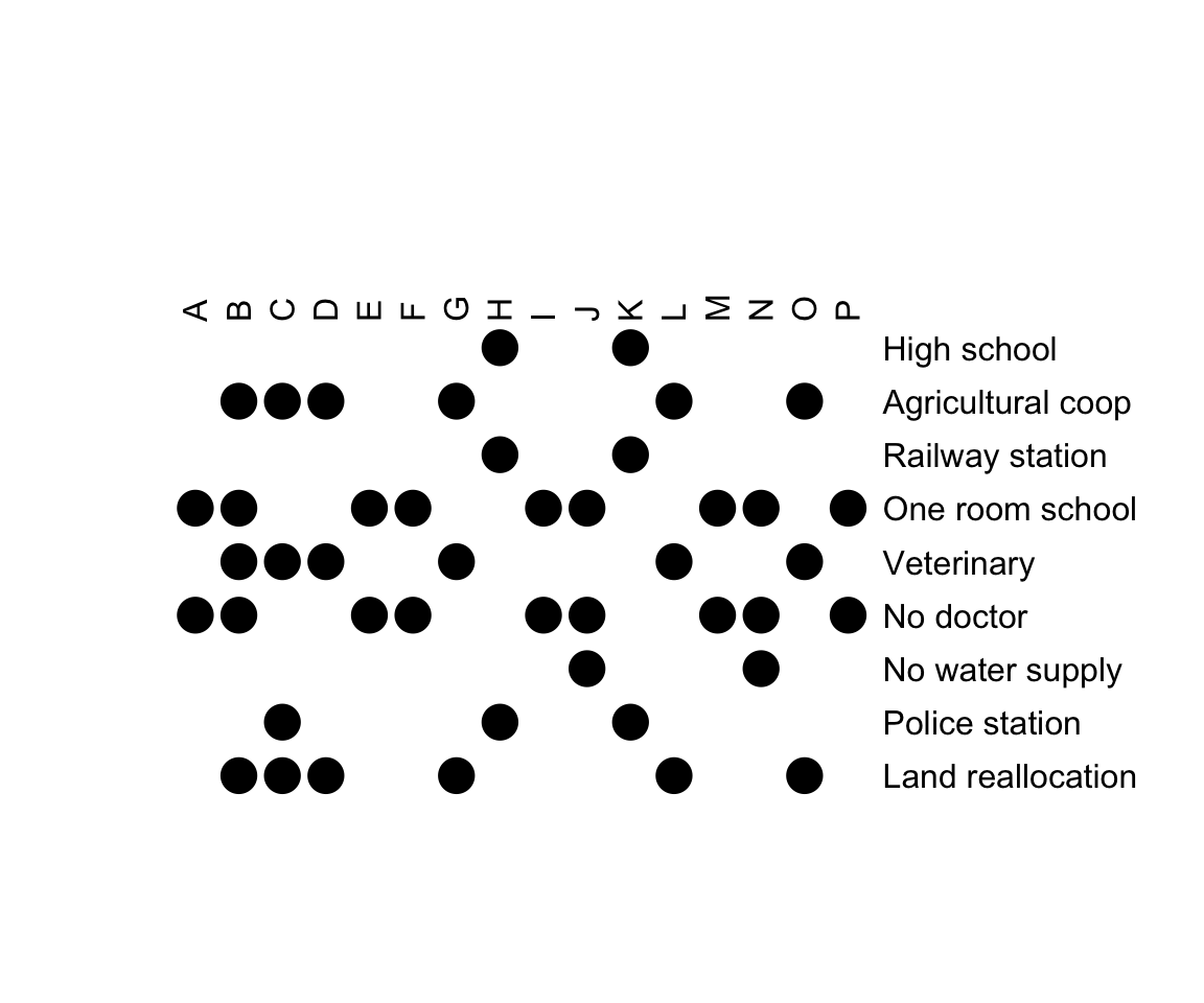
Binary data are 0-1 data matrices. The standard visualization of bertinplot(), do not make much sense for binary data. We can use the panel functions panel.squares() or panel.circles().
# Load demo data
data("Townships")
# Visualize the original data
bertinplot(
  Townships,
  options = list(panel = panel.circles)
  )
# Seriate rows and columns using the bond energy algorithm (BEA)
set.seed(1234)
orders <- seriate(Townships, method = "BEA", control = list(rep = 10))
bertinplot(
  Townships, order = orders,
  options = list(panel = panel.circles)
  )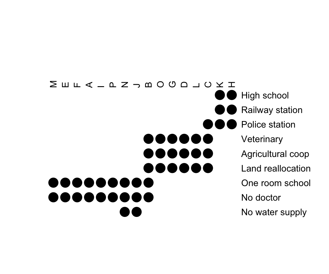
A clear structure is visible in the reordered matrix is displayed. The variables (rows in a Bertin plot) can be split into the three categories describing different evolution states of townships:
- Rural: No doctor, one-room school and possibly also no water supply
- Intermediate: Land reallocation, veterinary and agricultural cooperative
- Urban: Railway station, high school and police station
The townships also clearly fall into these three groups which tentatively can be called villages (first 7), towns (next 5) and cities (final 2). The townships B and C are on the transition to the next higher group.
Summary
This articles describes how to reorder objects in a dataset using seriation methods.
References
- Michael Hahsler, Kurt Hornik and Christian Buchta, Getting Things in Order: An Introduction to the R Package seriation, Journal of Statistical Software, 25(3), 2008.
Recommended for you
This section contains best data science and self-development resources to help you on your path.
Books - Data Science
Our Books
- Practical Guide to Cluster Analysis in R by A. Kassambara (Datanovia)
- Practical Guide To Principal Component Methods in R by A. Kassambara (Datanovia)
- Machine Learning Essentials: Practical Guide in R by A. Kassambara (Datanovia)
- R Graphics Essentials for Great Data Visualization by A. Kassambara (Datanovia)
- GGPlot2 Essentials for Great Data Visualization in R by A. Kassambara (Datanovia)
- Network Analysis and Visualization in R by A. Kassambara (Datanovia)
- Practical Statistics in R for Comparing Groups: Numerical Variables by A. Kassambara (Datanovia)
- Inter-Rater Reliability Essentials: Practical Guide in R by A. Kassambara (Datanovia)
Others
- R for Data Science: Import, Tidy, Transform, Visualize, and Model Data by Hadley Wickham & Garrett Grolemund
- Hands-On Machine Learning with Scikit-Learn, Keras, and TensorFlow: Concepts, Tools, and Techniques to Build Intelligent Systems by Aurelien Géron
- Practical Statistics for Data Scientists: 50 Essential Concepts by Peter Bruce & Andrew Bruce
- Hands-On Programming with R: Write Your Own Functions And Simulations by Garrett Grolemund & Hadley Wickham
- An Introduction to Statistical Learning: with Applications in R by Gareth James et al.
- Deep Learning with R by François Chollet & J.J. Allaire
- Deep Learning with Python by François Chollet
Version:
 Français


In your “Township”example you: #Seriate rows and columns using the bond energy algorithm (BEA)
I wanted to know if it is possible to only seriate the rows and fix the columns. I tried with the “margin” but I then get a error for plotting.
Thanks for your help and your amazing package (sounds dirty 😉
Seriate rows only. When creating the image, you need to specify the columns order even if you seriate only the rows; so, consider using
NAfor column orders:Perfect! Thank you for the quick reply.
Hie
Thanks a lot for yours exlanations, VERY usefull.
Do you know statisticals test post hoc to idendify which variables are spécifics to one or more class?
thanks a lot