This article presents how to easily highlight a ggplot using the gghighlight package.
Contents:
Prerequisites
Load required packages and set the default ggplot2 theme to theme_bw().
library(tidyverse)
library(gghighlight)
theme_set(theme_bw())
Line plot
- Basic line plot
p <- ggplot(
  airquality,
  aes(Day, Temp, group = Month, color = factor(Month))
  ) +
  geom_line() +
  scale_color_viridis_d() +
  labs(x = "Day of Month", y = "Temperature") +
  theme(legend.position = "top")
p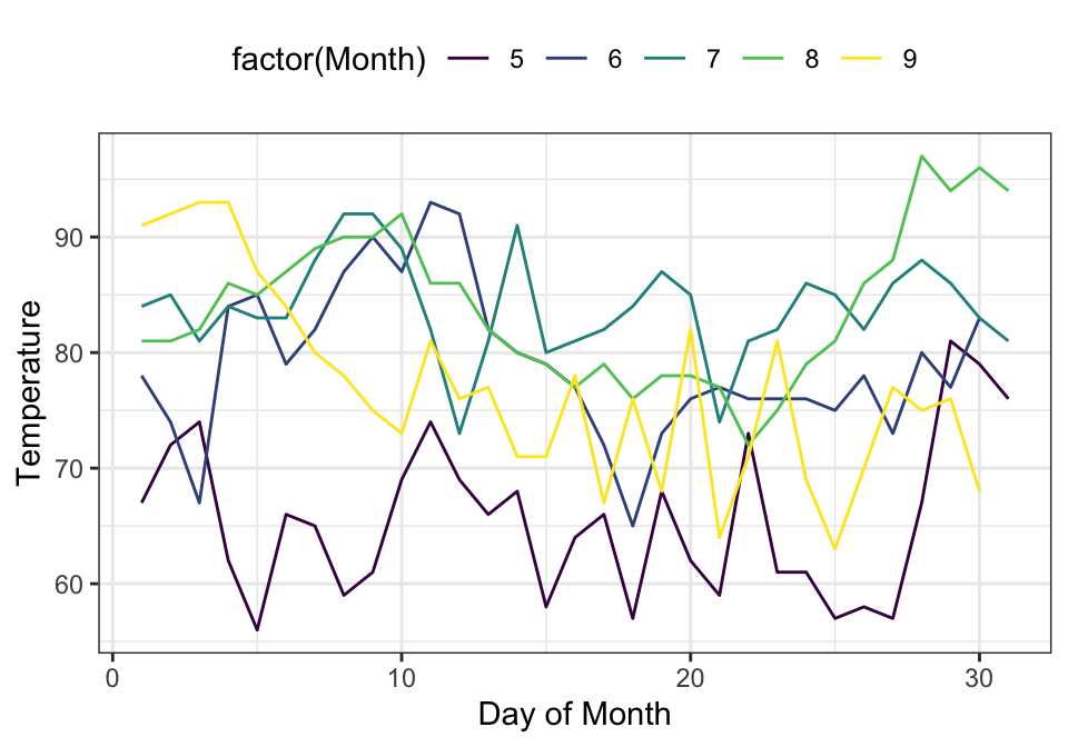
- Highlight the lines whose max values are larger than 93 like below:
p + gghighlight(max(Temp) > 93, label_key = Month)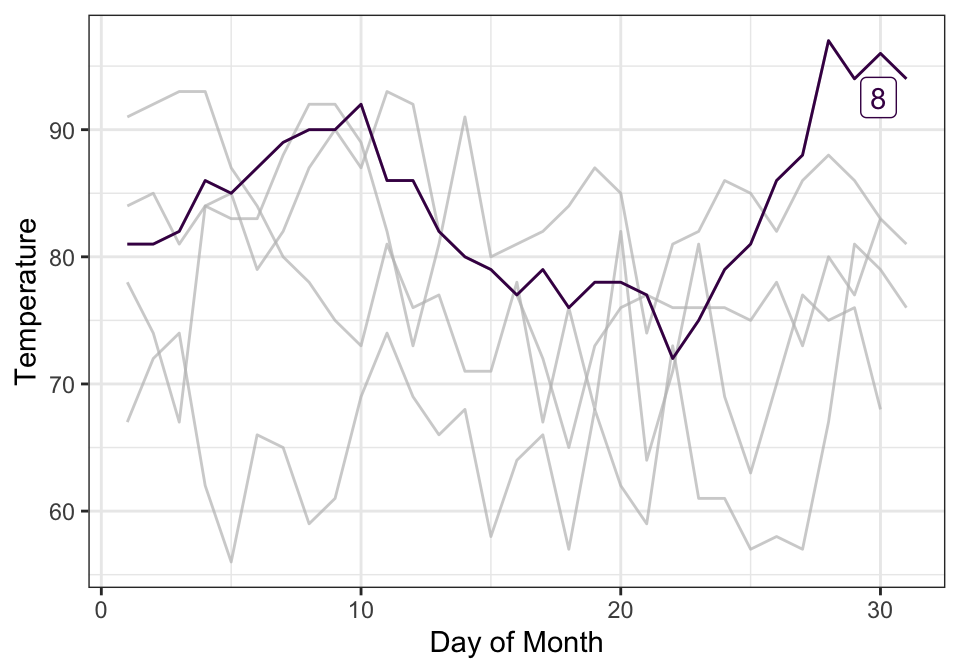
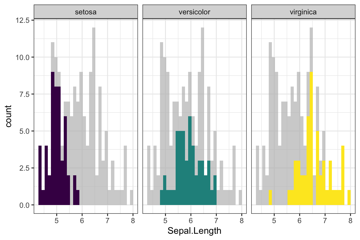
Histogram
ggplot(iris, aes(Sepal.Length, fill = Species)) +
  geom_histogram(bins = 30) +
  scale_fill_viridis_d() +
  gghighlight() +
  facet_wrap(~ Species)
Scatter plot
df <- mtcars %>% mutate(name = row.names(.))
df %>%
  ggplot(aes(mpg, disp)) +
  geom_point(col = "darkred") +
  gghighlight(disp > 350 & disp <= 400,
              unhighlighted_colour = alpha("steelblue", 0.4),
              use_direct_label = TRUE,
              label_key = name,
              label_params = list(size = 5)) +
geom_point(col = "darkred", size = 2.5) 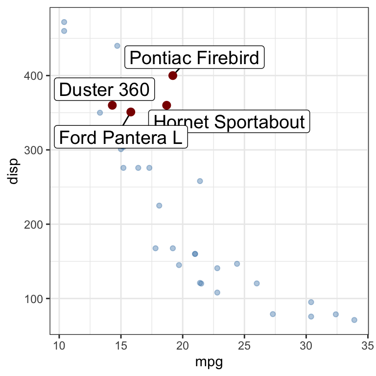
Bar plot
ggplot(df, aes(name, mpg)) +
  geom_col() +
  theme(axis.text.x = element_text(angle = 45, hjust = 1)) +
  gghighlight(mpg > 25)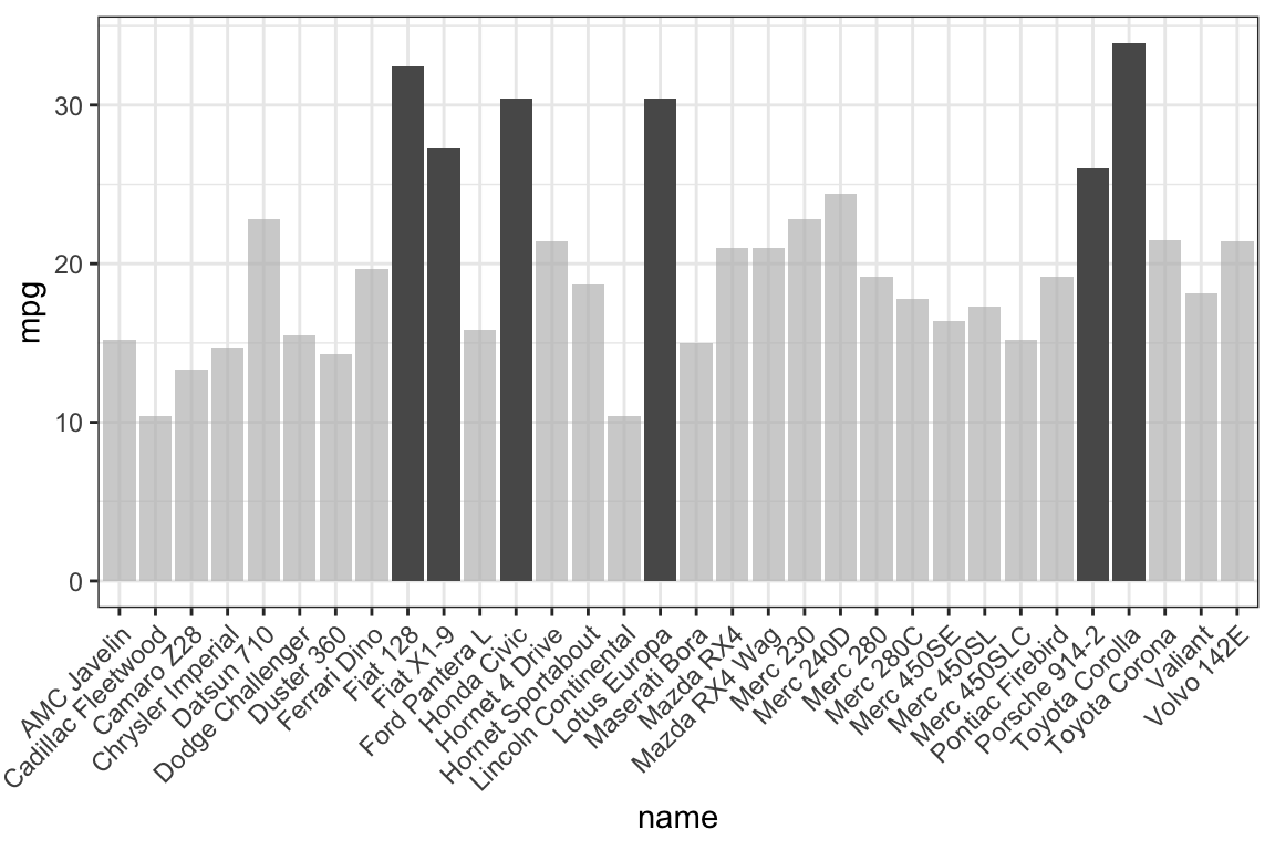
Recommended for you
This section contains best data science and self-development resources to help you on your path.
Books - Data Science
Our Books
- Practical Guide to Cluster Analysis in R by A. Kassambara (Datanovia)
- Practical Guide To Principal Component Methods in R by A. Kassambara (Datanovia)
- Machine Learning Essentials: Practical Guide in R by A. Kassambara (Datanovia)
- R Graphics Essentials for Great Data Visualization by A. Kassambara (Datanovia)
- GGPlot2 Essentials for Great Data Visualization in R by A. Kassambara (Datanovia)
- Network Analysis and Visualization in R by A. Kassambara (Datanovia)
- Practical Statistics in R for Comparing Groups: Numerical Variables by A. Kassambara (Datanovia)
- Inter-Rater Reliability Essentials: Practical Guide in R by A. Kassambara (Datanovia)
Others
- R for Data Science: Import, Tidy, Transform, Visualize, and Model Data by Hadley Wickham & Garrett Grolemund
- Hands-On Machine Learning with Scikit-Learn, Keras, and TensorFlow: Concepts, Tools, and Techniques to Build Intelligent Systems by Aurelien Géron
- Practical Statistics for Data Scientists: 50 Essential Concepts by Peter Bruce & Andrew Bruce
- Hands-On Programming with R: Write Your Own Functions And Simulations by Garrett Grolemund & Hadley Wickham
- An Introduction to Statistical Learning: with Applications in R by Gareth James et al.
- Deep Learning with R by François Chollet & J.J. Allaire
- Deep Learning with Python by François Chollet




I would like to realize a boxplot analysis with ggpubr library but I didn’t arrive to do it. In effect I have some questions to address you:
What is the adequate format to export the phenotyping data (excel, csv, test)?
is there a script appropriate to vizualise the phenotyping data for this library?
would he be possible to give the script to someaone?
Hi,
Here are the steps for creating a box plot:
1. Organize your data as follow:
2. Prepare your data as described at: Data preparation best practices
3. Save your data into csv format
4. Import the data into R (http://www.sthda.com/english/wiki/reading-data-from-txt-csv-files-r-base-functions):
5. Create the box plot:
If it does not work, send me a sample of your data by e-mail at contact@datanovia.com