This article presents multiple great solutions you should know for changing ggplot colors.
When creating graphs with the ggplot2 R package, colors can be specified either by name (e.g.: “red”) or by hexadecimal code (e.g. : “#FF1234”).
It is also possible to use pre-made color palettes available in different R packages, such as: viridis, RColorBrewer and ggsci packages.
In this tutorial, you’ll learn how to:
- Change ggplot colors by assigning a single color value to the geometry functions (
geom_point,geom_bar,geom_line, etc). You can use R color names or hex color codes. - Set a ggplot color by groups (i.e. by a factor variable). This is done by mapping a grouping variable to the
coloror to thefillarguments. In this case, we’ll show how to change manually the default ggplot2 colors by using the functionsscale_color_manual()andscale_fill_manual(). These functions makes it possible to set a custom color palette for each group level. - Use a list of colors that are color-blind friendly. R packages such as
viridisandRColorBrewerprovide different color scales that are robust to color-blindness. - Use predefined ggplot color palettes.
- Change a ggplot gradient color (also known as continuous color). To create a gradient color in ggplot2, a continuous variable is mapped to the options
colororfill. There are three different types of function to modify the default ggplot2 gradient color, includingscale_color_gradient(),scale_color_gradient2(),scale_color_gradientn(). The same scale functions exist for thefillarguments:scale_fill_gradient(),scale_fill_gradient2(),scale_fill_gradientn(). We’ll describe step by step how to use them.
Contents:
Key ggplot2 R functions
This section presents the key ggplot2 R function for changing a plot color.
Set ggplot color manually:
scale_fill_manual()for box plot, bar plot, violin plot, dot plot, etcscale_color_manual()orscale_colour_manual()for lines and points
Use colorbrewer palettes:
scale_fill_brewer()for box plot, bar plot, violin plot, dot plot, etcscale_color_brewer()orscale_colour_brewer()for lines and points
Use grey color scales:
scale_fill_grey()for box plot, bar plot, violin plot, dot plot, etcscale_colour_grey()orscale_colour_brewer()for points, lines, etc
Change the default ggplot gradient color:
scale_color_gradient(),scale_fill_gradient()for sequential gradients between two colorsscale_color_gradient2(),scale_fill_gradient2()for diverging gradientsscale_color_gradientn(),scale_fill_gradientn()for gradient between n colors
Prerequisites
- Load ggplot2 package and set the default theme:
library(ggplot2)
theme_set(
  theme_minimal() +
    theme(legend.position = "right")
)- Initialize ggplots using the
irisdata set. Create a box plot (bp) and a scatter plot (sp) that we’ll customize in the next section:
# Box plot
bp <- ggplot(iris, aes(Species, Sepal.Length))
# Scatter plot
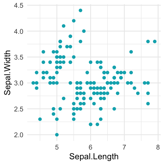
sp <- ggplot(iris, aes(Sepal.Length, Sepal.Width))Specify a single color
Colors in R can be specified either by name (e.g.: “red”) or by hexadecimal color codes, such as “#FF1234”. You can find many examples of color names and codes at:
The following R script changes the fill color (in box plots) and points color (in scatter plots).
- Using hexadecimal color codes:
# Box plot
bp + geom_boxplot(fill = "#FFDB6D", color = "#C4961A")

# Scatter plot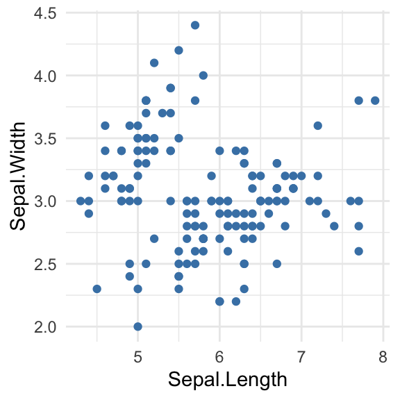
sp + geom_point(color = "#00AFBB") 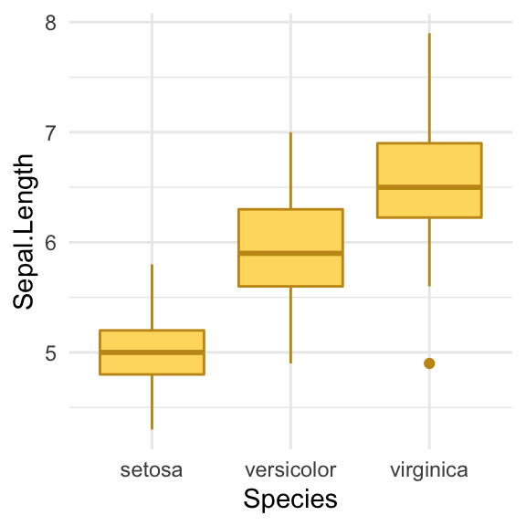
- Using color names
# Box plot
bp + geom_boxplot(fill = "lightgray", color = "black")

# Scatter plot
sp + geom_point(color = "steelblue") 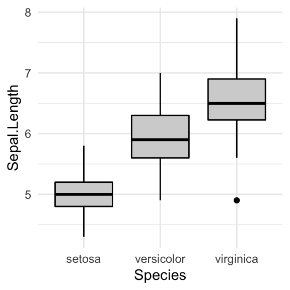
Change colors by groups: ggplot default colors
You can set colors according to the levels of a grouping variable by:
- Mapping the argument
colorto the variable of interest. This will be applied to points, lines and texts - Mapping the argument
fillto the variable of interest. This will change the fill color of areas, such as in box plot, bar plot, histogram, density plots, etc.
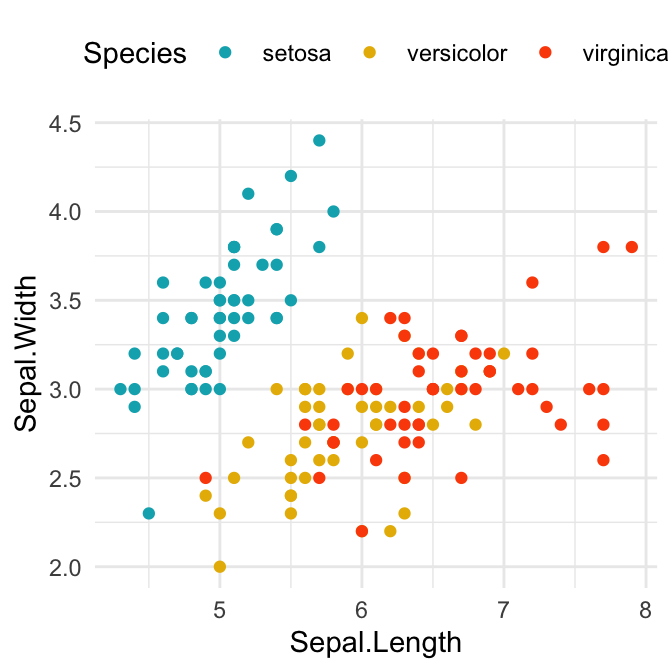
In the following example, we’ll map the options color and fill to the grouping variable Species, for scatter plot and box plot, respectively.
Changes colors by groups using the levels of Species variable:
# Box plot
bp <- bp + geom_boxplot(aes(fill = Species)) +
theme(legend.position = "top")
bp
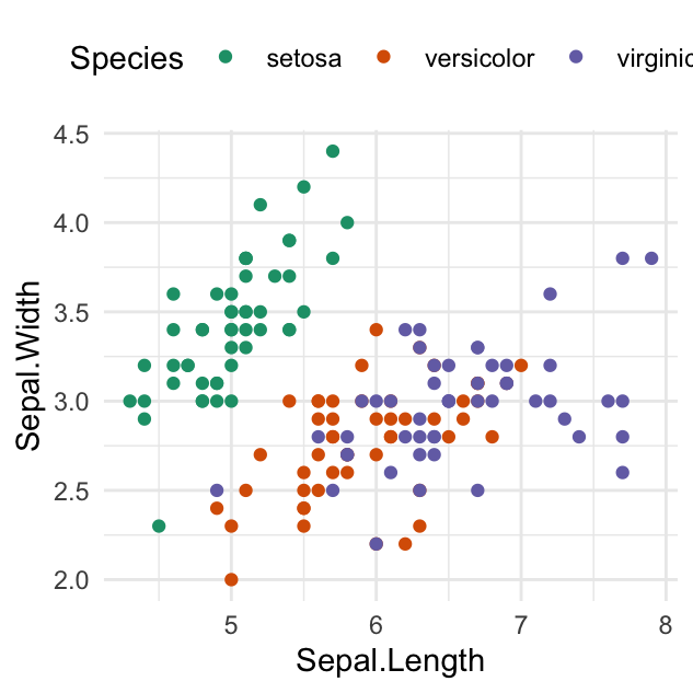
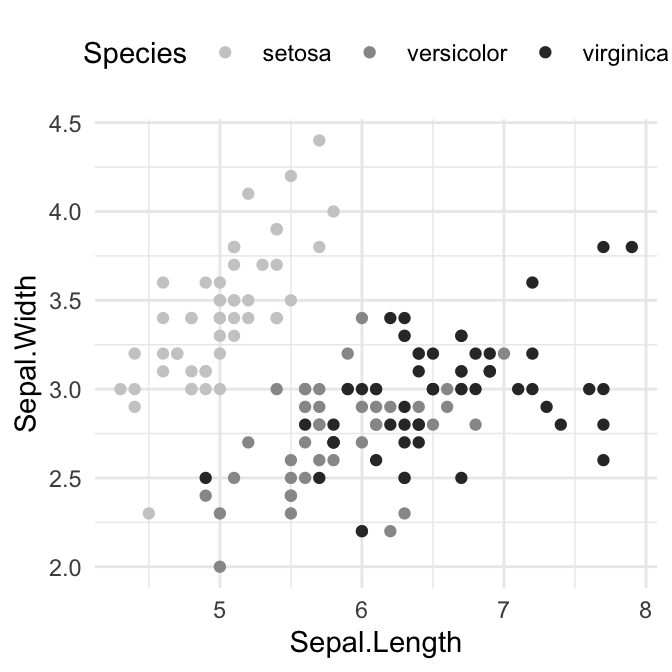
# Scatter plot
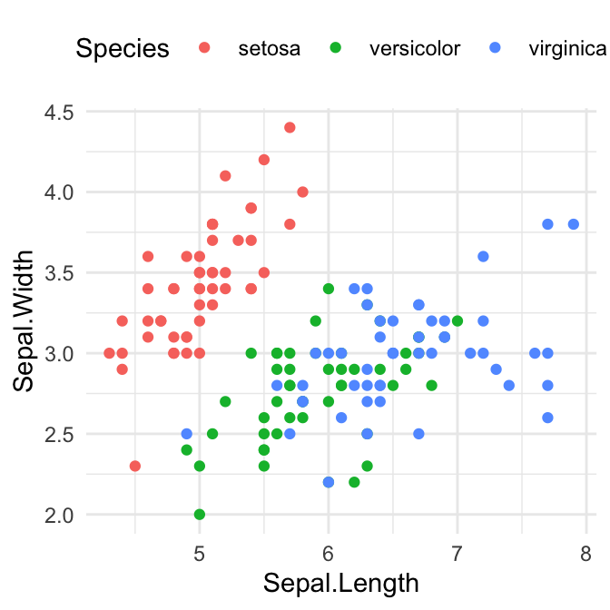
sp <- sp + geom_point(aes(color = Species)) +
theme(legend.position = "top")
sp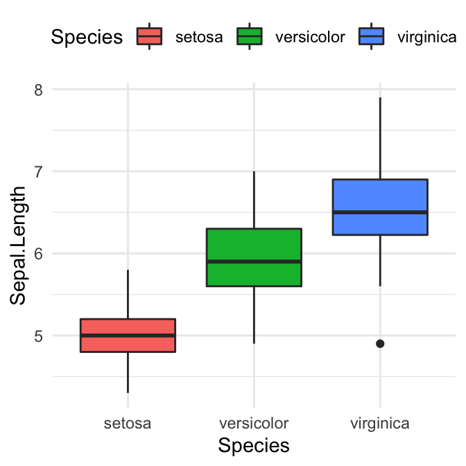
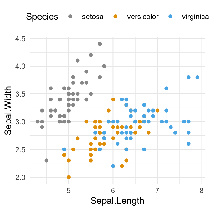
Set custom color palettes
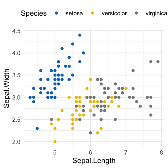
It’s possible to set manually the color palettes by using the functions:
scale_fill_manual()for box plot, bar plot, violin plot, dot plot, etcscale_color_manual()orscale_colour_manual()for lines and points
# Box plot
bp + scale_fill_manual(values = c("#00AFBB", "#E7B800", "#FC4E07"))

# Scatter plot
sp + scale_color_manual(values = c("#00AFBB", "#E7B800", "#FC4E07"))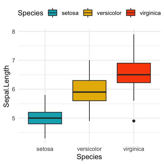
You might also find interesting, the following list of colors:
custom.col <- c("#FFDB6D", "#C4961A", "#F4EDCA",
                "#D16103", "#C3D7A4", "#52854C", "#4E84C4", "#293352")
Use a colorblind-friendly palette
When selecting a set of colors, it’s recommended to make sure that you choose color palettes that are robust to colorblindness. In the next sections, we’ll show you to check that your production figures are colorblind-friendly.
Here, we present two color-blind-friendly palettes, one with gray, and one with black (palettes source: http://jfly.iam.u-tokyo.ac.jp/color/).
# The palette with grey:
cbp1 <- c("#999999", "#E69F00", "#56B4E9", "#009E73",
          "#F0E442", "#0072B2", "#D55E00", "#CC79A7")

# The palette with black:
cbp2 <- c("#000000", "#E69F00", "#56B4E9", "#009E73",
          "#F0E442", "#0072B2", "#D55E00", "#CC79A7")

You can use these palettes as follow:
# To use for fills, add
bp + scale_fill_manual(values = cbp1)

# To use for line and point colors, add
sp + scale_colour_manual(values=cbp1)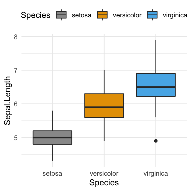
Predefined ggplot color palettes
You can modify the default ggplot colors by using predefined color palettes available in different R packages. The most commonly used color scales, include:
- Viridis color scales [
viridispackage]. - Colorbrewer palettes [
RColorBrewerpackage] - Grey color palettes [
ggplot2package] - Scientific journal color palettes [
ggscipackage] - Wes Anderson color palettes [
wesandersonpackage]
Learn more at: Top R Color Palettes to Know for Great Data Visualization
Viridis color palettes
The viridis R package provides color palettes to make beautiful plots that are: printer-friendly, perceptually uniform and easy to read by those with colorblindness. Key functions scale_color_viridis() and scale_fill_viridis()
library(viridis)
# Gradient color
ggplot(iris, aes(Sepal.Length, Sepal.Width))+
geom_point(aes(color = Sepal.Length)) +
scale_color_viridis(option = "D")
# Discrete color. use the argument discrete = TRUE
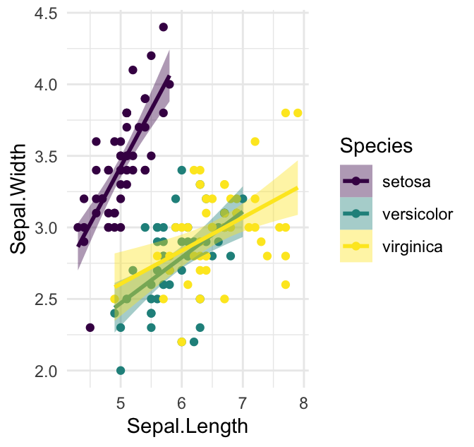
ggplot(iris, aes(Sepal.Length, Sepal.Width))+
geom_point(aes(color = Species)) +
geom_smooth(aes(color = Species, fill = Species), method = "lm") +
scale_color_viridis(discrete = TRUE, option = "D")+
scale_fill_viridis(discrete = TRUE) 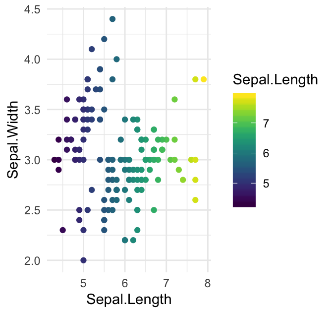
RColorBrewer palettes
The RColorBrewer package creates a nice looking color palettes. Read more at: The A – Z Of Rcolorbrewer Palette
Two color scale functions are available in ggplot2 for using the colorbrewer palettes:
scale_fill_brewer()for box plot, bar plot, violin plot, dot plot, etcscale_color_brewer()for lines and points
For example:
# Box plot
bp + scale_fill_brewer(palette = "Dark2")

# Scatter plot
sp + scale_color_brewer(palette = "Dark2")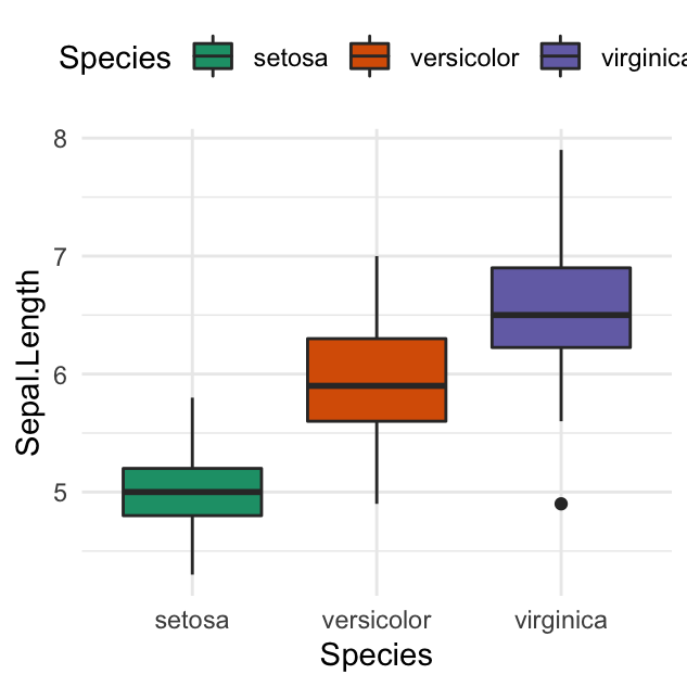
To display colorblind-friendly brewer palettes, use this R code:
library(RColorBrewer)
display.brewer.all(colorblindFriendly = TRUE)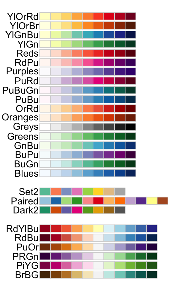
Grey color palettes
Key functions available in ggplot2:
scale_fill_grey()for box plot, bar plot, violin plot, dot plot, etcscale_colour_grey()for points, lines, etc
# Box plot
bp + scale_fill_grey(start = 0.8, end = 0.2)

# Scatter plot
sp + scale_color_grey(start = 0.8, end = 0.2) 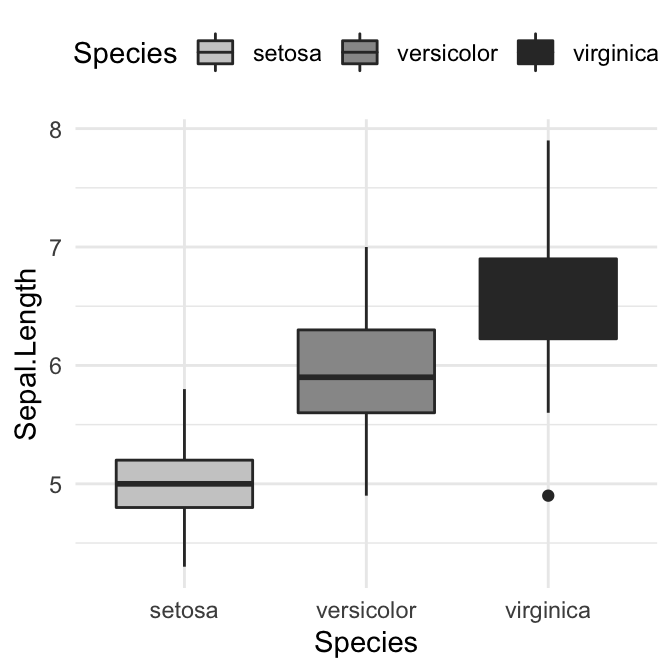
Scientific journal color palettes
The R package ggsci contains a collection of high-quality color palettes inspired by colors used in scientific journals, data visualization libraries, and more.
The color palettes are provided as ggplot2 scale functions:
scale_color_npg()andscale_fill_npg(): Nature Publishing Group color palettesscale_color_aaas()andscale_fill_aaas(): American Association for the Advancement of Science color palettesscale_color_lancet()andscale_fill_lancet(): Lancet journal color palettesscale_color_jco()andscale_fill_jco(): Journal of Clinical Oncology color palettesscale_color_tron()andscale_fill_tron(): This palette is inspired by the colors used in Tron Legacy. It is suitable for displaying data when using a dark theme.
You can find more examples in the ggsci package vignettes.
- Usage in ggplot2. We’ll use JCO and the Tron Legacy color palettes.
library("ggsci")
# Change area fill color using jco palette
bp + scale_fill_jco()


# Change point color
sp + scale_color_jco()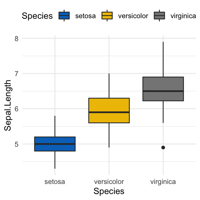
Learn more at: Top R Color Palettes to Know for Great Data Visualization
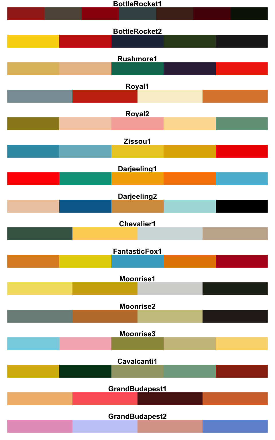
Wes Anderson color palettes
It contains 16 color palettes from Wes Anderson movies.
library(wesanderson)
names(wes_palettes)
## [1] "BottleRocket1" "BottleRocket2" "Rushmore1" "Royal1"
## [5] "Royal2" "Zissou1" "Darjeeling1" "Darjeeling2"
## [9] "Chevalier1" "FantasticFox1" "Moonrise1" "Moonrise2"
## [13] "Moonrise3" "Cavalcanti1" "GrandBudapest1" "GrandBudapest2"The available color palettes are illustrated in the chart below :
You can use the different palettes as discrete or continuous color in ggplot2, as follow:
library(wesanderson)
# Discrete color
bp + scale_fill_manual(values = wes_palette("GrandBudapest1", n = 3))
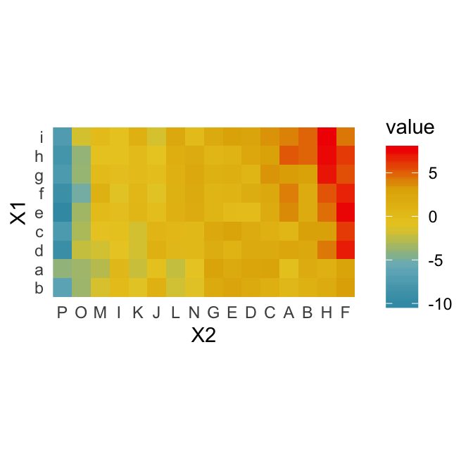
# Gradient color
pal <- wes_palette("Zissou1", 100, type = "continuous")
ggplot(heatmap, aes(x = X2, y = X1, fill = value)) +
geom_tile() +
scale_fill_gradientn(colours = pal) +
scale_x_discrete(expand = c(0, 0)) +
scale_y_discrete(expand = c(0, 0)) +
coord_equal() 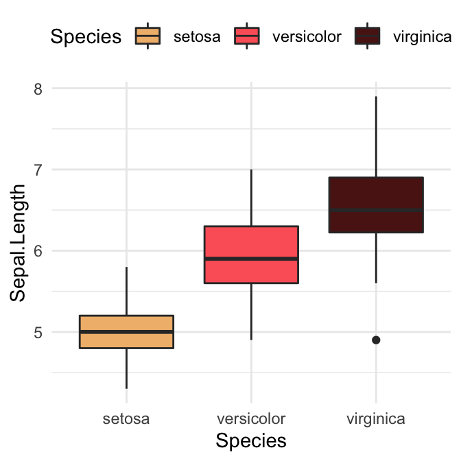
Learn more at: Top R Color Palettes to Know for Great Data Visualization
Gradient or continuous colors
Default ggplot gradient colors
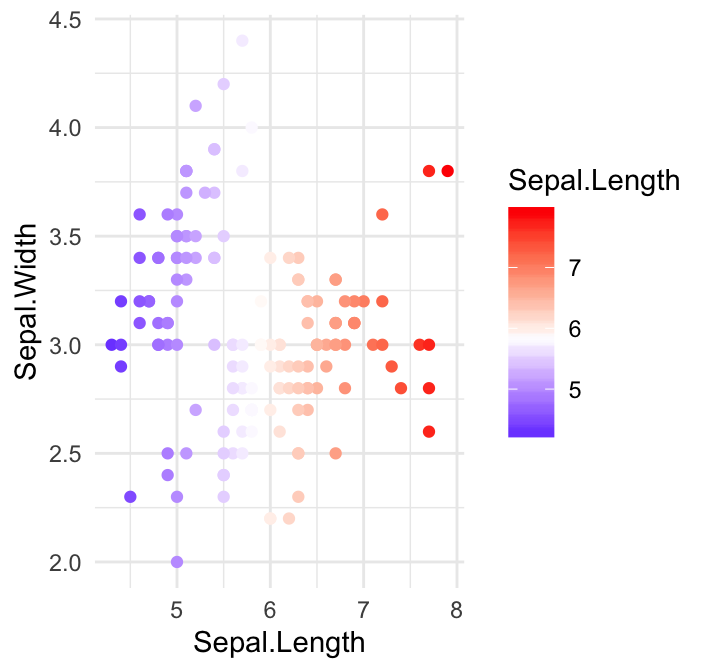
For gradient colors, you should map the map the argument color and/or fill to a continuous variable. The default ggplot2 setting for gradient colors is a continuous blue color.
In the following example, we color points according to the variable: Sepal.Length.
sp2 <- ggplot(iris, aes(Sepal.Length, Sepal.Width))+
  geom_point(aes(color = Sepal.Length))
Key functions to change default gradient colors
The default gradient color can be modified using the following ggplot2 functions:
scale_color_gradient(),scale_fill_gradient()for sequential gradients between two colorsscale_color_gradient2(),scale_fill_gradient2()for diverging gradientsscale_color_gradientn(),scale_fill_gradientn()for gradient between n colors
Set gradient between two colors
Change the colors for low and high ends of the gradient:
# Sequential color scheme.
# Specify the colors for low and high ends of gradient
sp2 + scale_color_gradient(low = "blue", high = "red")

# Diverging color scheme
# Specify also the colour for mid point
mid <- mean(iris$Sepal.Length)
sp2 + scale_color_gradient2(midpoint = mid, low = "blue", mid = "white",
                            high = "red", space = "Lab" )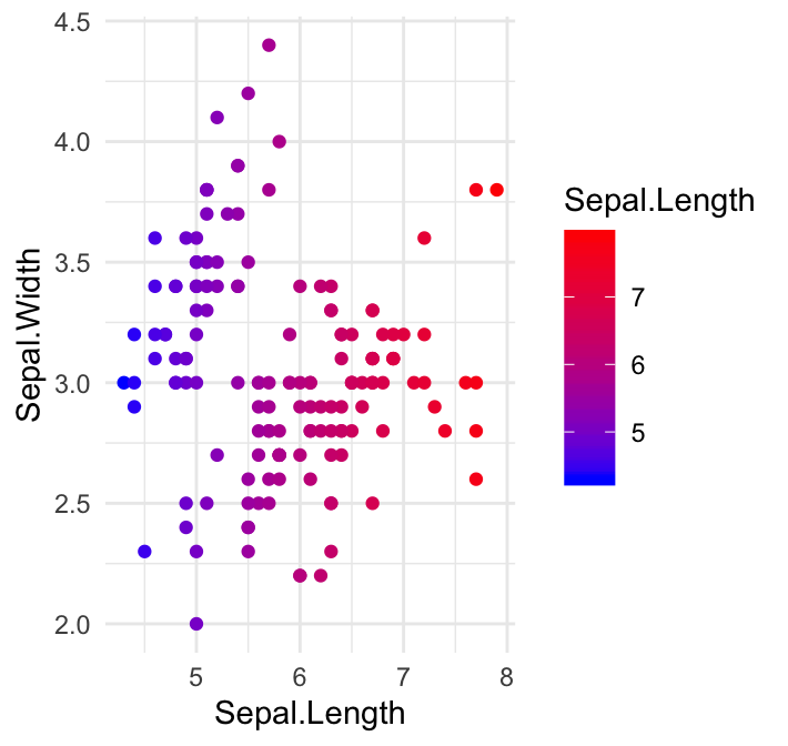
Note that, the functions scale_color_continuous() and scale_fill_continuous() can be also used to set gradient colors.
Set gradient between n colors
In the example below, we’ll use the R base function rainbow() to generate a vector of 5 colors, which will be used to set the gradient colors.
sp2 + scale_color_gradientn(colours = rainbow(5))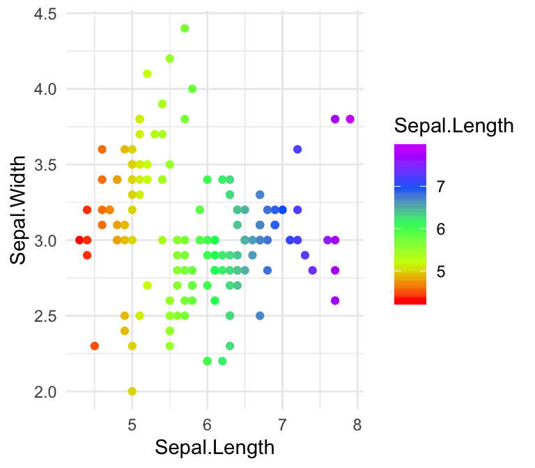
Conclusion
This article presents how to customize ggplot colors. The main points are summarized as follow.
- Create a basic ggplot. Map the
colorargument to a factor or grouping variable.
p <- ggplot(iris, aes(Sepal.Length, Sepal.Width))+
  geom_point(aes(color = Species))
p- Set the color palette manually using a custom color scale:
p + scale_color_manual(values = c("#00AFBB", "#E7B800", "#FC4E07"))- Use color blind-friendly palette:
cbp1 <- c("#999999", "#E69F00", "#56B4E9", "#009E73",
          "#F0E442", "#0072B2", "#D55E00", "#CC79A7")
p + scale_color_manual(values = cbp1)- Use RColorBrewer palettes:
p + scale_color_brewer(palette = "Dark2")- Use viridis color scales:
library(viridis)
p + scale_color_viridis(discrete = TRUE)
Recommended for you
This section contains best data science and self-development resources to help you on your path.
Books - Data Science
Our Books
- Practical Guide to Cluster Analysis in R by A. Kassambara (Datanovia)
- Practical Guide To Principal Component Methods in R by A. Kassambara (Datanovia)
- Machine Learning Essentials: Practical Guide in R by A. Kassambara (Datanovia)
- R Graphics Essentials for Great Data Visualization by A. Kassambara (Datanovia)
- GGPlot2 Essentials for Great Data Visualization in R by A. Kassambara (Datanovia)
- Network Analysis and Visualization in R by A. Kassambara (Datanovia)
- Practical Statistics in R for Comparing Groups: Numerical Variables by A. Kassambara (Datanovia)
- Inter-Rater Reliability Essentials: Practical Guide in R by A. Kassambara (Datanovia)
Others
- R for Data Science: Import, Tidy, Transform, Visualize, and Model Data by Hadley Wickham & Garrett Grolemund
- Hands-On Machine Learning with Scikit-Learn, Keras, and TensorFlow: Concepts, Tools, and Techniques to Build Intelligent Systems by Aurelien Géron
- Practical Statistics for Data Scientists: 50 Essential Concepts by Peter Bruce & Andrew Bruce
- Hands-On Programming with R: Write Your Own Functions And Simulations by Garrett Grolemund & Hadley Wickham
- An Introduction to Statistical Learning: with Applications in R by Gareth James et al.
- Deep Learning with R by François Chollet & J.J. Allaire
- Deep Learning with Python by François Chollet
Version:
 Français


Very nice tips. Thank you!
Thank you for your positive feedback, highly appreciated!
Excellent post! Thank you very much Kassambra!
Hi David Rowie, I appreciate your positive feedback, thank you!
Awesome tips! Thanks so much for the post!
Fantastic guide, super helpful, thank you!
Thank you for the positive feedback, highly appreciated!
Thanks a lot, but do you know how to color each point a different colour manually ? My dataframe is given below, the colour of the points is in col column.
head(df)
x1 x2 z col
1 0.72 2757 86 #2DFE89
2 0.72 2757 86 #2DFE89
3 0.72 2757 86 #2DFE89
4 0.70 2757 82 #28FE97
5 0.86 2757 26 #007C7D
6 0.75 2757 79 #24FEA1
Change point color by a grouping variable, then set the color manually:
library(ggplot2) ggplot(iris, aes(Sepal.Length, Petal.Width)) + geom_point(aes(color = Species)) + scale_color_manual(values = c("lightgray", "darkgray", "black"))Pingback:Simple tools for mastering color in scientific figures |
What package or what is the code for the function show_pal() in the section Set Custom Color Palettes?
Thank you for the comment. This is an internal helper function. It’s supposed to be hidden in the tutorial. I updated now the tutorial to hide it. Please find below the R code in case you want it