This article presents the top R color palettes for changing the default color of a graph generated using either the ggplot2 package or the R base plot functions.
You’ll learn how to use the top 6 predefined color palettes in R, available in different R packages:
- Viridis color scales [
viridispackage]. - Colorbrewer palettes [
RColorBrewerpackage] - Grey color palettes [
ggplot2package] - Scientific journal color palettes [
ggscipackage] - Wes Anderson color palettes [
wesandersonpackage] - R base color palettes:
rainbow,heat.colors,cm.colors.
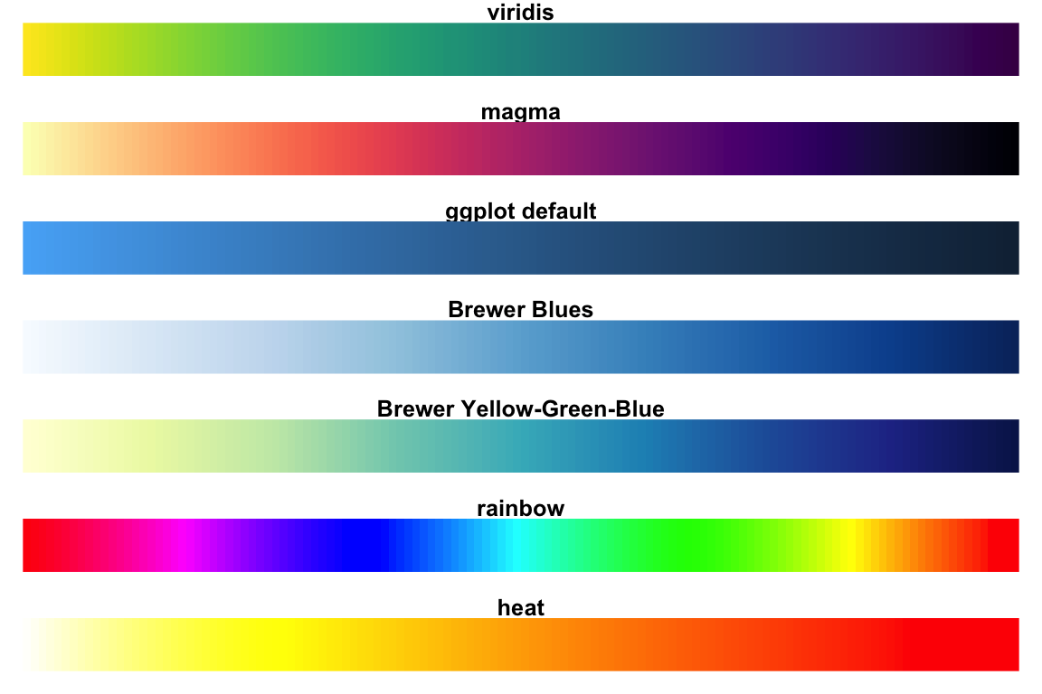
Note that, the “rainbow” and “heat” color palettes are less perceptually uniform compared to the other color scales. The “viridis” scale stands out for its large perceptual range. It makes as much use of the available color space as possible while maintaining uniformity.
When comparing these color palettes as they might appear under various forms of colorblindness, the viridis palettes remain the most robust.
Contents:
Demo dataset
We’ll use the R built-in iris demo dataset.
head(iris, 6)## Sepal.Length Sepal.Width Petal.Length Petal.Width Species
## 1 5.1 3.5 1.4 0.2 setosa
## 2 4.9 3.0 1.4 0.2 setosa
## 3 4.7 3.2 1.3 0.2 setosa
## 4 4.6 3.1 1.5 0.2 setosa
## 5 5.0 3.6 1.4 0.2 setosa
## 6 5.4 3.9 1.7 0.4 setosaCreate a basic ggplot colored by groups
You can change colors according to a grouping variable by:
- Mapping the argument
colorto the variable of interest. This will be applied to points, lines and texts - Mapping the argument
fillto the variable of interest. This will change the fill color of areas, such as in box plot, bar plot, histogram, density plots, etc.
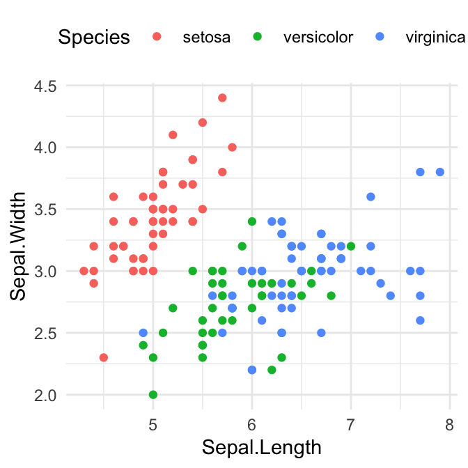
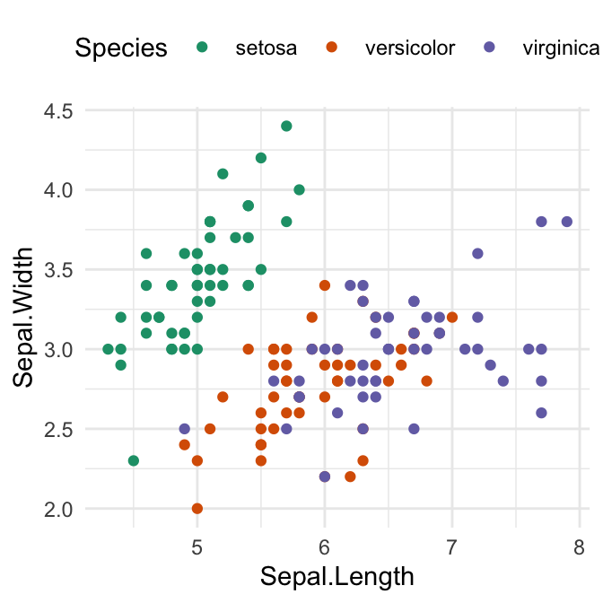
In our example, we’ll map the options color and fill to the grouping variable Species, for scatter plot and box plot, respectively.
Changes colors by groups using the levels of Species variable:
library("ggplot2")
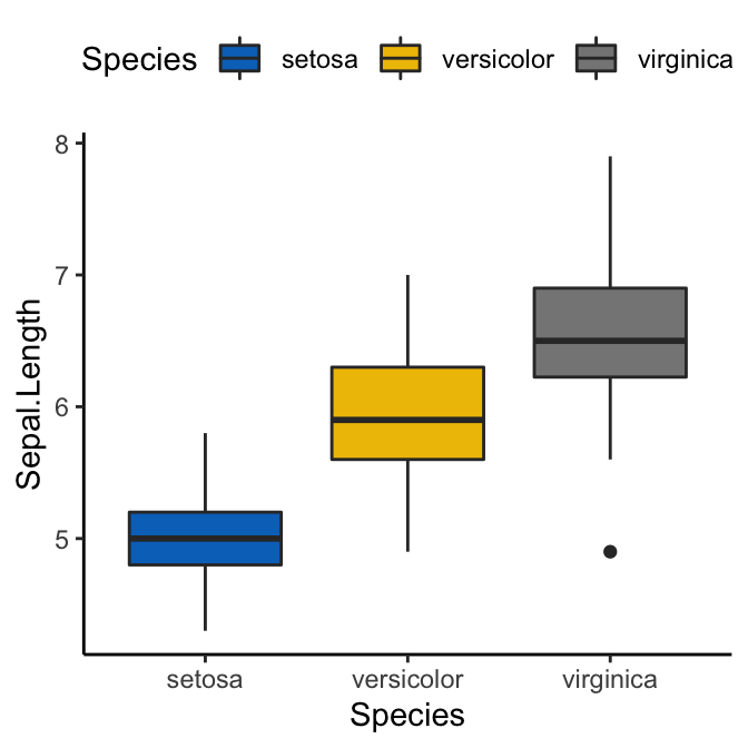
# Box plot
bp <- ggplot(iris, aes(Species, Sepal.Length)) +
geom_boxplot(aes(fill = Species)) +
theme_minimal() +
theme(legend.position = "top")
bp
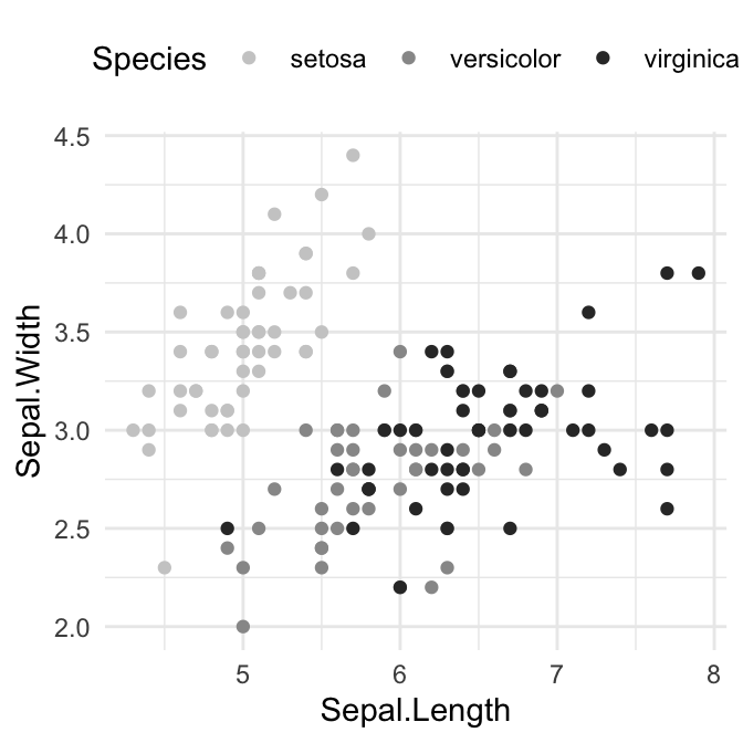
# Scatter plot
sp <- ggplot(iris, aes(Sepal.Length, Sepal.Width)) +
geom_point(aes(color = Species)) +
theme_minimal()+
theme(legend.position = "top")
sp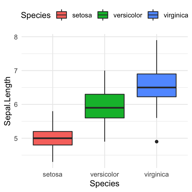
Viridis color palettes
The viridis R package (by Simon Garnier) provides color palettes to make beautiful plots that are: printer-friendly, perceptually uniform and easy to read by those with colorblindness.
Install and load the package as follow:
install.packages("viridis")  # Install
library("viridis")           # Load
The viridis package contains four sequential color scales: “Viridis” (the primary choice) and three alternatives with similar properties (“magma”, “plasma”, and “inferno”).

Key functions:
scale_color_viridis(): Change the color of points, lines and textsscale_fill_viridis(): Change the fill color of areas (box plot, bar plot, etc)viridis(n),magma(n),inferno(n)andplasma(n): Generate color palettes for base plot, wherenis the number of colors to returns.
Note that, the function scale_color_viridis() and scale_fill_viridis() have an argument named option, which is a character string indicating the colormap option to use. Four options are available: “magma” (or “A”), “inferno” (or “B”), “plasma” (or “C”), and “viridis” (or “D”, the default option).
- Usage in ggplot2
library(ggplot2)
# Gradient color
ggplot(iris, aes(Sepal.Length, Sepal.Width))+
geom_point(aes(color = Sepal.Length)) +
scale_color_viridis(option = "D")+
theme_minimal() +
theme(legend.position = "bottom")
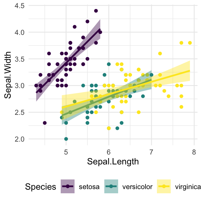
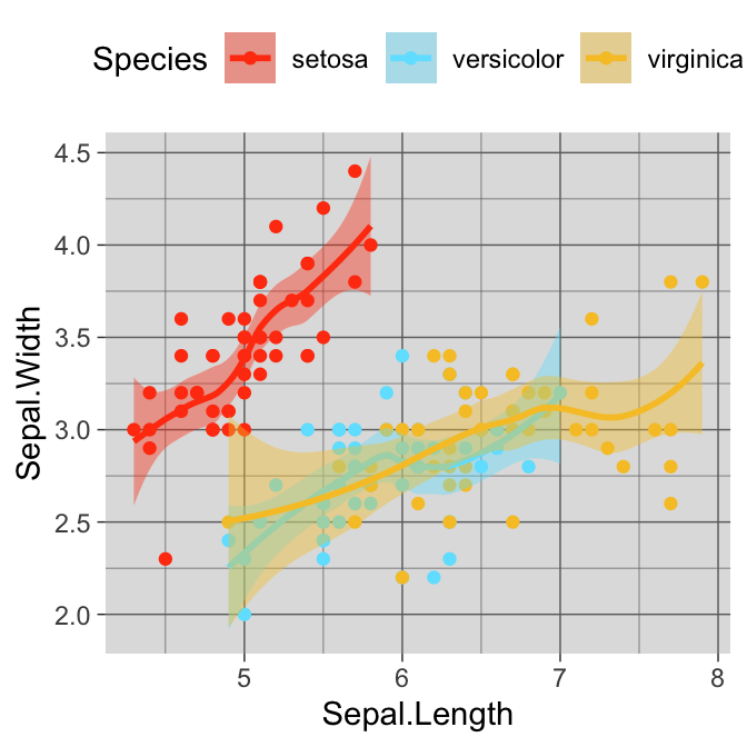
# Discrete color. use the argument discrete = TRUE
ggplot(iris, aes(Sepal.Length, Sepal.Width))+
geom_point(aes(color = Species)) +
geom_smooth(aes(color = Species, fill = Species), method = "lm") +
scale_color_viridis(discrete = TRUE, option = "D")+
scale_fill_viridis(discrete = TRUE) +
theme_minimal() +
theme(legend.position = "bottom")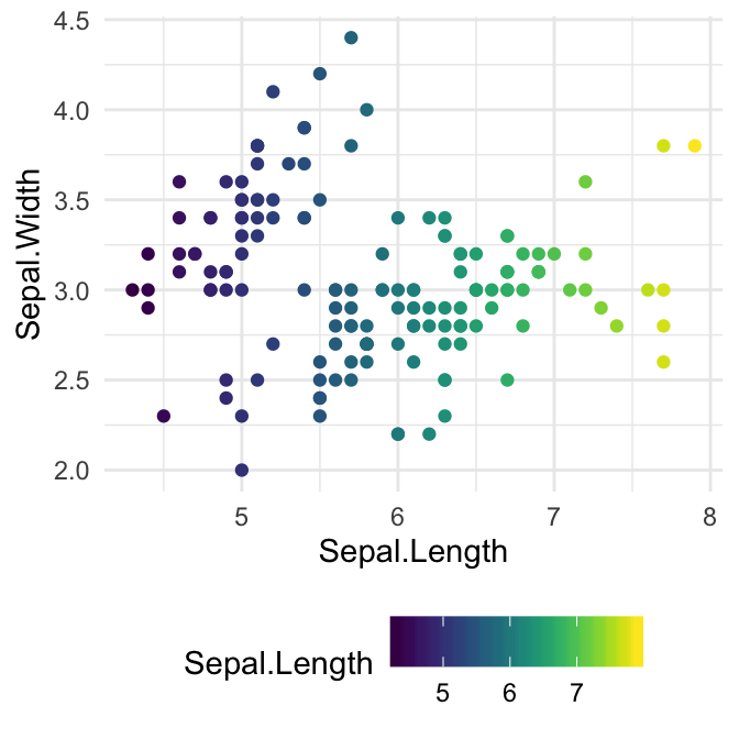
- Usage in base plot. Use the function
viridis()to generate the number of colors you want:
barplot(1:10, col = viridis(10))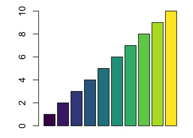
RColorBrewer palettes
The RColorBrewer package creates a nice looking color palettes. You should first install it as follow: install.packages("RColorBrewer").
To display all the color palettes in the package, type this:
library(RColorBrewer)
display.brewer.all()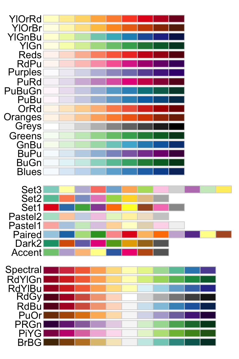
The package contains 3 types of color palettes: sequential, diverging, and qualitative.
- Sequential palettes (first list of colors), which are suited to ordered data that progress from low to high (gradient). The palettes names are : Blues, BuGn, BuPu, GnBu, Greens, Greys, Oranges, OrRd, PuBu, PuBuGn, PuRd, Purples, RdPu, Reds, YlGn, YlGnBu YlOrBr, YlOrRd.
- Qualitative palettes (second list of colors), which are best suited to represent nominal or categorical data. They not imply magnitude differences between groups. The palettes names are : Accent, Dark2, Paired, Pastel1, Pastel2, Set1, Set2, Set3.
- Diverging palettes (third list of colors), which put equal emphasis on mid-range critical values and extremes at both ends of the data range. The diverging palettes are : BrBG, PiYG, PRGn, PuOr, RdBu, RdGy, RdYlBu, RdYlGn, Spectral
The RColorBrewer package include also three important functions:
# 1. Return the hexadecimal color specification
brewer.pal(n, name)

# 2. Display a single RColorBrewer palette
# by specifying its name
display.brewer.pal(n, name)

# 3. Display all color palette
display.brewer.all(n = NULL, type = "all", select = NULL,
                   colorblindFriendly = FALSE)
Description of the function arguments:
n: Number of different colors in the palette, minimum 3, maximum depending on palette.name: A palette name from the lists above. For examplename = RdBu.type: The type of palette to display. Allowed values are one of: “div”, “qual”, “seq”, or “all”.select: A list of palette names to display.colorblindFriendly: if TRUE, display only colorblind friendly palettes.
To display only colorblind-friendly brewer palettes, use this R code:
display.brewer.all(colorblindFriendly = TRUE)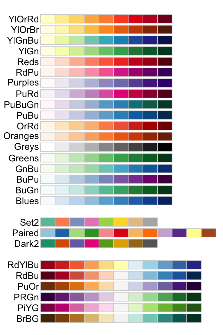
You can also view a single RColorBrewer palette by specifying its name as follow :
# View a single RColorBrewer palette by specifying its name
display.brewer.pal(n = 8, name = 'Dark2')
# Hexadecimal color specification
brewer.pal(n = 8, name = "Dark2")
## [1] "#1B9E77" "#D95F02" "#7570B3" "#E7298A" "#66A61E" "#E6AB02" "#A6761D"
## [8] "#666666"Usage in ggplot2. Two color scale functions are available in ggplot2 for using the colorbrewer palettes:
scale_fill_brewer()for box plot, bar plot, violin plot, dot plot, etcscale_color_brewer()for lines and points
# Box plot
bp + scale_fill_brewer(palette = "Dark2")

# Scatter plot
sp + scale_color_brewer(palette = "Dark2")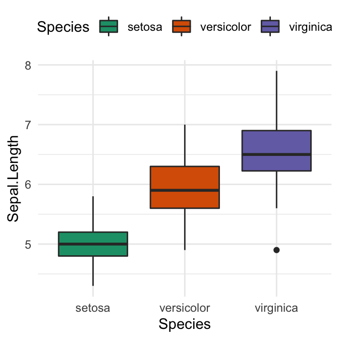
Usage in base plots. The function brewer.pal() is used to generate a vector of colors.
# Barplot using RColorBrewer
barplot(c(2,5,7), col = brewer.pal(n = 3, name = "RdBu"))
Grey color palettes
Key functions:
scale_fill_grey()for box plot, bar plot, violin plot, dot plot, etcscale_colour_grey()for points, lines, etc
# Box plot
bp + scale_fill_grey(start = 0.8, end = 0.2)

# Scatter plot
sp + scale_color_grey(start = 0.8, end = 0.2) 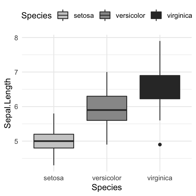
Scientific journal color palettes
The R package ggsci contains a collection of high-quality color palettes inspired by colors used in scientific journals, data visualization libraries, and more.
The color palettes are provided as ggplot2 scale functions:
scale_color_npg()andscale_fill_npg(): Nature Publishing Group color palettesscale_color_aaas()andscale_fill_aaas(): American Association for the Advancement of Science color palettesscale_color_lancet()andscale_fill_lancet(): Lancet journal color palettesscale_color_jco()andscale_fill_jco(): Journal of Clinical Oncology color palettesscale_color_tron()andscale_fill_tron(): This palette is inspired by the colors used in Tron Legacy. It is suitable for displaying data when using a dark theme.
You can find more examples in the ggsci package vignettes.
Note that for base plots, you can use the corresponding palette generator for creating a list of colors. For example, you can use: pal_npg(), pal_aaas(), pal_lancet(), pal_jco(), and so on.
- Usage in ggplot2. We’ll use JCO and the Tron Legacy color palettes.
library("ggplot2")
library("ggsci")
# Change area fill color. JCO palette
ggplot(iris, aes(Species, Sepal.Length)) +
  geom_boxplot(aes(fill = Species)) +
  scale_fill_jco()+
  theme_classic() +
  theme(legend.position = "top")

# Change point color and the confidence band fill color.
# Use tron palette on dark theme
ggplot(iris, aes(Sepal.Length, Sepal.Width)) +
  geom_point(aes(color = Species)) +
  geom_smooth(aes(color = Species, fill = Species)) +
  scale_color_tron()+
  scale_fill_tron()+
  theme_dark() +
  theme(
    legend.position = "top",
    panel.background = element_rect(fill = "#2D2D2D"),
    legend.key = element_rect(fill = "#2D2D2D")
    )
- Usage in base plots
par(mar = c(1, 3.5, 1, 1))
barplot(1:10, col = pal_jco()(10))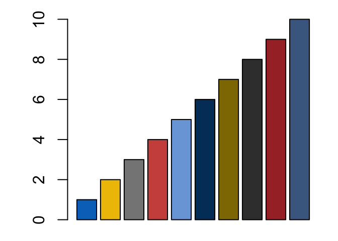
Wes Anderson color palettes
Install the latest developmental version from Github (devtools::install_github("karthik/wesanderson")) or install from CRAN (install.packages("wesanderson")).
It contains 16 color palettes from Wes Anderson movies:
library(wesanderson)
names(wes_palettes)
## [1] "BottleRocket1" "BottleRocket2" "Rushmore1" "Royal1"
## [5] "Royal2" "Zissou1" "Darjeeling1" "Darjeeling2"
## [9] "Chevalier1" "FantasticFox1" "Moonrise1" "Moonrise2"
## [13] "Moonrise3" "Cavalcanti1" "GrandBudapest1" "GrandBudapest2"The key R function in the package, for generating a vector of colors, is
wes_palette(name, n, type = c("discrete", "continuous"))name: Name of desired paletten: Number of colors desired. Unfortunately most palettes now only have 4 or 5 colors.type: Either “continuous” or “discrete”. Use continuous if you want to automatically interpolate between colours.
If you need more colours than normally found in a palette, you can use a continuous palette to interpolate between existing colours.
The available color palettes are :
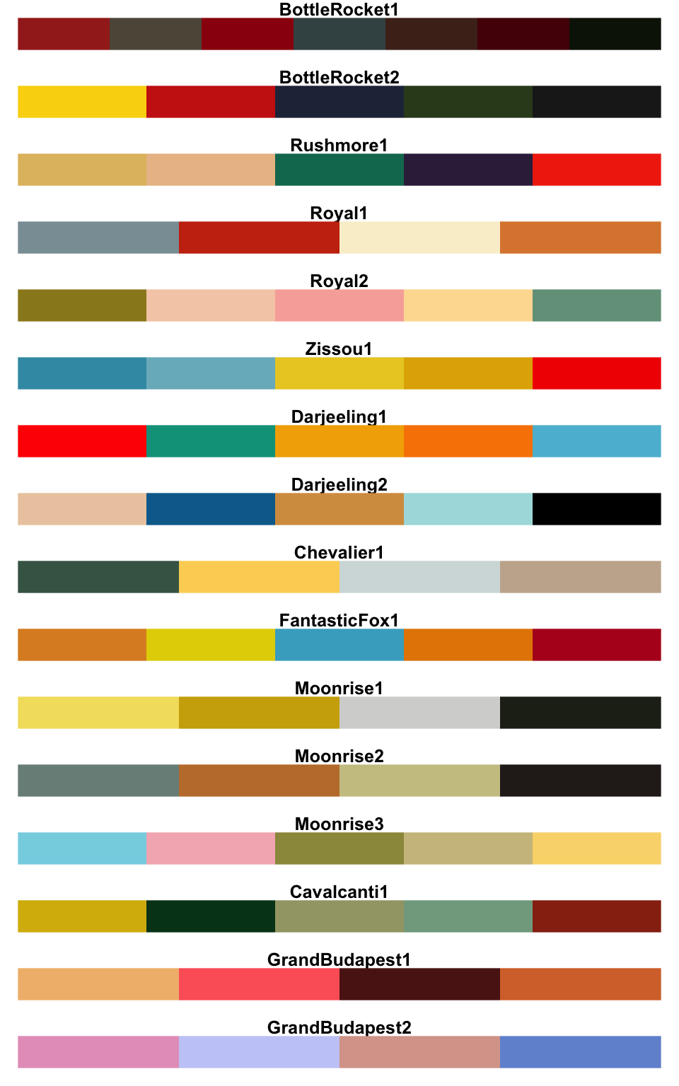
Usage in ggplot2:
library(wesanderson)
# Discrete color
bp + scale_fill_manual(values = wes_palette("GrandBudapest1", n = 3))
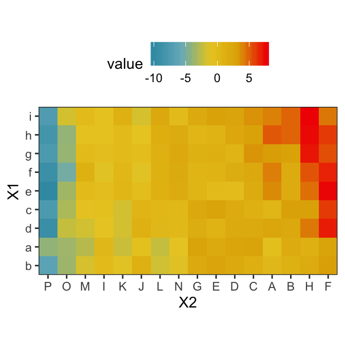
# Gradient color
pal <- wes_palette("Zissou1", 100, type = "continuous")
ggplot(heatmap, aes(x = X2, y = X1, fill = value)) +
geom_tile() +
scale_fill_gradientn(colours = pal) +
scale_x_discrete(expand = c(0, 0)) +
scale_y_discrete(expand = c(0, 0)) +
coord_equal() 
Usage in base plots:
barplot(1:10, col = wes_palette("Zissou1", 10, type = "continuous"))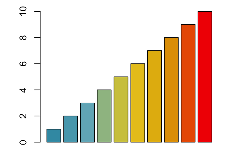
R base color palettes
There are 5 R base functions that can be used to generate a vector of n contiguous colors: rainbow(n), heat.colors(n), terrain.colors(n), topo.colors(n), and cm.colors(n).
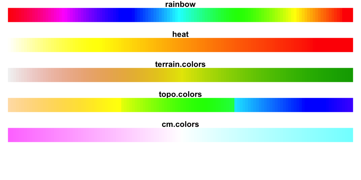
Usage in R base plots:
barplot(1:5, col=rainbow(5))
# Use heat.colors
barplot(1:5, col=heat.colors(5))
# Use terrain.colors
barplot(1:5, col=terrain.colors(5))
# Use topo.colors
barplot(1:5, col=topo.colors(5))
# Use cm.colors
barplot(1:5, col=cm.colors(5))
Conclusion
We present the top R color palette to customize graphics generated by either the ggplot2 package or by the R base functions. The main points are summarized as follow.
- Create a basic ggplot. Map the
colorargument to a factor or grouping variable.
p <- ggplot(iris, aes(Sepal.Length, Sepal.Width))+
  geom_point(aes(color = Species))
p- Set the color palette manually using a custom color scale:
p + scale_color_manual(values = c("#00AFBB", "#E7B800", "#FC4E07"))- Use color blind-friendly palette:
cbp1 <- c("#999999", "#E69F00", "#56B4E9", "#009E73",
          "#F0E442", "#0072B2", "#D55E00", "#CC79A7")
p + scale_color_manual(values = cbp1)- Use RColorBrewer palettes:
p + scale_color_brewer(palette = "Dark2")- Use viridis color scales:
library(viridis)
p + scale_color_viridis(discrete = TRUE)
Recommended for you
This section contains best data science and self-development resources to help you on your path.
Books - Data Science
Our Books
- Practical Guide to Cluster Analysis in R by A. Kassambara (Datanovia)
- Practical Guide To Principal Component Methods in R by A. Kassambara (Datanovia)
- Machine Learning Essentials: Practical Guide in R by A. Kassambara (Datanovia)
- R Graphics Essentials for Great Data Visualization by A. Kassambara (Datanovia)
- GGPlot2 Essentials for Great Data Visualization in R by A. Kassambara (Datanovia)
- Network Analysis and Visualization in R by A. Kassambara (Datanovia)
- Practical Statistics in R for Comparing Groups: Numerical Variables by A. Kassambara (Datanovia)
- Inter-Rater Reliability Essentials: Practical Guide in R by A. Kassambara (Datanovia)
Others
- R for Data Science: Import, Tidy, Transform, Visualize, and Model Data by Hadley Wickham & Garrett Grolemund
- Hands-On Machine Learning with Scikit-Learn, Keras, and TensorFlow: Concepts, Tools, and Techniques to Build Intelligent Systems by Aurelien Géron
- Practical Statistics for Data Scientists: 50 Essential Concepts by Peter Bruce & Andrew Bruce
- Hands-On Programming with R: Write Your Own Functions And Simulations by Garrett Grolemund & Hadley Wickham
- An Introduction to Statistical Learning: with Applications in R by Gareth James et al.
- Deep Learning with R by François Chollet & J.J. Allaire
- Deep Learning with Python by François Chollet
Version:
 Français


Great information!! thank you so much! I am not expert in R at all.. I have a question. I’d like to use viridis scales with basic R but I’d need the inverted scale, more clear colors for lower values and stronger colors for higher values/abundances. Is there a way to invert the i.e. plasma scale? Thank you!
Thanks for compiling the list of most widely used color palette. This is of great help.
Awesome. I read excellent post in recent days, this post is very informative this article is helped me a lot .Thanks for sharing such useful information.
Hi i am Venkata Panchumarthi.
Awesome. This post is very nice, i read the excellent post in recent days, it is very informative. Thanks for sharing such a nice post.