This article describes the basics of how to compute and add p-values to basic ggplots using the rstatix and the ggpubr R packages.
You will learn how to:
- Perform pairwise mean comparisons and add the p-values onto basic box plots and bar plots.
- Display adjusted p-values and the significance levels onto the plots
- Format the p-value labels
- Specify manually the y position of p-value labels and shorten the width of the brackets
We will follow the steps below for adding significance levels onto a ggplot:
-
Compute easily statistical tests (
t_test()orwilcox_test()) using therstatixpackage -
Auto-compute p-value label positions using the function
add_xy_position()[in rstatix package]. -
Add the p-values to the plot using the function
stat_pvalue_manual()[in ggpubr package]. The following key options are illustrated in some of the examples:-
The option
bracket.nudge.yis used to move up or to move down the brackets. -
The option
step.increaseis used to add more space between brackets. -
The option
vjustis used to vertically adjust the position of the p-values labels
-
The option
Note that, in some situations, the p-value labels are partially hidden by the plot top border. In these cases, the ggplot2 function scale_y_continuous(expand = expansion(mult = c(0, 0.1))) can be used to add more spaces between labels and the plot top border. The option mult = c(0, 0.1) indicates that 0% and 10% spaces are respectively added at the bottom and the top of the plot.
Contents:
Prerequisites
Make sure you have installed the following R packages:
ggpubrfor creating easily publication ready plotsrstatixprovides pipe-friendly R functions for easy statistical analyses.
Start by loading the following required packages:
library(ggpubr)
library(rstatix)
Data preparation
# Transform `dose` into factor variable
df <- ToothGrowth
df$dose <- as.factor(df$dose)
head(df, 3)
## len supp dose
## 1 4.2 VC 0.5
## 2 11.5 VC 0.5
## 3 7.3 VC 0.5Comparing two means
To compare the means of two groups, you can use either the function t_test() (parametric) or wilcox_test() (non-parametric). In the following example the t-test will be illustrated.
Compare two independent groups
Box plots with p-values
# Statistical test
stat.test <- df %>%
  t_test(len ~ supp) %>%
  add_significance()
stat.test
## # A tibble: 1 x 9
## .y. group1 group2 n1 n2 statistic df p p.signif
## * <chr> <chr> <chr> <int> <int> <dbl> <dbl> <dbl> <chr>
## 1 len OJ VC 30 30 1.92 55.3 0.0606 ns# Box plots with p-values
bxp <- ggboxplot(df, x = "supp", y = "len", fill = "#00AFBB")
stat.test <- stat.test %>% add_xy_position(x = "supp")
bxp +
stat_pvalue_manual(stat.test, label = "p") +
scale_y_continuous(expand = expansion(mult = c(0.05, 0.1)))
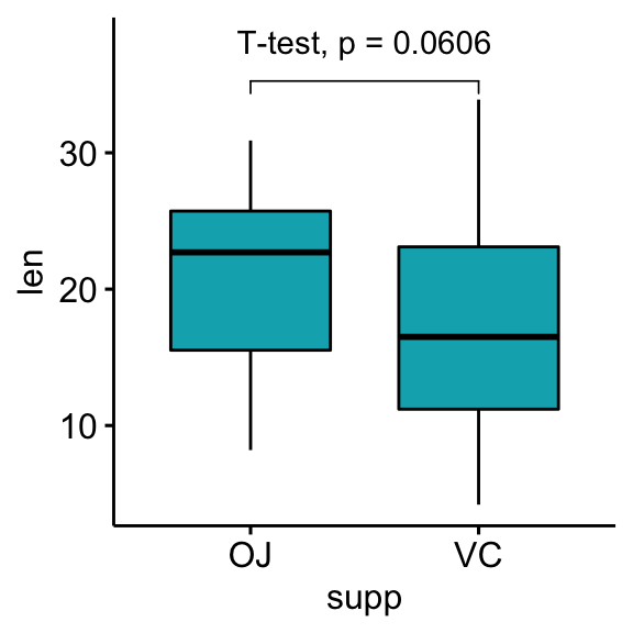
# Customize p-value labels using glue expression
# https://github.com/tidyverse/glue
bxp + stat_pvalue_manual(
stat.test, label = "T-test, p = {p}",
vjust = -1, bracket.nudge.y = 1
) +
scale_y_continuous(expand = expansion(mult = c(0.05, 0.15)))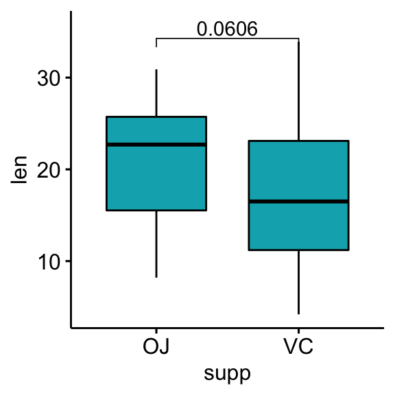
Grouped data
Group the data by the dose variable and then compare the levels of the supp variable.
# Statistical test
stat.test <- df %>%
  group_by(dose) %>%
  t_test(len ~ supp) %>%
  adjust_pvalue() %>%
  add_significance("p.adj")
stat.test
## # A tibble: 3 x 11
## dose .y. group1 group2 n1 n2 statistic df p p.adj p.adj.signif
## * <fct> <chr> <chr> <chr> <int> <int> <dbl> <dbl> <dbl> <dbl> <chr>
## 1 0.5 len OJ VC 10 10 3.17 15.0 0.00636 0.0127 *
## 2 1 len OJ VC 10 10 4.03 15.4 0.00104 0.00312 **
## 3 2 len OJ VC 10 10 -0.0461 14.0 0.964 0.964 ns# Box plots with p-values
stat.test <- stat.test %>% add_xy_position(x = "supp")
bxp <- ggboxplot(df, x = "supp", y = "len", fill = "#00AFBB",
facet.by = "dose")
bxp +
stat_pvalue_manual(stat.test, label = "p.adj") +
scale_y_continuous(expand = expansion(mult = c(0.05, 0.10)))
Show p-values if significant otherwise show ns
This section describes how to display p-values when they are significant and show “ns” when the p-values are not significant.
# Add a custom label column
# showing adjusted p-values if significant otherwise "ns"
stat.test <- stat.test %>% add_xy_position(x = "supp")
stat.test$custom.label <- ifelse(stat.test$p.adj <= 0.05, stat.test$p.adj, "ns")

# Visualization
bxp +
  stat_pvalue_manual(stat.test, label = "custom.label") +
  scale_y_continuous(expand = expansion(mult = c(0.05, 0.10)))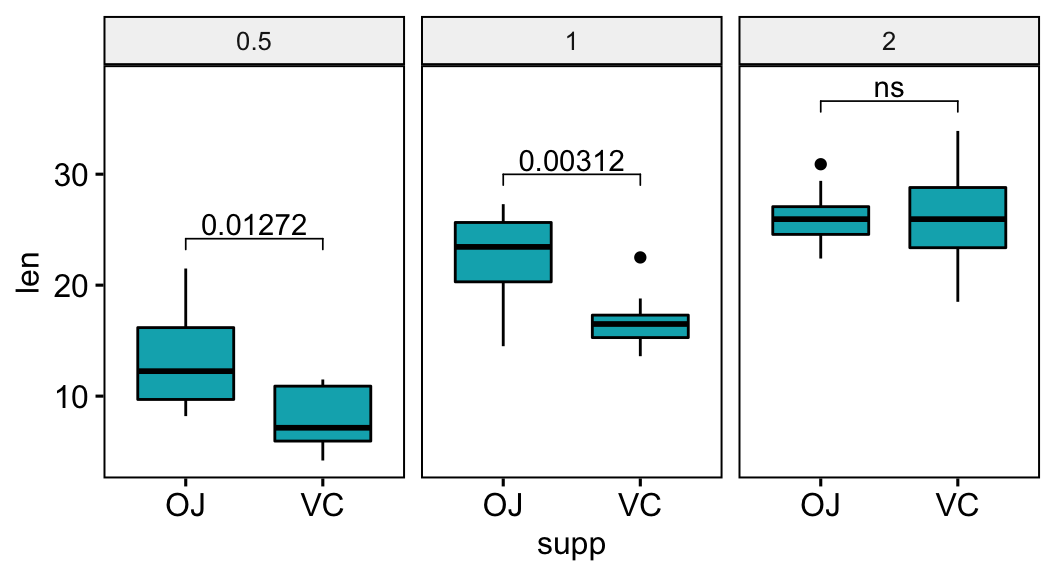
Format p-values using the accuracy option
The p-values will be formatted using “<” and “>”.
stat.test <- stat.test %>% add_xy_position(x = "supp")
stat.test$p.format <- p_format(
  stat.test$p.adj, accuracy = 0.01,
  leading.zero = FALSE
  )
# Visualization
bxp +
  stat_pvalue_manual(stat.test, label = "p.format") +
  scale_y_continuous(expand = expansion(mult = c(0.05, 0.10)))
Format p-values into scientific notation format
# Format p-values into scientific format
stat.test <- stat.test %>% add_xy_position(x = "supp")
stat.test$p.scient <- format(stat.test$p.adj, scientific = TRUE)
bxp +
  stat_pvalue_manual(stat.test, label = "p.scient") +
   scale_y_continuous(expand = expansion(mult = c(0.05, 0.15)))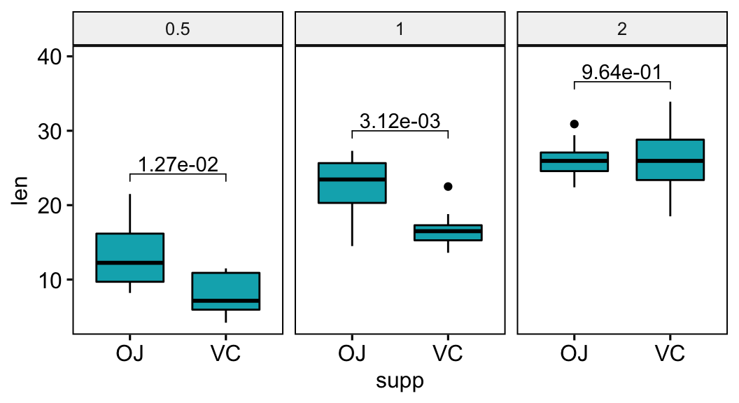
Compare paired samples
# Statistical test
stat.test <- df %>%
  t_test(len ~ supp, paired = TRUE) %>%
  add_significance()
stat.test
## # A tibble: 1 x 9
## .y. group1 group2 n1 n2 statistic df p p.signif
## * <chr> <chr> <chr> <int> <int> <dbl> <dbl> <dbl> <chr>
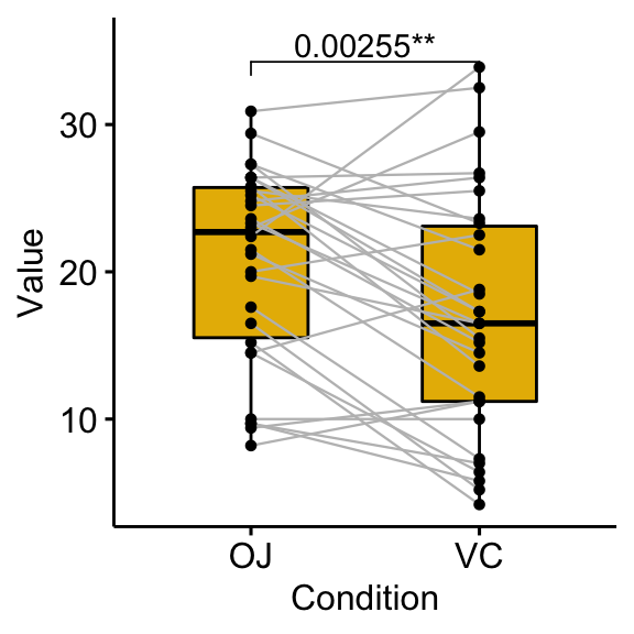
## 1 len OJ VC 30 30 3.30 29 0.00255 **# Box plots with p-values
bxp <- ggpaired(df, x = "supp", y = "len", fill = "#E7B800",
line.color = "gray", line.size = 0.4)
stat.test <- stat.test %>% add_xy_position(x = "supp")
bxp + stat_pvalue_manual(stat.test, label = "p.signif")
# Show the p-value combined with the significance level
bxp +
stat_pvalue_manual(stat.test, label = "{p}{p.signif}") +
scale_y_continuous(expand = expansion(mult = c(0.05, 0.10)))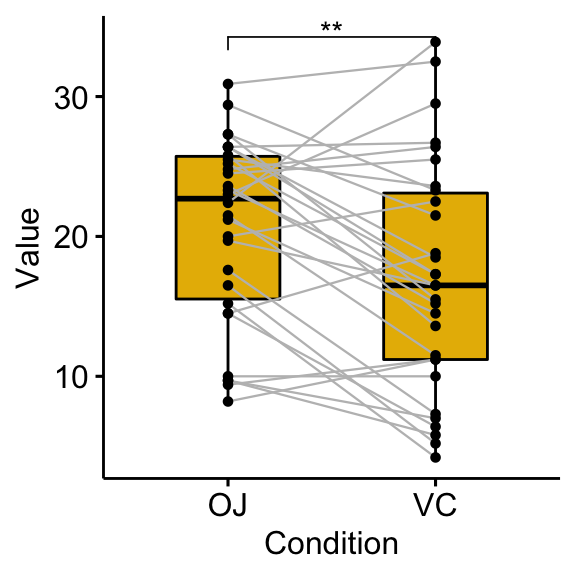
Pairwise comparisons
Create simple plots
# Box plots
bxp <- ggboxplot(df, x = "dose", y = "len", fill = "dose",
palette = c("#00AFBB", "#E7B800", "#FC4E07"))
bxp
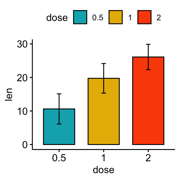
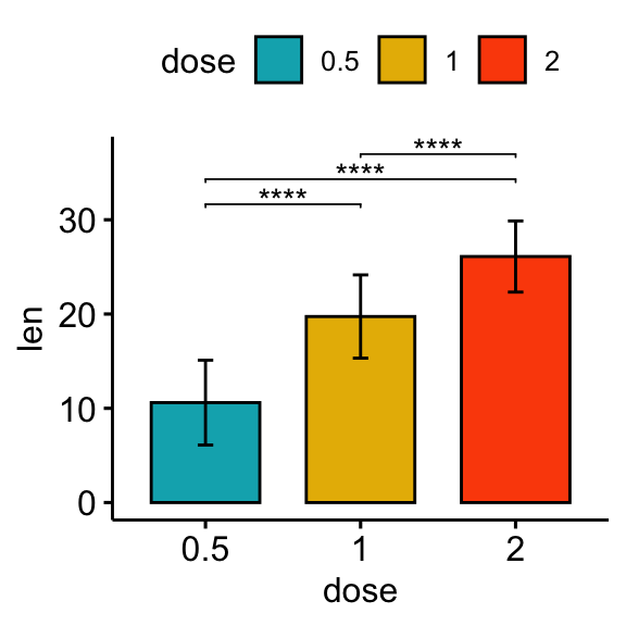
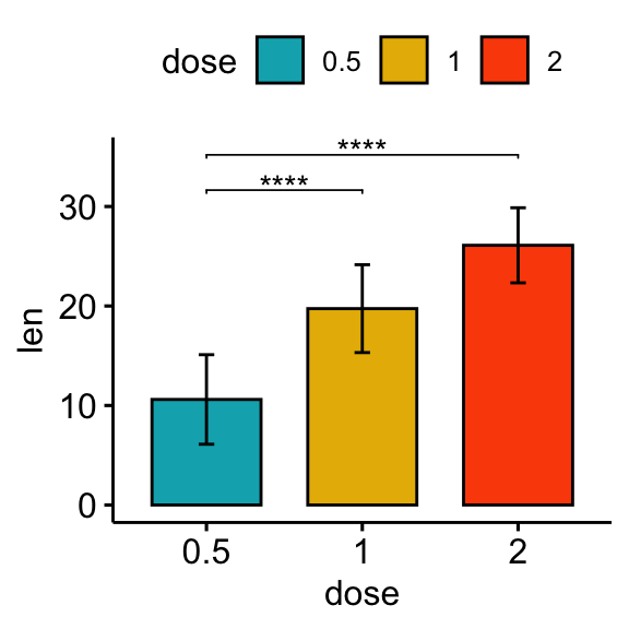
# Bar plots showing mean +/- SD
bp <- ggbarplot(df, x = "dose", y = "len", add = "mean_sd", fill = "dose",
palette = c("#00AFBB", "#E7B800", "#FC4E07"))
bp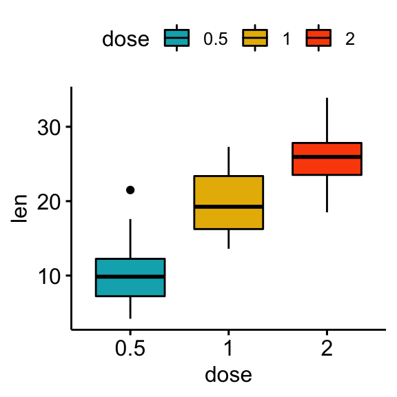
Statistical test
In the following example, we’ll perform T-test using the function t_test() [rstatix package]. It’s also possible to use the function wilcox_test().
stat.test <- df %>% t_test(len ~ dose)
stat.test
## # A tibble: 3 x 10
## .y. group1 group2 n1 n2 statistic df p p.adj p.adj.signif
## * <chr> <chr> <chr> <int> <int> <dbl> <dbl> <dbl> <dbl> <chr>
## 1 len 0.5 1 20 20 -6.48 38.0 1.27e- 7 2.54e- 7 ****
## 2 len 0.5 2 20 20 -11.8 36.9 4.40e-14 1.32e-13 ****
## 3 len 1 2 20 20 -4.90 37.1 1.91e- 5 1.91e- 5 ****Create plots with significance levels
# Box plot
stat.test <- stat.test %>% add_xy_position(x = "dose")
bxp + stat_pvalue_manual(stat.test, label = "p.adj.signif", tip.length = 0.01)

# Bar plot
stat.test <- stat.test %>% add_xy_position(fun = "mean_sd", x = "dose")
bp + stat_pvalue_manual(stat.test, label = "p.adj.signif", tip.length = 0.01)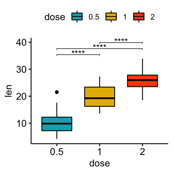
Specify manually the y position of p-value labels and shorten the width of the brackets:
bxp +
  stat_pvalue_manual(
    stat.test, label = "p.adj.signif", tip.length = 0.01,
    y.position = c(35, 40, 35), bracket.shorten = 0.05
    )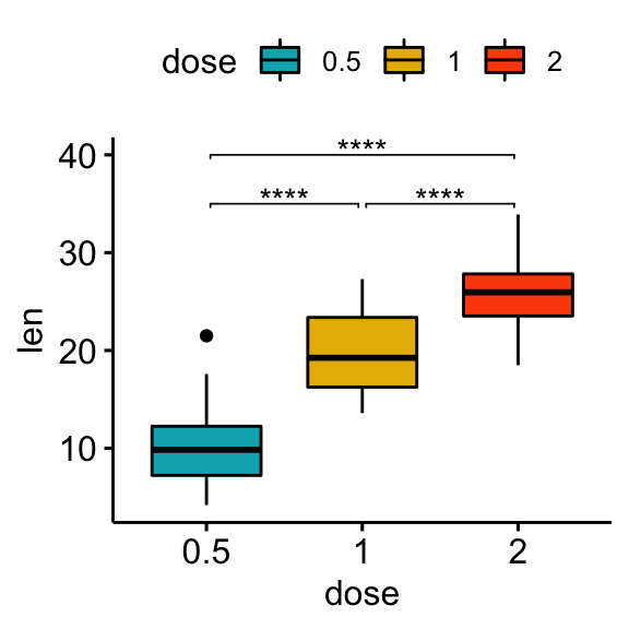
Comparisons against reference groups
# Statistical tests
stat.test <- df %>% t_test(len ~ dose, ref.group = "0.5")
stat.test
## # A tibble: 2 x 10
## .y. group1 group2 n1 n2 statistic df p p.adj p.adj.signif
## * <chr> <chr> <chr> <int> <int> <dbl> <dbl> <dbl> <dbl> <chr>
## 1 len 0.5 1 20 20 -6.48 38.0 1.27e- 7 1.27e- 7 ****
## 2 len 0.5 2 20 20 -11.8 36.9 4.40e-14 8.80e-14 ****# Box plot
stat.test <- stat.test %>% add_xy_position(x = "dose")
bxp + stat_pvalue_manual(stat.test, label = "p.adj.signif", tip.length = 0.01)
# Bar plot
stat.test <- stat.test %>% add_xy_position(fun = "mean_sd", x = "dose")
bp + stat_pvalue_manual(stat.test, label = "p.adj.signif", tip.length = 0.01)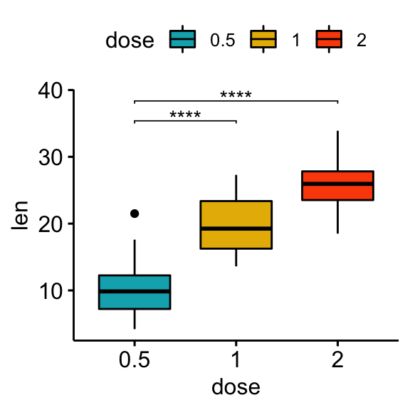
Comparisons against all (basemean)
Each group is compared to all groups combined.
# Statistical tests
stat.test <- df %>% t_test(len ~ dose, ref.group = "all")
stat.test
## # A tibble: 3 x 10
## .y. group1 group2 n1 n2 statistic df p p.adj p.adj.signif
## * <chr> <chr> <chr> <int> <int> <dbl> <dbl> <dbl> <dbl> <chr>
## 1 len all 0.5 60 20 5.82 56.4 0.000000290 0.00000087 ****
## 2 len all 1 60 20 -0.660 57.5 0.512 0.512 ns
## 3 len all 2 60 20 -5.61 66.5 0.000000425 0.00000087 ****# Box plot
stat.test <- stat.test %>% add_xy_position(x = "dose")
bxp + stat_pvalue_manual(stat.test, label = "p.adj.signif")
# Manually specify the y position
bxp + stat_pvalue_manual(stat.test, label = "p.adj.signif", y.position = 35)
# Bar plot
stat.test <- stat.test %>% add_xy_position(fun = "mean_sd", x = "dose")
bp + stat_pvalue_manual(stat.test, label = "p.adj.signif")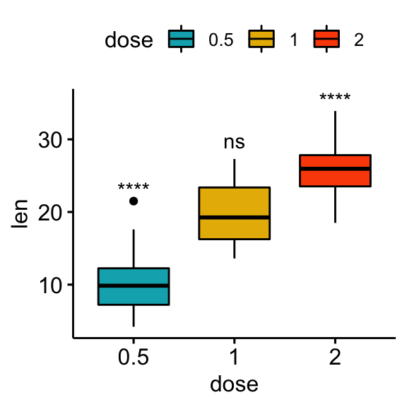


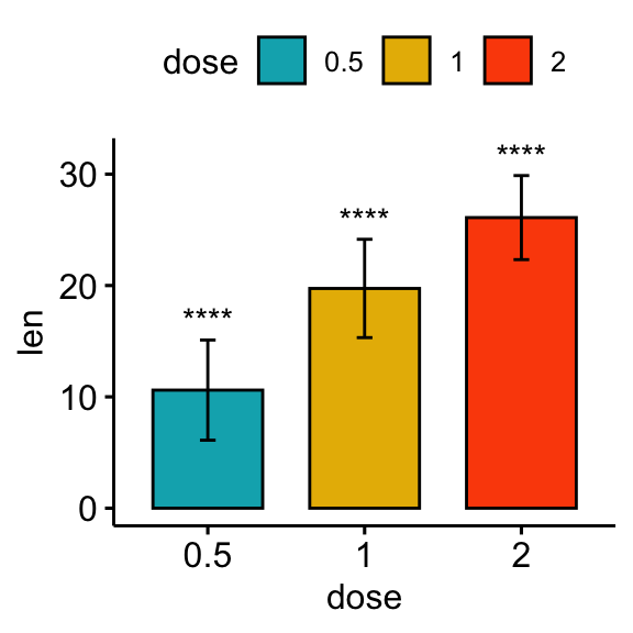
Comparisons against null: one-sample test
The one-sample test is used to compare the mean of one sample to a known standard (or theoretical / hypothetical) mean (mu). The default value of mu is zero.
# Statistical tests
stat.test <- df %>%
  group_by(dose) %>%
  t_test(len ~ 1) %>%
  adjust_pvalue() %>%
  add_significance("p.adj")
stat.test
## # A tibble: 3 x 10
## dose .y. group1 group2 n statistic df p p.adj p.adj.signif
## * <fct> <chr> <chr> <chr> <int> <dbl> <dbl> <dbl> <dbl> <chr>
## 1 0.5 len 1 null model 20 10.5 19 2.24e- 9 2.24e- 9 ****
## 2 1 len 1 null model 20 20.0 19 3.22e-14 6.44e-14 ****
## 3 2 len 1 null model 20 30.9 19 1.03e-17 3.09e-17 ****# Box plot
stat.test <- stat.test %>% add_xy_position(x = "dose")
bxp + stat_pvalue_manual(stat.test, x = "dose", label = "p.adj.signif")
# bar plot
stat.test <- stat.test %>% add_xy_position(fun = "mean_sd", x = "dose")
bp + stat_pvalue_manual(stat.test, x = "dose", label = "p.adj.signif")
Conclusion
This article introduces how to easily compute and add p-values onto ggplot, such as box plots and bar plots. See other related frequently questions: ggpubr FAQ.
Recommended for you
This section contains best data science and self-development resources to help you on your path.
Books - Data Science
Our Books
- Practical Guide to Cluster Analysis in R by A. Kassambara (Datanovia)
- Practical Guide To Principal Component Methods in R by A. Kassambara (Datanovia)
- Machine Learning Essentials: Practical Guide in R by A. Kassambara (Datanovia)
- R Graphics Essentials for Great Data Visualization by A. Kassambara (Datanovia)
- GGPlot2 Essentials for Great Data Visualization in R by A. Kassambara (Datanovia)
- Network Analysis and Visualization in R by A. Kassambara (Datanovia)
- Practical Statistics in R for Comparing Groups: Numerical Variables by A. Kassambara (Datanovia)
- Inter-Rater Reliability Essentials: Practical Guide in R by A. Kassambara (Datanovia)
Others
- R for Data Science: Import, Tidy, Transform, Visualize, and Model Data by Hadley Wickham & Garrett Grolemund
- Hands-On Machine Learning with Scikit-Learn, Keras, and TensorFlow: Concepts, Tools, and Techniques to Build Intelligent Systems by Aurelien Géron
- Practical Statistics for Data Scientists: 50 Essential Concepts by Peter Bruce & Andrew Bruce
- Hands-On Programming with R: Write Your Own Functions And Simulations by Garrett Grolemund & Hadley Wickham
- An Introduction to Statistical Learning: with Applications in R by Gareth James et al.
- Deep Learning with R by François Chollet & J.J. Allaire
- Deep Learning with Python by François Chollet
Version:
 Français


Hi Dr. Kassambara,
Inside the section Pairwise comparisons, subsection statistical tests, if you check the corrected p-values one them it’s the same one as the uncorrected one (p-value: 1.91e- 5 and corrected p-value: 1.91e- 5 in the group 1 -> 1 vs group 2 -> 2 comparison). How were this corrections calculated? Initially I thought it might be Bonferroni correction but the only one in the same example that seems to follow the correction is the group 1 -> 0.5 vs group 2 -> 2 comparison (p-value: 4.40e-14 ajdusted p-value: (4.40e-14 multiplied by 3 =)1.32e-13. But this is just one example. I’ve seen the same issue in other examples in this same page that p-value and adjusted p-value are the same. Am I missing something? How is the adjusted p-value calculated in all the above examples?
Thanks a lot for you hard work. I am a big follower of your webpage. Please keep on doing this great work!
Best,
Josue
Thank you for your comment and the positive feedback. The default method used to adjust the p-values is the
Holmmethod. P-values are adjusted using the standard R base functionp.adjust(); for example:You can specify the p-value adjustment method in the function
t_test()[rstatix package] as follow:Hi Dr. Kassambara,
I am a follower of your page. Kudos to you for all the great work.
I am working with kruskal wallis test using ggpubr package for violin plots. I have a scientific p value of 6.4e-09, but i would like to show case a simplified p value in this case. Any idea how can i simplify the p value (ex: P<0.0001)?
Thank you
Hi Dr. Kassambara,
First, thanks for everything. This site is amazing for me.Very helpful and I recommend to all my friends.
I have a problem with ANOVA values for ggplot.
I want to use ” Within Subject” values for ggplot.. But I couldnt add this value.. Is there any way to add “Within subject value” for this plot?
For adding this, I need to write 3rd row’s value (Region) for my plot..Also I tried to find another way to add this value, but “paired t test and others” gives me different values..(p =0.021)
For example; when I extract the “between= (Group)” from anova_test()….it gives me totally different results ( DFn=1, DFd= 20, F= 6.306, p=0.021, ges=0.038)
when I try to use: pairwise_t_test() which gives me (p=0,021) again; but in SPSS “pairwise comp” section is also shows “0,24” which is same in ANOVA table. Isnt it interesting for R ? (shows different value)
Do you know why is this happening ? What can I do for this problem?
I just thought that ANOVA is using F-tests, maybe it is happening because of F-test , I do not know.
Could you help me?
It would be great for me if you can help.
#######################################
ANOVA Table (type III tests)
Effect DFn DFd SSn SSd F p p<.05 ges
1 (Intercept) 1 19 12.157 0.726 318.292 0.000000000000251 * 0.936
2 Group 1 19 0.028 0.726 0.735 0.402000000000000 0.033
3 Region 1 19 0.033 0.104 5.975 0.024000000000000 * 0.038
4 Group:Region 1 19 0.003 0.104 0.545 0.470000000000000 0.004
###################################################
Hi, thank you for the positive feedback, highly appreciated.
Can you please clarify your ANOVA experimental design?
Is it a one-way repeated measure ANOVA (one within-subjects variable)? If yes, then make sure you have read this: Repeated Measures ANOVA in R Is it a two-way mixed- ANOVA (one within-subjects + on-between subject variables)? If yes, then make sure you have read this: Mixed ANOVA in R
If you still have the issue, please send to me a reproducible R code with a demo data, so that I can help efficiently.
I tired your way “filter” but in my PWC test also shows p=0,021), it doesnt worked for me, but I want to show “Condition” section in ANOVA table as a “SUBTITLE” in visiual report((((F(1,19)= 5.975, p= 0.024 eta= 0.038.))In short I just want to show as a subtitle in report “Conditon ANova Values” but couldnt filter, I tried it too.
Thank you very much in advance for your time
The following R code should work:
labs(subtitle = get_test_label(res.aov, row = 2, detailed = TRUE))……so, row=2 huh :)))
of course it works!
Dashed is good idea by the way
Thank you very much..
labs(subtitle = get_test_label(res.aov, row = 2, detailed = TRUE))……so, row=2 huh :)))
of course it works!
Dashed is good idea by the way
Thank you very much..
Dear Kassambara,
Thanks for preparing such a great ggplot extension.
I have a little problem with setting the p-value to display in a ggline plot.
I would like to have control over the number of digits after the decimal point, but I have the impression that these values are displayed randomly, i.e. sometimes 2 digits appear, sometimes 3, sometimes 4 digits after the decimal point. Is there any way to control this?
Below is my code:
stat.test %
group_by (SET)%>%
tukey_hsd (speed_avg ~ Protocol)%>%
adjust_pvalue (method = “bonferroni”)%>%
add_significance (“p.adj”)
stat.test % add_xy_position (x = “SET”, fun = “mean_ci”, dodge = 0.5)
stat.test $ p.format <- p_format (stat.test $ p.adj, accuracy = 0.001)
Thank you in advance for any help.