
This tutorial describes how to create a ggplot with multiple lines.
Related Book
GGPlot2 Essentials for Great Data Visualization in RLoad ggplot2 package
Load ggplot2 and set the default theme:
library(ggplot2)
theme_set(theme_minimal())
Data
The US economics time series datasets are used. This is a data frame with 478 rows and 6 variables.
head(economics)## # A tibble: 6 x 6
## date pce pop psavert uempmed unemploy
## <date> <dbl> <int> <dbl> <dbl> <int>
## 1 1967-07-01 507. 198712 12.5 4.5 2944
## 2 1967-08-01 510. 198911 12.5 4.7 2945
## 3 1967-09-01 516. 199113 11.7 4.6 2958
## 4 1967-10-01 513. 199311 12.5 4.9 3143
## 5 1967-11-01 518. 199498 12.5 4.7 3066
## 6 1967-12-01 526. 199657 12.1 4.8 3018- date: Month of data collection
- psavert: personal savings rate
- pce: personal consumption expenditures, in billions of dollars
- unemploy: number of unemployed in thousands
- uempmed: median duration of unemployment, in weeks
- pop: total population, in thousands
Basic line plot
Line plot of the variable ‘psavert’ by date:
ggplot(data = economics, aes(x = date, y = psavert))+
  geom_line()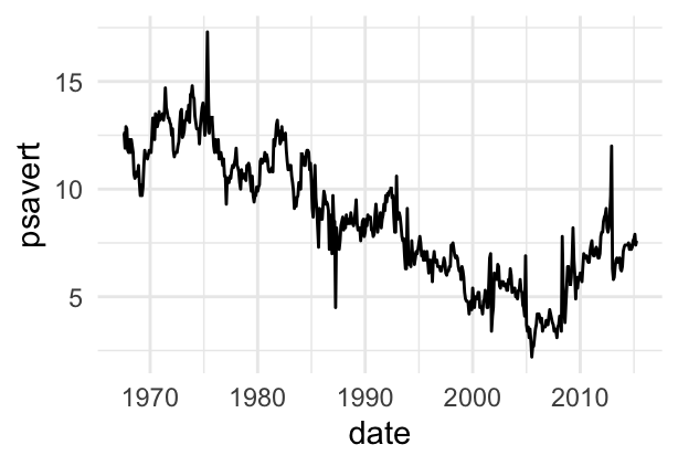
Plot with multiple lines
Well plot both ‘psavert’ and ‘uempmed’ on the same line chart.
- Solution 1: Make two calls to
geom_line():
ggplot(economics, aes(x=date)) +
  geom_line(aes(y = psavert), color = "darkred") +
geom_line(aes(y = uempmed), color="steelblue", linetype="twodash") 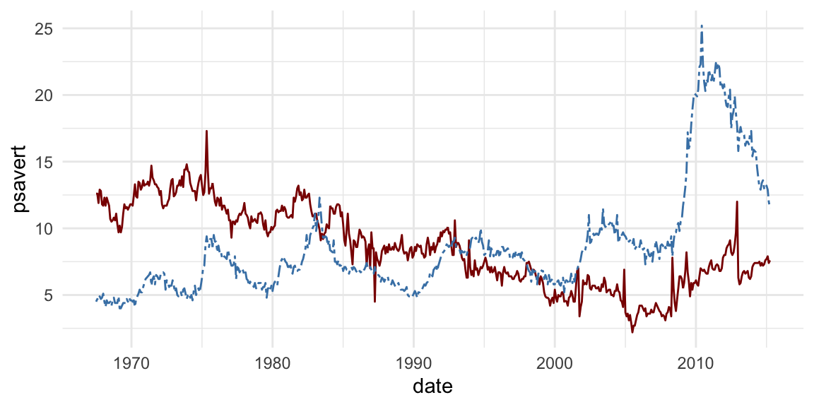
- Solution 2:
- Prepare the data using the
tidyversepackages. Collapses the two variables ‘psavert’ and ‘uempmed’ into key-value pairs - Visualize using one geom_line() call
- Prepare the data using the
# Data preparation
library("tidyverse")
df <- economics %>%
  select(date, psavert, uempmed) %>%
  gather(key = "variable", value = "value", -date)
head(df)
## # A tibble: 6 x 3
## date variable value
## <date> <chr> <dbl>
## 1 1967-07-01 psavert 12.5
## 2 1967-08-01 psavert 12.5
## 3 1967-09-01 psavert 11.7
## 4 1967-10-01 psavert 12.5
## 5 1967-11-01 psavert 12.5
## 6 1967-12-01 psavert 12.1# Visualization
ggplot(df, aes(x = date, y = value)) +
geom_line(aes(color = variable, linetype = variable)) +
scale_color_manual(values = c("darkred", "steelblue"))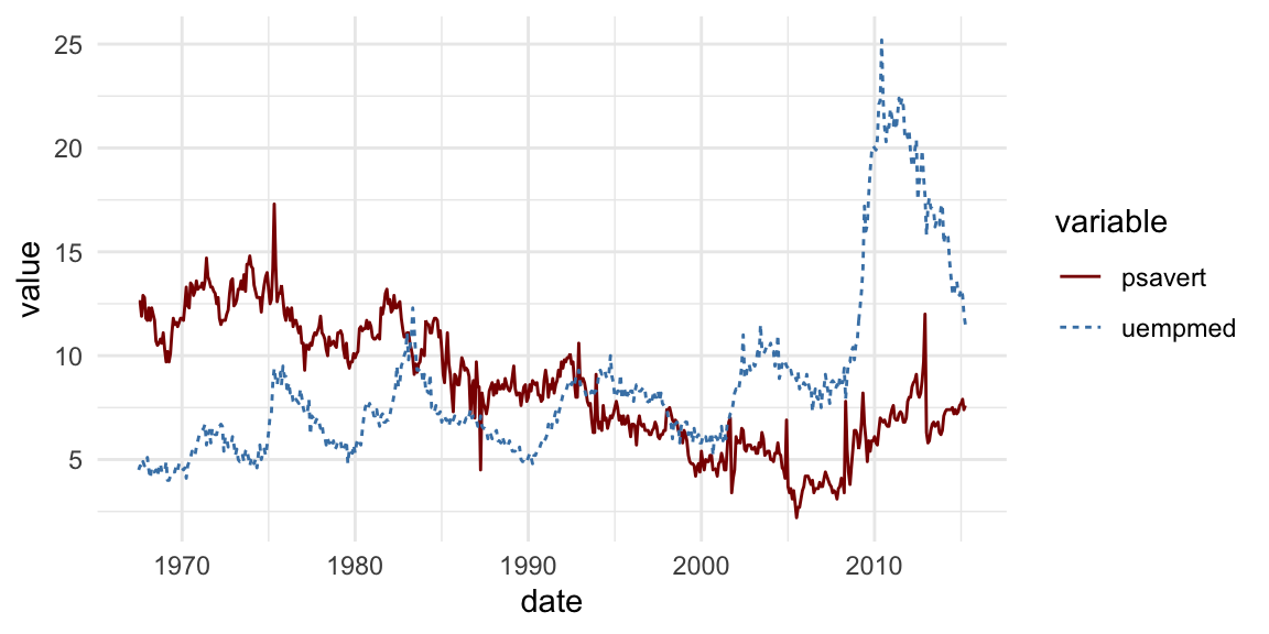
Recommended for you
This section contains best data science and self-development resources to help you on your path.
Books - Data Science
Our Books
- Practical Guide to Cluster Analysis in R by A. Kassambara (Datanovia)
- Practical Guide To Principal Component Methods in R by A. Kassambara (Datanovia)
- Machine Learning Essentials: Practical Guide in R by A. Kassambara (Datanovia)
- R Graphics Essentials for Great Data Visualization by A. Kassambara (Datanovia)
- GGPlot2 Essentials for Great Data Visualization in R by A. Kassambara (Datanovia)
- Network Analysis and Visualization in R by A. Kassambara (Datanovia)
- Practical Statistics in R for Comparing Groups: Numerical Variables by A. Kassambara (Datanovia)
- Inter-Rater Reliability Essentials: Practical Guide in R by A. Kassambara (Datanovia)
Others
- R for Data Science: Import, Tidy, Transform, Visualize, and Model Data by Hadley Wickham & Garrett Grolemund
- Hands-On Machine Learning with Scikit-Learn, Keras, and TensorFlow: Concepts, Tools, and Techniques to Build Intelligent Systems by Aurelien Géron
- Practical Statistics for Data Scientists: 50 Essential Concepts by Peter Bruce & Andrew Bruce
- Hands-On Programming with R: Write Your Own Functions And Simulations by Garrett Grolemund & Hadley Wickham
- An Introduction to Statistical Learning: with Applications in R by Gareth James et al.
- Deep Learning with R by François Chollet & J.J. Allaire
- Deep Learning with Python by François Chollet
Version:
 Français


How can you change the size(thickness) of one of the lines in the tidyverse version?
You can specify, for example, the argument size = 3 in the function geom_line()
I have used the first method but i have difficulties with the legend. As you can see, there is no legend indicating the column each line represents. How can i add legend for the first case (method)?
First, you need to set the colors of each line inside aes(…). That will create the legend, but the colors wont be the expected ones . To get them, add
+ scale_color_identity(guide = legend())
at the end of ggplot() block code
This doesnt work. Argument legend is missing.
Thank you Sir
it is very simple and explained very well
If i want to add more than 2 lines what should i do, i am trying with the second method and it works fine with only 2 but won’t show others
Hi, please make sure you have specified as many colors as the number of lines. This works for me:
Thank you for this it is very well explained.
I have following question. In the solution 1 there is no legend for the lines whereas the solution 2 has a legend.
I was wondering if you can show how to put a legend and chart title etc in Solution 1.
Thanks
Thank you for the positive comment, highly appreciated! Here’s how I’ll add a legend: I specify the variable color in aes() and give it the name I want to be displayed in the legend.
Thank you very much for the quick response. I am a beginner and trying to explore R. I am glad I learned this otherwise it would have been very demotivating.
Thanks a ton
Is there a way to display the last value of each line in the plot? I am new to R and have not found any workable solution. Thank you in advance!
This blog post might help GPLOT: How to Display the Last Value of Each Line as Label
This was terrific! I believe I got your both your examples of coding to work because your variables were all continuous. What if your X variable is categorical (e.g. gender)?
How do you change the name of the legend values? (I.e. psavert, uempmed, etc.)
if I want to change word color in legend then what can we do as u scale_color_manual is there any option to change the heading of legends