
This article describes how to create a pie chart and donut chart using the ggplot2 R package. Pie chart is just a stacked bar chart in polar coordinates.
The function coord_polar() is used to produce pie chart from a bar plot.
Contents:
Related Book
GGPlot2 Essentials for Great Data Visualization in RPrerequisites
Load required packages
library("ggplot2")  # Data visualization
library("dplyr")    # Data manipulation
Data preparation
- Create titanic passengers count dataset:
count.data <- data.frame(
  class = c("1st", "2nd", "3rd", "Crew"),
  n = c(325, 285, 706, 885),
  prop = c(14.8, 12.9, 32.1, 40.2)
)
count.data
## class n prop
## 1 1st 325 14.8
## 2 2nd 285 12.9
## 3 3rd 706 32.1
## 4 Crew 885 40.2- Compute the position of the text labels as the cumulative sum of the proportion:
- Arrange the grouping variable (
class) in descending order. This is important to compute the y coordinates of labels. - To put the labels in the center of pies, we’ll use
cumsum(prop) - 0.5*propas label position.
# Add label position
count.data <- count.data %>%
  arrange(desc(class)) %>%
  mutate(lab.ypos = cumsum(prop) - 0.5*prop)
count.data
## class n prop lab.ypos
## 1 Crew 885 40.2 20.1
## 2 3rd 706 32.1 56.3
## 3 2nd 285 12.9 78.8
## 4 1st 325 14.8 92.6Pie chart
- Create the pie charts using ggplot2 verbs. Key function:
geom_bar()+coord_polar(). - Add text labels:
geom_text() - Change fill color manually:
scale_color_manual() - Apply
theme_void()to remove axes, background, etc
mycols <- c("#0073C2FF", "#EFC000FF", "#868686FF", "#CD534CFF")

ggplot(count.data, aes(x = "", y = prop, fill = class)) +
  geom_bar(width = 1, stat = "identity", color = "white") +
  coord_polar("y", start = 0)+
  geom_text(aes(y = lab.ypos, label = prop), color = "white")+
  scale_fill_manual(values = mycols) +
  theme_void()
Donut chart
Donut chart chart is just a simple pie chart with a hole inside.
The only difference between the pie chart code is that we set: x = 2 and xlim = c(0.5, 2.5) to create the hole inside the pie chart. Additionally, the argument width in the function geom_bar() is no longer needed.
ggplot(count.data, aes(x = 2, y = prop, fill = class)) +
  geom_bar(stat = "identity", color = "white") +
  coord_polar(theta = "y", start = 0)+
  geom_text(aes(y = lab.ypos, label = prop), color = "white")+
  scale_fill_manual(values = mycols) +
  theme_void()+
  xlim(0.5, 2.5)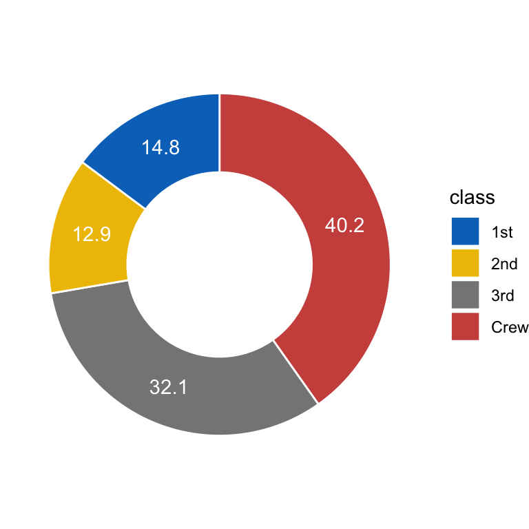
Recommended for you
This section contains best data science and self-development resources to help you on your path.
Books - Data Science
Our Books
- Practical Guide to Cluster Analysis in R by A. Kassambara (Datanovia)
- Practical Guide To Principal Component Methods in R by A. Kassambara (Datanovia)
- Machine Learning Essentials: Practical Guide in R by A. Kassambara (Datanovia)
- R Graphics Essentials for Great Data Visualization by A. Kassambara (Datanovia)
- GGPlot2 Essentials for Great Data Visualization in R by A. Kassambara (Datanovia)
- Network Analysis and Visualization in R by A. Kassambara (Datanovia)
- Practical Statistics in R for Comparing Groups: Numerical Variables by A. Kassambara (Datanovia)
- Inter-Rater Reliability Essentials: Practical Guide in R by A. Kassambara (Datanovia)
Others
- R for Data Science: Import, Tidy, Transform, Visualize, and Model Data by Hadley Wickham & Garrett Grolemund
- Hands-On Machine Learning with Scikit-Learn, Keras, and TensorFlow: Concepts, Tools, and Techniques to Build Intelligent Systems by Aurelien Géron
- Practical Statistics for Data Scientists: 50 Essential Concepts by Peter Bruce & Andrew Bruce
- Hands-On Programming with R: Write Your Own Functions And Simulations by Garrett Grolemund & Hadley Wickham
- An Introduction to Statistical Learning: with Applications in R by Gareth James et al.
- Deep Learning with R by François Chollet & J.J. Allaire
- Deep Learning with Python by François Chollet
Version:
 Français


Thanks! Very helpful. Your plots render beautifully, while mine are jagged (my non-polar plots are fine). Any idea why and how to fix?