DESeq2 Differential Expression Analysis in R: A Step-by-Step Tutorial
From a count matrix to a ranked list of differentially expressed genes — fit, interpret, shrink, and visualize with a volcano plot
Bioinformatics
A practical, end-to-end guide to differential gene expression analysis with DESeq2 in R. Start from a bulk RNA-seq count matrix, build the DESeqDataSet with the right design, run the negative binomial test between two conditions, and read every column of the result — base mean, log2 fold change and its direction, standard error, the Wald statistic, p-value, and the FDR-adjusted padj. Shrink the fold changes for ranking and plotting, map Ensembl IDs to gene symbols, and draw the two figures every RNA-seq paper uses: the MA plot and the volcano plot. On the built-in airway dataset.
Published
June 29, 2026
Modified
July 8, 2026
TipKey takeaways
DESeq2 finds genes that change between two conditions in bulk RNA-seq. It models raw counts with a negative binomial distribution and borrows information across genes — far more reliable than a gene-by-gene t-test on a handful of replicates.
Feed it the raw count matrix (never pre-normalized values) plus a sample table and a design formula. DESeq2 estimates its own size factors, so you do not normalize by hand.
The result has one row per gene: log2FoldChange (effect size and direction), pvalue, and padj — the FDR-corrected p-value you actually trust. The gate is padj < 0.05, not pvalue.
log2FoldChange is the log₂ ratio of the two conditions: +1 = 2× higher, -1 = 2× lower. The sign depends on which level is the reference — set it with relevel() before you test.
Shrink the fold changes (lfcShrink, apeglm) before ranking or plotting, then read the result with an MA plot (effect vs expression — a QC view) and a volcano plot (effect vs significance — the hits).
Introduction
You have a bulk RNA-seq experiment: cells treated one way versus another, each condition sequenced a few times, and a count matrix where every row is a gene and every number is how many reads landed on that gene in that sample. The question is always the same — which genes changed, and by how much?
That is differential expression analysis, and DESeq2 is the standard tool for it. It is the right choice whenever you have raw counts from a designed comparison (treated vs control, mutant vs wild-type, tumour vs normal) with at least two replicates per group. This guide takes you from the count matrix to a ranked, annotated gene list and the volcano plot you will put in the paper — and, just as important, shows you how to read every number the test returns.
We use the airway dataset: airway smooth-muscle cells from four donors, each with and without dexamethasone (a glucocorticoid anti-inflammatory). It ships as a Bioconductor package, so the whole analysis is reproducible on your machine.
The data: a count matrix and its samples
airway arrives as a RangedSummarizedExperiment — a container that holds the count matrix (assay) alongside the per-sample table (colData). Load it and look at both.
library(airway)library(DESeq2)data("airway")airway # the container: genes x samples
# The sample table: `cell` = the four donor cell lines, `dex` = treated / untreated.as.data.frame(colData(airway)[, c("cell", "dex")])
              cell   dex
SRR1039508  N61311 untrt
SRR1039509  N61311   trt
SRR1039512 N052611 untrt
SRR1039513 N052611   trt
SRR1039516 N080611 untrt
SRR1039517 N080611   trt
SRR1039520 N061011 untrt
SRR1039521 N061011   trt
Eight samples: four cell lines, each appearing once treated (trt) and once untreated (untrt). That paired structure matters — we will control for the cell line in the design so the test sees the dexamethasone effect, not donor-to-donor differences.
# Raw counts — whole numbers, one row per gene. The top-left corner:head(assay(airway))[, 1:4]
DESeq2 works on its own object, the DESeqDataSet, which bundles the counts, the sample table, and the design formula. The formula lists what explains expression: here, ~ cell + dex says “account for the cell line, then test the treatment.” The variable of interest goes last.
dds <-DESeqDataSet(airway, design =~ cell + dex)# Set the reference level explicitly: compare treated AGAINST untreated.dds$dex <-relevel(dds$dex, ref ="untrt")
Setting the reference with relevel() is not optional housekeeping — it decides the direction of every fold change. With untrt as the reference, a positive log2FoldChange means “higher in treated.”
One quick filter removes genes with almost no reads. They carry no information and only add to the multiple-testing burden.
# Keep genes with at least 10 reads in total across the 8 samples.keep <-rowSums(counts(dds)) >=10dds <- dds[keep, ]nrow(dds) # genes retained
[1] 22369
NoteWhy DESeq2 and not a t-test?
A t-test assumes roughly normal measurements with equal variance. RNA-seq counts are neither: they are whole numbers, never negative, skewed, and more variable for highly expressed genes. DESeq2 fits a negative binomial model per gene — the count-data counterpart of the bell curve — and lets each gene have its own extra variability (dispersion), which it stabilizes by borrowing information across all genes. That is what makes it trustworthy with only a few replicates. It also normalizes internally with a per-sample size factor (median-of-ratios), so samples sequenced to different depths are comparable without any manual step. Close relatives: edgeR (also negative binomial, strong with very few replicates) and limma-voom (fast on very large studies) — see the FAQ.
Run the differential expression test
DESeq() does the whole fit in one call — size factors, dispersions, and the negative binomial Wald test. Then results() pulls out the table for the contrast you care about.
out of 22369 with nonzero total read count
adjusted p-value < 0.1
LFC > 0 (up)       : 2610, 12%
LFC < 0 (down)     : 2224, 9.9%
outliers [1]       : 0, 0%
low counts [2]     : 4337, 19%
(mean count < 5)
[1] see 'cooksCutoff' argument of ?results
[2] see 'independentFiltering' argument of ?results
The summary() gives the headline: how many genes go up and down at the default padj < 0.1, plus how many were dropped by independent filtering and outlier detection. To work at the conventional 5% FDR, sort the table and keep padj < 0.05.
res <- res[order(res$padj), ] # most significant firsthead(res, 5)
log2 fold change (MLE): dex trt vs untrt
Wald test p-value: dex trt vs untrt
DataFrame with 5 rows and 6 columns
                 baseMean log2FoldChange     lfcSE      stat       pvalue
                <numeric>      <numeric> <numeric> <numeric>    <numeric>
ENSG00000152583   997.445        4.57497  0.184241   24.8314 4.11067e-136
ENSG00000165995   495.096        3.29110  0.133053   24.7353 4.46338e-135
ENSG00000120129  3409.038        2.94785  0.121876   24.1872 3.03384e-129
ENSG00000101347 12703.413        3.76702  0.155992   24.1488 7.68266e-129
ENSG00000189221  2341.781        3.35365  0.142181   23.5872 5.21271e-123
                        padj
                   <numeric>
ENSG00000152583 7.41235e-132
ENSG00000165995 4.02419e-131
ENSG00000120129 1.82354e-125
ENSG00000101347 3.46334e-125
ENSG00000189221 1.87991e-119
Interpret the output — every column
That table is the whole point of the analysis, so read it column by column rather than jumping to the p-value:
baseMean — the average normalized count for the gene across all samples. A rough expression level; very low values mean the estimate rests on little data.
log2FoldChange — the effect size and direction on a log₂ scale. +1 = 2× higher in treated, +2 = 4× higher, -1 = 2× lower. Because we set untrt as the reference, positive = up with dexamethasone.
lfcSE — the standard error of that log2 fold change: how precise the estimate is.
stat — the Wald statistic, log2FoldChange / lfcSE. Large magnitude → strong evidence.
pvalue — the raw p-value for “this gene does not change.”
padj — the p-value after multiple-testing correction (Benjamini–Hochberg FDR). With ~18,000 genes tested, raw p-values are guaranteed to throw up thousands of false positives; padj controls that. This is the column you filter on.
# Genes at 5% FDR, and how the change splits up vs down.sig <-subset(res, padj <0.05)nrow(sig)
[1] 4000
table(direction =ifelse(sig$log2FoldChange >0, "up in treated", "down in treated"))
direction
down in treated   up in treated
           1807            2193
A clear two-sided signal — about 2,200 genes up and 1,800 down. That balance is what a real biological response looks like; an all-one-direction result usually signals a normalization or design problem.
ImportantFilter on padj, never on raw pvalue
With thousands of genes tested at once, the raw pvalue column will list many genes as “significant” by chance alone. Always gate on padj < 0.05 (FDR). A gene with pvalue = 0.001 but padj = 0.4 is not a hit — out of thousands of tests, a p of 0.001 is unremarkable.
Shrink the fold changes
For low-count genes, the raw log2FoldChange is wildly uncertain — a gene with 3 reads in one group and 1 in another shows a huge fold change that means nothing. lfcShrink() pulls those noisy estimates toward zero in proportion to their uncertainty, leaving well-measured genes almost untouched. Always shrink before ranking genes or drawing an MA / volcano plot.
resultsNames(dds) # the coefficient name to shrink
resLFC <-lfcShrink(dds, coef ="dex_trt_vs_untrt", type ="apeglm")
coef = "dex_trt_vs_untrt" names the treated-vs-untreated effect (visible in resultsNames()); the apeglm shrinkage estimator is the current DESeq2 default and the one to cite.
Map Ensembl IDs to gene symbols
airway labels genes by Ensembl ID (ENSG…), which no one reads at a glance. Map them to gene symbols with the human annotation package so the plots and tables are interpretable.
library(org.Hs.eg.db)resLFC$symbol <-mapIds(org.Hs.eg.db,keys =rownames(resLFC),column ="SYMBOL",keytype ="ENSEMBL",multiVals ="first")# The strongest hits, now readable:head(as.data.frame(resLFC[order(resLFC$padj), c("symbol", "log2FoldChange", "padj")]), 6)
The strongest hits — led by SPARCL1 and DUSP1, both well-documented glucocorticoid-responsive genes — are a reassuring sanity check that the pipeline found real biology, not noise.
Visualize: MA plot and volcano plot
A 22,000-row table is impossible to read by eye, so RNA-seq analyses turn it into two standard pictures.
MA plot — a quality-control view
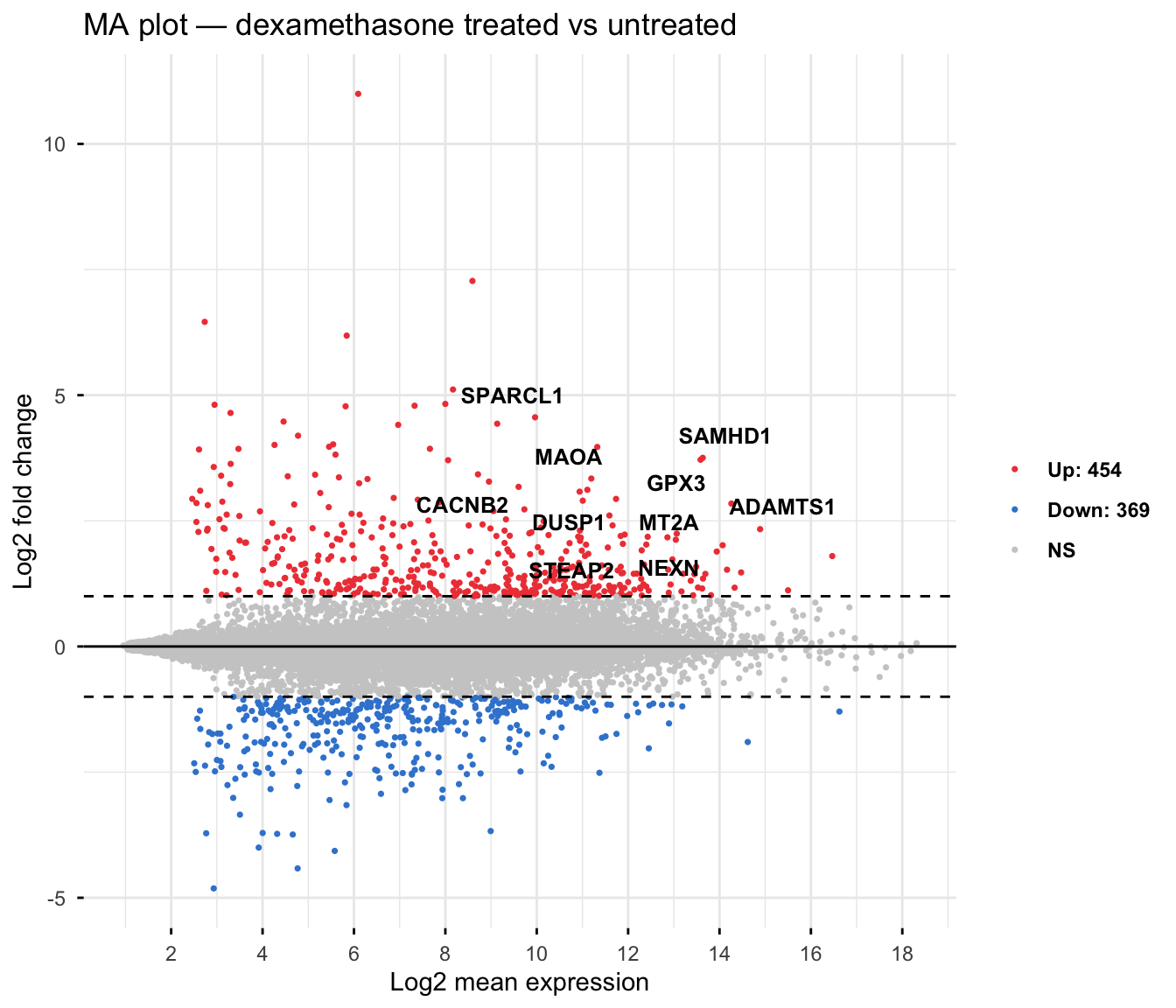
The MA plot shows, for every gene, its average expression (x, log scale) against its shrunken log2 fold change (y), with the significant genes coloured and the strongest labelled. It is the first plot to draw because it reveals whether the change behaves sensibly across low- and high-count genes — the cloud should funnel tightly to zero on the left. We draw the publication-grade version with ggpubr::ggmaplot.
Each dot is a gene, and the cloud funnels to zero at low expression — the sign of a well-behaved result with no systematic bias. The coloured genes pass both FDR < 5% and a two-fold change, a stricter bar than significance alone: of the ~4,000 FDR-significant genes, 454 are up and 369 down at this fold-change cut, with the strongest (SPARCL1, CACNB2, DUSP1…) labelled. Adding an effect-size threshold to significance is standard practice when you want a confident shortlist.
Volcano plot — the hits
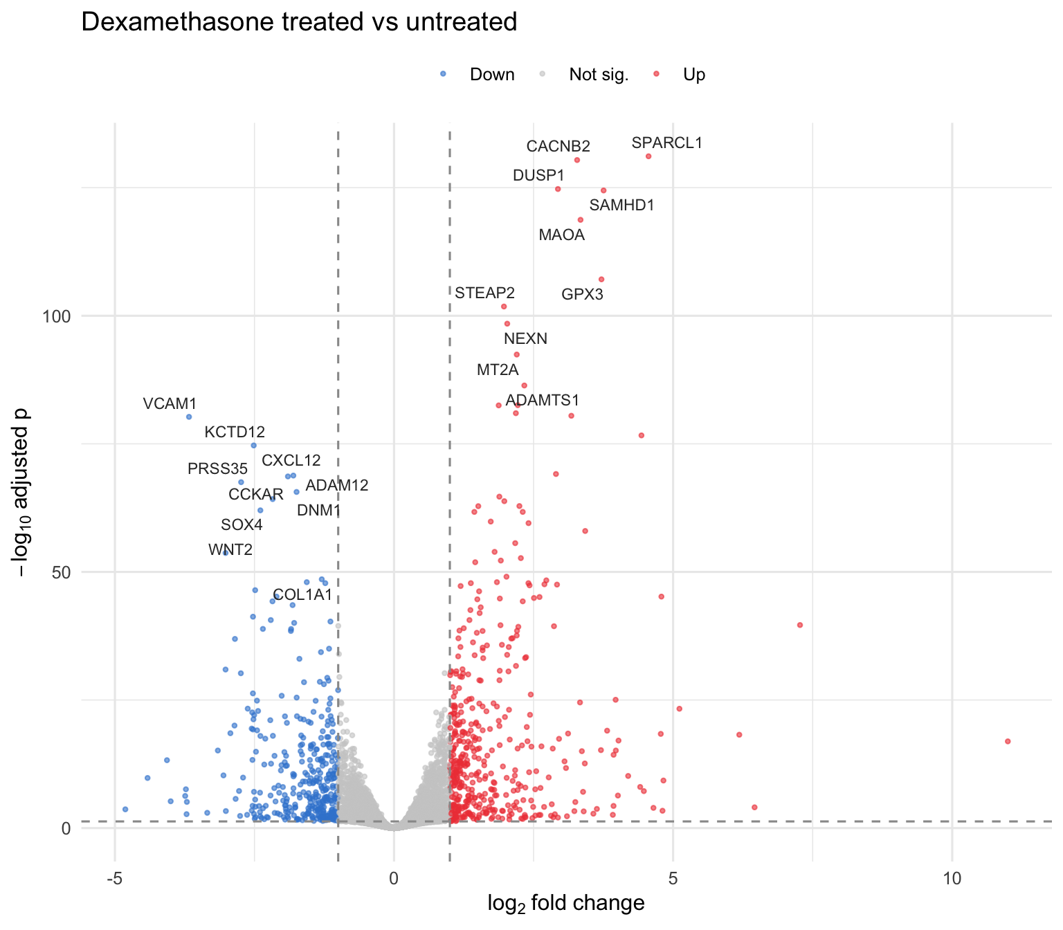
The volcano plot is the figure everyone recognizes: log2 fold change (x) against statistical significance, -log10(padj) (y). The interesting genes sit in the top corners — a large change and a small adjusted p-value. Rather than reach for a black-box package, we build it directly in ggplot2 — a short, publication-grade recipe you own and can restyle for any paper. First classify each gene by the same two thresholds we used above (FDR < 5% and |log2FC| > 1):
vol <-as.data.frame(resLFC)vol <- vol[!is.na(vol$padj), ]vol$status <-"Not sig."vol$status[vol$padj <0.05& vol$log2FoldChange >1] <-"Up"vol$status[vol$padj <0.05& vol$log2FoldChange <-1] <-"Down"# label the top 10 hits in EACH direction (so up and down are both shown)up <- vol[vol$status =="Up", ]down <- vol[vol$status =="Down", ]top <-rbind(head(up[order(up$padj), ], 10),head(down[order(down$padj), ], 10))table(vol$status)
    Down Not sig.       Up
     369    17209      454
Now plot: points coloured by status, dashed lines at the cutoffs, and the top 10 genes in each direction labelled with ggrepel so the names never overlap.
Most genes sit near the centre (small change, not significant); the hits spread into both top corners — a real, two-sided response. Genes in the top-right (red) are induced by dexamethasone, those in the top-left (azure) are repressed — the same 454 up / 369 down the MA plot flagged, now placed by significance. Because it’s plain ggplot2, you can swap the thresholds, colours, or labelled genes to suit your own figure.
NoteMA plot vs volcano plot — when to use which?
Both put the same fold change on one axis but pair it with a different second axis, so they answer different questions — draw both.
MA plot
Volcano plot
Axes
fold change vs mean expression
fold change vs significance (−log10 padj)
Best for
a QC look — is the change consistent across low- and high-count genes?
spotting the top hits — big change and significant — at a glance
Blind spot
no significance axis — you cannot see padj
hides expression level — a big fold change in a low-count gene can look impressive but be unreliable
Save the results to share
Export the annotated table so collaborators can open it in Excel or feed it to the next step (pathway enrichment).
out <-as.data.frame(resLFC)out$ensembl <-rownames(out)write.csv(out, "deseq2_results.csv", row.names =FALSE)
Common issues
The fold changes point the wrong way. The sign is set by the reference level. If positive values mean “down in treated,” you forgot to relevel() the factor (or named the contrast backwards). Set relevel(dds$dex, ref = "untrt") before DESeq() and re-run.
Lots of NA in padj. That is expected and intentional. DESeq2 sets padj = NA for genes it filters out — those with very low counts (no power) or a flagged outlier. They are removed from the multiple-testing correction so they do not dilute it; they are not errors.
lfcShrink errors with an unknown coef. The coefficient name must match resultsNames(dds) exactly. After relevelling, the treated-vs-untreated effect is dex_trt_vs_untrt. Run resultsNames(dds) and copy the string.
Frequently asked questions
NoteWhat does log2 fold change mean in DESeq2?
It is the log₂ of the ratio between your two conditions, so it reads as powers of two: +1 = 2× higher, +2 = 4× higher, -1 = 2× lower. The sign’s direction depends on the reference level you set with relevel() — with untrt as reference, a positive value means higher in the treated group.
NoteShould I filter on pvalue or padj?
On padj. With thousands of genes tested at once, raw p-values produce many false positives by chance. padj is the Benjamini–Hochberg FDR correction; padj < 0.05 keeps the expected false-discovery rate at 5%. A small pvalue with a large padj is not a real hit.
NoteDESeq2 vs edgeR — which should I use?
Both fit a negative binomial model to counts and usually agree on the strong genes. DESeq2 has gentle defaults (independent filtering, fold-change shrinkage) and is forgiving for typical designs; edgeR is often preferred with very few replicates and offers the flexible glmQLFit quasi-likelihood test. Pick one, report it, and do not cherry-pick the tool that gives the result you want. limma-voom is a third option that scales to very large studies.
NoteDo I give DESeq2 raw counts or normalized values?
Raw integer counts, always. DESeq2 estimates its own normalization (size factors) internally and the negative binomial model assumes counts. Never feed it TPM, FPKM, RPKM, or log-transformed values — those break the model’s assumptions.
NoteWhy shrink the log2 fold changes?
Low-count genes produce huge, unreliable fold-change estimates. lfcShrink() pulls noisy estimates toward zero in proportion to their uncertainty while leaving well-measured genes alone, so ranking and volcano/MA plots reflect genes you can actually trust. Use the apeglm estimator (the current default).
Test your understanding
ImportantYour turn: re-run the comparison in the other direction
Using the dds object from this lesson, produce a results table where a positivelog2FoldChange means a gene is higher in untreated cells (the reverse of what we did). Confirm the top gene’s fold change has simply flipped sign.
TipHint
You do not need to refit the model. Either change the contrast order in results(), or relevel() the factor to make trt the reference and re-run DESeq().
Every log2FoldChange is the negative of the original, and padj is unchanged — the evidence is the same, only the chosen direction differs.
NoteQuick check: what does padj < 0.05 control?
A. The probability that any single gene is a false positive. B. The expected proportion of false positives among the genes you call significant. C. The size of the fold change.
TipShow answer
B.padj is the false-discovery rate (Benjamini–Hochberg). At padj < 0.05, roughly 5% of the genes you declare significant are expected to be false positives. It says nothing about effect size — that is the separate log2FoldChange.
Conclusion
You ran a differential expression analysis end to end: from the airway count matrix to a DESeqDataSet with a ~ cell + dex design, through the negative binomial Wald test, to a ranked table you can read column by column — log2FoldChange for effect and direction, padj for the gate. You shrank the fold changes for honest ranking, mapped Ensembl IDs to gene symbols, and drew the MA and volcano plots that summarize the result. The practical rules: feed it raw counts, put the variable of interest last in the design and set its reference level, and filter on padj, not pvalue.
The natural next step is to ask what those genes do — grouping the hits into pathways with over-representation and gene-set enrichment analysis.
Related lessons
Bulk RNA-Seq Analysis — the full series, from the count matrix to pathway enrichment. · Bioinformatics — the pillar: RNA-seq, single-cell, and reproducible omics workflows.
Coming next in this series: pathway enrichment — turning your list of differentially expressed genes into the biological processes they affect (GO, KEGG, and Hallmark gene sets).
Was this page helpful?
Thanks for the feedback!
Prove you can do it. Master the whole Bulk RNA-Seq Analysis in R series — track your path, build projects, and earn a certificate.
This lesson is reproducible: every table, statistic and figure was produced by the code shown — copy any block and run it to reproduce them. The runtime is the judge.
References
Love, M. I., Huber, W., & Anders, S. (2014). Moderated estimation of fold change and dispersion for RNA-seq data with DESeq2. Genome Biology, 15(12), 550.
Zhu, A., Ibrahim, J. G., & Love, M. I. (2019). Heavy-tailed prior distributions for sequence count data: removing the noise and preserving large differences (apeglm). Bioinformatics, 35(12), 2084–2092.
Himes, B. E., et al. (2014). RNA-Seq transcriptome profiling identifies CRISPLD2 as a glucocorticoid responsive gene in airway smooth muscle cells (the airway dataset). PLoS ONE, 9(6), e99625.
Love, M. I., Anders, S., & Huber, W. Analyzing RNA-seq data with DESeq2 — the Bioconductor vignette.