Seurat Clustering & UMAP: Cluster Single Cells in R (pbmc3k)
Run PCA, decide how many principal components to keep, build a neighbor graph, find clusters at a resolution you choose, and project them with UMAP
Bioinformatics
A practical guide to clustering single-cell RNA-seq data in R with Seurat. Starting from a normalized, scaled pbmc3k object, run linear dimension reduction with RunPCA, choose how many principal components to keep from an ElbowPlot, build a shared-nearest-neighbor graph with FindNeighbors, partition the cells into clusters with FindClusters (and the resolution knob that controls how many you get), then project the clusters into two dimensions with RunUMAP and DimPlot.
Published
June 29, 2026
Modified
July 7, 2026
TipKey takeaways
Cells live in a ~2,000-gene space — too many dimensions to cluster directly. RunPCA() compresses that into a few dozen principal components that capture the real cell-to-cell structure.
Decide how many PCs to keep from an ElbowPlot: keep the components before the curve flattens. For pbmc3k the elbow sits around PC 10, so dims = 1:10 is the standard, defensible choice.
FindNeighbors(dims = 1:10) builds a shared-nearest-neighbor graph; FindClusters(resolution = ...) partitions it. Resolution is the knob that matters — lower gives fewer, coarser clusters; higher gives more, finer ones. At resolution = 0.5, pbmc3k splits into 9 clusters.
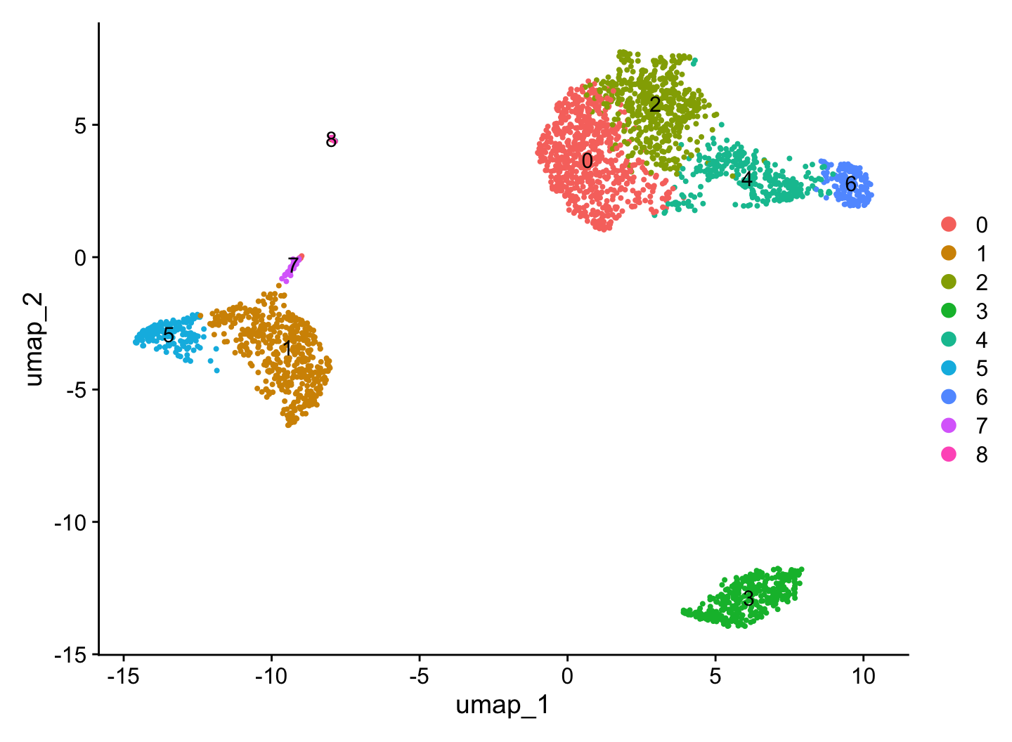
RunUMAP(dims = 1:10) projects the same PCs to 2-D for plotting; DimPlot(reduction = "umap") is the signature figure — the clusters you found, laid out in space.
Clusters are data-driven groupings, not cell types yet. Cluster 0 is “a group of similar cells,” not “T cells” — naming them comes next, from marker genes. The pipeline is deterministic (RunUMAP seeds with 42), so you reproduce the same figure every time.
Introduction
You have a normalized, scaled pbmc3k object: 2,638 quality cells described by 2,000 variable genes. The goal now is to find the groups of similar cells hiding in that matrix — the populations that, once named, become T cells, monocytes, B cells, and the rest. That is clustering, and in Seurat it is a short, well-worn sequence: reduce the dimensions with PCA, decide how many components carry real signal, build a neighbor graph on those components, partition it into clusters, and lay the result out with UMAP.
Two decisions shape the outcome, and this lesson is really about them: how many principal components to keep and at what resolution to cluster. Get a feel for those two knobs and the rest is mechanical. We pick up from the normalization lesson on the same pbmc3k object, so the workflow transfers directly to your own 10x data.
Pick up from C3: rebuild the analysis-ready object
Each code block here is self-contained, so it starts by re-creating the normalized, scaled object from the previous lesson — load the 10x matrix, build the Seurat object, add percent.mt, subset to the clean cells, then normalize, find variable features, and scale. This is exactly the object you ended C3 with.
An object of class Seurat
13714 features across 2638 samples within 1 assay
Active assay: RNA (13714 features, 2000 variable features)
 3 layers present: counts, data, scale.data
13,714 genes across 2,638 cells, with three layers (counts, data, scale.data) and 2,000 variable features set. Everything below runs on this object.
Run PCA: compress the cells before you cluster
Clustering 2,638 cells across 2,000 genes directly is both slow and noisy — most of those genes carry a little signal and a lot of technical scatter. Principal component analysis (PCA) solves this: it finds the directions (linear combinations of genes) along which the cells vary most, and re-expresses each cell as a handful of scores on those directions. A few dozen principal components then stand in for the full expression matrix, keeping the structure that separates cell types and discarding most of the noise.
RunPCA() runs on the scaled variable features by default. Printing the result shows which genes load most strongly on each component — and those genes are immediately interpretable.
library(Seurat)pbmc.data <-Read10X("_data/filtered_gene_bc_matrices/hg19")pbmc <-CreateSeuratObject(pbmc.data, project ="pbmc3k",min.cells =3, min.features =200)pbmc[["percent.mt"]] <-PercentageFeatureSet(pbmc, pattern ="^MT-")pbmc <-subset(pbmc, subset = nFeature_RNA >200& nFeature_RNA <2500& percent.mt <5)pbmc <-NormalizeData(pbmc)pbmc <-FindVariableFeatures(pbmc, selection.method ="vst", nfeatures =2000)pbmc <-ScaleData(pbmc)# Linear dimension reduction on the scaled variable featurespbmc <-RunPCA(pbmc, features =VariableFeatures(pbmc))# Top genes defining the first few componentsprint(pbmc[["pca"]], dims =1:3, nfeatures =5)
The components are not abstract — each one is a biological axis. PC 1 runs from MALAT1, LTB, IL32, IL7R, CD2 (lymphocyte genes) on the negative side to CST3, TYROBP, LST1, AIF1, FTL (monocyte/ myeloid genes) on the positive side: it is the myeloid-vs-lymphoid split, the single biggest source of variation in blood. PC 2 separates CD79A, MS4A1, TCL1A (B-cell genes) from NKG7, PRF1, GZMB, GZMA (NK/cytotoxic genes). The PCs have already organized the cells along the lines that clustering will formalize.
To see that structure on a single component, DimHeatmap() plots the cells (columns) against the top-loading genes (rows) for a PC, sorted by their PCA score.
library(Seurat)pbmc.data <-Read10X("_data/filtered_gene_bc_matrices/hg19")pbmc <-CreateSeuratObject(pbmc.data, project ="pbmc3k",min.cells =3, min.features =200)pbmc[["percent.mt"]] <-PercentageFeatureSet(pbmc, pattern ="^MT-")pbmc <-subset(pbmc, subset = nFeature_RNA >200& nFeature_RNA <2500& percent.mt <5)pbmc <-NormalizeData(pbmc)pbmc <-FindVariableFeatures(pbmc, selection.method ="vst", nfeatures =2000)pbmc <-ScaleData(pbmc)pbmc <-RunPCA(pbmc, features =VariableFeatures(pbmc))# How PC1 splits the cells: top genes (rows) x 500 cells (columns), sorted by PC1 scoreDimHeatmap(pbmc, dims =1, cells =500, balanced =TRUE, fast =FALSE)
The two clean blocks are the point: one set of cells is high in the myeloid genes and low in the lymphocyte genes, the other set is the mirror image. PC 1 is genuinely capturing a biological boundary, not noise — which is why it is safe to cluster on these components instead of the raw genes.
How many PCs? Read the ElbowPlot
The first real decision: how many principal components to keep for the neighbor graph and UMAP. Keep too few and you merge distinct populations; keep too many and you start clustering on noise (the later PCs are mostly technical scatter). The standard tool is the elbow plot — the standard deviation explained by each component, in order. Keep the components before the curve flattens out.
Read it left to right. The standard deviation plunges from 7.1 at PC 1 to about 3.2 at PC 5, eases down to ~2.0 by PC 7-8, and then flattens into a near-flat plateau around 1.8 from PC 10 onward. That bend — the elbow — is where extra components stop adding real signal. Everything past it is essentially noise, so dims = 1:10 is the natural, defensible choice for pbmc3k.
This is a judgment call, not a formula, and it is forgiving: anywhere from about 7 to 15 PCs gives nearly the same clusters here, because the structure lives in the first handful of components. When you are unsure, lean slightly high (a few extra noise PCs rarely hurt) and check that your clusters are stable. We keep 10.
Build the neighbor graph and find clusters
With the dimensions chosen, clustering is two calls. FindNeighbors() builds a graph where each cell is connected to the cells nearest it in PC space (a shared-nearest-neighbor, or SNN, graph). FindClusters() then partitions that graph into communities — densely connected groups of cells — using the Louvain algorithm.
The knob that matters here is resolution. It controls how finely the graph is cut: lower resolution gives fewer, larger clusters; higher resolution gives more, smaller ones. There is no single correct value — it depends on how granular you want your cell populations. For a dataset of a few thousand cells, Seurat’s guidance is 0.4–1.2, and 0.5 is a sound default.
library(Seurat)pbmc.data <-Read10X("_data/filtered_gene_bc_matrices/hg19")pbmc <-CreateSeuratObject(pbmc.data, project ="pbmc3k",min.cells =3, min.features =200)pbmc[["percent.mt"]] <-PercentageFeatureSet(pbmc, pattern ="^MT-")pbmc <-subset(pbmc, subset = nFeature_RNA >200& nFeature_RNA <2500& percent.mt <5)pbmc <-NormalizeData(pbmc)pbmc <-FindVariableFeatures(pbmc, selection.method ="vst", nfeatures =2000)pbmc <-ScaleData(pbmc)pbmc <-RunPCA(pbmc, features =VariableFeatures(pbmc))# Graph on the first 10 PCs, then partition itpbmc <-FindNeighbors(pbmc, dims =1:10)pbmc <-FindClusters(pbmc, resolution =0.5)
Modularity Optimizer version 1.3.0 by Ludo Waltman and Nees Jan van Eck

Number of nodes: 2638
Number of edges: 95927

Running Louvain algorithm...
Maximum modularity in 10 random starts: 0.8728
Number of communities: 9
Elapsed time: 0 seconds
At resolution = 0.5, pbmc3k splits into 9 clusters (labelled 0–8, largest first): cluster 0 holds 684 cells, down to cluster 8 with just 13. The cluster labels are stored as the cells’ active identity (Idents(pbmc)), so every downstream plot colours by them automatically.
Resolution is a dial, not a fact. Turn it and the cluster count moves — the same cells, cut more or less finely:
The counts climb with resolution: 4 clusters at 0.1, 7 at 0.3, 9 at 0.5, 11 at 0.8, and 12 at 1.2. Low resolution lumps related populations together (CD4 and CD8 T cells as one); high resolution splits them, and eventually starts carving real clusters into sub-clusters that may or may not be biologically meaningful. The right value is the one whose clusters you can defend with marker genes — which is why annotation (the next lesson) often sends you back to retune this. For pbmc3k, 0.5 and its 9 clusters is the well-established choice.
Visualize the clusters with UMAP
The clusters were found in 10-dimensional PC space, which you cannot plot. UMAP (Uniform Manifold Approximation and Projection) collapses those 10 dimensions to 2 for visualization, placing similar cells near each other so the populations show up as separated islands. Run it on the same PCs you clustered on, then colour the projection by cluster.
Modularity Optimizer version 1.3.0 by Ludo Waltman and Nees Jan van Eck

Number of nodes: 2638
Number of edges: 95927

Running Louvain algorithm...
Maximum modularity in 10 random starts: 0.8728
Number of communities: 9
Elapsed time: 0 seconds
# Project the same 10 PCs to 2-D and colour by clusterpbmc <-RunUMAP(pbmc, dims =1:10)DimPlot(pbmc, reduction ="umap", label =TRUE)
This is the signature figure of a clustering analysis. Read it as a map: cells that the graph judged similar sit together, and the gaps between islands are real biological distance. The big upper-right island (clusters 0, 2, 4, 6) is a connected continuum of related cell types; the left-hand island (clusters 5, 1) is another; and cluster 3 sits alone at the bottom, the most distinct population on the plot — its complete separation is the visual signature of a cell type quite unlike the rest. Use UMAP for exactly this — which groups are distinct, which are neighbors — and not for fine distances or cluster sizes, which it distorts.
One caution that trips people up: the layout is for the eye, not the analysis. UMAP coordinates are a projection; the clusters were defined in PC space, so two clusters touching on the UMAP are not necessarily a single population, and absolute distances on the plot are not meaningful. Trust the clustering for what’s a group; trust the UMAP for roughly how the groups relate.
Interpret honestly: clusters are not cell types yet
The most important point about this figure: a cluster is a data-driven grouping of similar cells, not a named cell type. Cluster 0 is “684 cells that the graph placed together,” not “T cells.” The numbers 0–8 are arbitrary labels assigned largest-first; they carry no biology on their own. The clustering is honest about structure — these cells differ from those cells — but it is silent about identity.
Naming the clusters is the next step, and it is driven by marker genes: find the genes each cluster over-expresses, match them to known cell-type markers (MS4A1 for B cells, CD3E for T cells, CD14 for monocytes, and so on), and relabel. That is exactly what the marker genes & annotation lesson does — it turns clusters 0–8 into named populations and often loops back to retune the resolution.
Reproducibility note. The whole pipeline is deterministic. FindClusters() is deterministic for a given graph and resolution, and RunUMAP() fixes its random seed (seed.use = 42 by default), so re-running this lesson gives the same 9 clusters and the same UMAP every time. State the versions and parameters when you report — “Cells were clustered on the first 10 principal components with FindNeighbors/FindClusters (resolution 0.5), yielding 9 clusters, and visualized with UMAP (Seurat 5.4.0, seed.use = 42)” — and a reader reproduces your figure exactly.
Common issues
Forgetting to use the same dims everywhere. The PCs you cluster on (FindNeighbors(dims = 1:10)) and the PCs you project (RunUMAP(dims = 1:10)) should match. Clustering on 1:10 but running UMAP on 1:30 produces a layout that disagrees with the cluster boundaries — clusters that look smeared or interleaved on the plot for no biological reason.
Chasing a “correct” number of clusters by cranking resolution. Higher resolution always yields more clusters; that does not make them real. A cluster is only worth keeping if it has distinct marker genes. Pick a sensible resolution (0.4–1.2 for a few thousand cells), then validate with markers in the next step — do not tune resolution until you hit a target count.
A different UMAP shape than a colleague’s. UMAP’s orientation (which island is left vs right, mirror flips) is not fixed across machines or package versions, even with the same seed, because it depends on the UMAP backend (uwot versus umap-learn) and BLAS. The clustering and the relationships between clusters are stable; only the cosmetic layout rotates. Compare cluster assignments, not pixel positions.
Frequently asked questions
NoteHow many principal components should I use in Seurat?
Read an ElbowPlot() and keep the components before the standard-deviation curve flattens. For pbmc3k the elbow is around PC 10, so dims = 1:10 is the standard choice. The decision is forgiving — anywhere from about 7 to 15 PCs gives nearly the same clusters — so when unsure, lean slightly high and confirm your clusters are stable.
NoteWhat does the resolution parameter do in FindClusters?
resolution controls how finely the neighbor graph is partitioned: lower values give fewer, larger clusters and higher values give more, smaller ones. On pbmc3k, resolution = 0.5 yields 9 clusters, 0.1 gives 4, and 1.2 gives 12. Seurat suggests 0.4–1.2 for datasets of a few thousand cells; validate the choice with marker genes rather than tuning to a target count.
NoteWhat is the difference between PCA and UMAP in a Seurat workflow?
PCA (RunPCA) is the linear reduction you cluster on — it captures the main axes of variation in a few dozen interpretable components. UMAP (RunUMAP) is a non-linear projection of those PCs to 2-D you plot on. You cluster in PC space and visualize in UMAP space; UMAP is for the eye, not for defining clusters or measuring distances.
NoteWhy are my clusters just numbers and not cell types?
FindClusters() groups cells by similarity and labels the groups 0, 1, 2, … largest-first — the numbers are arbitrary and carry no biology. Naming them requires marker genes: find what each cluster over-expresses and match it to known cell-type markers (for example MS4A1 for B cells, CD14 for monocytes). That annotation step comes after clustering.
NoteIs Seurat clustering and UMAP reproducible?
Yes. FindClusters() is deterministic for a given graph and resolution, and RunUMAP() fixes a random seed (seed.use = 42 by default), so the same input gives the same clusters and the same embedding every run. The UMAP’s orientation can still differ across package versions or BLAS libraries, but the cluster assignments and the relationships between clusters are stable — report your Seurat version and parameters and others reproduce the result.
Test your understanding
ImportantYour turn: cluster pbmc3k at two resolutions
Starting from the normalized, scaled pbmc3k object, run RunPCA, build the neighbor graph on dims = 1:10, and cluster at resolution 0.5 and again at resolution 1.0. Report how many clusters each resolution produces, then run UMAP and confirm the embedding has one row per cell.
TipHint
Call FindClusters() twice with different resolution values; nlevels(Idents(pbmc)) gives the current cluster count after each call. RunUMAP(pbmc, dims = 1:10) then dim(Embeddings(pbmc, "umap")) confirms the embedding shape.
TipSolution
library(Seurat)pbmc.data <-Read10X("_data/filtered_gene_bc_matrices/hg19")pbmc <-CreateSeuratObject(pbmc.data, project ="pbmc3k",min.cells =3, min.features =200)pbmc[["percent.mt"]] <-PercentageFeatureSet(pbmc, pattern ="^MT-")pbmc <-subset(pbmc, subset = nFeature_RNA >200& nFeature_RNA <2500& percent.mt <5)pbmc <-NormalizeData(pbmc)pbmc <-FindVariableFeatures(pbmc, selection.method ="vst", nfeatures =2000)pbmc <-ScaleData(pbmc)pbmc <-RunPCA(pbmc, features =VariableFeatures(pbmc))pbmc <-FindNeighbors(pbmc, dims =1:10)pbmc <-FindClusters(pbmc, resolution =0.5)nlevels(Idents(pbmc)) # 9 clusterspbmc <-FindClusters(pbmc, resolution =1.0)nlevels(Idents(pbmc)) # more clusters (about 12) at the higher resolutionpbmc <-RunUMAP(pbmc, dims =1:10)dim(Embeddings(pbmc, "umap")) # 2638 x 2: one (x, y) per cell
Resolution 0.5 gives 9 clusters; raising it to 1.0 splits the cells more finely into roughly a dozen. The UMAP embedding is 2,638 × 2 — two coordinates for each of the clean cells.
NoteQuick check: in which space are the clusters actually defined?
A. In the 2-D UMAP space — clusters are the visible islands on the DimPlot. B. In PC space — FindNeighbors/FindClusters use the principal components, and UMAP only visualizes them. C. In the full 2,000-gene expression space, with no dimension reduction.
TipShow answer
B. Clusters are defined on the principal components (FindNeighbors(dims = 1:10) builds the graph from them). UMAP is a separate projection of those same PCs to 2-D for plotting only — two clusters touching on the UMAP are not necessarily one population, which is why you trust the clustering for grouping and the UMAP only for rough relationships.
Conclusion
Clustering single cells is a five-step sequence built around two decisions. You compressed the cells with RunPCA(), decided to keep 10 principal components by reading the ElbowPlot, built a neighbor graph with FindNeighbors(dims = 1:10), partitioned it into 9 clusters with FindClusters(resolution = 0.5), and projected the result with RunUMAP() and DimPlot(). The durable logic: the two knobs are how many PCs (read the elbow) and resolution (lower = coarser, higher = finer), and a cluster is a data-driven group of similar cells — honest about structure, silent about identity. Naming those clusters from their marker genes is the final step of the standard workflow.
Ask Prova“how do I cluster my own Seurat object and choose the number of PCs and the resolution?” — it answers with R code you can run on your own data, runs RunPCA/FindNeighbors/FindClusters/RunUMAP, and helps you read the ElbowPlot and tune the resolution. The runtime is the judge.Ask Prova →
Was this page helpful?
Thanks for the feedback!
Prove you can do it. Master the whole Single-Cell RNA-Seq Analysis in R series — track your path, build projects, and earn a certificate.
This lesson is reproducible: every figure and number was produced by the code shown — copy any block and run it to reproduce them. The runtime is the judge.
References
Hao, Y., et al. (2021). Integrated analysis of multimodal single-cell data (Seurat v4). Cell, 184(13), 3573–3587.
Becht, E., et al. (2019). Dimensionality reduction for visualizing single-cell data using UMAP. Nature Biotechnology, 37(1), 38–44.
Blondel, V. D., Guillaume, J.-L., Lambiotte, R., & Lefebvre, E. (2008). Fast unfolding of communities in large networks. Journal of Statistical Mechanics, 2008(10), P10008.
10x Genomics. 3k PBMCs from a Healthy Donor — the canonical pbmc3k filtered gene–barcode matrix (Cell Ranger 1.1.0).