Visualizing Genomic Data in R with Gviz: Genome-Browser Tracks
Build annotation, ideogram, gene-model, and data tracks along chromosomal coordinates
Draw genome-browser-style figures in R with the Bioconductor Gviz package — stack annotation, genome-axis, chromosome-ideogram, gene-model, sequence, and data tracks along chromosomal coordinates, zoom to a locus, and highlight regions. The standard way to visualize genomic data at a locus in R.
The figures below are the real output of the R code shown, rendered with Gviz on Bioconductor. There is no in-browser sandbox on this page — the Bioconductor genome-annotation stack (BSgenome, TxDb, Biomart) is too heavy to run in the browser. To reproduce a figure, install the Bioconductor packages and copy any block into your own R session:
install.packages("BiocManager")
BiocManager::install(c("Gviz", "GenomicRanges", "GenomicFeatures",
                       "BSgenome.Hsapiens.UCSC.hg19"))
New to Bioconductor? See Setting up R for RNA-seq analysis for BiocManager basics. The runtime is the judge.
- Gviz turns genomic data into a genome-browser figure: each kind of feature — genes, coverage, annotations, sequence — is a separate horizontal panel called a track, and you stack them along the same chromosomal coordinates.
- The workflow is always the same: build one or more track objects (
AnnotationTrack,GenomeAxisTrack,IdeogramTrack,GeneRegionTrack,SequenceTrack,DataTrack,AlignmentsTrack), then draw them together with a singleplotTracks(list(...))call. - A
DataTrackcarries numeric signal (coverage, microarray, scores) and renders as dot, line, histogram, boxplot, heatmap, or gradient — set by thetypeargument; grouping by a factor overlays samples. - Zoom to any locus with
from/to(orextend.left/extend.right), read individual bases with aSequenceTrack, and inspect aligned reads with anAlignmentsTrack. HighlightTrackshades a region across every track;OverlayTracksuperimposes tracks on the same panel — the two ways to combine tracks for emphasis or comparison.
Introduction
Almost every genomics figure you have seen in a paper — a coverage pileup under a gene model, a ChIP-seq peak lined up with an annotation, a SNP call shown against the reference sequence — is a genome browser view: several data types drawn on a shared coordinate axis so you can read where things line up. Gviz is the Bioconductor package that produces exactly these figures in R, publication-ready, without leaving your analysis.
The mental model is simple. Each data type is a track (one horizontal panel): a gene model is one track, read coverage is another, the chromosome ideogram (the banded chromosome cartoon that marks where on the chromosome you are) is another. You build each track as an R object, then hand a list() of them to plotTracks(), which draws them stacked and aligned. This guide walks every track type in that order, then covers zooming, highlighting, and overlays.
The original figures use the human hg19 genome build (a track = one horizontal data panel drawn along genomic coordinates). The same code runs on GRCh38/hg38 by swapping the annotation and genome packages (for example BSgenome.Hsapiens.UCSC.hg38 and an hg38 TxDb) — the Gviz calls themselves do not change.
chr
By default Gviz validates chromosome names against the UCSC convention: they must start with the string chr (chr7, not 7). If your data uses Ensembl-style names (7, X), either rename them or turn the check off with options(ucscChromosomeNames = FALSE).
An annotation track
A track is easiest to understand as the smallest useful example: a set of features drawn as boxes along the coordinate line. The AnnotationTrack is that track — it takes genomic ranges (here a built-in GRanges of CpG islands, i.e. genomic ranges: start–end intervals on a chromosome) and draws each as a box. Build the track with AnnotationTrack(), then draw it with plotTracks():
library(Gviz)
library(GenomicRanges)

# Built-in GRanges of CpG islands on chr7 (hg19)
data(cpgIslands)
cpgIslands
#> GRanges object with 10 ranges and 0 metadata columns ...

# One annotation track, titled "CpG"
atrack <- AnnotationTrack(cpgIslands, name = "CpG")
plotTracks(atrack)
Each box is one CpG island. On its own the track has no coordinate reference — you cannot yet tell where on the chromosome these islands sit. That is what the next track adds.
AnnotationTrack constructor is flexible
AnnotationTrack() accepts many inputs: a GRanges, a data.frame, an IRanges/GRangesList, or plain start/end/chromosome arguments. Use whichever matches the data you already have — the resulting track is the same.
A genome-axis track
The GenomeAxisTrack draws the coordinate ruler that tells the reader which region is in view. It needs no data — it reads the coordinate range from whatever it is plotted with. Add it by passing a list() of tracks to plotTracks(); tracks stack top-to-bottom in list order:
gtrack <- GenomeAxisTrack()
plotTracks(list(gtrack, atrack))
Now the islands have coordinates. plotTracks(list(...)) is the one call you will use for every figure from here on — build tracks, then list them in the order you want them stacked.
A chromosome ideogram
The IdeogramTrack draws the familiar banded-chromosome cartoon (the ideogram) with a marker showing where the current view sits on the whole chromosome. It needs a valid UCSC genome build and chromosome name, which you can pull straight from the data:
gen <- genome(cpgIslands)                       # "hg19"
chr <- as.character(unique(seqnames(cpgIslands)))  # "chr7"

itrack <- IdeogramTrack(genome = gen, chromosome = chr)
plotTracks(list(itrack, gtrack, atrack))
The red marker on the ideogram shows the viewed region in its whole-chromosome context.
IdeogramTrack
It fetches band data from UCSC, so it needs an internet connection and can be slow the first time. And it is the one track that is not drawn on the shared coordinate system — the current location is shown by the red box (or a red line when the region is too small for a box) on the chromosome cartoon.
A gene model
The GeneRegionTrack draws transcript models — exons as boxes, introns as connecting lines, arrows for the transcription direction — the centrepiece of most locus figures. Here it reads from a built-in data.frame of gene models; the track is added to the stack like any other:
data(geneModels)
head(geneModels)

grtrack <- GeneRegionTrack(geneModels, genome = gen,
                           chromosome = chr, name = "Gene Model")
plotTracks(list(itrack, gtrack, atrack, grtrack))
This is the canonical genome-browser view: ideogram, axis, annotations, and a multi-transcript gene model, all aligned on chromosome-7 coordinates. Each row in the gene-model track is one transcript isoform.
Zoom to a region
You rarely want the whole window. Two ways to zoom, both passed to plotTracks(): give explicit from/to coordinates, or extend.left/extend.right relative to the current view. A third touch — col = NULL — drops the exon borders for a cleaner look:
# Zoom to an explicit coordinate window
plotTracks(list(itrack, gtrack, atrack, grtrack),
           from = 26700000, to = 26750000)

# Extend the current view left and right (relative)
plotTracks(list(itrack, gtrack, atrack, grtrack),
           extend.left = 0.5, extend.right = 1000000)

# Same, with exon bounding borders removed
plotTracks(list(itrack, gtrack, atrack, grtrack),
           extend.left = 0.5, extend.right = 1000000, col = NULL)


col = NULL, dropping the exon bounding borders for a cleaner gene-model rendering.An extend.left = 0.5 zooms in to half the currently displayed range; extend.right = 1000000 adds a megabase of context on the right.
A sequence track
Zoom in far enough and you can show the reference sequence itself. The SequenceTrack pulls bases from a BSgenome package (the packaged reference genome) and draws the letters once the region is narrow enough to fit them:
library(BSgenome.Hsapiens.UCSC.hg19)

strack <- SequenceTrack(Hsapiens, chromosome = chr)
plotTracks(list(itrack, gtrack, atrack, grtrack, strack),
           from = 26591822, to = 26591852, cex = 0.8)
At this 30-base scale the individual nucleotides are legible. The sequence track is what lets an alignment figure show mismatches against the reference (below).
A data track: numeric signal
The DataTrack is how you draw quantitative data along the genome — coverage, microarray intensities, per-window scores. Internally it is a run-length-encoded numeric vector or matrix tied to a set of ranges. Build one from values plus their coordinates:
set.seed(255)
lim <- c(26700000, 26750000)
coords <- sort(c(lim[1], sample(seq(lim[1], lim[2]), 99), lim[2]))
dat <- runif(100, min = -10, max = 10)

dtrack <- DataTrack(data = dat, start = coords[-length(coords)],
                    end = coords[-1], chromosome = chr, genome = gen,
                    name = "Uniform")

# Default: a dot plot
plotTracks(list(itrack, gtrack, atrack, grtrack, dtrack),
           from = lim[1], to = lim[2])

# Same data as a histogram
plotTracks(list(itrack, gtrack, atrack, grtrack, dtrack),
           from = lim[1], to = lim[2], type = "histogram")

type = "histogram", the values shown as vertical bars instead of dots.The type argument switches the rendering — the same numbers become dots or bars. This is the track you use for NGS read coverage or microarray probe measurements along a chromosome.
The plot types
DataTrack supports a whole family of renderings, set by type. Using a built-in two-group dataset, here are the common ones side by side:
data(twoGroups)

plotTracks(DataTrack(twoGroups, name = "p"),         type = "p")          # dot plot
plotTracks(DataTrack(twoGroups, name = "l"),         type = "l")          # lines
plotTracks(DataTrack(twoGroups, name = "b"),         type = "b")          # both
plotTracks(DataTrack(twoGroups, name = "a"),         type = "a")          # average line
plotTracks(DataTrack(twoGroups, name = "h"),         type = "h")          # histogram lines
plotTracks(DataTrack(twoGroups, name = "histogram"), type = "histogram")  # bars
plotTracks(DataTrack(twoGroups, name = "polygon"),   type = "polygon")    # filled to baseline
plotTracks(DataTrack(twoGroups, name = "boxplot"),   type = "boxplot")    # box-and-whisker
plotTracks(DataTrack(twoGroups, name = "heatmap"),   type = "heatmap")    # false-colour image
type = "p": a dot plot of the data-track values.
type = "l": the values joined as a line.
type = "b": both dots and connecting lines.
type = "a": a line through the group average.
type = "h": histogram-style vertical lines from the baseline.
type = "histogram": filled bars with width equal to each range.
type = "polygon": the signal filled to a baseline as a polygon.
type = "boxplot": a box-and-whisker summary per position.
type = "heatmap": the individual values as a false-colour image.You can also combine types by passing a vector — type = c("boxplot", "a", "g") draws a boxplot with an average line over a background grid.
Group and aggregate samples
When a DataTrack holds several samples, a grouping factor overlays or summarizes them. Pass groups = (a factor the same length as the number of samples) and, optionally, aggregateGroups/aggregation to collapse each group to a single statistic:
dTrack <- DataTrack(twoGroups, name = "uniform")

# Overlay two groups, points + average line, with a legend
plotTracks(dTrack, groups = rep(c("control", "treated"), each = 3),
           type = c("a", "p"), legend = TRUE)

# Grouped boxplot
plotTracks(dTrack, groups = rep(c("control", "treated"), each = 3),
           type = "boxplot")

# Collapse each group to its maximum
plotTracks(dTrack, groups = rep(c("control", "treated"), each = 3),
           type = "b", aggregateGroups = TRUE, aggregation = "max")

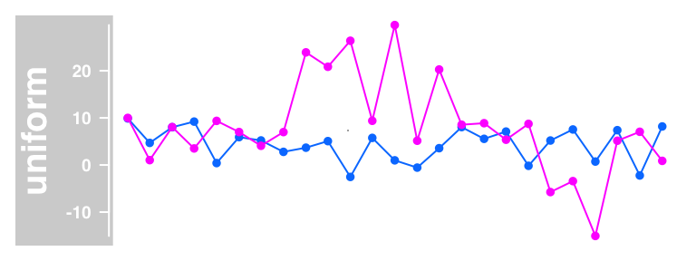
aggregation accepts mean, median, extreme, sum, min, or max — the way you turn many samples into one summary line.
Stream a data track from a file
DataTrack reads the common genomics file formats directly — wig, bigWig, bedGraph, and bam (Gviz uses rtracklayer for the import). The real advantage is streaming from indexed files: only the region you plot is loaded, so the underlying file can be huge without a memory or speed cost.
For a BAM file (Binary Alignment Map — aligned sequencing reads), the natural DataTrack is per-position coverage, computed on the fly with window = -1:
bamFile <- system.file("extdata/test.bam", package = "Gviz")

dTrack4 <- DataTrack(range = bamFile, genome = "hg19", type = "l",
                     name = "Coverage", window = -1, chromosome = "chr1")
plotTracks(dTrack4, from = 189990000, to = 190000000)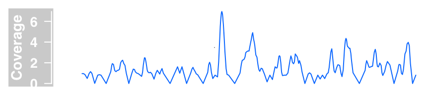
The same BAM file can instead be shown as an AnnotationTrack to display the individual reads as boxes rather than their summed coverage:
aTrack2 <- AnnotationTrack(range = bamFile, genome = "hg19",
                           name = "Reads", chromosome = "chr1")
plotTracks(aTrack2, from = 189995000, to = 190000000)
A gene model from a TranscriptDb
You do not have to supply gene models by hand. The GenomicFeatures package stores annotation as a TxDb (a local SQLite database of transcripts), and GeneRegionTrack() reads one directly — with the bonus of coding/non-coding detail (5′ and 3′ UTRs and CDS regions drawn distinctly):
library(GenomicFeatures)

samplefile <- system.file("extdata", "UCSC_knownGene_sample.sqlite",
                          package = "GenomicFeatures")
txdb <- loadDb(samplefile)

txTr <- GeneRegionTrack(txdb, chromosome = "chr6",
                        start = 300000, end = 350000)
plotTracks(txTr)
The thicker boxes are coding exons (CDS), the thinner ones the UTRs — detail that a plain data.frame gene model does not carry. For gene models fetched live from Ensembl instead, BiomartGeneRegionTrack() contacts the Biomart service and builds the model on the fly (it needs an internet connection).
Aligned reads: the AlignmentsTrack
To inspect the actual reads — for example to eyeball a called variant — the AlignmentsTrack draws a BAM file as a coverage histogram on top of a pile-up of individual reads. Here paired RNA-seq reads are shown against an Ensembl gene model for the region:
afrom <- 2960000
ato   <- 3160000

alTrack <- AlignmentsTrack(
  system.file(package = "Gviz", "extdata", "gapped.bam"), isPaired = TRUE)
bmt <- BiomartGeneRegionTrack(genome = "hg19", chromosome = "chr12",
                              start = afrom, end = ato,
                              filter = list(with_ox_refseq_mrna = TRUE),
                              stacking = "dense")
plotTracks(c(bmt, alTrack), from = afrom, to = ato, chromosome = "chr12")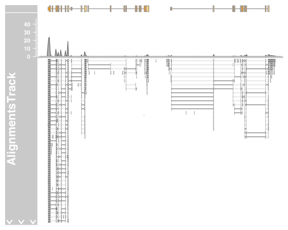
The top panel is coverage; below it each row is a read. Read pairs are joined by a light grey line and alignment gaps by darker connectors. Pass type = "coverage" to drop the pile-up when it is too dense to be useful.
For a DNA-seq SNP-calling view, add a SequenceTrack so mismatches against the reference are coloured on both the reads and the coverage histogram:
afrom <- 44945200
ato   <- 44947200
sTrack <- SequenceTrack(Hsapiens)

alTrack <- AlignmentsTrack(
  system.file(package = "Gviz", "extdata", "snps.bam"), isPaired = TRUE)
plotTracks(c(alTrack, sTrack), chromosome = "chr21",
           from = afrom, to = ato)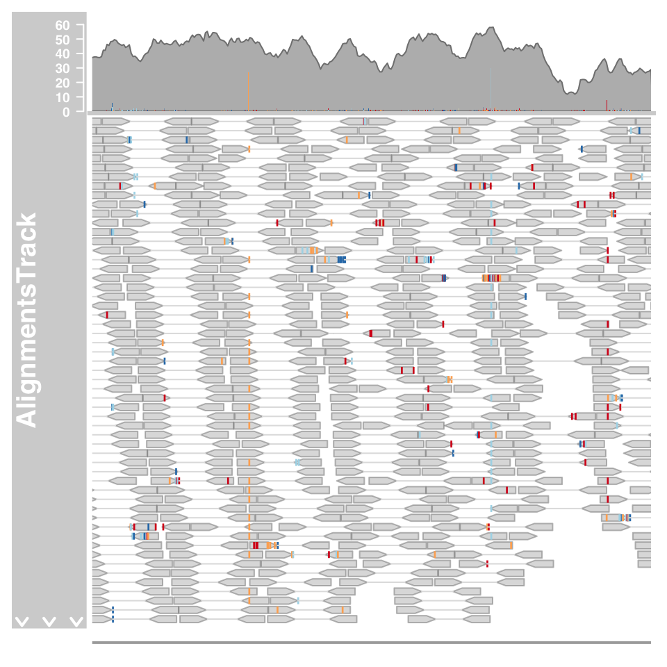
The coloured marks are bases that disagree with the reference — the visual signature of a heterozygous SNP. Zoom in further (from/to) and Gviz draws the individual letters.
Change how tracks look: display parameters
Every track takes display parameters — colours, backgrounds, label positions, annotation style — set either in the constructor or later with displayPars(). For a GeneRegionTrack, transcriptAnnotation = "symbol" labels each transcript and the background.* parameters recolour the panel:
grtrack <- GeneRegionTrack(geneModels, genome = gen, chromosome = chr,
                           name = "Gene Model",
                           transcriptAnnotation = "symbol",
                           background.panel = "#FFFEDB",
                           background.title = "darkblue")
plotTracks(list(itrack, gtrack, atrack, grtrack))
The same idea applies per track type. A GenomeAxisTrack, for instance, can label ranges below the axis and show IDs in a chosen colour:
axisTrack <- GenomeAxisTrack(
  range = IRanges(start = c(2000000, 4000000),
                  end   = c(3000000, 7000000),
                  names = rep("N-stretch", 2)))
plotTracks(axisTrack, from = 1000000, to = 9000000,
           labelPos = "below", showId = TRUE, col = "red")
Plot on the reverse strand
By default tracks are drawn 5′→3′. Set reverseStrand = TRUE to show the data relative to the opposite strand — the coordinate axis flips to match:
plotTracks(list(itrack, gtrack, atrack, grtrack),
           reverseStrand = TRUE)
Notice the axis coordinates run right-to-left — the reversal is reflected in the GenomeAxisTrack, not just the gene model.
Highlight a region across tracks
A HighlightTrack shades a coordinate window across a set of tracks at once — the way to draw the reader’s eye to a locus. Wrap the tracks you want shaded in HighlightTrack() and give it the region(s):
ht <- HighlightTrack(trackList = list(atrack, grtrack, dtrack),
                     start = c(26705000, 26720000), width = 7000,
                     chromosome = 7)
plotTracks(list(itrack, gtrack, ht), from = lim[1], to = lim[2])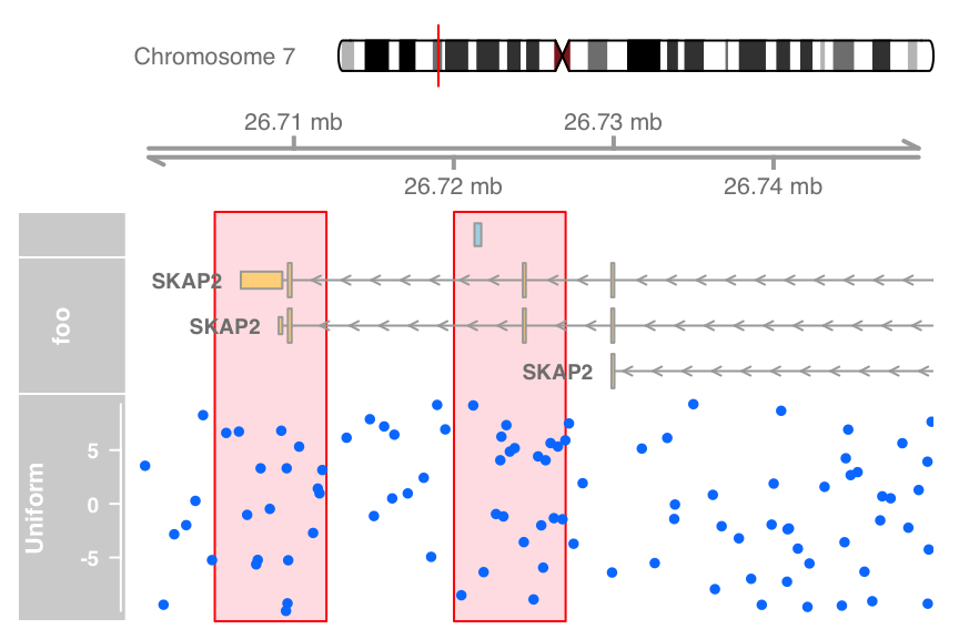
The two shaded bands span every wrapped track, so a region of interest lines up visually from the annotation down to the data.
Overlay tracks on one panel
Where HighlightTrack stacks, an OverlayTrack superimposes — it draws several tracks in the same panel, the way to compare two samples directly. Build a second DataTrack, wrap both in OverlayTrack(), and plot:
dat2 <- runif(100, min = -2, max = 22)
dtrack2 <- DataTrack(data = dat2, start = coords[-length(coords)],
                     end = coords[-1], chromosome = chr, genome = gen,
                     name = "Uniform2",
                     groups = factor("sample 2",
                                     levels = c("sample 1", "sample 2")),
                     legend = TRUE)
displayPars(dtrack) <- list(
  groups = factor("sample 1", levels = c("sample 1", "sample 2")),
  legend = TRUE)

ot <- OverlayTrack(trackList = list(dtrack2, dtrack))
ylims <- extendrange(range(c(values(dtrack), values(dtrack2))))
plotTracks(list(itrack, gtrack, ot), from = lim[1], to = lim[2],
           ylim = ylims, type = c("smooth", "p"))
Both samples share one panel, so their trends compare directly. On devices that support transparency, setting alpha on each track (displayPars(dtrack)$alpha <- 0.5) reduces overplotting when the overlaid data is dense.
Common issues
Error: Invalid chromosome name. Gviz enforces the UCSC convention that chromosome names start with chr. Rename 7 to chr7, or disable the check with options(ucscChromosomeNames = FALSE) if your whole workflow uses Ensembl-style names.
IdeogramTrack or BiomartGeneRegionTrack hangs or errors. Both fetch data over the network (UCSC and Ensembl respectively). Confirm you have an internet connection; on a sealed/offline machine, build gene models from a local TxDb instead (see the TranscriptDb section) and skip the ideogram.
The sequence letters do not appear on a SequenceTrack. Bases are only drawn once the window is narrow enough for the letters to fit — typically a few hundred bases or less. Zoom in with from/to; at a wide view the track shows a coloured density strip instead.
Frequently asked questions
Gviz is a Bioconductor package for drawing genome-browser-style figures in R. It plots any data type — gene models, read coverage, annotations, sequence, alignments — as stacked tracks along genomic coordinates, so you can produce publication-ready locus figures directly from your analysis without switching to a standalone browser like IGV or the UCSC browser.
Build each track as an object (AnnotationTrack, GenomeAxisTrack, GeneRegionTrack, DataTrack, …) and pass them as a list() to a single plotTracks() call: plotTracks(list(itrack, gtrack, atrack, grtrack)). Tracks stack top-to-bottom in the order you list them, all aligned on the same coordinate axis.
Pass from and to coordinates to plotTracks() — for example plotTracks(tracks, from = 26700000, to = 26750000). Alternatively use extend.left and extend.right to grow the current view relative to what is shown (extend.left = 0.5 zooms in to half the range).
Use a DataTrack. It holds a numeric vector or matrix tied to genomic ranges and renders as a dot plot, line, histogram, boxplot, or heatmap via the type argument. Build coverage straight from a BAM file with DataTrack(range = bamFile, type = "l", window = -1, ...), which streams only the plotted region.
Yes. DataTrack() and AnnotationTrack() accept wig, bigWig, bedGraph, and BAM files via the range = argument (Gviz uses rtracklayer for import). Indexed files are streamed — only the region you plot is loaded — so very large files plot quickly without a large memory footprint.
Task. You have read depth for one sample stored in a GRanges called cov (with a numeric score metadata column) on chr7, and a gene model in a data.frame called genes. Sketch the Gviz code that draws, top to bottom: a chromosome-7 ideogram, a coordinate axis, the gene model, and the coverage as a histogram — all zoomed to 26,700,000–26,750,000.
You need four track objects — IdeogramTrack, GenomeAxisTrack, GeneRegionTrack, and DataTrack — then one plotTracks(list(...)) with from/to. The histogram rendering comes from type = "histogram" on the data track (or in the plotTracks call).
library(Gviz)

itrack  <- IdeogramTrack(genome = "hg19", chromosome = "chr7")
gtrack  <- GenomeAxisTrack()
grtrack <- GeneRegionTrack(genes, genome = "hg19",
                           chromosome = "chr7", name = "Gene Model")
dtrack  <- DataTrack(cov, name = "Coverage", type = "histogram")

plotTracks(list(itrack, gtrack, grtrack, dtrack),
           from = 26700000, to = 26750000)
Each track is built once, then listed in stacking order; from/to zoom the whole figure to the locus, and type = "histogram" draws the coverage as bars. (Passing a GRanges to DataTrack() lets it pick up the score column automatically.)
Which single function draws a set of already-built Gviz track objects as one aligned figure?
A. AnnotationTrack() B. plotTracks() C. DataTrack()
B — plotTracks(). The *Track() constructors build individual track objects; plotTracks(list(...)) is what draws them, stacked and aligned on a shared coordinate axis.
Conclusion
Gviz builds a genome-browser figure from interchangeable tracks: annotation and gene-model tracks for features, a genome-axis and ideogram for orientation, a sequence track for bases, DataTrack for numeric signal, and AlignmentsTrack for reads — every one drawn together by a single plotTracks(list(...)) call. Add from/to to zoom, type to change how a data track renders, groups to compare samples, and HighlightTrack/OverlayTrack to combine tracks for emphasis or comparison. Because the tracks all share one coordinate system, any combination lines up correctly, giving you a reproducible, publication-ready locus figure without leaving R.
References
- Hahne, F., & Ivanek, R. (2016). Visualizing genomic data using Gviz and Bioconductor. Methods in Molecular Biology, 1418, 335–351.
- Gviz — Plotting data and annotation information along genomic coordinates. Bioconductor — package page.
Reuse
Citation
@online{2026,
  author = {},
  title = {Visualizing {Genomic} {Data} in {R} with {Gviz:}
    {Genome-Browser} {Tracks}},
  date = {2026-07-08},
  url = {https://www.datanovia.com/learn/bioinformatics/genomics/gviz-visualize-genomic-data},
  langid = {en}
}