Visualizing Genomic Data with ggbio: ggplot2 for the Genome
Ideograms, gene models, alignment and coverage tracks, and circular plots with ggbio
Visualize genomic data with the ggbio package — a ggplot2 grammar for the genome. Draw ideograms, gene models, alignment and coverage tracks, variant tracks, stacked multi-track figures, and circular (Circos-style) genome plots. A ggplot2-native companion to Gviz for genomic visualization in R.
- ggbio brings the ggplot2 grammar to the genome.
ggbiobuilds on ggplot2 so oneautoplot()call turns a genomic object — an ideogram, a gene model, a BAM file, a VCF file — into a track you can add layers to. - Every genomic object has a track.
Ideogram()draws a chromosome,autoplot()draws gene models (from anOrganismDb/TxDb), reference sequence (from aBSgenome), alignments and coverage (from BAM), and variants (from VCF). - Stack tracks with
tracks(). Combine an ideogram, gene model, coverage, and variants into one aligned, multi-panel figure sharing a genomic x-axis. circle()builds Circos-style plots. Layer ideogram, scale, labels, and mutation rings for a whole-genome overview.- ggbio is a lightly maintained legacy package. The figures here are real outputs of the code shown on the noted genome build; for actively maintained genome-track plotting, prefer Gviz or newer tools.
Introduction
Genomic data is almost always read as a track: a horizontal panel drawn against genomic coordinates — a gene model, a read pileup, a variant row, a coverage curve — several of them stacked so you can line up features by position. ggbio is the package that draws those tracks with the ggplot2 grammar of graphics: instead of a bespoke plotting function per data type, a single autoplot() method turns a Bioconductor genomic object into a ggplot layer you can extend, theme, and combine like any other.
This lesson is a tour of what ggbio draws, in the order you build a browser view: an ideogram (a schematic of a chromosome and its stained banding pattern, the cytobands), a gene model (the exon–intron structure of transcripts), a reference-sequence track, an alignment track from a BAM (Binary Alignment Map) file with coverage and mismatch summaries, a variant track from a VCF (Variant Call Format) file, the tracks() function that stacks them, and finally circular (Circos-style) whole-genome overviews. Each feature is shown as the code you run plus the figure it produces. See the ggbio Bioconductor page for the full reference.
ggbio and the annotation meta-packages it leans on for gene models (Homo.sapiens / the OrganismDb family) are lightly maintained and may fail to install or load on a recent Bioconductor release. Every figure below is a real output of the code shown, rendered on the human genome build hg19 (GRCh37); treat this page as an illustrated reference for the ggbio grammar rather than a guaranteed-to-run script on today’s Bioconductor. For actively maintained genome-track plotting, prefer Gviz (the sibling lesson in this series) or newer tools such as ggcoverage and plotgardener. The concepts — tracks, gene models, coverage, circular overviews — carry over directly.
Before you start
ggbio and its annotation dependencies come from Bioconductor, installed with BiocManager:
if (!requireNamespace("BiocManager", quietly = TRUE)) install.packages("BiocManager")
BiocManager::install(c(
  "ggbio",
  "biovizBase",                         # sample genomic data used below
  "Homo.sapiens",                       # OrganismDb gene models (hg19)
  "TxDb.Hsapiens.UCSC.hg19.knownGene",  # TxDb gene models (hg19)
  "BSgenome.Hsapiens.UCSC.hg19",        # reference sequence (hg19)
  "VariantAnnotation"                   # reads VCF files
))
The annotation packages are pinned to hg19. To work on the current build, swap them for their hg38 equivalents (BSgenome.Hsapiens.UCSC.hg38, TxDb.Hsapiens.UCSC.hg38.knownGene) — the ggbio code is identical; only the annotation source changes. If you have not set up R for Bioconductor yet, see Setting up R for RNA-seq.
Draw an ideogram
An ideogram is a schematic of a whole chromosome showing its cytobands — the light and dark bands a stained chromosome shows under a microscope, the classic coordinate landmarks. Ideogram() builds one for a genome build; ggbio ships the cytoband data for common builds (hg19, hg18, mm10, mm9) so nothing downloads on the fly. By default it draws chromosome 1:
library(ggbio)
p.ideo <- Ideogram(genome = "hg19")   # chr1 by default (subchr = "chr1")
p.ideo
Because the ideogram is a ggplot object, you highlight a region by adding an xlim() with a GRanges (genomic ranges) locus — here a 10 Mb window on chromosome 2. The red marker shows where that window falls on the whole chromosome:
library(GenomicRanges)
p.ideo + xlim(GRanges("chr2", IRanges(1e8, 1e8 + 1e7)))
The color and fill arguments of Ideogram() change the outline and highlight colours if you want to match a house palette.
Draw a gene model
A gene model is the exon–intron structure of a gene’s transcripts: the CDS (coding sequence), the UTRs (untranslated regions), the exons, and the introns between them. ggbio builds a gene-model track three ways:
- from an
OrganismDbobject (recommended — it can label transcripts by gene symbol); - from a
TxDb(transcript database) object (no gene-symbol labels — it uses transcript IDs); - from a
GRangesListyou parse yourself from a GTF file (the flexible fallback when no annotation package exists; see the ggbio vignette).
From an OrganismDb object
Homo.sapiens is an OrganismDb meta-package that ties several annotation resources together, so ggbio can label transcripts by gene symbol. First pick a locus: load the genesymbol table (one gene per row) from biovizBase, take the BRCA1 and NBR1 genes, and collapse them to a single spanning range with range(). Then autoplot() draws every transcript in that window:
library(ggbio)
library(Homo.sapiens)

# gene coordinates: a GRanges, one gene per row
data(genesymbol, package = "biovizBase")
wh <- genesymbol[c("BRCA1", "NBR1")]
wh <- range(wh, ignore.strand = TRUE)   # one range spanning both genes

# draw every transcript in the window
p.txdb <- autoplot(Homo.sapiens, which = wh)
p.txdb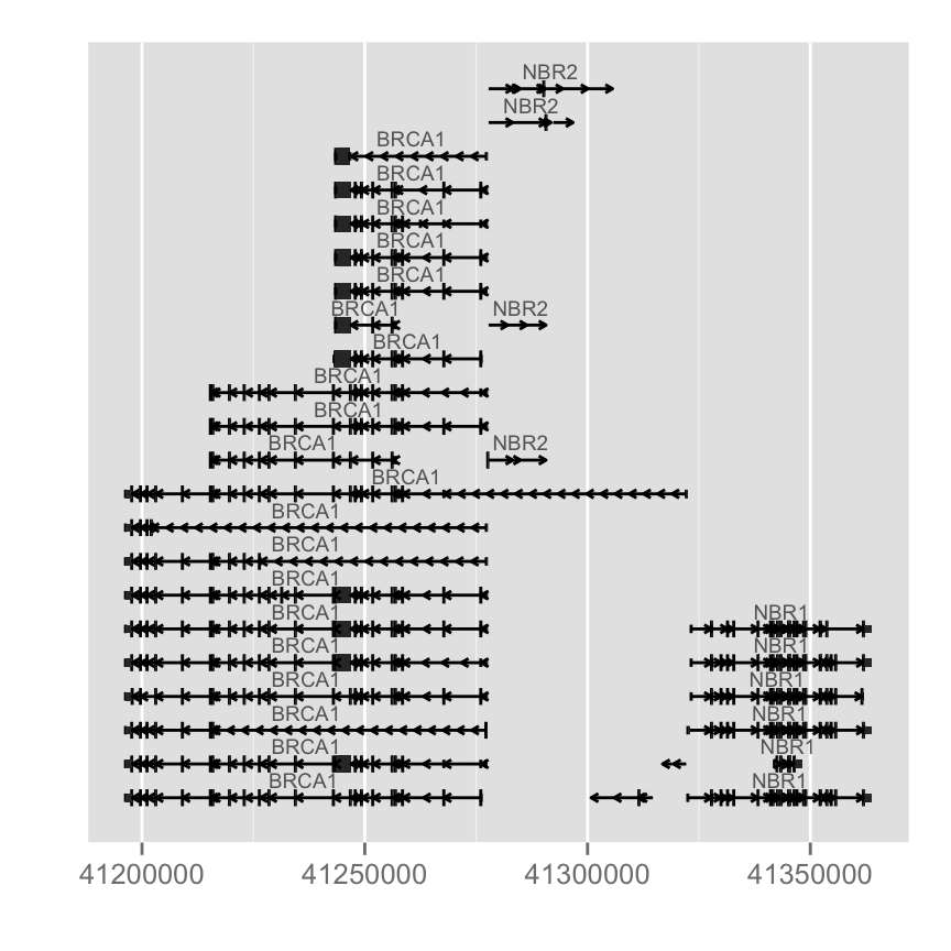
Each row is one transcript; the thick boxes are exons, the thin lines the introns. The default intron geometry is a plain line — switch it to arrowed chevrons (which show transcription direction) with gap.geom:
autoplot(Homo.sapiens, which = wh, gap.geom = "chevron")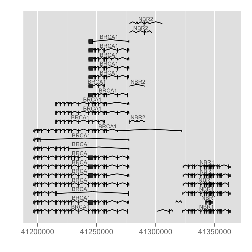
The OrganismDb gene-symbol route (Homo.sapiens above) is the piece most likely to break on a current Bioconductor install — these meta-packages are lightly maintained. The figures here are genuine outputs on hg19. If Homo.sapiens will not load, drop to the TxDb route below (transcript-ID labels, but a more robust dependency), or plot gene models with Gviz’s GeneRegionTrack instead.
Colours and labels are arguments: label.color sets the transcript-label colour, color the outline, and fill the exon fill.
autoplot(Homo.sapiens, which = wh,
         label.color = "black", color = "brown", fill = "brown")
The label itself is flexible. columns() lists the annotation columns available, and names.expr composes a label from any of them — here gene name and GO (Gene Ontology) term:
columns(Homo.sapiens)
autoplot(Homo.sapiens, which = wh,
         columns = c("GENENAME", "GO"),
         names.expr = "GENENAME::GO")
From a TxDb object
A TxDb carries no gene-symbol information, so transcripts are labelled by transcript ID instead. The autoplot() call is otherwise identical — the object type drives the rest:
library(TxDb.Hsapiens.UCSC.hg19.knownGene)
txdb <- TxDb.Hsapiens.UCSC.hg19.knownGene
autoplot(txdb, which = wh)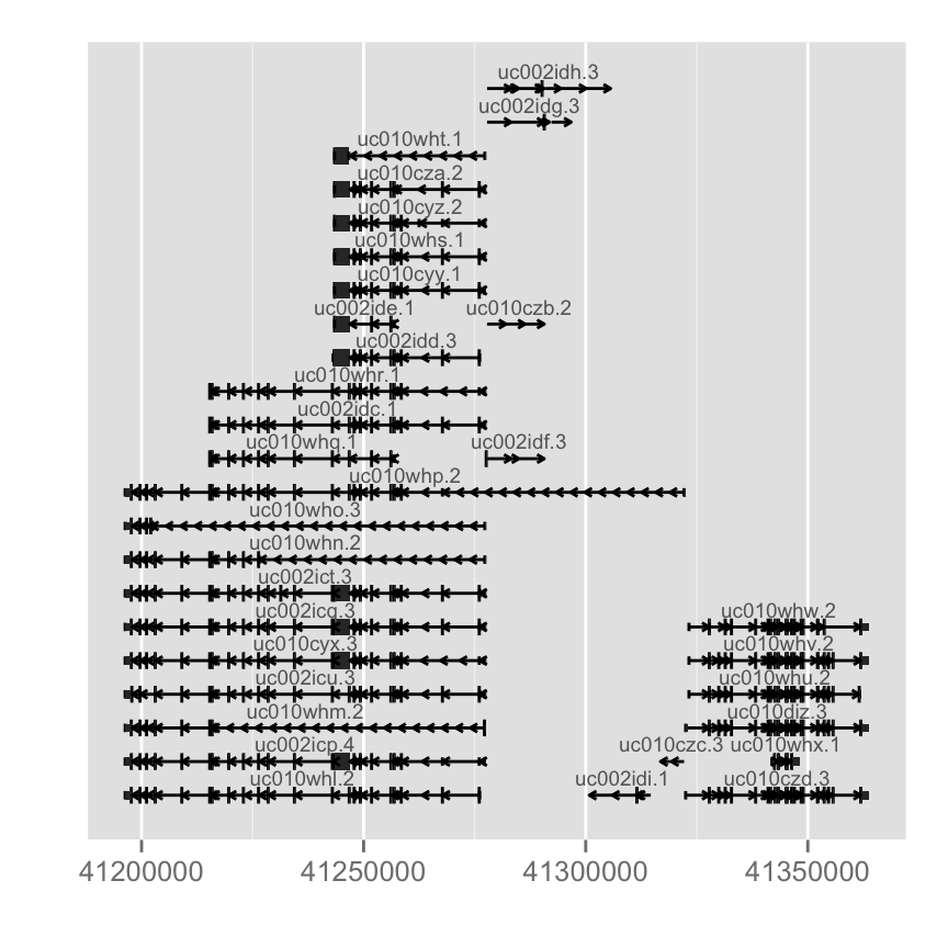
Draw the reference sequence
A reference track shows the actual genome sequence. Load a BSgenome (the full genome sequence as a package) and autoplot() it over the same window. ggbio uses semantic zoom: how the sequence is drawn depends on how far you are zoomed in. zoom() takes a factor — above 1 zooms out, below 1 zooms in — and ggbio switches geometry as the bases become legible: a coloured bar when zoomed out, then segments, rectangles, and finally the letters A/C/G/T when a handful of bases fill the panel.
library(BSgenome.Hsapiens.UCSC.hg19)
bg <- BSgenome.Hsapiens.UCSC.hg19
p.bg <- autoplot(bg, which = wh)

p.bg              # zoomed out: a coloured density bar
p.bg + zoom(1/100)   # segments
p.bg + zoom(1/1000)  # rectangles, one per base
p.bg + zoom(1/2500)  # the base letters themselves


To override the automatic threshold and force a geometry at any zoom level, pass geom explicitly:
autoplot(bg, which = resize(wh, width = width(wh) / 2000), geom = "segment")Draw an alignment track from a BAM file
A BAM (Binary Alignment Map) file holds sequencing reads aligned to the genome. autoplot() accepts a BAM path (indexed) or a BamFile object; pass which to stream just one region. Here we use a sample BAM that ships with biovizBase and restrict the window to chromosome 17 with keepSeqlevels():
fl.bam <- system.file("extdata", "wg-brca1.sorted.bam", package = "biovizBase")
wh <- keepSeqlevels(wh, "chr17")   # BRCA1 is on chr17
autoplot(fl.bam, which = wh)
Mismatch summary
To colour-code where reads disagree with the reference — the raw signal of a possible variant — pass the BSgenome as bsgenome and set stat = "mismatch". ggbio draws a bar chart whose colours mark the proportion of mismatching bases per position:
p.mis <- autoplot(fl.bam, bsgenome = bg, which = wh, stat = "mismatch")
p.mis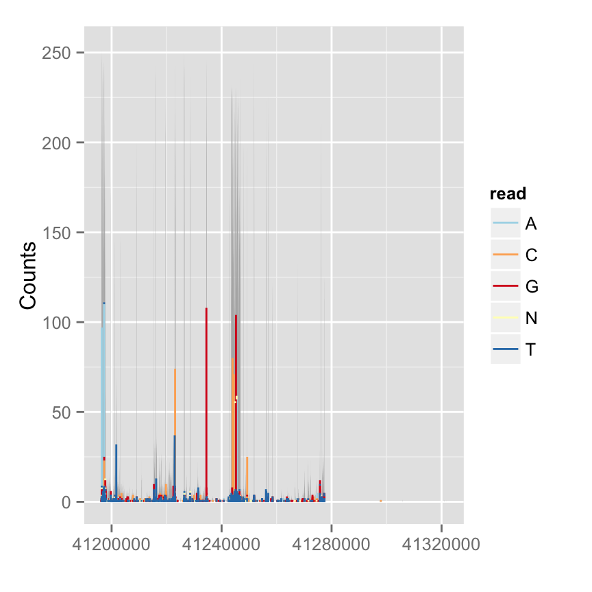
Coverage distribution
For a whole-file overview rather than a single window, method = "estimate" draws the estimated coverage distribution — the read depth across the genome. which also accepts plain chromosome names, and the hidden ..coverage.. value lets you transform depth inside aes() (a log scale here keeps deep peaks from flattening everything else):
# overall estimated coverage
autoplot(fl.bam, method = "estimate")

# selected chromosomes, log-transformed depth
autoplot(fl.bam, method = "estimate",
         which = paste0("chr", 17:18),
         aes(y = log(..coverage..)))

Draw a variant track from a VCF file
A VCF (Variant Call Format) file lists genomic variants — SNPs (single-nucleotide polymorphisms) and short indels. Read it with VariantAnnotation::readVcf(), coerce to a VRanges (a variant-aware GRanges), and rename its chromosome to match the chr17 convention. This track is also semantic-zoom aware — zoomed out it is a density-like summary; zoomed in each variant becomes a labelled mark:
library(VariantAnnotation)
fl.vcf <- system.file("extdata", "17-1409-CEU-brca1.vcf.bgz", package = "biovizBase")
vcf <- readVcf(fl.vcf, "hg19")
vr  <- as(vcf[, 1:3], "VRanges")
vr  <- renameSeqlevels(vr, c("17" = "chr17"))

gr17 <- GRanges("chr17", IRanges(41234400, 41234530))  # a small dense region
p.vr <- autoplot(vr, which = wh)

p.vr                       # zoomed out
p.vr + xlim(gr17)          # rectangles in a narrow window
p.vr + xlim(gr17) + zoom() # zoomed in: labelled variants

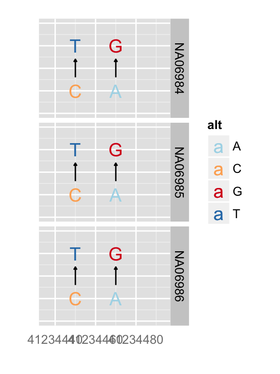
You can override the geometry directly rather than relying on the zoom threshold:
autoplot(vr, which = wh, geom = "rect", arrow = FALSE)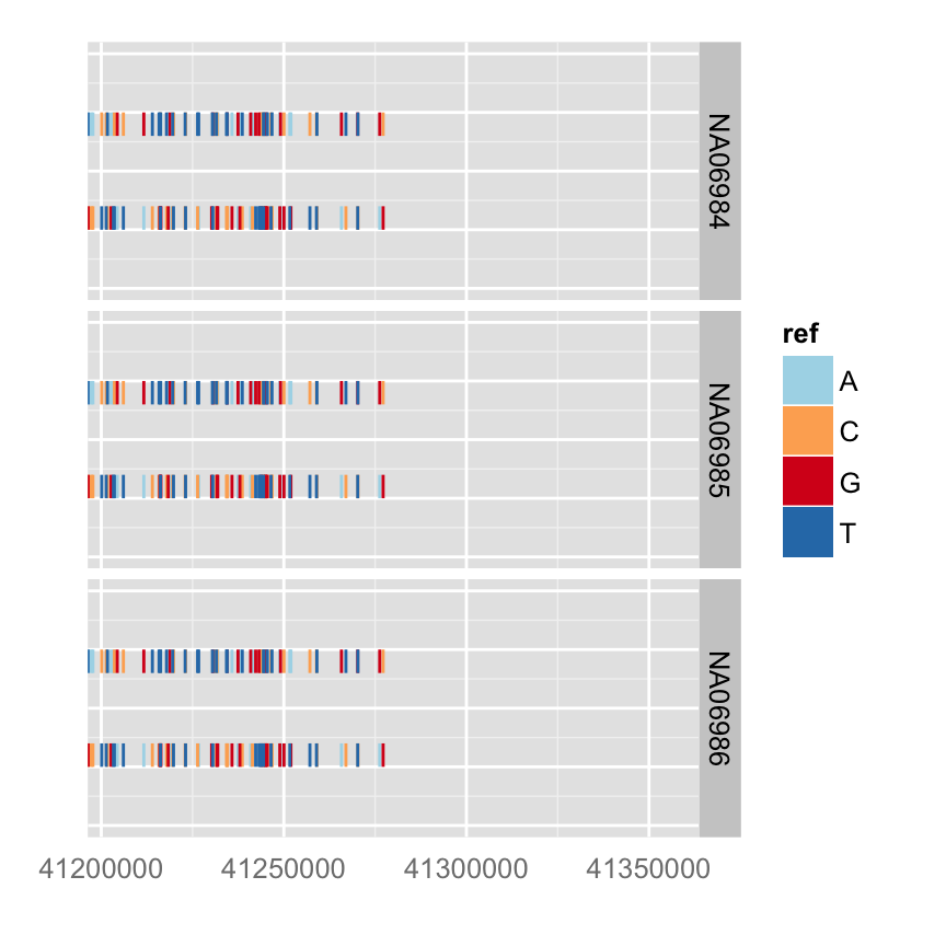
Stack tracks with tracks()
The payoff of one grammar for every data type: tracks() stacks the panels you built above into one aligned figure sharing a genomic x-axis. Give each panel a name and a relative height, add an xlim() to focus the view, and apply a track theme:
gr17 <- GRanges("chr17", IRanges(41234415, 41234569))
tks <- tracks(
  p.ideo, mismatch = p.mis, dbSNP = p.vr, ref = p.bg, gene = p.txdb,
  heights = c(2, 3, 3, 1, 4)
) + xlim(gr17) + theme_tracks_sunset()
tks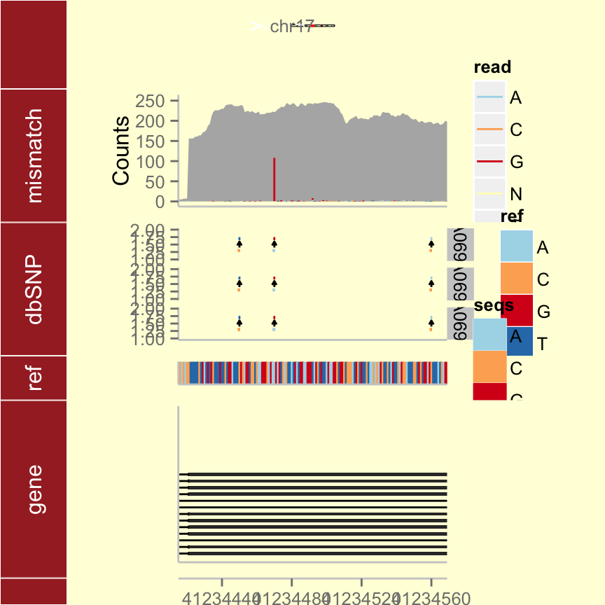
Draw a circular (Circos-style) overview
A circular plot (the Circos style) lays the whole genome out as a ring, good for showing genome-wide events — structural variants, somatic mutations — at a glance. Two rules matter: the seqlengths, seqlevels, and chromosome names must match across every layer, and you must start from ggbio’s own ggbio() constructor (not ggplot()) so the circle() layers know they are polar.
Load the sample data — pre-built GRanges objects from biovizBase:
data("CRC", package = "biovizBase")
head(hg19sub)   # a trimmed hg19 chromosome set
circle() adds one ring per call, from the inside out. Start with an ideogram ring, a scale ring, and a chromosome-label ring:
p <- ggbio() +
  circle(hg19sub, geom = "ideo", fill = "gray70") +                       # ideogram ring
  circle(hg19sub, geom = "scale", size = 2) +                             # scale ring
  circle(hg19sub, geom = "text", aes(label = seqnames), vjust = 0, size = 3)  # chromosome labels
p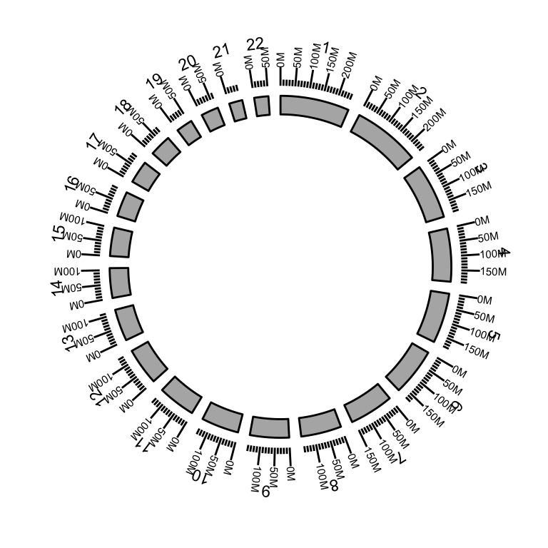
Add data as more rings. Here a rect ring draws somatic mutations (mut.gr) outside the ideogram:
head(mut.gr)   # somatic mutations as a GRanges
p <- ggbio() +
  circle(mut.gr, geom = "rect", color = "steelblue") +                    # mutation ring
  circle(hg19sub, geom = "ideo", fill = "gray70") +
  circle(hg19sub, geom = "scale", size = 2) +
  circle(hg19sub, geom = "text", aes(label = seqnames), vjust = 0, size = 3)
p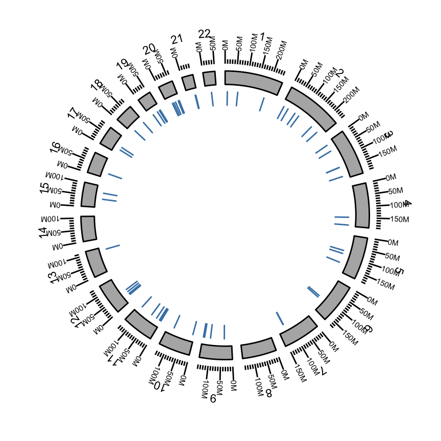
Common issues
Homo.sapiens (or another annotation package) fails to install or load. These OrganismDb meta-packages are lightly maintained and often lag the current Bioconductor release. Drop to the TxDb route (TxDb.Hsapiens.UCSC.hg19.knownGene) for a more robust dependency, or plot gene models with Gviz instead. If you only need the annotation for a specific region, parsing a GTF into a GRangesList and plotting that also sidesteps the meta-package entirely.
The circular plot errors or comes out blank. Two usual causes: you started from ggplot() instead of ggbio’s ggplot()-like ggbio() constructor, or the seqlengths / seqlevels / chromosome names differ between the ideogram layer and the data layer. Trim every layer to the same chromosome set (as hg19sub does) and confirm the names match before adding rings.
Nothing shows for a BAM or VCF region. The window and the file must use the same chromosome naming — 17 versus chr17 will silently return no features. Use renameSeqlevels() / keepSeqlevels() to align them, as in the alignment and variant sections above.
Frequently asked questions
ggbio is a Bioconductor package that draws genomic data with the ggplot2 grammar of graphics. A single autoplot() method renders ideograms, gene models, reference sequence, BAM alignments and coverage, and VCF variants as ggplot tracks you can layer and combine — and tracks() stacks them into one aligned figure.
Both draw genome-browser-style tracks in R. ggbio extends ggplot2, so tracks are ggplot objects you build with + layers; Gviz has its own track classes and plotTracks() API. Gviz is more actively maintained, so for production track figures it is the safer default; ggbio is appealing when you already think in ggplot2 and want circular (Circos-style) overviews.
Call autoplot() on an annotation object over a window: autoplot(Homo.sapiens, which = wh) for an OrganismDb (with gene-symbol labels), or autoplot(txdb, which = wh) for a TxDb (transcript-ID labels). wh is a GRanges giving the region — build it from genesymbol[c("BRCA1", "NBR1")] and range().
Start from ggbio’s ggbio() constructor and add one circle() layer per ring, from the inside out — e.g. circle(gr, geom = "ideo") for the ideogram, circle(gr, geom = "scale"), circle(gr, geom = "text") for labels, and circle(data, geom = "rect") for a data ring. Every layer must share the same chromosome names and seqlengths.
ggbio and the OrganismDb meta-packages (like Homo.sapiens) are lightly maintained and can fail to install or load on a recent Bioconductor release. The figures on this page are real outputs on hg19; treat it as an illustrated reference. For a maintained alternative, use Gviz, ggcoverage, or plotgardener.
Test your understanding
You have a gene-model panel p.txdb and a mismatch panel p.mis for the BRCA1 region (built in the sections above). Stack them into a single figure with the gene model on the bottom and twice the height of the mismatch panel, focused on the window GRanges("chr17", IRanges(41234415, 41234569)).
tracks() takes named panels top-to-bottom and a heights vector of relative sizes; add an xlim() with a single-row GRanges to focus the view.
gr17 <- GRanges("chr17", IRanges(41234415, 41234569))
tracks(
  mismatch = p.mis,
  gene     = p.txdb,
  heights  = c(1, 2)          # gene model twice as tall
) + xlim(gr17)
Panels are drawn in the order you list them (top to bottom), so mismatch first puts the gene model on the bottom; heights = c(1, 2) makes the gene panel twice the mismatch panel; xlim(gr17) restricts both to the window.
A. TxDb B. OrganismDb (e.g. Homo.sapiens) C. BSgenome
B — OrganismDb. An OrganismDb such as Homo.sapiens ties annotation resources together, so autoplot() can label transcripts by gene symbol. A TxDb (A) has no symbol information and falls back to transcript IDs; a BSgenome (C) holds reference sequence, not gene models.
Conclusion
ggbio applies one idea — the ggplot2 grammar — to every kind of genomic data. Ideogram() draws a chromosome, autoplot() draws gene models from an OrganismDb/TxDb, reference sequence from a BSgenome, alignments and coverage from BAM, and variants from VCF; tracks() stacks those panels on a shared genomic axis; and circle() builds circular whole-genome overviews. Because each track is a ggplot object, you zoom, navigate, recolour, and combine with familiar + layers. The one caveat is maintenance: ggbio and its OrganismDb annotation packages are legacy, so for track figures you rely on day to day, reach for Gviz — the concepts transfer directly.
Reuse
Citation
@online{2026,
  author = {},
  title = {Visualizing {Genomic} {Data} with Ggbio: Ggplot2 for the
    {Genome}},
  date = {2026-07-08},
  url = {https://www.datanovia.com/learn/bioinformatics/genomics/ggbio-visualize-genomic-data},
  langid = {en}
}