PCA and Sample Clustering for RNA-Seq in R (DESeq2)
Check your samples before differential expression — variance-stabilize, run PCA, and cluster samples to spot grouping, outliers, and batch effects
Bioinformatics
A practical guide to exploratory quality control for bulk RNA-seq in R with DESeq2. Before testing for differential expression, check that your samples make sense: apply a variance-stabilizing transformation (VST), draw a PCA plot to see whether samples separate by condition (and to catch outliers or batch effects), and a sample-to-sample distance heatmap to see how they cluster. Read the percent-variance axes in plain language. On the airway dataset.
Published
June 29, 2026
Modified
July 7, 2026
TipKey takeaways
Look at your samples before you test them. A quick PCA + clustering check catches mislabelled samples, outliers, and batch effects before they wreck your differential expression.
Variance-stabilize first. Raw counts have variance that grows with the mean, so a few loud genes would dominate. DESeq2’s VST (vst()) puts all genes on a comparable scale for the visual steps.
PCA projects the samples onto the directions of greatest variation. If your biological groups separate along PC1 or PC2, the signal is strong; if a batch separates them instead, you have a problem to model.
A sample-to-sample distance heatmap is the complementary view: it clusters samples so you can see which group together and spot any that sit alone.
These are QC steps, not the test — they run on transformed counts; the differential expression test runs on the raw counts (DESeq2 lesson).
Introduction
Before asking which genes changed, ask a simpler question: do my samples make sense? Sequencing experiments are full of avoidable disasters — a swapped label, a failed library, a batch processed on a different day. A two-minute exploratory check catches them before they corrupt every downstream result.
The check has two standard views, both built on a variance-stabilized version of the counts: a PCA plot (do samples separate by condition?) and a sample-to-sample distance heatmap (how do they cluster?). This guide runs both in R with DESeq2 on the airway dataset — airway smooth-muscle cells from four donors, each treated and untreated with dexamethasone.
Start from the count data
We build the DESeq2 object from the raw counts — the same starting point as the DESeq2 lesson.
Raw counts are a poor input for PCA and clustering: their variance grows with the mean, so a handful of highly expressed genes would dominate purely because they are big. The variance-stabilizing transformation (vst) fixes this — it puts low- and high-count genes on a comparable scale, like a smarter log2.
vsd <-vst(dds, blind =TRUE) # blind = TRUE: ignore the design, a pure QC viewhead(assay(vsd))[, 1:4]
We set blind = TRUE so the transformation does not use the experimental design — exactly what you want for an unbiased quality-control look. (For downstream modelling you would use blind = FALSE.) For very small studies, rlog() can be more robust; for typical and larger experiments, VST is faster and the standard choice.
PCA — do samples separate by condition?
Principal component analysis projects each sample onto the directions that capture the most variation. PC1 is the biggest source of variance, PC2 the next. If your biological grouping lines up with PC1 or PC2, the effect is strong relative to the noise.
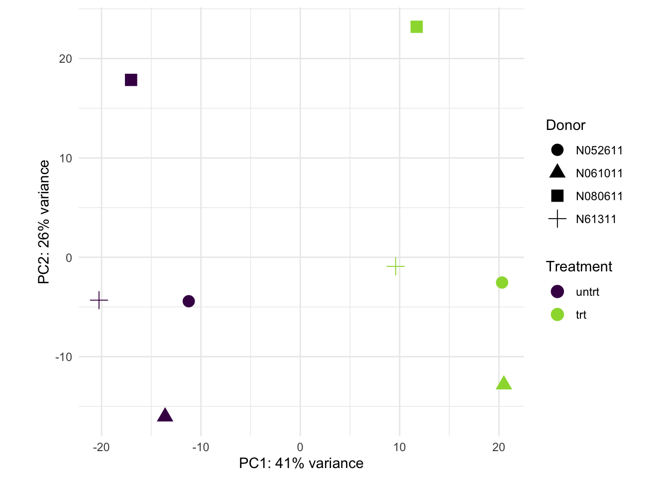
Read the plot. PC1 captures 41% of the variance and cleanly separates treated from untreated samples (left vs right) — the dexamethasone effect is the single biggest source of variation, a reassuring sign before testing. PC2 (26%) captures donor-to-donor variation (most visibly one donor high, another low), the person-to-person differences we control for with cell in the design. No sample sits off on its own, so there are no obvious outliers.
WarningIf a batch separates your samples on PC1
The danger sign is when PC1 lines up with a technical variable — sequencing day, lane, kit — instead of your biology. That means a batch effect is the dominant signal. The fix is to add the batch to your design (~ batch + condition) so DESeq2 accounts for it, not to ignore it. PCA is how you catch it.
Sample-to-sample distance heatmap
PCA summarizes the samples in two dimensions; a distance heatmap shows the full pairwise picture. Compute the distances between samples on the VST data and cluster them — samples from the same group should sit together.
The dendrogram tells a subtler story than PCA did. One donor (N080611) dominates: its treated and untreated samples cluster together and split off from the rest first; only among the remaining six does treatment then drive the split. Why the difference from PCA? The PCA used the 500 most variable genes — where the treatment effect stands out — while these distances use all genes, so a single strongly-different donor can dominate the overall picture. That the two views emphasize different structure is itself informative: it confirms the donor effect is real and large, which is exactly why the design controls for it with ~ cell + dex. Always read both — they answer slightly different questions.
Common issues
Samples don’t separate by condition. Either the effect is genuinely small (GSEA on the next step may still find coordinated shifts), or a stronger nuisance variable dominates. Colour the PCA by other variables (batch, RIN, donor) to find what PC1 is really tracking.
One sample sits far from the rest. A likely outlier — a failed library or a swap. Check its library size and QC metrics; consider dropping it, but never silently. Document the decision.
You ran PCA on raw or plain-log counts. Don’t. Without VST (or rlog), high-count genes dominate the variance and the plot reflects sequencing depth more than biology. Always transform first.
Frequently asked questions
NoteVST or rlog — which transformation should I use?
Both stabilize the variance for visualization. vst() is fast and the default for typical studies; rlog() is more robust on very small datasets (a handful of samples) but much slower on large ones. For QC plots either is fine — use VST unless you have very few samples.
NoteShould blind be TRUE or FALSE in vst()?
For quality control use blind = TRUE: the transformation ignores the design, giving an unbiased look at whether samples group as expected. For transformed values you will feed into downstream modelling, use blind = FALSE so the design-related variance is preserved.
NoteWhy not just run PCA on the raw counts?
Because count variance grows with the mean: a few highly expressed genes would dominate the principal components, and the plot would reflect sequencing depth more than biology. The VST puts all genes on a comparable scale first, so PCA sees real structure.
NoteWhat if PC1 separates by batch instead of condition?
That is a batch effect dominating your data. Don’t ignore it — add the batch variable to the DESeq2 design (~ batch + condition) so the test accounts for it. PCA is exactly the tool that reveals the problem before you test.
Test your understanding
ImportantYour turn: which variable drives PC2?
The PCA above colours by treatment. Re-plot it colouring by donor (cell) instead, and decide which principal component the donor effect lines up with. Is it PC1 or PC2?
TipHint
Reuse pcaData; just change the color = aesthetic to cell. Look at which axis spreads the donors apart.
The donors spread along PC2, not PC1 — treatment is the dominant axis (PC1, 41%), donor the secondary one (PC2, 26%). That is exactly why the design is ~ cell + dex: it removes the donor variance so the test can see the treatment effect cleanly.
NoteQuick check: why transform counts before PCA?
A. To make the test more significant. B. Because raw-count variance grows with the mean, so big genes would dominate the components. C. PCA cannot handle integers.
TipShow answer
B. Count variance scales with expression level, so without a variance-stabilizing transform a few highly expressed genes drive the principal components and the plot tracks sequencing depth, not biology.
Conclusion
You ran the standard exploratory check for bulk RNA-seq: variance-stabilize the counts (vst), then look at the samples two ways — a PCA plot (here PC1 captured 41% of the variance and cleanly split treated from untreated, with donor variation on PC2) and a sample-distance heatmap (which, using all genes, was dominated by one donor — a reminder that the two views can emphasize different structure). The practical rule: always do this before differential expression — it is the cheapest way to catch a swapped label, an outlier, or a batch effect, and it tells you whether your effect is strong enough to trust. With the samples checked, you are ready to test for differential expression.
This lesson is reproducible: every figure was produced by the code shown — copy any block and run it to reproduce them. The runtime is the judge.
References
Love, M. I., Huber, W., & Anders, S. (2014). Moderated estimation of fold change and dispersion for RNA-seq data with DESeq2. Genome Biology, 15(12), 550.
Love, M. I., Anders, S., & Huber, W. Analyzing RNA-seq data with DESeq2 — the Bioconductor vignette (data transformations & quality assessment).
Himes, B. E., et al. (2014). RNA-Seq transcriptome profiling identifies CRISPLD2 as a glucocorticoid responsive gene in airway smooth muscle cells (the airway dataset). PLoS ONE, 9(6), e99625.
@online{2026,
  author = {},
  title = {PCA and {Sample} {Clustering} for {RNA-Seq} in {R}
    {(DESeq2)}},
  date = {2026-06-29},
  url = {https://www.datanovia.com/learn/bioinformatics/bulk-rna-seq/pca-and-sample-clustering},
  langid = {en}
}