The Kaplan-Meier Figure in R: Build the Clinical Survival Curve from ADTTE
Build the publication-grade Kaplan-Meier figure a Clinical Study Report ships — survival curves by treatment arm with censoring ticks, a number-at-risk table, median survival, and the log-rank p-value — in R from a CDISC ADTTE with survminer
Pharma & Clinical
A complete, runnable tutorial for the clinical Kaplan-Meier figure — the survival curve that goes in a Clinical Study Report. Learn what the figure must show (curves by treatment arm, censoring ticks, a number-at-risk table, median survival, and the log-rank p with the hazard ratio), then build it from a CDISC ADTTE time-to-event dataset on public pharmaverse data with survminer’s ggsurvplot(risk.table, conf.int, pval, surv.median.line) — the one call that assembles the whole panel. Includes the CNSR-to-event mapping (Surv(AVAL, 1 - CNSR)), how to read the medians and the log-rank test, and the common traps (CNSR direction, the time-unit axis, risk-table alignment).
TipKey takeaways
- The Kaplan-Meier (KM) figure is the headline efficacy figure of many Clinical Study Reports (CSRs) — the survival curve by treatment arm for overall survival (OS) or progression-free survival (PFS). It lives in CSR section 14 and is often the single most scrutinized output in the submission.
- A submission-grade KM figure shows six things: the step curves per arm, censoring ticks, a number-at-risk table under the x-axis, the median survival per arm, the log-rank p-value, and — paired with the time-to-event model — the hazard ratio (HR).
- It reads a CDISC (Clinical Data Interchange Standards Consortium) ADTTE. The time-to-event ADaM (Analysis Data Model) dataset gives you
AVAL(the time) andCNSR(the censor flag). The CDISC convention isCNSR = 0= event, a positive integer = censored, so every survival call flips it:Surv(AVAL, 1 - CNSR). - One call builds the whole panel. survminer’s
ggsurvplot()assembles every element the convention asks for — curves + confidence bands + risk table + log-rank p-value + median lines + censoring ticks — from thesurvfitobject in a single function call, which is why it is the most widely used survival-plot function in R. - The figure pairs with a model. The curve and the log-rank p describe and compare; the HR with its confidence interval (CI) comes from the Cox model fit on the same ADTTE — report both.
Introduction
In an oncology trial, one figure carries the result: the Kaplan-Meier survival curve. It is the first thing a reviewer turns to, the figure that appears in the press release, and the picture behind every “median overall survival of 18.7 months, hazard ratio 0.74”. Building it correctly — from a conformant CDISC (Clinical Data Interchange Standards Consortium) dataset, with the censoring marks, the number-at-risk table, and the statistics a regulator expects on the panel — is a core skill of clinical reporting.
This lesson builds that figure in R from an ADTTE (the time-to-event ADaM analysis dataset) with survminer — whose ggsurvplot() is the engine behind thousands of published survival figures and assembles the entire submission panel in one call. We work on public pharmaverse data so every line runs as written.
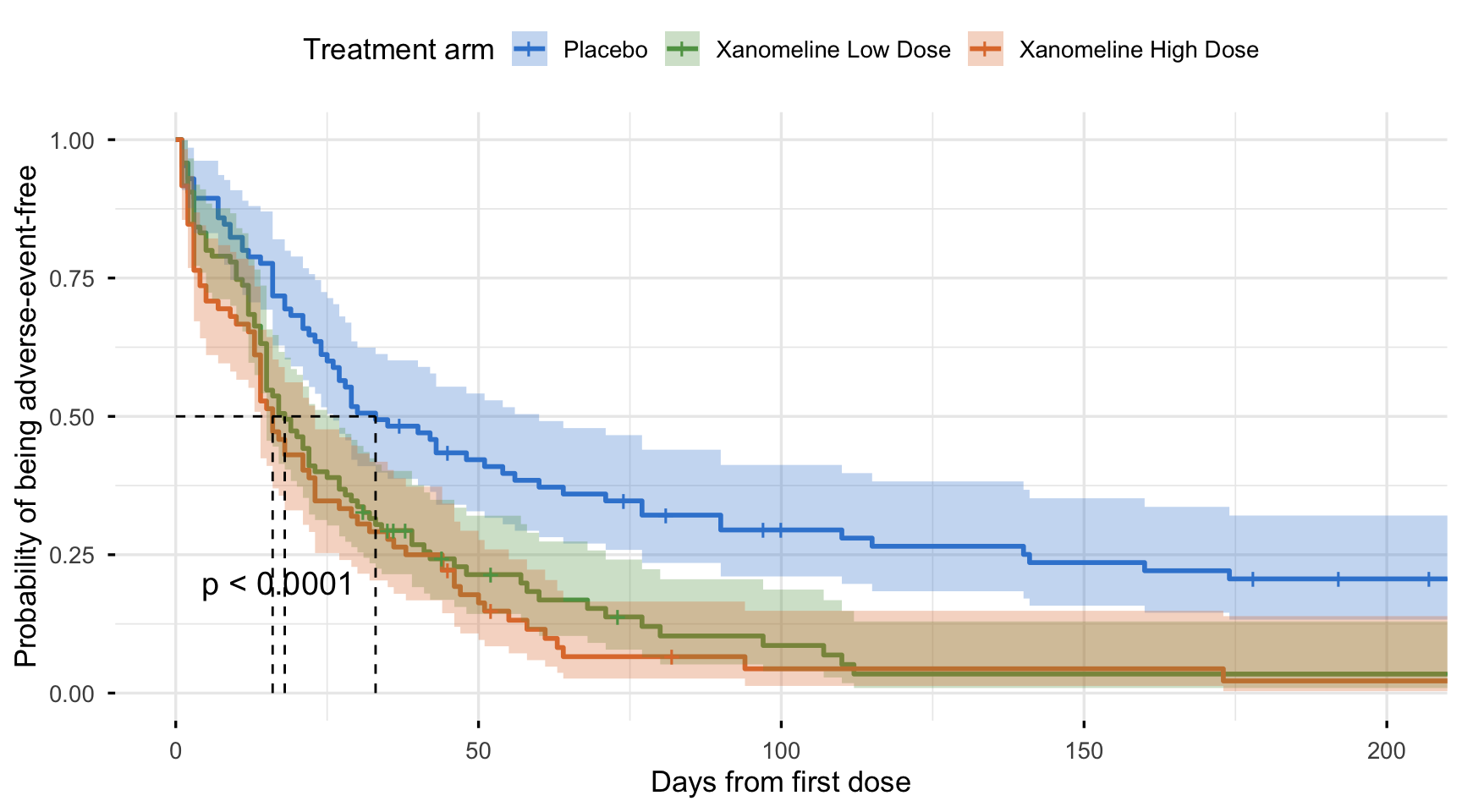
Here is the figure we are building — survival curves by treatment arm with confidence bands, the median guides, censoring ticks, and the log-rank p-value on the panel (the full version adds the number-at-risk table below):
By the end you will produce that exact figure and know how to read every element on it. If the words “ADTTE”, “ADaM”, or “CNSR” are new, build the dataset first in Build the time-to-event ADaM dataset (ADTTE); for the survival method behind the curve — the estimator, the log-rank mechanics, the Cox model — the biostatistics pillar’s Kaplan-Meier estimation goes all the way down.
What the figure must show
A KM figure is not just a plot of two curves. A regulator reads it as a self-contained summary of a time-to-event endpoint, so the ICH E3 guideline on Clinical Study Reports (which defines the efficacy section the figure sits in) and decades of convention fix its anatomy. Every submission KM figure carries the same six elements:
| Element | What it is | Why a reviewer needs it |
|---|---|---|
| Step curves by arm | One survival curve per treatment arm | The headline comparison: which arm does better, and by how much |
| Censoring ticks | A small mark where a subject is censored | Shows follow-up, not events — distinguishes “still event-free” from “had the event” |
| Number-at-risk table | The count still at risk under each time | Tells you how much data backs the tail (curves get unreliable as it thins) |
| Median survival | The time where each curve crosses 0.5 | The most-reported single summary of a survival curve |
| Log-rank p-value | The test of “do the curves differ?” | The formal evidence the arms’ survival is not the same |
| Hazard ratio (HR) + CI | The effect size from the Cox model | A magnitude, not just a yes/no — the number that drives the conclusion |
The first five live on the figure; the HR comes from the time-to-event model fit on the same dataset and is usually printed alongside. We build all six below.
The data: a CDISC ADTTE
The figure reads an ADTTE — the analysis-ready time-to-event dataset in the CDISC ADaM (Analysis Data Model) standard. It follows the Basic Data Structure (BDS), one row per subject per parameter, and carries the two columns a survival curve needs: AVAL (the analysis value — the time to the event) and CNSR (the censor flag). We derive it here in a few admiral calls; the full, annotated derivation is the ADTTE lesson — this lesson reuses it and focuses on the figure.
The public CDISC pilot shipped in pharmaverseadam is a low-mortality safety study, so its overall-survival curve is nearly flat — fine for teaching a derivation, useless as a figure. To get an interpretable, well-separated curve we use its time-to-first-adverse-event endpoint, which has the events a real figure needs. The figure code is identical for OS or PFS; only the PARAMCD (the parameter code naming the endpoint) changes.
library(admiral)
library(dplyr, warn.conflicts = FALSE)
library(pharmaversesdtm)
library(pharmaverseadam)
library(lubridate)

adsl <- pharmaverseadam::adsl
ae   <- pharmaversesdtm::ae %>% convert_blanks_to_na()

# Treatment-emergent AEs: bring treatment dates, impute the onset date, flag emergence
adae <- ae %>%
  derive_vars_merged(dataset_add = adsl, new_vars = exprs(TRTSDT, TRTEDT),
                     by_vars = exprs(STUDYID, USUBJID)) %>%
  derive_vars_dt(new_vars_prefix = "AST", dtc = AESTDTC, highest_imputation = "M") %>%
  mutate(TRTEMFL = if_else(ASTDT >= TRTSDT & ASTDT <= TRTEDT + days(30), "Y", NA_character_))

# Event = first AE; censor = end of treatment + 30 days for subjects with none
ttae <- event_source(dataset_name = "ae", date = ASTDT, order = exprs(AESEQ),
  set_values_to = exprs(EVNTDESC = "ADVERSE EVENT", SRCDOM = "ADAE", SRCVAR = "ASTDT"))
eot <- censor_source(dataset_name = "adsl", date = TRTEDT + days(30),
  set_values_to = exprs(EVNTDESC = "END OF TREATMENT", SRCDOM = "ADSL", SRCVAR = "TRTEDT"))

adtte <- derive_param_tte(
  dataset_adsl = adsl, start_date = TRTSDT,
  event_conditions = list(ttae), censor_conditions = list(eot),
  source_datasets = list(adsl = adsl, ae = filter(adae, TRTEMFL == "Y")),
  set_values_to = exprs(PARAMCD = "TTAE", PARAM = "Time to First Adverse Event")) %>%
  derive_vars_duration(new_var = AVAL, start_date = STARTDT, end_date = ADT, out_unit = "days") %>%
  derive_vars_merged(dataset_add = adsl, new_vars = exprs(TRT01A),
                     by_vars = exprs(STUDYID, USUBJID)) %>%
  filter(TRT01A != "Screen Failure") %>%
  # fix the arm order so the figure reads placebo first, then ascending dose
  mutate(TRT01A = factor(TRT01A,
    levels = c("Placebo", "Xanomeline Low Dose", "Xanomeline High Dose")))

adtte %>%
  select(USUBJID, PARAMCD, AVAL, CNSR, TRT01A) %>%
  head(5)
# A tibble: 5 × 5
USUBJID PARAMCD AVAL CNSR TRT01A
<chr> <chr> <dbl> <int> <fct>
1 01-701-1015 TTAE 2 0 Placebo
2 01-701-1023 TTAE 3 0 Placebo
3 01-701-1028 TTAE 3 0 Xanomeline High Dose
4 01-701-1033 TTAE 44 1 Xanomeline Low Dose
5 01-701-1034 TTAE 58 0 Xanomeline High DoseThat is a conformant ADTTE: one row per subject, AVAL holding the days to the event, CNSR flagging event-versus-censor, and the treatment arm attached for the split. Read the censor flag before plotting:
adtte %>%
  count(CNSR) %>%
  mutate(meaning = if_else(CNSR == 0, "Event (had an AE)", "Censored (no AE)"))
# A tibble: 2 × 3
CNSR n meaning
<int> <int> <chr>
1 0 217 Event (had an AE)
2 1 35 Censored (no AE) This is the convention that trips up every newcomer. In CDISC ADTTE, CNSR = 0 means the event happened and a positive integer means censored — the opposite of the survival package, which expects 1 = event. CDISC strongly recommends this CNSR = 0 for events convention, and admiral enforces it. So every survival call below uses Surv(AVAL, 1 - CNSR), which flips CNSR back to the status the survival package wants. Get this one expression wrong and your curve turns upside down.
Estimate the curves: survfit()
The figure is a picture of a survfit object. Build it with the standard formula — the Surv() response on the left, the grouping variable on the right — on the survival package:
library(survival)

fit <- survfit(Surv(AVAL, 1 - CNSR) ~ TRT01A, data = adtte)
fit
Call: survfit(formula = Surv(AVAL, 1 - CNSR) ~ TRT01A, data = adtte)
n events median 0.95LCL 0.95UCL
TRT01A=Placebo 85 65 33 26 60
TRT01A=Xanomeline Low Dose 95 84 18 15 27
TRT01A=Xanomeline High Dose 72 68 16 14 23The printout already gives the headline numbers. Per arm it reports n, the number of events, and the median survival with its 95% confidence interval: median time to first adverse event is 33 days on placebo (95% CI 26–60), versus 18 days on Xanomeline Low Dose (95% CI 15–27) and 16 days on Xanomeline High Dose (95% CI 14–23). Placebo subjects stay adverse-event-free roughly twice as long. Those are the medians the dashed lines on the figure will mark.
Build it the survminer way: ggsurvplot()
survminer’s ggsurvplot() builds the entire panel in one call. You hand it the fit and the data, then switch on each element the convention asks for:
conf.int = TRUE— shaded 95% confidence bands;risk.table = TRUE— the number-at-risk table beneath the plot;pval = TRUE— the log-rank p-value on the panel;surv.median.line = "hv"— dashed median-survival guides;censor = TRUE(the default) — the censoring ticks;palette = "jco"— a colourblind-safe journal palette.
library(survival)
library(survminer)

fit <- survfit(Surv(AVAL, 1 - CNSR) ~ TRT01A, data = adtte)

ggsurvplot(
  fit,
  data = adtte,
  risk.table = TRUE,                 # number at risk under the plot
  conf.int = TRUE,                   # 95% confidence bands
  pval = TRUE,                       # log-rank p-value on the panel
  surv.median.line = "hv",           # dashed median-survival guides
  censor = TRUE,                     # censoring ticks (the default)
  palette = "jco",                   # colourblind-safe journal palette
  legend.labs = c("Placebo", "Xanomeline Low Dose", "Xanomeline High Dose"),
  legend.title = "Treatment arm",
  xlab = "Days from first dose",
  ylab = "Probability of being adverse-event-free",
  risk.table.height = 0.28,
  ggtheme = theme_minimal()
)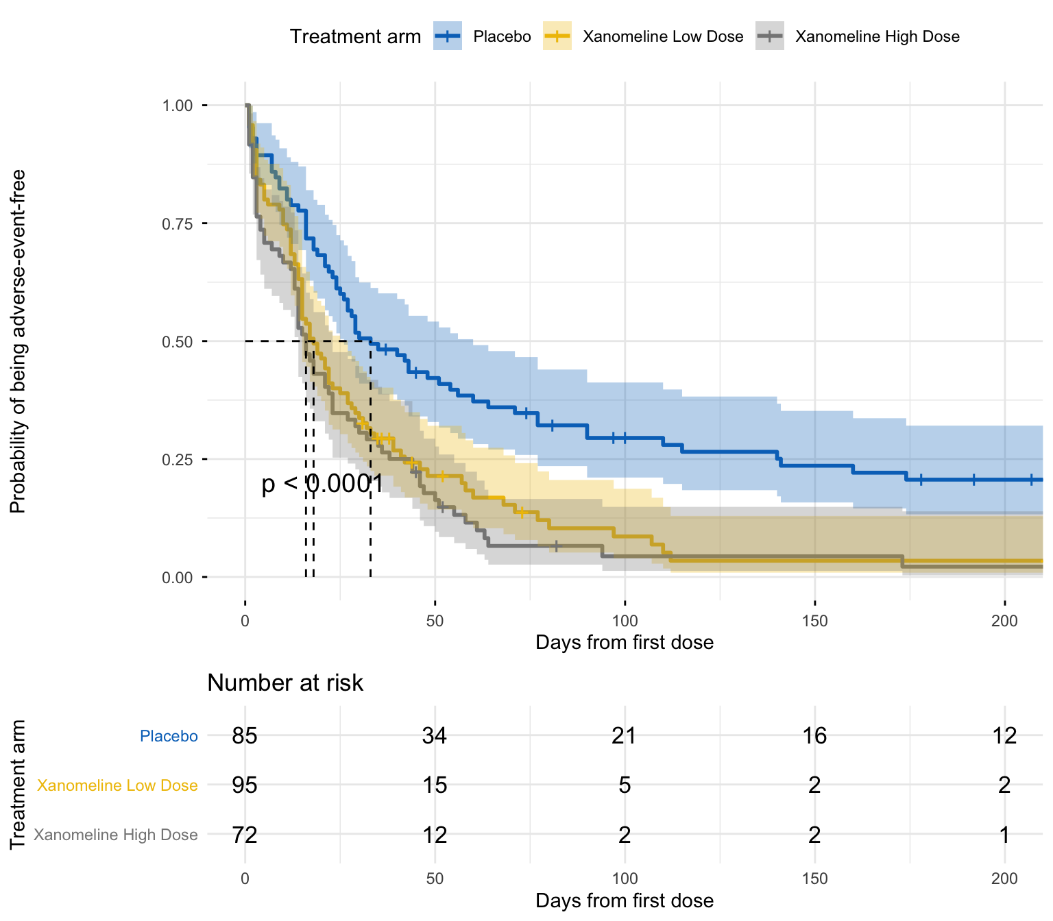
That is a submission-shaped figure from one function. The curves separate cleanly, the placebo arm sits highest, the dashed lines drop to each arm’s median, the log-rank p is on the panel, and the risk table shows the counts thinning as time goes on. ggsurvplot() is the fastest route to a complete, polished KM figure, which is why it is the most widely used survival-plot function in R.
Customizing the figure
ggsurvplot() gives you the finished panel in one call, but it does not lock you out of ggplot. The object it returns is a list of ggplots — $plot is the curve and $table is the number-at-risk strip — so you can keep theming after the fact:
- Reach through to any ggplot layer.
p <- ggsurvplot(fit, data = adtte, ...), thenp$plot + labs(title = "Overall survival")or+ theme(legend.position = "bottom")— the curve is a normal ggplot, so any scale, annotation, or theme composes on. ggpar()restyles the whole panel (fonts, axis text, legend) without reaching into the list.- Tune the anatomy through arguments:
surv.median.line = "hv"for the median guides,break.time.by =for the axis ticks (the risk table inherits them),risk.table.height =for the table’s share of the panel, andtables.theme = theme_cleantable()for a minimal risk-table style.
Everything the convention asks for is a ggsurvplot() argument; everything beyond it is a ggplot layer away.
Read the figure: medians, separation, p-value, and the hazard ratio
A KM figure is read in four moves.
The medians are the dashed lines: 33 days on placebo against 16–18 days on the active arms. Half the placebo subjects are still adverse-event-free at 33 days, versus half the Xanomeline subjects at little more than two weeks.
The separation is the visual story — the placebo curve sits above both active curves at every time point, all the way out. Consistent separation in one direction is what makes the comparison trustworthy (curves that cross would break it).
The log-rank p-value formalizes that gap. Compute it directly:
library(survival)

survdiff(Surv(AVAL, 1 - CNSR) ~ TRT01A, data = adtte)
Call:
survdiff(formula = Surv(AVAL, 1 - CNSR) ~ TRT01A, data = adtte)
N Observed Expected (O-E)^2/E (O-E)^2/V
TRT01A=Placebo 85 65 98.1 11.15 22.3
TRT01A=Xanomeline Low Dose 95 84 70.1 2.76 4.3
TRT01A=Xanomeline High Dose 72 68 48.8 7.51 10.2
Chisq= 23.4 on 2 degrees of freedom, p= 8e-06 The log-rank statistic is χ² = 23.4 on 2 degrees of freedom, p ≈ 8 × 10⁻⁶ — far below 0.001. The three curves are not the same; the difference is highly unlikely under the null of identical survival.
The hazard ratio turns “they differ” into “by how much.” The log-rank test gives no effect size, so fit the Cox proportional-hazards model on the same ADTTE — the model the time-to-event analysis pairs with the figure:
library(survival)

cox <- coxph(Surv(AVAL, 1 - CNSR) ~ TRT01A, data = adtte)
summary(cox)$conf.int
exp(coef) exp(-coef) lower .95 upper .95
TRT01AXanomeline Low Dose 1.899640 0.5264155 1.362864 2.647831
TRT01AXanomeline High Dose 2.222727 0.4498977 1.568091 3.150657Relative to placebo (the reference), the hazard of a first adverse event is HR 1.90 (95% CI 1.36–2.65) on Low Dose and HR 2.22 (95% CI 1.57–3.15) on High Dose. Plainly: subjects on Xanomeline reach their first AE roughly twice as fast as placebo subjects, and both CIs exclude 1, so the effect is significant. The HR is the number that belongs beside the figure in the report.
Note
This worked example is a safety read-out (time to first AE), so “better” means higher — the placebo arm stays event-free longest. For an efficacy endpoint (OS, PFS) the identical code produces the figure, but you expect the active arm to sit higher and a protective HR below 1. The mechanics never change; only the clinical direction does.
Report
Time to first treatment-emergent adverse event differed significantly across the three arms (log-rank χ²(2) = 23.4, p < 0.001). Median time to first adverse event was 33 days (95% CI 26–60) on placebo, 18 days (95% CI 15–27) on Xanomeline Low Dose, and 16 days (95% CI 14–23) on Xanomeline High Dose. Relative to placebo, the hazard of a first adverse event was higher on both active arms (Low Dose HR 1.90, 95% CI 1.36–2.65; High Dose HR 2.22, 95% CI 1.57–3.15).
That paragraph — estimate, interval, test, effect size — is what accompanies the figure in the CSR.
NoteThe log-rank test vs the Cox model (optional)
Both compare survival across arms, and they answer different questions. The log-rank test (survdiff()) is a non-parametric test of the null “the survival curves are identical” — it returns a χ² statistic and a p-value, but no effect size and no way to adjust for covariates. The Cox proportional-hazards model (coxph()) estimates a hazard ratio per arm — a magnitude with a confidence interval — and can adjust for age, sex, stratification factors, and more in the same fit. In a CSR you typically report both: the log-rank p as the primary test of difference, and the Cox HR (often stratified, per the statistical analysis plan) as the effect size. They agree here — a tiny log-rank p and HRs well above 1 both say the arms differ. The log-rank test and Cox proportional hazards lessons cover each in depth.
🟢 With an AI agent
Ask Prova “how do I add a stratified hazard-ratio annotation to my survminer Kaplan-Meier figure for an OS endpoint?” — it answers grounded in this pillar’s lessons, with runnable survminer code you can try on the example pharmaverse ADTTE. The runtime is the judge. Ask Prova →
Common issues
Your curve is upside-down (it climbs toward 1.0 instead of falling). You passed CNSR straight in as the event status. ADTTE uses CNSR = 0 = event, but survival wants 1 = event. Always use Surv(AVAL, 1 - CNSR). A rising curve is almost always this flipped convention.
The x-axis is in the wrong time unit. AVAL is whatever unit the ADTTE stored (here, days — check AVALU). If your study reports survival in months or years, the curve, the median lines, and the x-axis label must all use that unit. Convert AVAL once (AVAL / 30.4375 for months, AVAL / 365.25 for years) before survfit(), and set xlab to match — never relabel the axis without rescaling the data, or the medians on the figure will contradict the table.
The risk table doesn’t line up under the curve. The number-at-risk table must share the curve’s x-axis breaks and limits, or the counts sit under the wrong times. In ggsurvplot(), set the axis once with break.time.by = and xlim = and the table inherits them — never scale the curve and the table separately. Tune the table’s height with risk.table.height.
Frequently asked questions
NoteHow do I make a Kaplan-Meier plot for a clinical trial in R?
Fit the curves with survfit(Surv(AVAL, 1 - CNSR) ~ TRT01A, data = adtte) on your CDISC ADTTE, then draw the figure with survminer’s ggsurvplot() — switch on risk.table = TRUE, conf.int = TRUE, pval = TRUE, and surv.median.line = "hv" and the whole submission panel comes out of one call. It is worked through above on public pharmaverse data. The 1 - CNSR flips the CDISC censor convention to the event status survival expects.
NoteWhy is my survminer survival curve upside down?
Because you used CNSR directly as the status. In a CDISC ADTTE, CNSR = 0 is the event and a positive integer is censored — the reverse of the survival package, which treats 1 as the event. Use Surv(AVAL, 1 - CNSR) so events and censors are coded the way survfit() expects, and the curve falls correctly from 1.0.
NoteHow do I customize a survminer Kaplan-Meier plot with ggplot2?
ggsurvplot() returns a list of ggplots — $plot is the curve, $table is the number-at-risk strip — so you can keep theming after the call: p <- ggsurvplot(fit, data = adtte, ...), then p$plot + theme(legend.position = "bottom") or + labs(title = "Overall survival"). ggpar() restyles the whole panel in one step, and arguments like break.time.by, risk.table.height, and tables.theme = theme_cleantable() tune the anatomy without touching the list.
NoteHow do I add the number-at-risk table to a Kaplan-Meier plot?
In survminer, set risk.table = TRUE in ggsurvplot() and tune its size with risk.table.height. The table must share the curve’s x-axis breaks and limits so the counts align under the right times — set the axis once with break.time.by = (and xlim = if you clip it) and the table inherits it.
NoteShould I report the log-rank p-value or the hazard ratio on a KM figure?
Both. The log-rank p (from survdiff(), shown by pval = TRUE) tests whether the curves differ but gives no magnitude. The hazard ratio with its confidence interval (from the Cox model coxph() on the same ADTTE) is the effect size — how much faster or slower the event happens in one arm versus another. A Clinical Study Report typically shows the curve with the log-rank p on the panel and the HR alongside in the figure footnote or the accompanying table.
NoteCan I build the KM figure for overall survival instead of time to first adverse event?
Yes — the figure code is identical. Point survfit() at the OS rows of your ADTTE (PARAMCD == "OS") and rebuild; only the parameter changes. We use time to first adverse event here because the public CDISC pilot is a low-mortality study whose overall-survival curve is nearly flat — a poor teaching figure. For an efficacy endpoint you expect the active arm to sit higher and a protective hazard ratio below 1.
Test your understanding
ImportantYour turn: rebuild the figure in months with a cleaner axis
Using the adtte object built in this lesson, redraw the survminer Kaplan-Meier figure with the x-axis in months instead of days, with axis breaks every 2 months, and the y-axis as a percentage. Keep the risk table, the confidence bands, the log-rank p, and the median lines.
TipHint
Add a months column with mutate(AVAL_M = AVAL / 30.4375) and fit on Surv(AVAL_M, 1 - CNSR). In ggsurvplot(), set break.time.by = 2, relabel xlab = "Months from first dose", and pass surv.scale = "percent". Rescale the data, not just the axis label.
TipSolution
library(dplyr)
library(survival)
library(survminer)

adtte_m <- adtte %>% mutate(AVAL_M = AVAL / 30.4375)   # days -> months

fit_m <- survfit(Surv(AVAL_M, 1 - CNSR) ~ TRT01A, data = adtte_m)

ggsurvplot(
  fit_m, data = adtte_m,
  risk.table = TRUE, conf.int = TRUE, pval = TRUE,
  surv.median.line = "hv", palette = "jco",
  surv.scale = "percent",            # y-axis as a percentage
  break.time.by = 2,                 # an axis tick every 2 months
  legend.labs = c("Placebo", "Xanomeline Low Dose", "Xanomeline High Dose"),
  legend.title = "Treatment arm",
  xlab = "Months from first dose",
  ylab = "Adverse-event-free probability",
  ggtheme = theme_minimal()
)
The medians now read in months (about 1.1 vs 0.5–0.6), and the risk-table counts line up under each 2-month tick. The shape is unchanged — only the unit moved, because you rescaled AVAL, not just the label. That is the discipline the “wrong time unit” trap is about.
NoteQuick check: which
Surv() call draws a CDISC ADTTE Kaplan-Meier figure correctly?
A. Surv(AVAL, CNSR) B. Surv(AVAL, 1 - CNSR) C. Surv(CNSR, AVAL)
TipShow answer
B. A CDISC ADTTE codes CNSR = 0 for an event, but Surv() expects 1 = event, so you flip it with 1 - CNSR. A inverts every subject’s status (events become censors), which turns the curve upside down. C swaps the time and status arguments entirely. The whole figure depends on getting this one expression right.
Conclusion
The Kaplan-Meier figure is the headline of a time-to-event analysis, and building it for a Clinical Study Report is a fixed recipe: read the ADTTE, flip the censor convention with Surv(AVAL, 1 - CNSR), estimate the curves with survfit(), and draw the panel with everything a reviewer needs — curves by arm, censoring ticks, the number-at-risk table, the median lines, and the log-rank p. survminer’s ggsurvplot() builds that whole panel in one call, and because it returns plain ggplots you can theme it as far as any house style needs. Pair the figure with the hazard ratio from the Cox model on the same dataset, get the time unit and the risk-table alignment right, and your KM figure is submission-ready.
Note
This lesson is reproducible: every result on this page was produced by the code shown — copy any block and run it to reproduce them. The runtime is the judge.
Reuse
Citation
BibTeX citation:
@online{2026,
  author = {},
  title = {The {Kaplan-Meier} {Figure} in {R:} {Build} the {Clinical}
    {Survival} {Curve} from {ADTTE}},
  date = {2026-07-01},
  url = {https://www.datanovia.com/learn/pharma-clinical/04-tlf-generation/kaplan-meier-figure-survminer},
  langid = {en}
}
For attribution, please cite this work as:
“The Kaplan-Meier Figure in R: Build the Clinical Survival Curve
from ADTTE.” 2026. July 1. https://www.datanovia.com/learn/pharma-clinical/04-tlf-generation/kaplan-meier-figure-survminer.