Kaplan-Meier Survival Curve in R: Estimate and Plot, Step by Step
Estimate survival probabilities with survfit, read the median survival and 95% CI, and draw the signature survminer Kaplan-Meier plot — risk table, confidence bands, and the log-rank p-value on the lung-cancer data
Biostatistics
Learn Kaplan-Meier estimation in R with the survival and survminer packages. Build the Surv(time, status) object, estimate survival curves with survfit on the NCCTG lung-cancer data, read the median survival and its 95% confidence interval, interpret the survival probability at a given time, and draw the publication-ready ggsurvplot with a risk table, confidence bands, median lines, and the log-rank p-value.
Published
June 25, 2026
Modified
July 7, 2026
TipKey takeaways
Kaplan-Meier estimation is the standard non-parametric way to estimate and plot a survival curve — the probability of surviving past each time point — from data with censoring (patients still alive, or lost to follow-up, at the end of the study).
Estimate it with survfit(Surv(time, status) ~ group, data); the printout gives you the median survival and its 95% confidence interval per group.
On the lung-cancer data, median survival is 270 days for men and 426 days for women — a clear survival advantage for women that the log-rank test confirms (p = 0.001).
Draw the signature curve with survminer’s ggsurvplot(): survival steps + risk table + confidence bands + median lines + the log-rank p-value, all on one publication-ready panel (never a bare plot()).
KM describes and compares survival across categorical groups; to adjust for covariates or use a continuous predictor, move to the Cox model.
Introduction
Picture a lung-cancer study: you follow patients for months, some die during follow-up, and others are still alive when the study closes — you never see their event. You want a simple, honest answer to two questions: what fraction of patients survive past a given time, and does survival differ between groups (here, men vs women)?
You can’t just average survival times — that throws away every patient who is still alive (their true survival time is unknown, only that it is longer than what you observed). This is censoring, and it is the defining feature of survival data. The method that handles it is the Kaplan-Meier (KM) estimator (Kaplan & Meier, 1958): a non-parametric estimate of the survival probability\(S(t)\) — the probability of surviving beyond time \(t\) — built one event at a time.
Kaplan-Meier is the entry point to all of survival analysis. Use it to:
describe survival in a single group (the overall survival curve and the median survival time);
compare survival between 2+ categorical groups visually, with the log-rank test for the formal p-value;
This lesson estimates KM curves in R with survival (the engine) and survminer (publication-grade plots), on the classic NCCTG lung-cancer dataset, so you can reproduce the exact numbers and the figure.
The data: the NCCTG lung-cancer study
We use lung, the North Central Cancer Treatment Group dataset that ships with the survival package — survival in 228 patients with advanced lung cancer. Load the package and look at the first rows (the dataset auto-attaches with survival, so you reference lung directly — no data() call needed):
status — censoring status: 1 = censored (alive at last follow-up), 2 = dead (the event).
sex — 1 = male, 2 = female.
The Surv() object — the response
The response in survival analysis is not a single number but a time–event pair: how long the patient was observed, and whether the event (death) actually happened or the observation was censored. You build it with Surv(time, status). R reads status coded as 1 = censored / 2 = event automatically; a + after a time marks a censored patient (alive when last seen):
Read the first few: 306 and 455 are deaths; 1010+ is censored — that patient was alive at 1010 days, so we know only that their survival exceeds 1010 days. This Surv() object is the left-hand side of every survival formula.
Estimate the survival curves: survfit()
Use survfit() with the Surv(time, status) response on the left and the grouping variable on the right. Here we estimate survival by sex:
library(survival)fit <-survfit(Surv(time, status) ~ sex, data = lung)print(fit)
Call: survfit(formula = Surv(time, status) ~ sex, data = lung)

        n events median 0.95LCL 0.95UCL
sex=1 138    112    270     212     310
sex=2  90     53    426     348     550
Read the printout, line by line:
n — patients in each group: 138 men (sex=1), 90 women (sex=2).
events — deaths observed: 112 men, 53 women. The rest were censored.
median — the headline number: median survival is 270 days for men and 426 days for women. The median survival is the time at which the survival probability \(S(t)\) first drops to 0.5 (half the group has died) — the most reported summary of a survival curve.
0.95LCL / 0.95UCL — the 95% confidence interval for the median: 212–310 days for men, 348–550 days for women. The two intervals barely overlap, hinting at a real difference — which the log-rank test will confirm below.
Women survive markedly longer than men in these data.
Survival probability at a given time
A survival curve also answers “what fraction are still alive at time t?” Pass the times you care about to summary() — here, 180 and 360 days (roughly 6 and 12 months):
library(survival)fit <-survfit(Surv(time, status) ~ sex, data = lung)summary(fit, times =c(180, 360))
Call: survfit(formula = Surv(time, status) ~ sex, data = lung)

                sex=1
 time n.risk n.event survival std.err lower 95% CI upper 95% CI
  180     89      49    0.644  0.0408        0.569        0.730
  360     37      34    0.355  0.0437        0.279        0.452

                sex=2
 time n.risk n.event survival std.err lower 95% CI upper 95% CI
  180     71      14    0.842  0.0387        0.770        0.922
  360     33      20    0.560  0.0586        0.457        0.688
In plain language: at 360 days, the estimated survival probability is 0.36 (36%) for men and 0.56 (56%) for women, each with a 95% confidence interval (lower 95% CI / upper 95% CI). So a year in, roughly a third of men but over half of women are still alive — the same survival advantage the medians showed.
Visualize: the Kaplan-Meier plot with ggsurvplot()
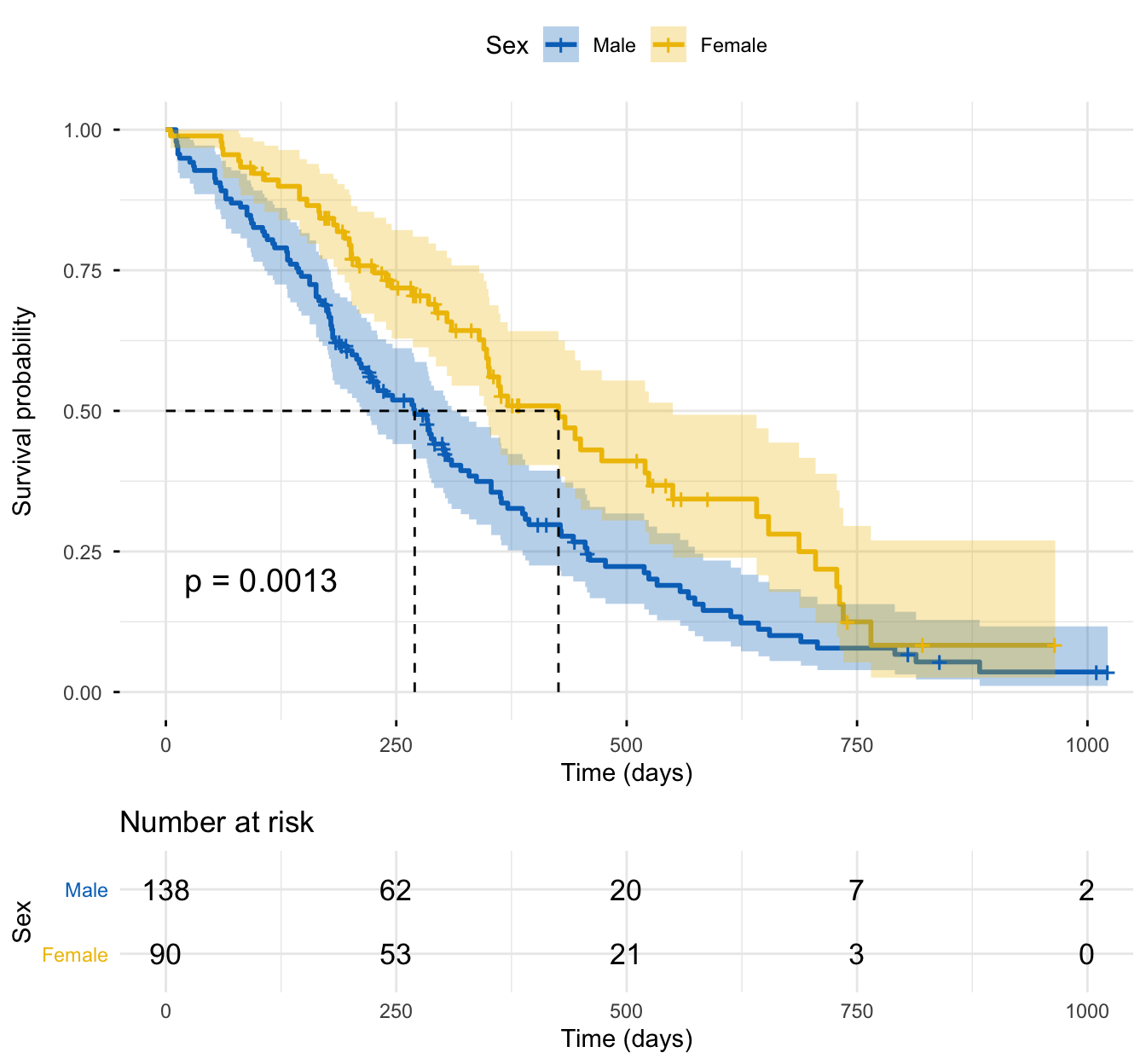
Numbers are precise, but a Kaplan-Meier plot is how survival results are read. Use survminer’s ggsurvplot() — it draws the step-function survival curves and adds everything a reader needs on one panel:
conf.int = TRUE — shaded 95% confidence bands around each curve;
risk.table = TRUE — the number at risk beneath the plot at each time (so you know how much data backs the tail);
pval = TRUE — the log-rank p-value comparing the curves, printed on the plot;
palette = "jco" — a colourblind-safe journal palette.
library(survival)library(survminer)fit <-survfit(Surv(time, status) ~ sex, data = lung)ggsurvplot( fit,data = lung,risk.table =TRUE, # number at risk under the plotconf.int =TRUE, # 95% confidence bandspval =TRUE, # log-rank p-value on the plotsurv.median.line ="hv", # dashed median-survival guidespalette ="jco", # colourblind-safe journal palettelegend.labs =c("Male", "Female"),legend.title ="Sex",xlab ="Time (days)",ylab ="Survival probability",ggtheme =theme_minimal())
How to read it:
The y-axis is the survival probability (starts at 1.0 = everyone alive); the x-axis is time in days. Each vertical drop is a death; each small tick mark is a censored patient.
The female curve stays above the male curve at every time point — better survival for women, the whole way through.
The dashed median lines meet the x-axis at 270 days (men) and 426 days (women) — the numbers from survfit(), now on the plot.
The log-rank p-value (0.0013) says the difference between the curves is statistically significant.
The risk table shows the number still at risk shrinking over time — note how few patients remain in the tail, which is why the confidence bands fan out late (interpret the right end of any KM curve with care).
The Kaplan-Meier life table: summary(fit)
ggsurvplot() shows the curve; the life table gives the underlying step-by-step estimate. summary(fit) returns, at each event time, the number at risk (n.risk), the number of deaths (n.event), the estimated survival probability (survival), and its confidence interval. It’s long, so look at the first rows for men:
library(survival)fit <-survfit(Surv(time, status) ~ sex, data = lung)s <-summary(fit)# The first few steps of the life table (one row per event time)life_table <-data.frame(time = s$time,n.risk = s$n.risk,n.event = s$n.event,surv =round(s$surv, 3),lower =round(s$lower, 3),upper =round(s$upper, 3),group = s$strata)head(life_table, 8)
Each row is a step in the curve: survival only changes at an event time, dropping by a factor that depends on how many were at risk. This is the product-limit estimate plotted above — the table and the figure are two views of it.
Compare the groups formally: the log-rank test
The KM plot suggests women survive longer; the log-rank test decides whether that gap is real. It is the standard non-parametric test for comparing survival curves, with H₀ = no difference in survival between the groups. The pval = TRUE you saw on the plot is exactly this test. Compute it directly with survdiff():
library(survival)survdiff(Surv(time, status) ~ sex, data = lung)
Call:
survdiff(formula = Surv(time, status) ~ sex, data = lung)

        N Observed Expected (O-E)^2/E (O-E)^2/V
sex=1 138      112     91.6      4.55      10.3
sex=2  90       53     73.4      5.68      10.3

 Chisq= 10.3  on 1 degrees of freedom, p= 0.001
The test gives χ² = 10.3 on 1 degree of freedom, p = 0.001 — the survival difference between men and women is statistically significant. The log-rank test answers “do the curves differ?” but gives no effect size and can’t handle continuous predictors or adjust for confounders — for that you need the Cox model.
NoteFrom describing to modelling survival
Describe / compare categorical groups → Kaplan-Meier curves + the log-rank test (this lesson) — a survival curve and a p-value.
Estimate an effect size, use a continuous predictor, or adjust for several covariates at once → the Cox proportional hazards model — a hazard ratio per factor.
Report
Survival was estimated by the Kaplan-Meier method on the NCCTG lung-cancer data (n = 228, 165 deaths). Median overall survival was 270 days (95% CI 212–310) for men and 426 days (95% CI 348–550) for women. One-year survival was 36% (men) versus 56% (women). The survival difference between the sexes was statistically significant (log-rank test χ²(1) = 10.3, p = 0.001).
NoteThe math behind the Kaplan-Meier estimator (optional)
The survival probability at event time \(t_i\) is built recursively from the probability at the previous event time, multiplied by the conditional probability of surviving the current one — the product-limit estimator:
where \(n_i\) is the number of patients at risk just before \(t_i\), \(d_i\) is the number of events (deaths) at \(t_i\), and \(S(t_0) = 1\). Because the curve only changes at an event time, \(S(t)\) is a step function: it stays flat between events and drops at each one. Censored patients leave the risk set without causing a drop — they simply reduce \(n_i\) for later times, which is how Kaplan-Meier uses every patient’s information up to the moment they are lost, instead of discarding them. The confidence interval around \(S(t)\) comes from Greenwood’s formula for its standard error.
Which method when?
TipChoosing your survival method
Describe survival in one group (curve, median survival, survival at time t) → Kaplan-Meier estimation (this lesson).
Compare survival between 2+ categorical groups with a p-value → log-rank test.
Model the effect of one or more covariates (categorical or continuous), adjusted for each other, with a hazard ratio → Cox proportional hazards.
Estimate the curves yourself — swap sex for another grouping variable, or change the times you summarize. The sandbox boots on first Run.
🟢 With an AI agent
Ask Prova“estimate Kaplan-Meier survival curves on my data, give me the median survival with 95% CIs, and draw a publication-ready ggsurvplot with the risk table and log-rank p-value” — it answers with survival + survminer code you can run on your own data. The runtime is the judge.Ask Prova →
Common issues
The median survival is NA (“not reached”). If fewer than half the patients in a group experience the event, the survival curve never drops to 0.5, so the median is undefined — R prints NA. This is normal with heavy censoring or short follow-up. Report a different quantile (e.g. the 25th percentile via quantile(fit, probs = 0.25)) or the survival probability at a fixed time instead.
Your curves cross. Kaplan-Meier and the log-rank test assume the curves separate in a consistent direction; crossing curves mean one group does better early and worse later (or vice versa). The log-rank test loses power here and can miss a real difference — consider a weighted test (Fleming-Harrington) or report survival at specific time points. Crossing curves also signal that the proportional-hazards assumption of a later Cox model is likely violated.
You forgot the censoring ticks, or read the tail too literally. The small tick marks on the curve are censored patients, not events — don’t mistake them for drops. And because few patients remain at risk late in follow-up (check the risk table), the right end of the curve is unstable and its confidence band is wide; avoid strong claims about long-term survival from a thin tail.
Frequently asked questions
NoteWhat is the Kaplan-Meier estimator used for?
It estimates the survival probability over time — the probability of surviving past each time point — from data with censoring. Use it to describe survival in a group (the survival curve and the median survival time), and to compare survival between categorical groups visually, paired with the log-rank test for the formal p-value.
NoteHow do I read the median survival from a Kaplan-Meier curve?
The median survival is the time at which the survival probability \(S(t)\) first reaches 0.5 — half the group has experienced the event. On the plot, draw a horizontal line at 0.5 and read where it crosses each curve (surv.median.line = "hv" does this for you); in R, survfit()’s printout reports it directly with a 95% confidence interval.
NoteWhy is my median survival NA or “not reached”?
Because fewer than half the patients in that group had the event, so the survival curve never drops to 0.5 and the median is undefined. This happens with heavy censoring or short follow-up. Report another quantile (e.g. the 25th percentile) or the survival probability at a fixed time (summary(fit, times = …)) instead.
NoteWhat is the difference between the Kaplan-Meier curve and the log-rank test?
The Kaplan-Meier curveestimates and displays survival over time for each group; the log-rank testtests whether the curves differ, returning a chi-square statistic and a p-value. KM is description; the log-rank test is inference. Neither gives an effect size or handles continuous predictors — for that, use the Cox model.
NoteWhich R packages do I need for Kaplan-Meier analysis?
Two: survival to estimate the curves (Surv(), survfit(), survdiff()) and survminer to draw the publication-ready plot (ggsurvplot() with the risk table, confidence bands, median lines, and the log-rank p-value). Both ship the lung dataset used here.
Test your understanding
ImportantPractice
Run it. In the live cell below, estimate Kaplan-Meier curves for the overall sample (one curve, no grouping) by filling the blank with 1. What is the overall median survival, and how does it compare to the by-sex medians (270 vs 426 days)?
Interpret. A KM analysis reports a median survival of NA in the treatment group but 280 days in the control group. In plain words, what does the NA mean, and what should you report instead?
NoteHint
For an overall curve with no groups, the right-hand side of the formula is 1. The printout’s median column gives the overall median survival; compare it to the per-sex medians.
NoteSolution
fit <-survfit(Surv(time, status) ~1, data = lung)print(fit)#> n = 228, events = 165, median = 310 (95% CI 285-363)
The overall median survival is 310 days — between the male (270) and female (426) medians, as expected when you pool the two groups.
For question 2: a median of NA (“not reached”) means fewer than half the treatment-group patients died, so the curve never dropped to 0.5 — often a good sign (better survival). Don’t report it as a missing value or zero; instead report the survival probability at a fixed time, or a lower quantile (e.g. the 25th percentile), and note the proportion still event-free at the end of follow-up.
TipQuick check
On a Kaplan-Meier plot, what does a small tick mark on a survival curve represent?
NoteShow answer
A censored patient — someone who was still alive (event-free) at that time but then left the study (end of follow-up or lost to follow-up). A tick is not an event; events are the vertical drops in the curve. Censored patients reduce the number at risk for later times but do not cause the curve to step down.
Conclusion
You can now run Kaplan-Meier estimation in R: build the Surv(time, status) response, estimate survival curves with survfit(), read the median survival and its 95% CI plus the survival probability at any time, and draw the signature survminer ggsurvplot() — risk table, confidence bands, median lines, and the log-rank p-value on one publication-ready panel. On the lung-cancer data, median survival was 270 days for men versus 426 for women, a difference the log-rank test confirmed (p = 0.001). Kaplan-Meier describes and compares survival across categorical groups; when you need an effect size, a continuous predictor, or adjustment for several factors at once, the Cox model is the next step.
Related lessons
Log-rank test — the formal test of whether two or more KM curves differ (the p-value on the plot, explained). · Cox proportional hazards — model survival on one or more covariates and get a hazard ratio per factor. · What is survival analysis? — censoring, hazard, and survival functions explained from scratch.
Every result on this page was produced by the code shown, run at build time against a pinned R environment — edit any block and Run to reproduce it yourself.